A couple of minor tweaks.
Eddie


A couple of minor tweaks.
Eddie
Whole chunks of my life come under the heading "it seemed like a good idea at the time".

Well that will be the end of my only new years resolution,when it's released that is. On the plus side, it will be the longest a resolution has held steadfast until crumbling to dust.Originally Posted by swanbourne

Looks very nice
Oh yeah, it will still be a flick of the coin between the B and the C, the white faced exploreresque piece is also very nice.
Last edited by nickyboyo; 5th January 2019 at 13:01.
Again, very nice, Eddie. From a technical perspective, would it be possible - or desirable - to blue the second hand and have a red tip below (above?) the lumed lollipop?
Sent from my iPhone using TZ-UK mobile app

That's fantastic Eddie.
That new version of C is very nice ... making me wonder whether the red second hand and red text would work with option B as well. For sure the slimmer straight (i.e. "non-triangular") second hand is much better and I'd like to see that replicated on B, with or without a colour change.

I like it very much, although I would like to see you use the same font for the numerals as on the "standard" Everest (I think it would make a nice visual connection to the other Everests), but I realise I can't have everything. It will make a nice companion to my black one nevertheless.
The vintage lume is fabulous on the PRS-82's black dial imho (and I suspect is one of the main reasons it is so popular) but not sure that it would work on the cream dial. The key line being a minuscule amount thicker could work but would be a more expensive idea to test at prototype stage I suppose. Ultimately, I think this is one of those issues that can only be resolved at prototype stage, wearing/handling the watch in differing lights and at differing angles. Tricky one.
To go back to the hands discussion for a sec I think the longer thinner minute hand, thicker shorter hour hand style is more balanced but I also prefer the hour hand tip to get a little closer to the numbers. Different strokes for different folks....
[QUOTE=size11s;4990869] ... The key line being a minuscule amount thicker could work but would be a more expensive idea to test at prototype stage I suppose. Ultimately, I think this is one of those issues that can only be resolved at prototype stage, wearing/handling the watch in differing lights and at differing angles. Tricky one ...QUOTE]
Overall, I think Eddie's latest mock-up looks superb and the watch has the potential to be something really very special. I agree with you and Oliver though in that the detail of the key line will make or break it. The trouble is the difference will comedown to hundredths of an mm and, as you say, will probably only be possible to evaluate in the flesh via a prototype. Visually, I hope they can appear as close to the size of those in the 36mm without overpowering the dial.
Perfect. New Years resolution canned.
Could you give any suggestion please Eddie, as to when when either/both white versions might be for sale?
I haven't ordered them yet, cashflow has taken a bit of a beating lately.
Eddie
Whole chunks of my life come under the heading "it seemed like a good idea at the time".
Perhaps I shouldn't say this - but have you ever thought about doing a type of 'crowdfunding' - say, once a design is finalised but before you order them, give people an opportunity to say pay a 50% deposit, and say the first 10, 20 or whatever number, would be entered into a draw for the watches with the first say 10 serial numbers - or whatever.
I guess there might be some consumer credit regulations you may need to be concerned with - but it might help (a bit) with cash-flow?
Edit - Opps Sorry Saint-Just hadn't seen your post.
Ill put a bigger picture next time
'Against stupidity, the gods themselves struggle in vain' - Schiller.
LOL - well I did start off by saying 'Perhaps I shouldn't say this..." 😜👍
That looks pretty much perfect! I will buy it.
I agree with a previous poster though in that I think the lumed section of the hour hand should be slightly increased.
I disagree personally. One of the reasons I also like the B variant. In the dark there needs to be very clear distinction between hands. Any longer and it might be the case that you need to focus your eyes to read the time at night rather than just know at a glance.
I didnt read anybody suggesting an increase in the length of the hour hand. It would be possible to increase the lume by making the hour hand a similar width to the minute hand.
Sent from my iPhone using TZ-UK mobile app
This would give the hands balance.
Understandable of course, thanks, good to have a sense of timescale, much appreciated.
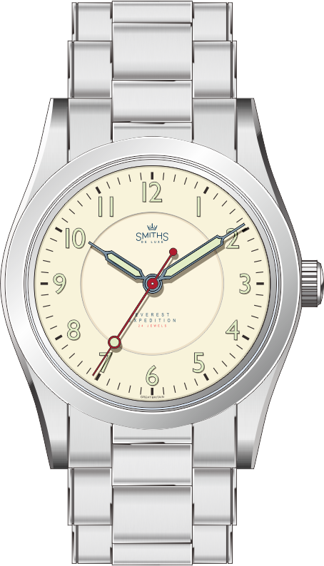
I really like that just as it is... Is there intended to be a physical step in the inner ring on the face Eddie?
Hmm I'm up for one :-)
A
Yes, confirmed as a sunken inner dial in post 233.
oops, missed that...sorry!
Even better then in my eyes.
A
I'm that confident the white version will be of the same quality of my last three purchases (29AM, 29A and the 36mm Everest), you can have the money and send the watch when its ready.
Eddie, why don't you try to crowdfund it, even within the TZ-UK community only? We know what we're getting, it could help with the cashflow issue
In other words,

'Against stupidity, the gods themselves struggle in vain' - Schiller.
Crowdfunding is an excellent idea, if workable for Mr EP. Especially with much stock being currently held of at least three recent releases.
As I have and appreciate the quality of the current Everest releases, Id be happy to pay now for a white 36mm prs-25, and receive when ready. Perhaps price could be the same as the current 36mm with buyers agreeing to a leeway of say 10%. Delivery date could be within a specified maximum number of months. Probably thered be a minimum number required before the order could be triggered. I dont know if this method is at all feasible for the business, but I like this idea!
Yes, please. SUATMM.
Really stunning - any chance it will be with a Hi-dome acrylic crystal?
I wish. I despair that we'll never see an acrylic crystal again.
The sapphire domed crystal on the new PRS-25 is the best compromise in terms of robustness, scratch resistance and vintage look, IMO.
The problem with the sapphire domed crystal is the milky ring - you don't get that distortion in the same way as you do with a Hi-dome acrylic crystal. If you look at pictures of the first PRS-25 with the acrylic domed crystal, you will see that the acrylic is clear around the edge, and it really is a crystal that makes the watch.
Compare this - https://wornandwound.com/review/smit...prs-25-review/ to this
https://uploads.tapatalk-cdn.com/201...7ecaf5e5dd.jpg
Do you see it?
Last edited by Mads Gorm; 8th January 2019 at 19:09. Reason: spelling ereor and added the word acrylic.
Yes, I know what you mean, but I can live with it, because for me the resistance to scratches is very important.
I think the sapphire domed crystal is also the reason that the watch looks smaller than its 36mm, more like 34mm. Now that the honeymoon phase is starting to wear off I have to say that I really dislike the milky ring effect of the crystal. I wonder if it's possible to replace the sapphire with an acrylic crystal. Guess I'll have to talk to a watchmaker.
I'm glad you agree about the milky ring. But I think that it is not that easy to go from sapphire to acrylic or vise versa - it is my understanding, that the case is constructed differently depending on the glass material. But I do hope the white dial would come i acrylic, it would fit the retro / vintage look, and acrylic just looks like a big diamant:)
But if not acrylic, then I would prefer a more contemporary slight doom, so you don't get the milky ring.
Any hint of a release date for version b?
Eddie has a number of other watches coming on line this year, so it may be some time before these become available. Mores the pity.
Thats the one :)
If one could by a Beads of rice bracelet as an extra accessory for the PRS-25 36 mm - would there then be an interest in that?

Last edited by Mads Gorm; 20th February 2019 at 12:14.
Too dressy for my taste - the oyster style suites it much better in my opinion
I agree, that it should not be the standard option, and should not replace the oyster, but just be possible to buy as an extra, for the dressy occasion or for the summer.
I really don't think that you can better the Oyster design as regards a bracelet for this kind of watch case.
As for BOR, I have tried them on a number of watches and don't like the way that they wear. Sized to fit above the wrist bone they seem to flop about to much to me. The design of Oyster links seems to keep the whole thing more rigid even when worn fairly loose.
The decision to go with sapphire was more commercial than customer driven and here's why. With the Smiths Military, I've replaced more than 50 acrylic crystals (700 sold) and only ONE sapphire on the 29-B (200 sold). When I ordered the PRS-1 (300 pieces) in 2001, I also ordered 20 spare sapphire crystals; I've still got 12 of them.
Eddie
Whole chunks of my life come under the heading "it seemed like a good idea at the time".
Thanks Eddie for your explanation.
Thanks for that explanation - definitely food for thought. Did the acrylic crystal pop out of the watches, or did they splinter?
Have you considered going with flat sapphire, like on the the current Rolex Explorer models, or perhaps a more moderet dome - like on the Tudor Black Bay and on the Current Omega models?
Last edited by Mads Gorm; 21st February 2019 at 20:44.
That Omega Ranchero looks fantastic on beads of rice IMV.
Yes, I'd be interested, but to be honest I'm not sure there'd be enough of us of like mind to justify a production run bearing in mind that it wouldn't be the default option but just an extra. (Not sure what the minimum production run would be for a standalone bracelet though - is it just the end links which might have to be added to a stock bracelet?)
I don't think it suits this watch, but WatchGecko do a BOR bracelet and supply curved endlinks for £5.
https://www.watchgecko.com/beads-of-rice-by-geckota.phpj
F.T.F.A.
Thanks. The link doesn't work for me but I've had a look at it on the Geckota website anyway. I'm a bit of a coward when it comes to this sort of thing and would want to see photos of the watch on the bracelet and reports of any difficulties getting the end links to fit before actually shelling out any cash on it.
In any case, I think you're right that it wouldn't really suit the classic 3-6-9 dial variants, which have always been my prime interest. I'm waiting to see photos of 'version C' before I decide whether to get one. (Based on the rendering, I have concerns about the thickness of the minute hand which seems to me to unbalance the handset - an issue which was discussed (much) earlier on in this thread.) That's the version on which, if I got it, I might be open to playing around with an alternative bracelet such as a BOR.

That looks nice, especially if you axed the lollipop on the second hand.
Am I the only who thinks that, if you’re going to do some of these beautiful homages to famous old Smiths AXXX dials, it would be nice in the manual PRS-29 style case, rather than an auto, PRS-25 Oyster style case, since the PRS-29 case is more similar to the Smiths from that time??
Last edited by duder13; 26th March 2019 at 14:44.
Personally I think the lugs are too long on the PRS-29 case, especially for the 36mm size. It means the watch only really works on a NATO type strap (or perlon). A leather strap would leave a big gap where your wrist shows through (almost all Nomos watches have the same issue) and a bracelet as standard (as per the render) would probably look really odd ... too much metal "visually" ? Like that awful new PO1 Tudor :-)
So definitely the Oyster case for me !
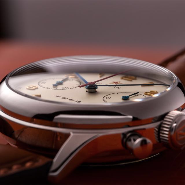
I hear you, but the old Smiths watches, like the A409 below, also had longish, narrow lugs for their size. I’m not saying the PRS-29 case is identical, but it’s more in line with older Smiths. I guess it’s just a little odd to me to do old Smiths dials in a Rolex-like case, which is partly why I’d choose the white Explorer dial B over dial C.
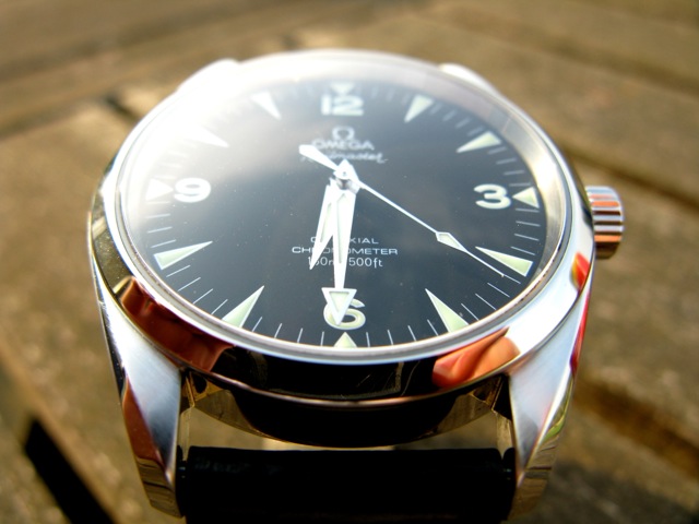
Plus, the PRS-29AM looks nice in a strap, to me. Not my pic:

I prefer the Everest case, equally at home on a bracelet or a strap.
A manual movement would be a nice option though.

Great combination - wonder where the strap was bought from?
 Posting Permissions

 Reply With Quote


