Reply With Quote
Out of interest - what's the issue with the Bonklip - were they prone to failure?Originally Posted by swanbourne

It's just that I can appreciate the desire to have something that looks 'period'.
I must admit the watch is really growing on me 👍


Brilliant, thanks Eddie.


Out of interest - what's the issue with the Bonklip - were they prone to failure?
It's just that I can appreciate the desire to have something that looks 'period'.
I must admit the watch is really growing on me 👍
Its past growing on me , I need a full on pruning, its that grown, kind if like my hair with all this stay in doors and my Barber has been closed for some time now. So looking forward to this model.

I think he was objecting to the idea of "fitted" rather than "bonklip".
Personally I will be getting some kind of third-party bonklip for this watch.
Ah, I see.
Is there a decent 3rd-Party Bonklip style manufacturer then? I thought it was the case of E-bay for NOS or 2nd hand, or some not so good versions?
https://www.serica-watches.com/en/pr...klip-bracelet/
Problem is you have to buy their watch too!
Last edited by lughugger; 29th April 2020 at 16:32.
Joseph Bonnie (who make the Serica strap) sell it separately for 91, not 99,
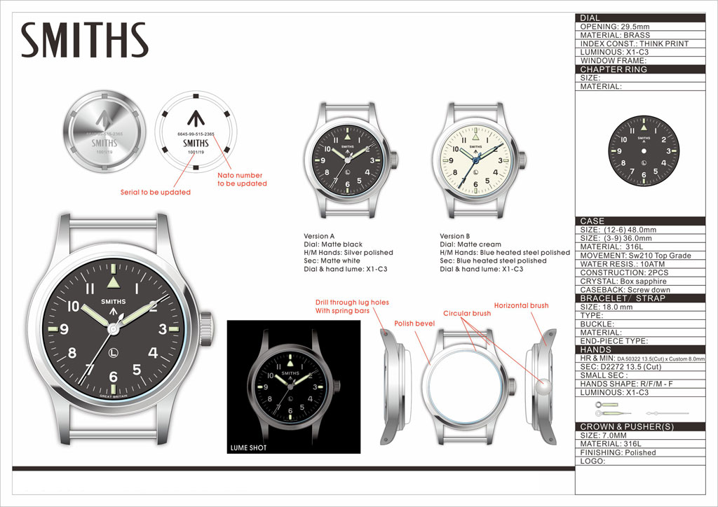
I asked JB, the ends of the new Bonklip are solid tubes, not open, so it will not fit fixed lug watches. Be warned.
I see the drawing for this has drilled lugs and springbars, so it will fit this.
I cannot comment on the JB one, never handled one, but original Bonklips are secure and comfortable, I have one of the original skinnier ones I wear on my HS9.
There are older ones that were made to imitate the BK, many were not so comfortable. I had one, the locating link did not pass through and then sit flat like the proper BK, it had 2 sprung tabs that held it in place. It was very uncomfy
Dave
Thanks for that - interesting its 304L - it does look good 👍
Thanks 👍
Here's the link to the Joseph Bonnie site incase anyone is interested https://www.josephbonnie.com/en/prod...atch-bracelet/
Hmmm... 🤔 just noticed the 'strap' width of the 'navigator' is 18mm; whereas the Joseph Bonnie is stated as having 20mm end links; 19mm connecting link and 17mm centre links.
So will it fit?
Depending on the shape of the end-link... you can generally file a 20mm into 18mm.
Hmmm.....fingers crossed it will come with something similar as either standard or a made for option then - shame.
I agree an original Bonklip is a very comfortable strap and would suit the watch fabulously, with drilled lugs it would even suit the frequent strap changers. I have had one or two copies too and none have been close to as good as the original. An original one with 18mm ends is quite a pricey item though, considerably more than 91 euros so I look forward to hearing whether someone is successful at filing down the Bonnie ones when the time comes but I think the 19mm connecting links will be problematic.
By looking at the Serica site... I reckon as long as the watch has drilled lugs, it should be ok. But at that price I won't be risking it.
Yes, could be OK. I think they would have to be a shade under 18mm to facilitate installation/removal without extensive inner lug scraping. Definitely not something I will be risking either at that price.
It will be interesting to see what strap Eddie ships it with.
I don't exactly think its a problem since I have that very watch with a black dial and the broad arrow hands and I love this watch. I think it is a great watch but.
I am really not sure, the original IWC Mk11 came with a Bonklip, but it Eddies creation so it comes with whatever he designs for it.
But......Come on, you can't leave us hanging like that!!!!!!
Is it still your only watch?
I've had Bonklips on an Omega 53 and IWC Mk11. Horrible things that I got rid of. They don't look right, are not great for strap changes with fixed bars and are fiddly. More than anything they spoil the look of the watch even if period correct. I think a nylon NATO or earlier canvas AF0210 or DEF3 looks better.
I still have a 16mm Bonklip that was on an RAF Bulova or Waltham (can't remember), but it's shoved in a box somewhere,

Not sure what the attraction is with bonklips. Always look like theyd be dead uncomfortable to me
Sent from my iPhone using TZ-UK mobile app
Always better to comment from experience. I have one of the old skinny ones on my HS9, it is very comfy, and very secure.
Dave
Sorry about, I didn't even realize that I hadn't even finished the post, guess it must be this being couped up for so long. Any ways I meant to say that it is a great watch but some people complain that you can't have a manual wind only watch with a screw down crown. I have not seen why that is an issue, because I haven't had any problems at all. Crown screws in like butter, I mean it is that smooth. Besides Rolex OP's from the 50's with manual wind and screw down crowns are still going strong.
And the answer to your last question is yes, it is for now the only watch that I have so it is my everyday do everything watch.

This is a watch I'm really looking forward to. Hope Eddie gets a prototype and can post pictures sometime soon.
For those interested in Bonklip bracelets, Fratello has recently published an article on the topic: https://www.fratellowatches.com/vint...bonklip-style/
I would personally love to try the one from Joseph Bonnie if someone confirms that it fits the watch.
There's a similar ladder-style bracelet from Merci meant for their LMM-01 watches with 19mm lug width. It costs 79 but I have no idea if it would fit.
Any news from the front on this one?
Eddie posted earlier in this thread that he had expected the prototypes in April but that was a fluid date, and as we can see April has come and gone and I imagine that with what has transpired as of late that delivery times can be expected to be late. A good sign is that Eddie did get in his recent supply of Smith's Everest and Expedition so we know that the supply chain is moving.
I know as soon as Eddie gets them in he will get some pictures up because I believe this project is certainly a hot one and much anticipated.
The manufacturer is due to get the dials on 12 May and I expect him to ship the prototypes the following day. If UPS perform, I should receive them on the 15th and will take pictures the same day.
Eddie
Whole chunks of my life come under the heading "it seemed like a good idea at the time".
Thanks Eddie for all your hard work and for the update on this project. I am really excited about this watch.
Hi, I have been following this thread since its inception and am greatly anticipating the watch.
I thought Id make one more post about the Smiths logo choice of font.
I think that the balance with the plain serif Smiths logo is nicer than the final design. The plain military Smiths font instead of the dressier crown topped one just works better. It fits the watch more. It looks more like the IXC Mk11 in spirit but better balanced because it has fewer characters and it is an issued watch not a civillian dress watch.
I do think the Smiths logo with the crown would be excellent for the white dial variant however!
What does everyone else think? I saw one or two posters stating their preference for the original concept Eddie presented but there was never a consensus.
Is it too late to have a White dial with the ornate crown topped logo and a black dial with the austere military style one?
Regards
Joe

Last edited by BritWatchFan; 11th May 2020 at 17:09. Reason: added image
Yes I know it is too late for this opinion with prototypes on the way but thought I would say it anyway. Much as I really like the boobies and arched Smiths I agree with the previous post, simpler is better for this one. Then the boobies can be saved for the GS DeLuxe next year.....cough! Otherwise, if Eddie did decide to do a GS DL at some point it wouldn't look too similar to this. Think this might be a change of mind for me but we are all allowed those.
I agree with BritWatchFan and would also vote for the no-frills Smiths logo on the black dial version. I think the boobies logo indeed looks the best on the cream dials - just compare PRS-29A vs PRS-29AM or the black vs white Everest.
If you look back to the very first post in this thread from 6 months ago, it showed it with the straight logo. I changed it due to requests for the "boobies" logo and now, 6 months later, people are suggesting that I revert to the original concept. It's a bit late now to be suggesting changes.
Eddie
Whole chunks of my life come under the heading "it seemed like a good idea at the time".
It will be superb either way.
I am happy however it is. Can't wait to see the prototype, hopefully later this week. Thanks Eddie.
Can't beat a pair of boobies Eddie ;)
Last edited by Daddelvirks; 12th May 2020 at 13:17.
Got a new watch, divers watch it is, had to drown the bastard to get it!
The man makes a compelling argument.
Sent from my iPhone using Tapatalk
I like a pair of boobies as much as the next guy, but the more austere SMITHS logo seems in keeping with the military design of this watch.
It won't be this week, he's shipping them on Friday or Saturday which means they will, arrive next week when I'll be dealing with the rush and won't have time to take pictures :-(
Eddie
Whole chunks of my life come under the heading "it seemed like a good idea at the time".
The fact that its the prototype and not a whole batch of finished production watches would suggest there is time to change Eddie. I think you could have the best of both worlds boobies in the white dial military on the black.
I looked through the thread again it seems pretty balanced in terms of opinion regarding the logo choice but I do think that there is a silent majority who would prefer the plain logo, because design wise it makes good sense and it would balance the dial more too.
To paraphrase one poster who prefers yhe boobies "Im not a fanatic of the original watch so I prefer the crown logo." For a military themed watch like this most buyers will be people who like the austere military aesthetic.
Is it too late to do an online poll? And if the results are convincing affect a slight change in dial printing for the production order?
Last edited by BritWatchFan; 12th May 2020 at 20:32. Reason: Re read through thread
Can we gather anonymous opinions here?
Would that be allowed Eddie?
https://www.surveymonkey.com/r/SCSHN33
A prototype is made so that the design can be judged in its executed form. From that, minor problems can be easily corrected. If there's a change back to the straight Smiths logo, there won't be the chance to weight up the result without going to a new prototype, which will add expense and delay the whole project.
It's the same in publishing: making changes in the final proof stage is an iffy thing. Yes, of course, if you spot a real error that somehow got through the editing and proofreading, but absolutely not to try to improve the finalised text, as this is precisely where errors creep in.
Not to mention the fact that while the move to the boobs might have been prompted by comments on the forum, it won't have been done 'by popular demand'. It represents Eddie's decision about how he wants the watch to look.
Full steam ahead, I say. The Captain knows where he's going.

Last edited by SplitSecond; 12th May 2020 at 21:04.
Six pages of discussion going on over six months. Why not have a date option? Why not do this or that? There comes a time when one needs to s*** or get off the pot. I think that time has arrived.
I totally agree, a military look deserves the plain logo.
I think it looks great with both logos - but actually believe that the curved one is more 1940s style and if I had a choice thats the one I would go for.
I cant help but think Eddie must feel like banging his head against a wall.....
But having said that - its good that people express their opinions
Sent from my iPad using Tapatalk
It does look 40s although the watch is 1950s isnt it?
I agree its a discussion forum so when some posters jump on the new guy for sticking his head above the parapet its a bit rich. Eddie made the right choice with his 1st dial choice in my opinion. No harm in stating a preference before the final watch is ordered and paid for.
Design is design its an iterative process. Forwards and backwards there is no cut off. Or the Prs29 wouldnt have had so many detail changes in its history.
Hmmm...I voted, but you can't see the result - anyway of getting that shown?
I thinki was one of the first to request boobies.
I still love the boobies
Boobies forever.
Last edited by Synthpunk; 13th May 2020 at 09:05. Reason: BAd Spellung
This makes sense.
"Once is happenstance. Twice is coincidence. The third time it's enemy action."
'Populism, the last refuge of a Tory scoundrel'.
As long as they arrive safely, besides, the store takes priority, and rush is probably an understatement. Thanks Eddie for the update and will be looking forward to the photos when you have time to photograph.
Boobies on a civilian Smiths watch like the Explorer would be perfect. Boobies on a military issue'esque' watch like this one are a superfluous distraction. I mean you wouldnt want the pilot to be distracted by looking at them would you?
I can see the results. I can share them with Eddie or make them public with his blessing.
It may be too late but I believe the boobies request was a bum steer for this particular watch.
 Posting Permissions