
 Reply With Quote
Looks nice. They have a special edition for everything it seems though?


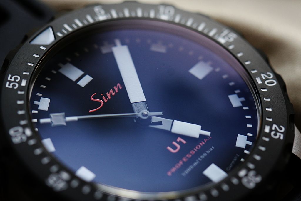
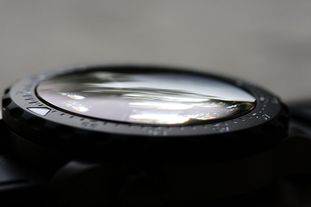
Upgraded to a domed crystal. No date. Less red. Crown at 10.
Better than the U1 original? I think so.

Looks nice. They have a special edition for everything it seems though?

Very nice , they seem to be making a lot of limited editions recently
Sent from my Moto G (4) using TZ-UK mobile app
I've just logged into Facebook and the first post I saw was an advert for a U1 LE. But not this one!
Nice. Very nice. Possibly nicer than the original too. Seemingly not available through page and cooper
Sent from my iPhone using Tapatalk
Not bad, but I fear Sinn may be following Omega's path in terms of the procession of limited editions.
Doesn't seem long ago the U1 was a £1000 watch......

Pretty sure this is US sale only, so budget for the VAT if buying.Originally Posted by AAddict

Certainly a nice version though.
Andy
Wanted - Damasko DC57
Love that. Crown in the right place for me (as a right wrist wearer).
Less is more,thumbs up here.
It was the Date that put me off this model. It's now in my future want list!
Uber clean and functional, the dates on Sinn divers are usually pretty discrete however that's a better looking dial without one.
The date is so discreet on the Standard U1 anyhow - actually if the version pictured had a date the hands would be covering it totally anyway?! - an odd way to photograph a watch without a date?!
Sent from my iPhone using Tapatalk
Very nice. I like that a lot.
Good looking watch, but I wish the hands were different.
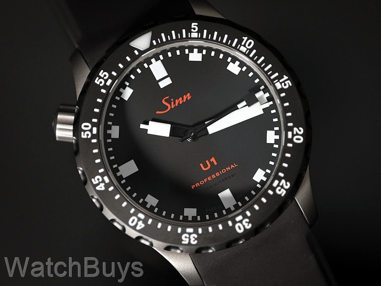
This takes what has become an iconic modern dive watch and improves on it in many ways. Domed crystal, improved lume, no-date dial, and the dial changes pushed this onto my wrist.
Nice - but what kind of Special Edition is it?
It's a nice variant on the original but that second hand is ready bugging me.. Can't see me replacing my normal U1 for this anytime soon.
Agreed - I like a lot about this variant, but that second-hand legibility looks poor: though, maybe, irl, when it's moving, it looks better (even so, I do like the normal red and white lego hands).
I'm afraid the U1 is a watch that escapes me completely.
I hate the Lego hands and overall it just looks, well, boring.
I've really tried to like it, because I like a lot about Sinn, but I simply don't.
I guess in my case more is more and this has EVEN less than than the standard U1.
M.
Adding more black isn't really an improvement on the aesthetics of the original IMO.
And I don't really get why people see a domed crystal as an upgrade. There is no major benefit over the standard flat crystal in typical use. It just creates more reflections which makes the watch a bit harder to read at times and the crystal sitting proud makes it easier to knock against things. Like adding HEV's, its largely pointless.
i was talking to someone about Sinn the other day, saying I like them for the simplicity of their dials, making great pilot/tool watches.
He completely disagreed, and said he loved the little details, and how they packed so much onto a dial while still keeping it legible. I guess if you look at my favourite (the 656) vs. his (the 142) you can see what he meant!
They certainly seem to have a watch to please all tastes!
My favourite is the 203 (most particularly the Arktis), but I love the EZM7, 903 (no surprise given my all-time favourite) and the 14X range too.
With such a wide range of designs, it's hardly surprising that few people like all their design equally.
M.
I think the standard U1 is a bit marmite, but the dial and handset are incredibly legible, the date is very easy to read but low profile at the same time being white on black, and imho the flat crystal suits its angular Germanic styling far better than a more organic dome. I rather like the red centre to the original handset too. I think it's a watch you need to wear for a few days to appreciate, it's all very industrial with no 'jewellery' aesthetic at all.
Sent from my iPhone using Tapatalk
Those massive hands and the horror stories on servicing put me off. There are some Sinn models I really like but I think as a company they are having issues scaling up as the brand gets more popular. 556i on bracelet would be my choice if I ever get one.
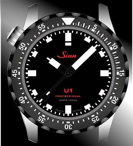
Easier to see in the design photo
I was very excited about the U1 for a long time but when I finally got hold of one I was so underwhelmed it was incredible. I'd spent a long time lusting but the thrill of the chase was, in this case, so much greater than when I bought it that the thing got sold within a couple of months. My fastest ever flip by years!
Ironically I still look at photos and think I love it but in reality it was a big disappointment for me.
I worry it's the same with this model. My heart says yes but, given the import costs involved, I'll listen to my head for once and say no
Sent from my iPhone using TZ-UK mobile app
I was the opposite Toby. Completely underwhelmed in photos but now I have one I think they're stunning watches and very different, left wondering why I didn't buy one years ago
Can I ask what aspects were disappointing? It's a watch that's been on my radar for a while.
I'm not bothered about the crown at 10 and I think the dial has been dumbed down a bit but I do like the black bezel and the rubber strap, both of which can be had separately for the regular U1 anyway. Legibility is what this watch is ALL about anyway for me.
There are a lot of variants of the U1 these days but I say the more the merrier. I especially like the all black one and the Camo version on the green strap.
Isn't the crown at 10 just the crown at 4 worn upside down? Obviously the dial needs rotating too.
Funny thing is I wear my watch on my right wrist, and having owned a couple of 'lefty' watches with reversed crowns I actually prefer the crown on the right hand side of the case. I've never understood why the crown is supposed to be positioned so it can dig into the wrist (?) although with the crown positioned where Otis on the regular U1 and most seiko divers it's a non issue really
Sent from my iPhone using Tapatalk
The domed crystal has benefit under water where even the best AR coating on a flat crystal can still white out at some angles. Since Sinn are all about 'tool' I get why they did this on a dive watch.
Whatever would make you buy a watch you'd only seen in photos but didn't like? We're an odd bunch us WIS eh?
Sent from my iPhone using TZ-UK mobile app
Can't fault the watch per se. Quality wise, finishing etc were great.
My issues were entirely aesthetics. It just didn't seem to have the depth to the dial in real life compared to photos. I also think the dark grey case maybe took something away.
I bought it thinking I'd sell my Pelagos if I liked it but there was no comparison to my mind. The Tudor is still in the box while the U1 is in someone else's!
All that said I'd definitely recommend trying it if you like it. Get one at a good price off SC & you won't lose on it if you're like me and decide it's not for you!
Sent from my iPhone using TZ-UK mobile app
I always thought it was so you can use the crown with your strong hand while the watch is on.
I'm a right wrist wearer too and never care that I have to take my watch off to change the time. Though on my Oris, which has the crown on the left, I've never noticed the crown digging into my wrist either so I don't really see the issue either way!
Sent from my iPhone using TZ-UK mobile app
Flat crystals can white out on one angle, domed crystals partially white out on almost all angles. Its not a good trade off and makes them harder to use underwater, not easier.
See: http://www.watchlords.com/forum/view...p?f=20&t=30654
Last edited by bedlam; 8th May 2017 at 01:51.
Same here!
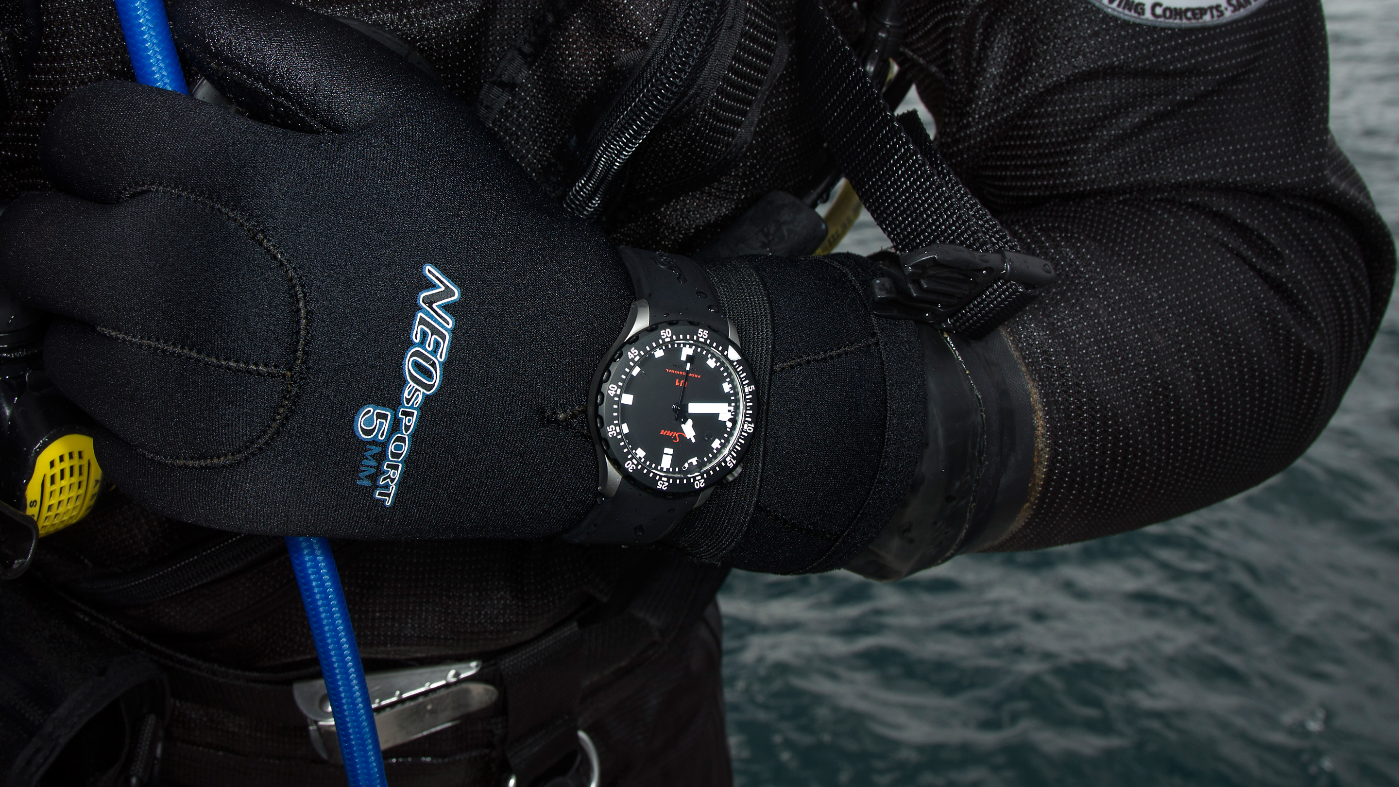
Supersized photos do the U1 no justice at all - On the wrist more understated & just plain old works.
... go as far as to say the love just keeps growing year on year.
We are indeed, as Dave says though not as big as I was expecting from the photos
Arrived today. Amazing watch!
Certainly looks good.
Andy
Wanted - Damasko DC57
Looks good!
A wrist shot would be nice?
From Hodinkee
https://www.hodinkee.com/articles/ru...1-professional
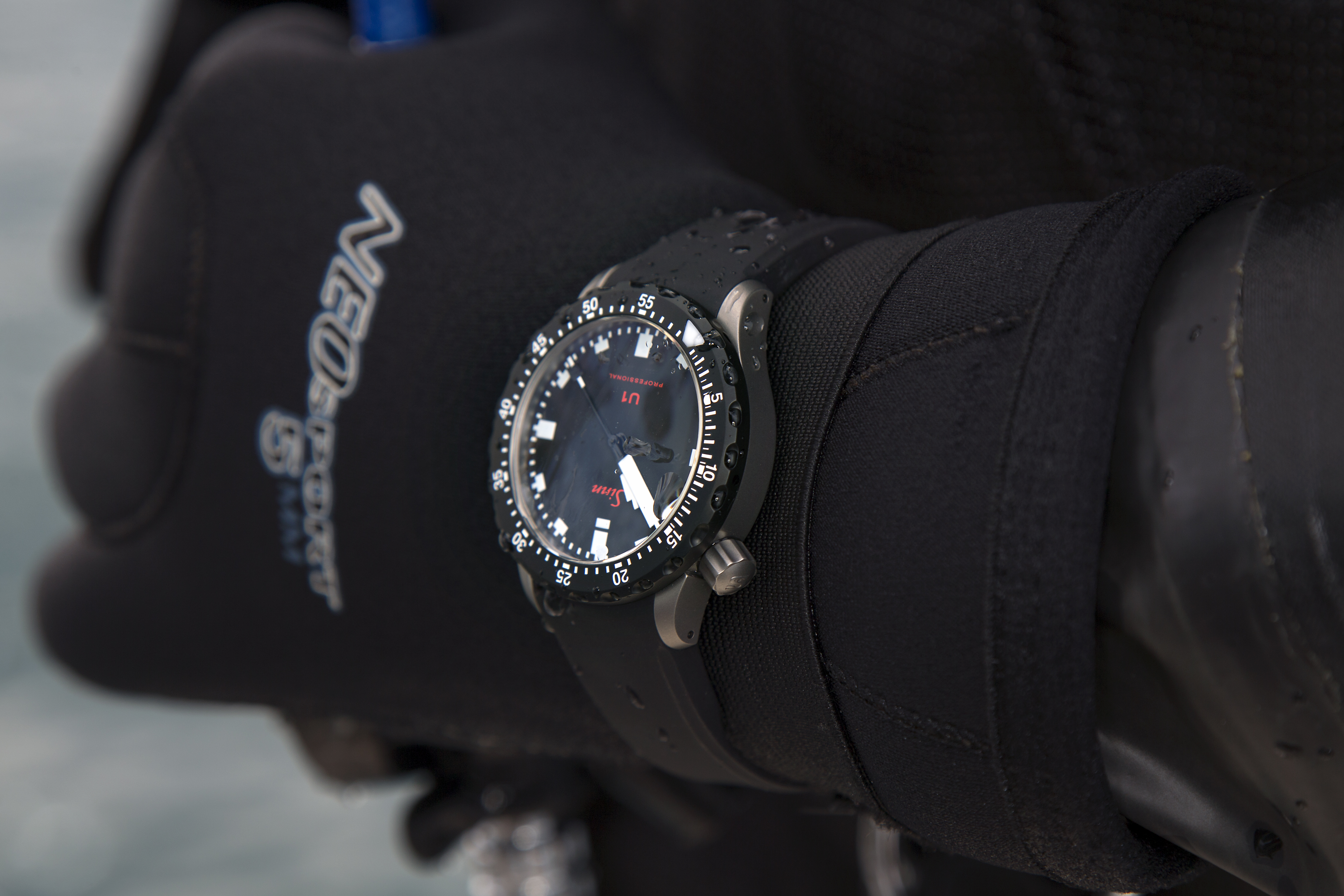
Because it only has a fixed length extension, the Sinn dive strap (like most bracelets), is useless for diving over a substantive wetsuit or a drysuit. If you can close the clasp on the boat the watch will be loose and flopping around your wrist at 15m. A glidelock clasp will work up to about a 6mm wetsuit with gloves, but beyond that you need a proper vented dive strap.
Last edited by bedlam; 11th July 2017 at 16:02.
And now a UK LE from P&C the Sinn BLU1 :
...also available with a black (S) finish.
Great. That's all we need. I look forward to p and c releasing the graduated Brown version 'in deep shit'.
Good luck everybody. Have a good one.
And suddenly an elephant is introduced to the room
I think not. Having a cop edition of a diving watch is pretty goofy, and the normal U1 has more than enough of the mall ninja vibe to it already.
Wow! That is one seriously unappealing watch.
It strikes me as a less ugly version of an ugly watch.
 Posting Permissions