
 Reply With Quote
Looks great Eddie, but no date??? I really think you limit the appeal and potential sales without.
Martin
Originally Posted by swanbourne


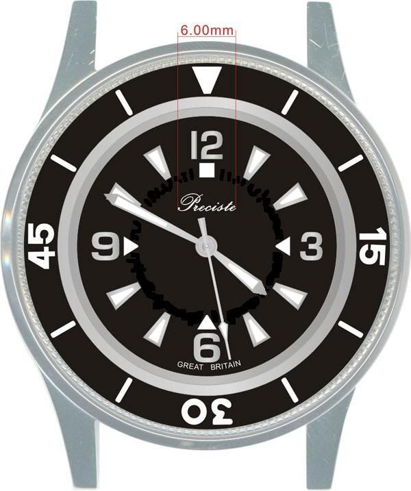
I received the first visualisation for the new PRS-50 today, the one based on the LIP version. There's a couple of errors on the drawing which will be corrected but I think it shows promise. "Precista" is spelt wrongly and "Great Britain" will be moved to either side of the "6" so that the complete hour chapter can be moved further outwards.
Eddie
Whole chunks of my life come under the heading "it seemed like a good idea at the time".

Looks great Eddie, but no date??? I really think you limit the appeal and potential sales without.
Martin
Certainly a date at perhaps the 4 position would have me look seriously at it. Otherwise it looks striking.
No date. If you want to know the date, buy a newspaper.
Eddie
Whole chunks of my life come under the heading "it seemed like a good idea at the time".
Fair enough but not for me then.
Martin
How about duplicating the breaks in the 6 and 9 - it looks really distinctive on the original: See
http://www.watchdeco.com/fiftyfathoms/i ... age67.html
Martin

It looks promising! I'm not sure about the hour markers (on the dial) though, they look sort of wrong to me.
Nice looking dial design, that. I prefer a date, so it's not for me, but I have a 50 already so that's OK!
Dave E
Skating away on the thin ice of a new day
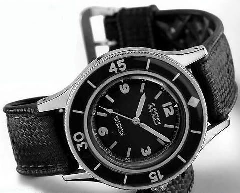
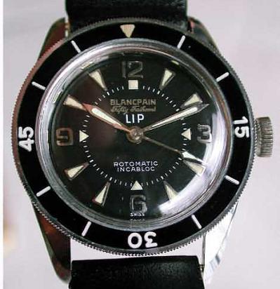
Picture of the BP LIP to compare
Looks interesting... will see how the next mock-up turns out though lack of date may rule it out for me also (don't buy the paper!).
Very nice. The 3 however is completely wrong (has probably to do with the font).
Would prefer this look here:
With a longer seconds hand of course.
I'm not as think as you drunk I am.
I too would prefer a date, maybe hidden away with a black date wheel and white figures, also i would like the markers and numerals a bit smaller and further out, how about a date at 6 and keep the date wheel as close to the dial face so as to hide it away, at least perfectly on the 6th of the month.
Looking good, will it be assigned it's own number as calling it the new PRS-50 will be confusing. Unless you are going to drop the current 50 design.

Looks sharp. I usually like a date but wouldn't want it on this watch. How about moving the minute markers to the outside edge?
IMO the inner minute track shouldn't be there.
* * *
Will this be sharing the same case as the previous PRS-50?
Apart from all that, it looks terrific. Pity my 50 doesnt have the Great Britain printing.
john
Every watch a story.
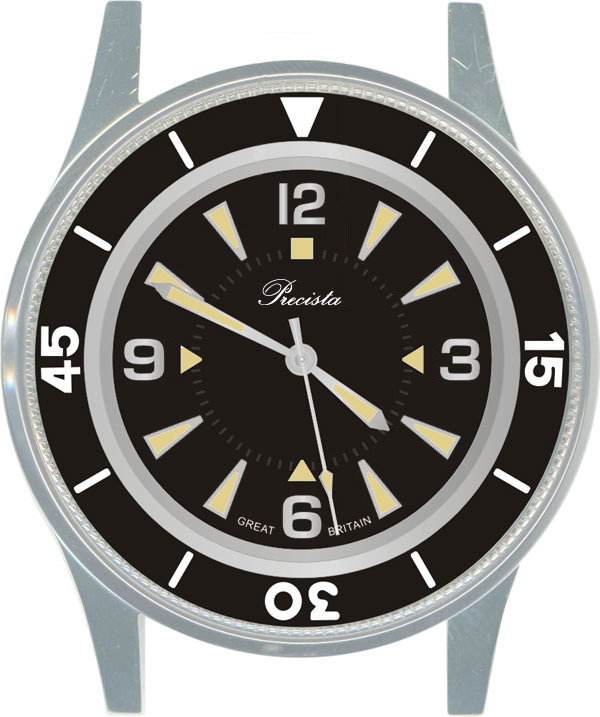
Imagine aged lume

I'm not as think as you drunk I am.
Here's the original on which it is based. The pennant markers are actually applied metal markers, luminous filled.
Eddie
Whole chunks of my life come under the heading "it seemed like a good idea at the time".
Why "LIP"?
LIP was (is?) a French watch company and BP made this watch for them.
Eddie
Whole chunks of my life come under the heading "it seemed like a good idea at the time".
It's lovely Eddie, surely another winner! I'm glad you've decided NOT to put a date window on the dial!
However, call it the Precista International.
A German made British homage to a French watch made in Switzerland ;-)
I'm not as think as you drunk I am.
AFAIK they produced these watches for BP since BP didn't have the capacity to do so.
Funny thing is, that LIP has been contacted by the French Navy to produce diver watches, but they didn't want to do so.
Some time later, they did however, but for BP.
They've made another little gem btw (you know it, don't you):
And look at these!
and:

I'm not as think as you drunk I am.
The new 50 looks great!
Realistically, where could you put a date on this dial without destroying it?
Eddie
Whole chunks of my life come under the heading "it seemed like a good idea at the time".
I would say: NO DATE (you can always check the date on your cell phone!)
Depends on the diameter of the dial/watch and the movement.... but my guess is... nowhere ;-)
I'm not as think as you drunk I am.
That looks a LOT more attractive than the 1st pic - and no, I can't see a date placement on here.
(Just wish the hour hand represented 11 to 5 though :blackeye: )
R
Ignorance breeds Fear. Fear breeds Hatred. Hatred breeds Ignorance. Break the chain.
Very nice, especially with the aged lume. Two questions please - will the case be polished, and will the bezel be acrylic like the current '50?
Cheers,
Guy :)
Looks nice without the date. Just one point I'd like to raise...
Will the bezel font be redrawn? The mix of round ended and square edge numerals don't sit well together for me. I'm happy to redraw the numerals if the manufacturer cannot.
Chris.
Good point Chris, please see what you can do.
Eddie
Whole chunks of my life come under the heading "it seemed like a good idea at the time".
I also noticed the mix of fonts, but that's what the original had.
Before I forget, Eddie, do you have a few AS movements lying around by any chance? Could we see another LE of... say 20 to 50 pieces?
That would really be great!
Edit: Oh, and I think this one would look even better with a beadblasted finish ;-)
(As an option perhaps?)
I'm not as think as you drunk I am.
Could GREAT BRITAIN be relocated to where ROTOMATIC INCABLOC is on the original?
If you look very closely at the pictures the original "15" and "45" are the same font as the prototype's "30"
In the original the numbers were machined into the backside of the plactic insert, so the ends of the lines and turns were round. The ends of the five minute index lines on the bezel should be round as well.
I like it and I prefer it without any date!
all the best
Jan
Like the missus likes it... here's a very quick and very dirty:

I'm not as think as you drunk I am.
That's pretty cool.
The dial already has no symmetry because of the presence of Arabic numerals and so I don't see how incorporating a date discretely would ruin it at all. My suggestion would be a circular date window at 4.30 with white on black. The only other alternative would be a window in place of or immediately above the triangle marker at the 6 position. You might even have a triangular shaped hole which would make a rather distinctive and unusual feature of the watch.
Two other suggestions: If you are trying to be as faithful to the original as possible then you should keep the inner minute track (although I have to confess this did jar initially until I looked at photos of the original). And secondly, could you keep Incablock on the dial - if you are using an ETA movement then is this not still appropriate?
Martin
That looks fab.
Martin
If the numerals were originally routed out of the bezel in-fill material the characters would have had a fixed width on all strokes, this is what I've drawn above.
I'll email you an EPS file and high res jpg if this looks OK.
Chris
I've reserved 200 pieces of the AS2063. This is why I never have any money, it's all tied up in future projects as soon as I get any.
Eddie
Whole chunks of my life come under the heading "it seemed like a good idea at the time".
Mamma Mia :shock: :shock:
The downside of turning your hobby into profession (except you're a pimp). :?
Edit: is there any possibility we'll see some sort of 'aged lume' on this one?
I'm not as think as you drunk I am.
Up until now I've not been very excited about the FF homages I've seen (which means I'm not too crazy about the original design I guess). Far and away this is my favorite version though. I think it's the markers that do it for me. Aged lume would look fantastic and some case finish other than polished. While I do like to have a date on my watches, I just can't see it fitting in here.
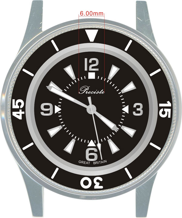
The bezel number font should look something like this:

Update with new bezel font:

I'm not as think as you drunk I am.
So Mr Platts, could some of these end up in the Vanguard?
I'm not a betting man, but would bet that the answer NO will have >50 (%) probability.
Obviously saying this as I already have an LE '50 and am desperate for a Vanguard.....
Don't the numbers on the bezel need straight and sharper edges as per those on the dial - I haven't been all through the thread to find if this is what is required to mimic the original - but it looks very odd to me at present?
Just read up a few posts and you will see the answer to that... it's to do with how the numbers are engraved into the bezel that gives it the rounded numbers :)
I would still like an answer please.
john
Every watch a story.
This looks tremendous but, like a couple of others, I wonder about the position of those minute markers. Presumably there was a reason for placing them where they are when the original watch was designed but accurate setting would seem to require having the point on the end of the minute hand hit a minute marker rather then having the minute hand cover a couple of markers.
 Posting Permissions