Reply With Quote
Tudor
Monochromatic BB58-meh
BB58 Coke GMT. Waay too vintage, but new movement and *may* be thinner
New Bremont releases a disaster :(
Sent from my iPhone using Tapatalk


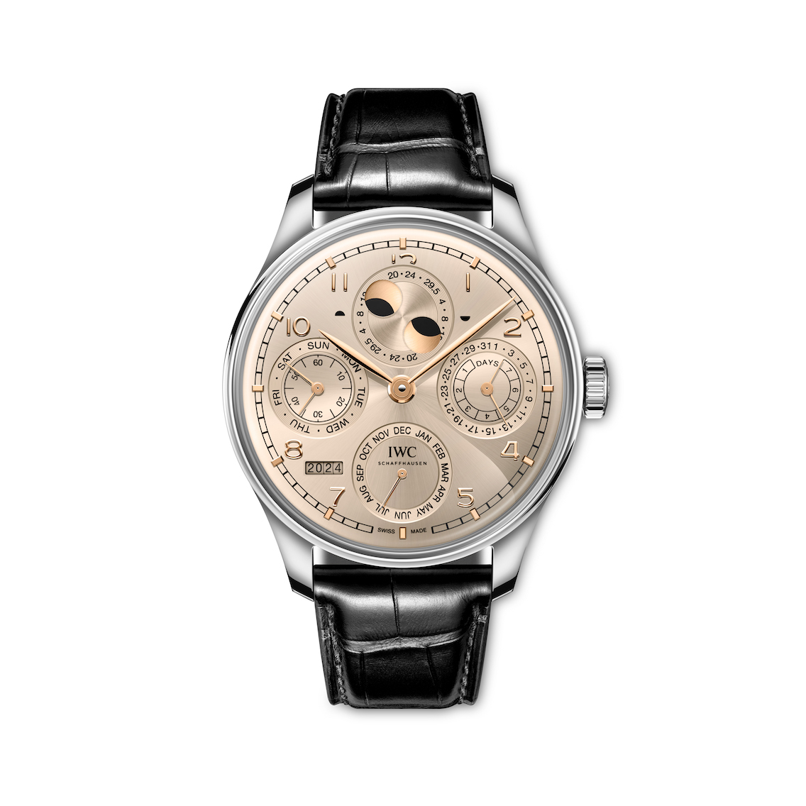
Lots coming out now, the Portuguese secular calendar is the highlight so far. Its squarely in the out of reach camp though.
Tag have released some pretty awful looking chronos too. The panda Carrera would have been lovely were it not for all the red accents.

Tudor
Monochromatic BB58-meh
BB58 Coke GMT. Waay too vintage, but new movement and *may* be thinner
New Bremont releases a disaster :(
Sent from my iPhone using Tapatalk
Last edited by helidoc; 9th April 2024 at 08:21.

Well the W&W24 releases have my wallet remaining firmly in my pocket.
I quite like the Zenith Diver in blue but I would not buy one.
Very uninspiring Tudor releases this year, and when did "Waterproofness" become a word?
I quite like the black & grey Rolex GMT though.
By god it's hard work scrolling past all the cr*p they stick up on the releases pages before you can even get to a rendering of the actual bloody watches to see what they look like face-on!

Great to see a coke, 58 GMT only 12.8mm thick....finally a Tudor I am definitely interested in.
It looks similar to the 90's Breitling Rouleaux bracelet.Originally Posted by Idontgram

Last edited by j111dja; 9th April 2024 at 08:41.
There isnt really anything jumping out as a home run to me just yet. The BB58 GMT is close but way too much gilt and I dont know why they persist with the rivets when no one likes them. The grey Rolex GMT is good, but as always seems a bit pointless when you cant buy one. Cartier Santos Dual Time looks OK. Bit of a meh year.
Oh and Bremont, what were they thinking. The brand already wasnt for me, but seriously?
Bremont seem to have taken a shift downmarket. Some very generic ETA/Sellita movement stuff that they've released that could equally say Alpina on the dial and we'd be none the wiser.
Bremont have junked everything they have done to date in one fell swoop.
Brand changed
Logo also changed to a very generic compass point.
Their unique design feature, the Trip-tick case abandoned.
One of their best models, the supermarine 300, now made very generic and dull.
Everything looks like a kickstarter AI pitch for watches designed to look faux vintage and over-macho at the same time.
Very, very disappointing. The new boss has made his mark, and I am not a fan
Needs more text on the dial.

Looking at the website they are continuing with the old logo on old S3 and S5 series watches and the new compass rose logo sees to be reserved for the new releases.
Typically muddled.
There's a new hand wound Grand Seiko hi-beat, but I can't seem to link a photo; it's reference SLGW003.
Here's the Instagram post anyway - https://www.instagram.com/p/C5iLjtLP...JpMmhnM2Fseg==
I owned the BB58 and loved the gilt accents, but IMHO it looks terrible on the coke GMT. That should have been a homerun on paper...
Sent from my SM-M325FV using Tapatalk
It looks like the new approach from Bremont is to embrace mediocrity but then try to market their way out of it with the spirit of adventure. I dont think it will work.
D
Sent from my iPhone using Tapatalk
Very nice. But not cheap at 11.700 in steel and 49.500 in rose gold.
Photos courtesy of Fratello.
https://www.fratellowatches.com/intr...-hand-winders/

This.
Rolex appear to be trying to replace themselves with Tudor this year, so they can concentrate on monstrosities like the 44mm gold Deepsea, arguably the worlds most pointless watch, and other delights such as the mother of pearl and diamond Daytona. I guess the platinum 1908 and Day-Date tweaks are more plausible, but theyre still decidedly high end. Theres very little for their traditional middle luxury market beyond a new grey and black GMT bezel, unless Im missing something. This is not the kind of year that brought us multi-coloured Oyster Perpetuals, or anything even slightly attainable to fantasise about. Meanwhile we have a $32,200 gold Tudor, where theyve kindly removed the faux rivets on the braclet, and some appealing monochrome black bays where they havent, with improved if still not exactly perfect proportions. Theyre still more appealing to most than the new Rolex releases though. We live in interesting times.
Vacheron Constantin offer the most complicated watch in existence, with the proportions of a tin of beans, and some green dials for the Overseas. Disappointingly, still no mid-size (say 38-39mm), more wearable mens Overseas in stainless steel, imagine the fuss if theyd launched that instant grail.
Lovers of larger watches are well served at IWC, I can forgive this for being oversized because, well, just look at it
This one too, if you can handle 40mm of all-dial watch:
The 2mm thick Piaget Altiplano Ultimate Concept Tourbillon has to be seen in motion, theres a video here.
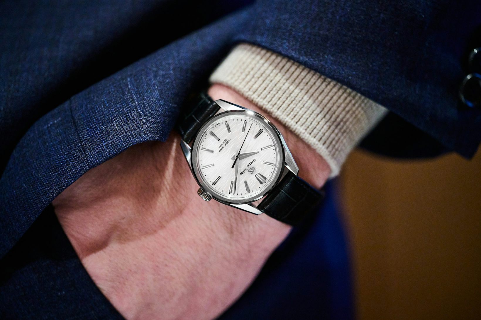
Im a little surprised not to see a hand wound Self-Dater 2nd GS reissue, in its 60th year, particularly as its one of Grand Seikos best proportioned and most wearable watches. But theres still time in 2024. No matter though, because as per some earlier posts, the hands down winner of the show for me so far, for a real world watch, has to be this GS hand wound white birch. Admittedly not exactly cheap, but at 38.6mm and under 10mm thick it has great proportions, plus with an 80 hour power reserve and a beautiful dial, in a brilliant hard titanium case, this one pushes all the right buttons. Theyve even avoided overdoing the polished surfaces on this one, brushing the lugs and the top of the bezel for a calm and cool look. Its one of the few releases this year that instantly makes it onto the want list.
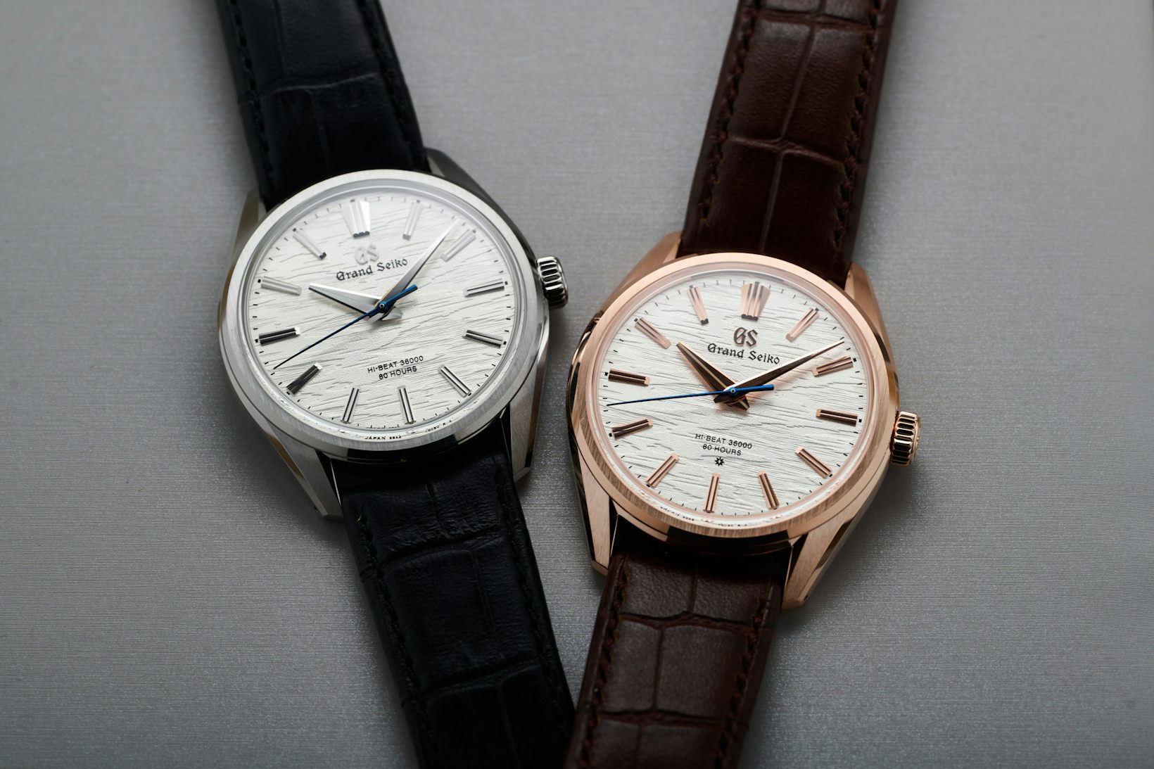
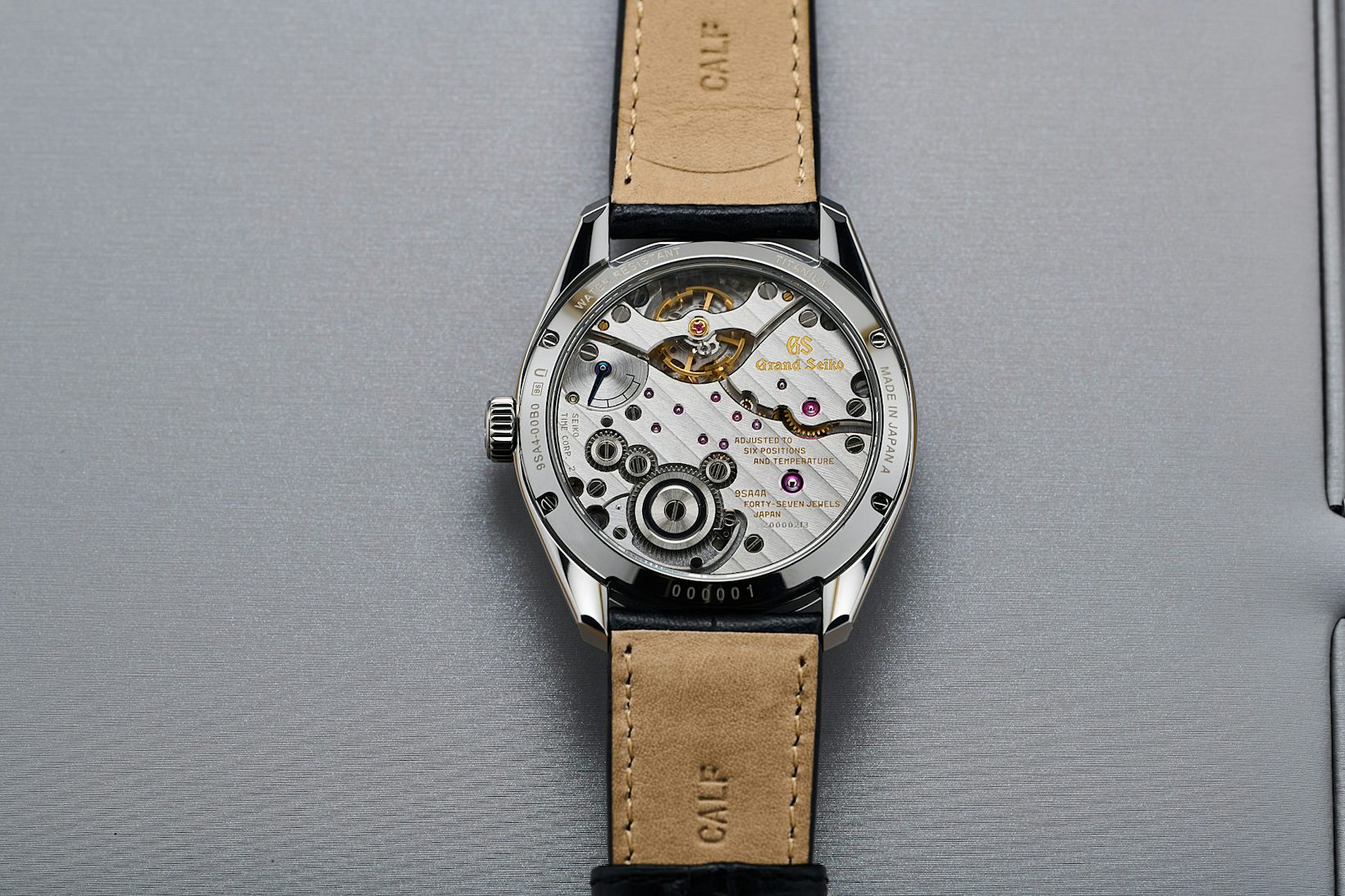
https://www.hodinkee.com/articles/in...lgw002-slgw003
Thanks for posting them.
Lovely looking watch, but I hadnt seen the price *gulp*
Thats some serious wedge. Its not that I think the mechanicals arent worth it, but GS for me is all about the quartz and Spring Drive, as I feel these are genuinely bringing something different to market; basically as lovely as this is, no way at that money for me.
Agreed it’s annoyingly expensive, though their prices make much more sense in Japan - 1,420,000 Yen equates to £7,540. Still plenty, but I’m struggling to see the cheap alternative, from the photos they appear to have made something faultless here. The only dressy watches that give me that feeling tend to be extremely high end, in precious metals only. Yes a spring drive could have been an interesting alternative, but a slim 80 hour high-beat hand wound has its merits too. The main objection is perhaps not the watch itself, but pre-conceptions about the brand positioning. However I suspect that even those who are sceptical of the brand would find very little to dislike about this one, if they can see past the logo.
Aaagh those new Bremont releases are just rotten.
I keep looking at them and trying to work out whats wrong but whatever it is I really dont like it.
Think these will be a really tough sell unless the plan all along was to make people buy the other watches as they now look even better!
Sent from my iPhone using Tapatalk
Just look like generic kickstarter watches & that new logo is very Stone Island
Sent from my iPhone using TZ-UK mobile app
Ouch and double ouch.
Bremont have certainly changed things dramatically.
The Triptick case design was always a bit chunky, but their design philosophy was fairly simple. Give it a hardened coating. Change the top case rather than refinishing the case during a service.
I do like the look of their new chronograph (the Terra Nova) but having a slightly modified ETA 7750, the price is utterly ridiculous. It's £4950 on the bracelet and £4700 on strap.

Last edited by j111dja; 9th April 2024 at 14:04.
Well its about time, Tudor have finally made a Blackbay 58 GMT, 39mm dia and 12.8mm thick (perfect) and its a coke, thats me sorted then...
Thanks Tudor, only taken you 5 years to finally deliver a watch I've been waiting for, name down at local dealers...

Last edited by Martylaa; 9th April 2024 at 15:54.
Very disappointing - priced too high also.
When you look long into an abyss, the abyss looks long into you.........
Brutal assessment.
I’m in full agreement, branding and new designs are awful. Cerrato might have found success with Tudor and the Black Bay, but that was a long time ago and I’d argue his input at Montblanc largely led to derivative rubbish. Like these.
Last edited by Matt.D; 9th April 2024 at 14:43.
Oh-dear Bremont - I really liked the Supermarine range, though could never justify the price, even used, but it had the virtue of standing out somewhat from the vastly overpopulated diver's watch genre.
Its main problem (Bremont's overall problem IMO) was never quite settling on a consistent design language, plus a certain pervasive 'lumpiness' to those designs.
The new one just screams "ME TOO!!!" - the awkward lump opposite the crown - though beloved of AP and others on toolish watchs - is horrid, and the comedy crown guards that are too small to serve any purpose...
Moving to 904L is just a marketing gimmick ("R*l*x use it!" So what?), I much preferred what they were doing with hardened steel in the past.
Just no.
I wish Bremont well, I actively want them to be successful, but I will be surprised if this new range gains much traction vs. the old.
edit: do rather like the Terra Nova chronos - first time for me liking a Bremont chrono. Comedy prices kill that stone dead mind...
AND ANOTHER THING... cheapskate drinks-tin aluminium bezel insert! Right now Christopher Ward are kicking their arse for 1/5 the price!
Last edited by earlofsodbury; 9th April 2024 at 16:10. Reason: added chuntering
Those Bremonts are dire.
The new design cues strike me as what an American marketing man thinks English watches should look like. The Terra Nova watches in particular strike me as ‘Olde Worlde this is what those quaint English people really like, and want, whilst sat in their Tudor look houses’.
I suspect the beginning of the end for Bremont, a la Anonimo as a brand.
The new Mr Bremont certainly has been talking the talk, but this walk is not walking, at all.
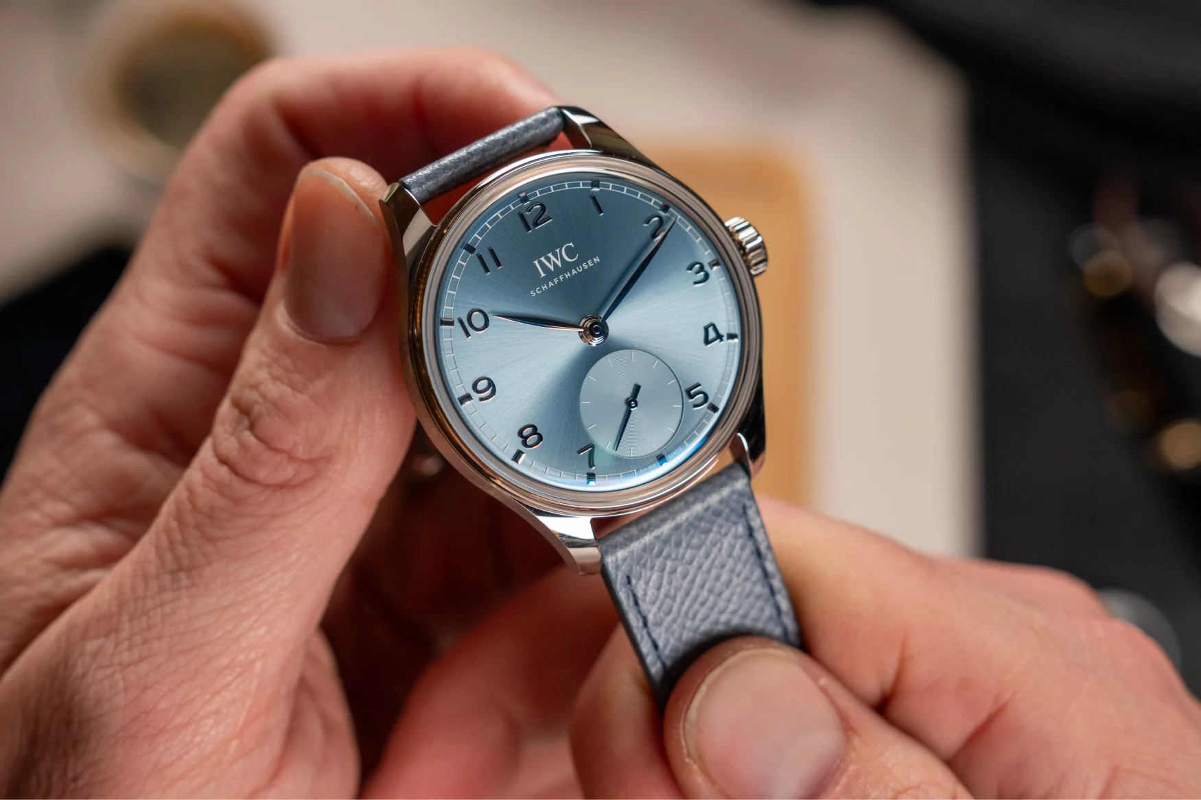
New IWC is rocking my boat. 120hr pwr is rather neat and 100m wrt. I do like a genta inspired design.

Ford... you're turning into a penguin. Stop it. HHGTTG
Ironically it's the US market that the new CEO wants to break so may be it's what an American marketing man thinks that an American consumer thinks English watches should look like.
That wasn't a release unfortunately, would be a winner IMO.
Hadnt spotted the size when I posted :(
Sent from my iPhone using Tapatalk
Beautiful. Just a shame about the price.
I mean it is lovely and all but when I see something like this I just think it looks like a Rolex and I might be in a minority but its not a look I would wear
Agree. Still cant get to grips with the fake rivets. That having owned 2 58s and a 41 GMT. At least this one comes as optional rubber and jubilee bracelet. Even with that its far too vintage looking for me. If this had been the current 41 Pepsi in this size I would have been sorely tempted.
I saw a YouTube short from Bremont announcing the new branding, and wondered why they weren't showing any watches in the video. Now I know why. I can't find anything to like about the Tera Nova, or the new Supermarine, even the bracelets look horrible. Certainly a change of direction for them!
Another Sub-a-like, how refreshing.
Started out with nothing. Still have most of it left.
WGACA
"Once is happenstance. Twice is coincidence. The third time it's enemy action."
"You gotta know when to hold em and know when to fold em".
Only if you believe the Blancpain fairy tale.
Started out with nothing. Still have most of it left.
Mists of time matey, mists of time...
"Once is happenstance. Twice is coincidence. The third time it's enemy action."
"You gotta know when to hold em and know when to fold em".
I can only agree.
I know size is relative, but this picture shows why I wish the Zenith Defy was a little more wearable. Imagine how nice it would be if theyd designed it to fit your wrist instead of your hand
https://deployant.com/live-from-wwg2...s-from-zenith/
Wow, that is amazing. Though obviously not for us mortals "The price of the watch is upon request but was not communicated to us when requested to give you an idea, though, the Altiplano Ultimate Concept without a tourbillon was announced at EUR 420,000."
I love the look of the BB58 GMT, and that it's a coke. Only concern is the gilt in real life, wasn't a fan of it on the original 58 and it looks more intense here, but otherwise I'm a keen bean. One thing that definitely isn't an issue in real life is the faux rivets - they stand out a lot in photos, but I never notice them on my BB58 blue when on the wrist.
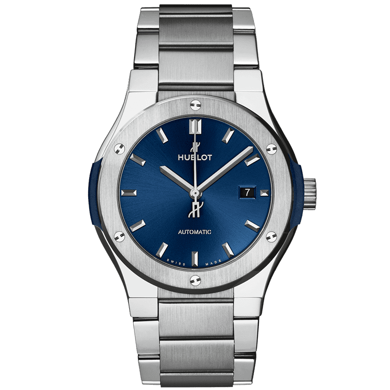
Nice Hublot tribute, but I prefer the original...
Another new Grand Seiko release, SLGH021. I think this is one of the best looking dials they've ever done.
(photos courtesy of Monochrome-watches)
https://monochrome-watches.com/grand...n-specs-price/

Very nice indeed, but damn are they getting expensive. Best part of £10k for this.
The left hand edge of the case looks odd to me, like there is a lump where I’d expect the case to have smooth flowing curve. I guess they’ve chosen to mirror the crown guard? Not keen.
 Posting Permissions