Reply With Quote
Perhaps Eddie should recall all these and take a hammer to themOriginally Posted by benshep


It doesn't bother me either way, but I'd probably prefer it as L. CWC took the opposite course and have have a T on the dial of the Mellor 72 but not on their current G10s. I don't see it having anything to do with Pulsar, but rather a trade of between accuracy of description (the lume used on the dial) and accuracy of reproduction (how the original looked.)
Last edited by gerrudd; 6th January 2021 at 19:37.
Perhaps Eddie should recall all these and take a hammer to them

Yup. Utter nonsense being spoken.
😂😂
It only bothers me, because I wore a couple of CWC 'back when' ..and they had T on the dial. L just, aesthetically looks wrong. ...the CWC W10 is QED; the T looks 'right' to anyone familiar with them.
Love the look of the white dial Navigator.... but that L... to my eye... just screams discordantly. No bother for those that don't see it.
In the camp for having the correct marker for the actual lum used, though I do have a current CWC heritage reissue with a luminova dial marked T.
Fair enough.
Sent from my iPhone using TZ-UK mobile app

The Broadarrows DID have Tritium.
Eddie
Whole chunks of my life come under the heading "it seemed like a good idea at the time".
Phew! Close call, was just about to box mine up for return . . . ;-)

F.T.F.A.
Is the T (or L) really useful or just a decorative touch as a nod to an old tradition? Would anyone actually be misled, to the point of some sort of inconvenience? It wouldn't bother me either way.
Boom!
My mistake and have dropped a tenner in the fundraiser for a slice of humble pie.

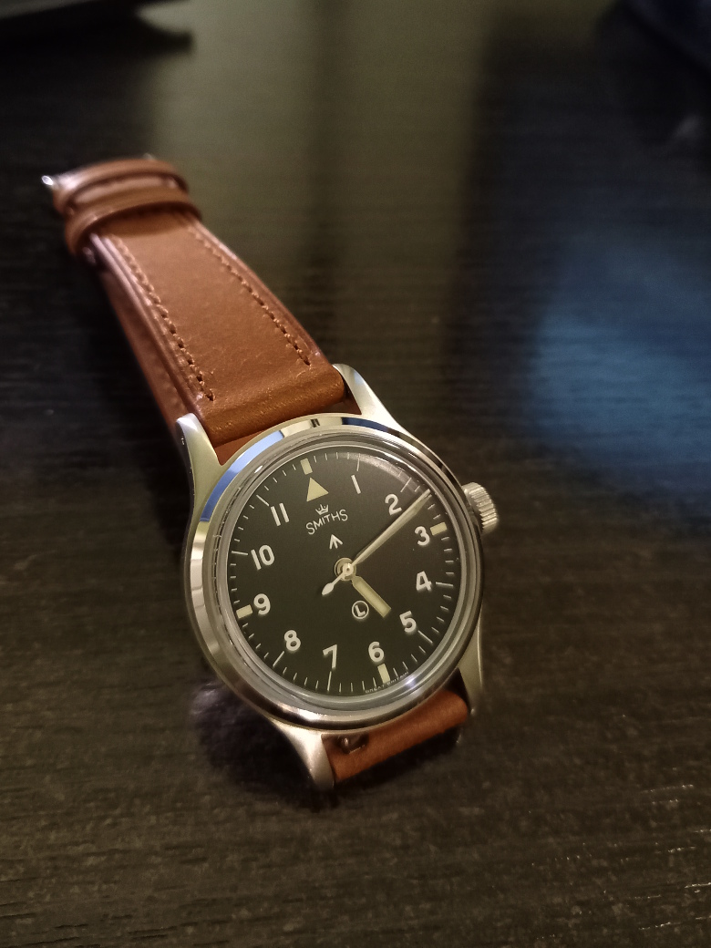
Navigator on Forstner Klip. Really happy with the look, also feels secure and well made.It is a little bit sharp on the wrist where the strap passes through itself. Will get a file to this. Only took around 7 working days from Mass. USA
Sent from my iPhone using TZ-UK mobile app
Attachment 18672
Sent from my iPhone using TZ-UK mobile app
This is the closest I have got to perfect watch and strap for my taste...for now at least, please do t release any more watches Eddie
Sent from my iPhone using TZ-UK mobile app
Attachment 18673Attachment 18674
Sent from my iPhone using TZ-UK mobile app
But no T! Shocking. Where's my warranty card?
Nice bit o brass that is and works well with dial and strap
Sent from my iPhone using TZ-UK mobile app
Precisely, a decorative touch, as is the pheon. T or L, or P or Z or whatever is an aesthetic choice. On a vintage homage, T is as valid as the pheon. Neither matter or are required or mandated by anyone.... if one wanted to be extra rule driven, it'd be interesting to speculate about the preponderance of non issue watches of varied manufacture now sporting MOD pheons... but it's just a 'vintage' aesthetic choice and we're all quite happy to accept they look right, despite being misused when compared to their original meaning and authorisation. and I'm simply observing that, with so much effort expended creating a vintage homage, that includes a pheon for its aesthetic, it is, to me, visually discordant to see a modern L placed front and centre.
For those bunching their panties on the imagined rules, there are none. It's an aesthetic choice and my comment is on the aesthetic of that choice. 😊
As far as im aware , most swiss Tritium watches have a T on the dial somewhere, whether they were mil or civilian. The ‘T<25’ or ‘T Swiss T’ marks (or even P for phosphor or SL for superluminova) for instance were there as a legal requirement to protect the watchmaker who had to work on your watch when you took it in for its regular service. No T(or P, or SL, or etc etc)= possible radium dust hazard. So putting T on a non T watch seems silly in my book.
/edit- Bill Yao (MKII watches) puts a circle Y on his watch dials, which irritates the &£#@ out of me.... its not like theyve got Yttrium luminescent dials is it?
Last edited by Synthpunk; 8th January 2021 at 00:55.
Yes, I believe that was to indicate they weren't radium, and were therefore safer. Radium was nasty stuff.
At that time, in comparison to radium, tritium paint was the SL of the age.
Do watchmakers still service and work on T watches? Clearly, yes. There's no 'real' issue. Do they treat them differently? I doubt it.
Why the change to SL on new watches? Cost. It's cheaper to handle within modern H&S.
The Y is an interesting point, a maker can put on any letter they choose, an aesthetic choice.
My personal view is that the letter in the circle in the dial was to indicate the substance used for the lume. Hence, if it is using luminova, it should have the 'L' and not a 'T'.
I gave up on natos because of the weirdness, settled with a two-piece cordura that fits like a glove. Now I'm pleased.

Suits it very well I must say.
What's brand of that strap?
Got a new watch, divers watch it is, had to drown the bastard to get it!
Morellato Cordura fabric strap
Yeah, I'm not a fan of NATO's at all - really don't like the way you have to tuck the excess strap in.
Your strap does look really good. Erika Originals are also a good alternative which I have on my G10, but I must say I'm really impressed with the comfort of my Bonklip that I have on the Navigator.
Thanks!
Got a new watch, divers watch it is, had to drown the bastard to get it!
That Morellato Cordura strap looks really the business. very tempting.
I just noticed your avatar thumbnail. Ive been drooling over that same 1016 image. I have an explorer but really am itching for a vintage.
I wonder how many more have fallen for the 1016 by reading that same review from Fratello watches.
Attachment 18699
Sent from my iPhone using TZ-UK mobile app
Just thought Id share a photo of the Navigator with its distant uncle the Hammy 6b. Similarities and differences. I love the the history/provenance of the hammy but the new Navigator has really got something about it.
Sent from my iPhone using TZ-UK mobile app
I will have to have a look at the price of a Cordura strap now, looks great Fogar
Sent from my iPhone using TZ-UK mobile app
Lovely, I'm in the process of ordering the same strap ;)
Got a new watch, divers watch it is, had to drown the bastard to get it!
Well I'm very pleased to report that I've got mine back today. I'll be having a look through my accumulation of 18mm straps for a candidate later. I do like the supplied strap in a way, but for my own taste a darker / more plain strap would suit the Navi better.
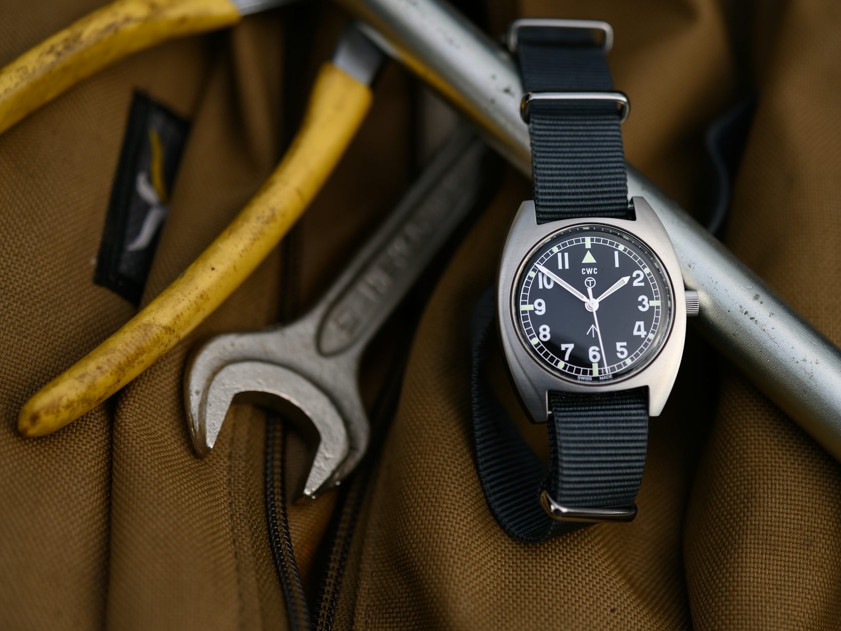
I bought Christian's Navigator, to some extent out of curiosity. I have an IWC Mk11 and with the Hamilton 6B and Smiths W10 represent my favourite style of watch. Christian's had been on SC for around about a fortnight, so I don't think I was depriving anybody who desperately wanted one. Let me know if I have.
I had been sceptical, principally around the branding. The logo and font in the large size pictures just didn't seem attractive to me.
Having got my hands on one, I thinks it's a very, very good watch. Solid, good weight, clear to read, very nicely finished and presented. My doubts about the branding, inconsequential in the flesh.
Is it fair to compare it directly with a Mk11? It's hard not to and compares very well. A lovely looking watch, classic design, for maybe 10% of the cost of a Mk11 without the risk of vintage ownership. I think some of the differences have been mentioned, the polished bezel rather than brushed, the position of the strap bars. One of the problems with the Mk11 is that the bars are set low in the lugs, fine with a NATO strap, but if you want to put it on a normal two piece leather strap, there is quite a gap between the strap and case.
Not keen on the strap, clasp contraption, but that would be true for any watch.
Overall, a sceptic won over.
I was wondering who the buyer was! I kept coming back to the advert, but ultimately knew it would compete with the acrylic PRS-29A in my collection, and I think the PRS would win....
Congratulations on what sound like a fantastic watch. Are you planning to post some side by side shots with the MK11?
Sent from my iPhone using Tapatalk
Apparently these all look the same
Sent from my iPhone using TZ-UK mobile app
Last edited by BillyCasper; 16th January 2021 at 13:37.
Great pics, my guess is theres a theme going on....;)
Got a new watch, divers watch it is, had to drown the bastard to get it!
Billy, that Hamilton 6B, the Smiths W10 and the IWC are magnificent. The Navigator could well become the daily wearer you neednt worry about.
Yes they are gooduns despite the poor quality photographs.
I think you could be right about the Navigator, although the Mk11 is on a black leather strap as I wore it regularly with a suit for work, thats when there was work.
Sent from my iPad using Tapatalk
My wife would go crazy...
That's an awesome collection, congratulations. Obviously, you love your field watches :)
I might be in a minority here, but I prefer how the navigator looks compared to the IWC. After my initial disappointment with nato straps, I have to admit that the lug holes position makes the watch look much better with 2 piece straps
Turns out I have loads of 20mm straps that would have worked, but not really 18mm. So I engaged Amazon for assistance and one arrived today (in packaging the size of a shoebox, of course).
Happy with that one. I tried a blue NATO in the meantime and that worked beautifully as well, I must say. But this is the one for me, I think.
Found this strap in the box my Benrus reissue came in and thought I'd try it on the Navigator. It's a khaki colored cotton strap that fastens like a bund style. Seems a good match. Would like to find one in OD green too. Ever see anyting like this for sale nowdays?

In the USA, although postage > strap cost.
https://www.ebay.co.uk/itm/Canvas-WW...kAAMXQnYJQ~~7d
Thanks for that. Just one state away for me.
I just love these side by side comparison pics and a fantastic collection to boot. Thanks for sharing.
I have a navigator which feels slightly smaller than 36mm IMHO though the Mark ii you have looks slightly smaller again.
I know its likely the effect of the numerals being slightly closer to the centre of the dial but its these details that come into contrast with these pics.
All an education.
Looks good...thanks to your post I got one from Watchgecko
Sent from my ONEPLUS A3003 using Tapatalk

Giving a try to this Joseph Bonnie Bonklip, I quite like it. I might try the same with the monopusher chrono when it becomes available.

Trying to find when Eddie said the next batch of these might become available. Someone on Instagram has asked me about it
Sent from my ONEPLUS A3003 using Tapatalk
Think it might be a while; Eddie indicated it took a year to source the SW210 Top movements for this initial production run.
 Posting Permissions