
 Reply With Quote
Those galaxy and linen dials look lovely. Any chance the galaxy version could have a date window?
Also, I think the date background on the linen should be a light color instead of black..


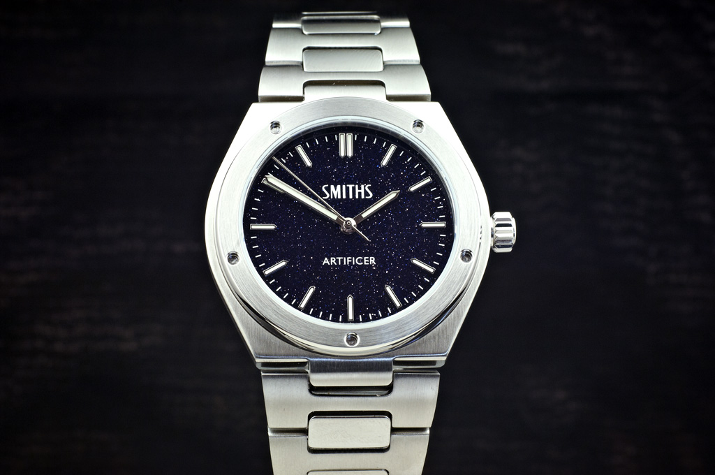
Aventurine dial
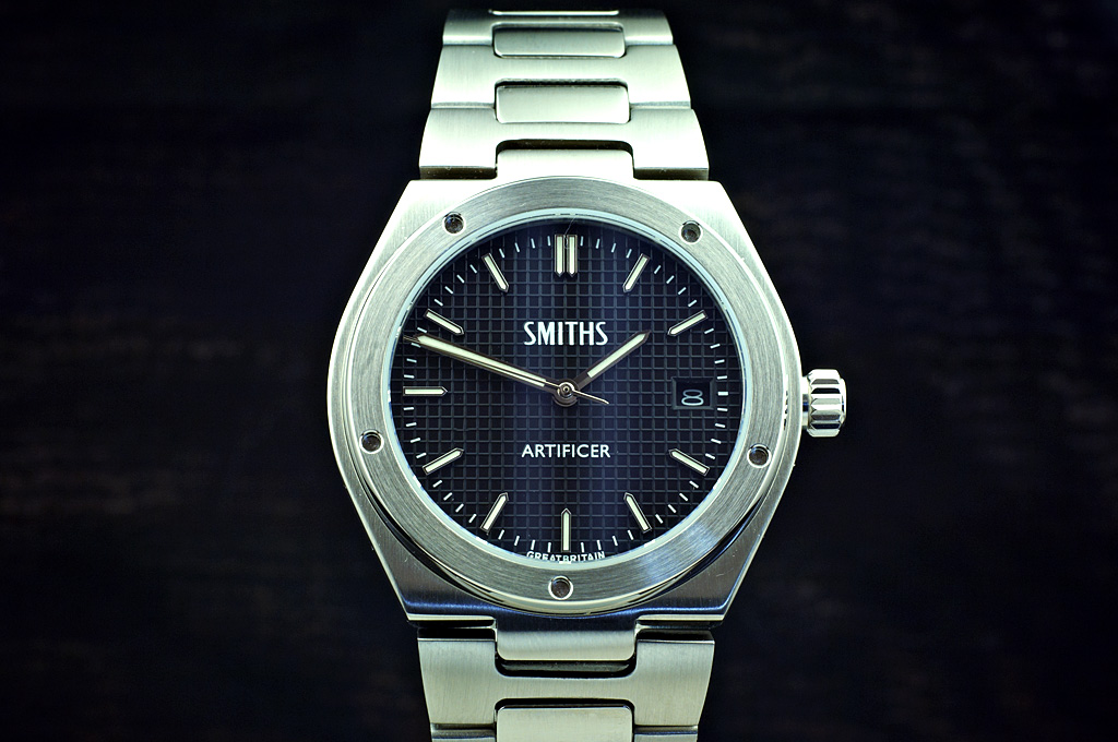
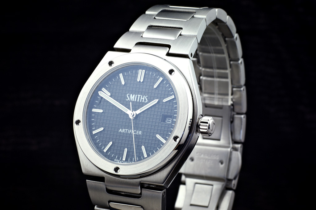
Waffle dial
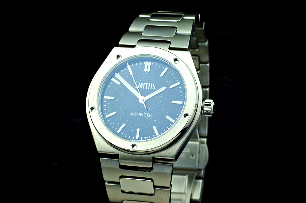
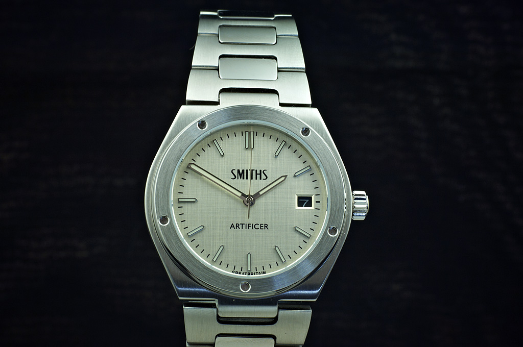
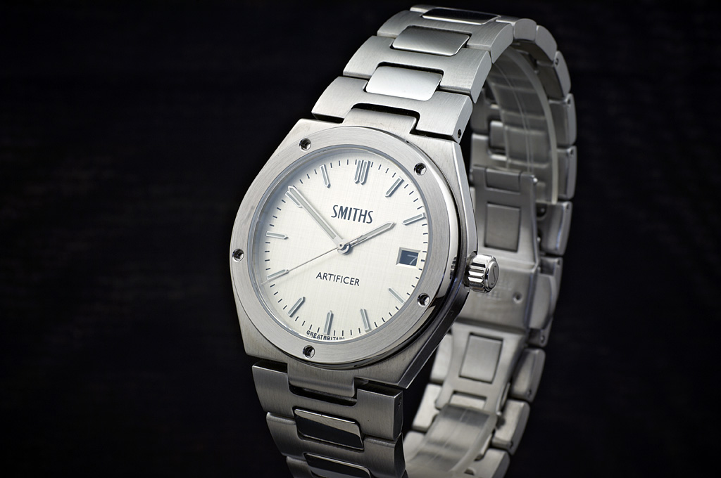
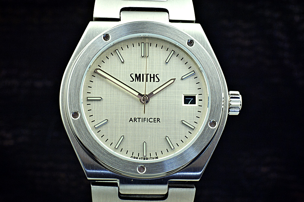
Linen dial
Eddie
Whole chunks of my life come under the heading "it seemed like a good idea at the time".

Those galaxy and linen dials look lovely. Any chance the galaxy version could have a date window?
Also, I think the date background on the linen should be a light color instead of black..

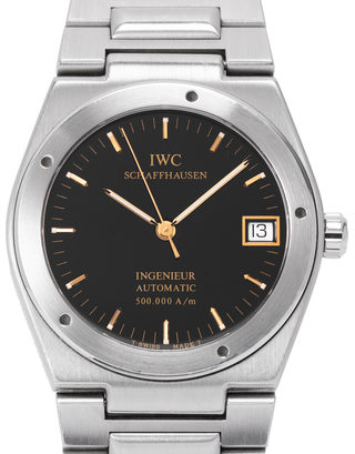
Nice! Pleased to see that the bezel is a little asymmetrical, spoils the Inge look otherwise.
Nice. Especially the waffle dial.
Any estimate on release date ?
z
Very nice, a tough choice but think I'd take the Waffle out of the three...
Cheers,
Adam.
Sent from my moto g(7) using Tapatalk

Blimey Eddie, you really are on a roll. I think a date window would spoil the Aventurine. And I agree the date wheel could do with being silver on the linen one.
The only way you can show off an aventurine dial is on video. This is a poor video because I couldn't see the LCD screen because of the sun but you can get an idea.
Eddie
Whole chunks of my life come under the heading "it seemed like a good idea at the time".

Really nice!
Cant wait until they are released
That is lovely Eddie. I agree, no date window on that one...Originally Posted by swanbourne

Cheers,
Adam.
Sent from my moto g(7) using Tapatalk
That looks magical!
Every watch a story.
Waffle dial is looking good.
Sent from my SM-N960F using TZ-UK mobile app
Like the Waffle and the Linen Eddie.
Either the Aventurine or the Waffle dial would be lovely to have. This looks like another amazing release.

YES!
Superb - I've been waiting on tenterhooks for this and am very excited. Straight in with the linen one for me... I really like that.
Everything on the dial is spot on and the hands are great. I don't feel strongly either way re colour of the date - but I like having the date for sure.
But in particular, I like the crown - very clean. And, of course, the taper of the bracelet looks so good.
A total winner for me... I can't wait!
PC
PS Any chance of a side-on photo?
Very nice. I especially like the waffle dial, but they are all good.
What size is this watch?
Linen dial looks classy. The aventurine looks great, but would drive me to distraction in no time flat!
Overall though, nice options - assuming you're going to offer them all..... I know....... NO!
Best Regards - Peter
I'd hate to be with you when you're on your own.
https://forum.tz-uk.com/showthread.p...ight=artificer
The waffle dial looks amazing!
Thanks, size looks to be perfect.
My dad started his navy career as an ERA (engine room artificer).
All very nice - what did the case height come out at in the end ?
From the first renders I was set on the waffle dial, but now the linen looks good and would balance out my predominately black/grey dial collection. Not sure about the contrast date window though. Then I watched the video of the Aventurine ... I now have a real dilemma, and cannot buy more than one. For the first time I hope these dont arrive to soon so I can try and come to a decision. Argh! A great project and completely scratches my long standing wish for an ingénieur without the cost or the worry of everyday usage.
Am I missing something about the bezel screws? Are they supposed to be out of whack? Otherwise the linen dial looks lovely.
Waffle dial has come up very well.
They do look like that. Having 5 of them, you'd expect the bottom one to line up perfectly at 6.
May be perspective or the angle of the camera?
Sent from my moto g(7) using Tapatalk
Yes.
Every watch a story.
They look ok here:

Really like all the 3 dials. The aventurine could be a good one for the missus.
The bezel screws only bother me slightly. Can live with it.
Would you?
I found this on wikipedia:
"An Artificer is an appointment held by a member of an armed forces service who is skilled at working on electronic, electrical, electro-mechanical and/or mechanical devices.The specific term for this function is typical of the armed forces of countries that are or have been in the British Commonwealth and refers to a Senior Non-Commissioned Officer. Artificer is a job title and not a rank. Artificers are addressed as Tiff or 'The Tiffy', and may oversee the maintenance and repair of a units mechanical equipment, help develop new equipment, or become further qualified on specific equipment."
I don't know if anyone else would agree with me, but the minute hand could be a tiny bit shorter, so that the pointed end isn't entirely covering the minute marker it's pointing at.
Last edited by Der Amf; 21st August 2020 at 09:03.
What bezel screws?
I'm liking these a lot.
Don't just do something, sit there. - TNH
Thought the same as Der Amf re the minute hand looking a fraction too long.
Anyone know what the case height is please?
My only suggestions/query would be to make the font slightly thinner. If I'm not mistaken and when comparing the drawings alongside the photos, the drawing font appears slimmer. IMHO the real thing looks slightly unbalance with thicker font. It's nit picking I know, but I think it still makes significant difference.
Is a non-date Waffle dial likely?
+1
It looked better in the original renderings, as per post #26.
Every watch a story.
Yes, they aren't supposed to be symmetrical (also they're not screws, just a pedantic point).
Last edited by monogroover; 21st August 2020 at 13:00.
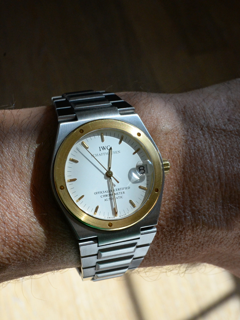
My own Inge. The 'Tiffy', as I shall know it, is not intended as an homage to this exact model, but anyway - the hands are a similar length relative to the dial and I've never thought of the minute hand as too long.
Wow!
I'd totally ignored this from the renderings, it didn't appeal at all in those, but in photos it looks totally different!
Like a lot of others, my first thought was the waffle looked best, but then I saw the Aventurine video and that could be the USP for this watch!
Eddie, will there be a premium for Aventurine dials?
Looks like another winner to me.
M
Breitling Cosmonaute 809 - What's not to like?
I agree with this suggestion, a slightly more subtle font or text size would look good.
And is there a way to minimize the gap between the case and the first link of the braclet? Or would that hinder the movement of the first link?
But overall it's a great looking watch!
Thanks for the clarification. What are they then?
Are they for tightening the bezel onto the watch body?
Cheers,
Adam.
Sent from my moto g(7) using Tapatalk
On the IWC they are purely ornamental.
So far the size of the crown is being increased from 5.5mm to 6.5mm and the date wheel on the linen dial has been changed to white. The linen and waffle dials will have the Miyota 9015 and the aventurine dial will have the Miyota 90S5 movement because the aventurine dial is thicker than standard dials and requires a different hand height.
Eddie
Whole chunks of my life come under the heading "it seemed like a good idea at the time".
I'm still on the fence with this one. Some details just seem a bit off and it's hard to pin down the exact problem. I think the issue with the minute hand is not that it's too long: it's too fat. In fact in the photos it looks slightly thicker than the hour hand. It has too much visual "mass" which is probably why it appears too long to some.
It's probably too late in the process to play with such things, but I think the now silver linen dial might look good if the markers and hands were painted black (with the same white/green lume). Then the contrast date also wouldn't stick out so much. As it is, that contrast date doesn't look right at all: nothing else is black so it just draws too much attention to itself. An MM300-style brushed metal date wheel might look really good, but it also might fall into that uncanny valley where it almost matches the linen but doesn't quite, which looks worse than going with contrast. For the same reason, white would probably look odd too.
The waffle dial looks the most cohesive to me, but I don't find it compelling enough to really want one right now. The aventurine dial is interesting, but it's definitely not for me and I'm not convinced it really suits this type of watch.
Thanks for the info.
Does anyone know why IWC bothered to include ornamental ‘holes’ on the bezel but not bother to line them up? I’m guessing it’s fixed and can’t easily be removed to at least align one ‘hole’ with 12 or 6.
EDIT: even more confused now as most images of the Ingenieur show the holes lined up at 12 or 6, creating a symmetrical appearance.
Last edited by Onelasttime; 21st August 2020 at 18:55.
I think they look great just as they are - black would be too stark imho.
Eddie's changes of larger crown and white date wheel are the perfect tweaks.
PC
As far as I know the random position of the holes was a design choice, making every model slightly different.
The whole point of getting prototypes made is so you can tweak the finished product if the prototypes don't deliver the concept.
Eddie
Whole chunks of my life come under the heading "it seemed like a good idea at the time".
Waffle has pole position - certainly like the aventurine dial but it looks too dressy for this case/bezel?
I also think that the minute hand looks a bit disproportionate and could do with sliming down a smidge.
Don't just do something, sit there. - TNH
I assume theyre used to screw the bezel on and they just end up wherever but may well be wrong!
Dont mind the random position unless theyre nearly symmetrical when looks like theyre supposed to be.
You're really on a roll with all these new TF watch introductions, Eddie
As with Kingstepper above, would the bezel's 5 round recesses, like a screw-down caseback's notches or round recesses, etc., be a means to unscrew the bezel, assuming it is attached to the case by threading? And, if so, is the screw-down bezel specifically intended to bear on the peripheral edges of the crystal and secure it against negative pressure?
Also, from what I remember from my past reading of the original IWC Ingenieur that inspired the Artificer, these refined tool watches had movements heavily buffered against external shock by neoprene bracketing that almost resembled a hammock. And if that is accurate, will the Artificer also incorporate something similar to make the watch especially shock and g-force resistant?
I further seem to recall from looking at the older and very nicely done hard cover books IWC used to send out circa 20 years ago which were in effect ultra premium grade "catalogues" of their products and history, that the integrated bracelet Ingenieur of that period was available with adaptor "end" links that allowed the use of 2-piece leather straps to give the owner more wearing options than the proprietary metal bracelet alone. Would the same likely be an option for the Artificer?
Since you are seeking comments on the various dial treatments, my own subjective vote would be for a version of the Artificer with the same gilt black dial treatment used in some of IWC's classic Ingenieurs as shown by Der Amf and Monogroover above
A few things that I see when I look at these.
Bezel features need to be a long way from inline, or inline. Close, but not symmetrical looks like a mistake.
Personally, I think the hour hand looks ever so slightly too thin compared to the minute (or the minute fatter). The renders seem to show same thickness, there is definitely a difference in the protos.
The gap from the watch head to the first link looks too great, they are too far apart for me.
I agree with crown and date wheel corrections, perhaps the crown could be shorter along its stem axis.
Looks lovely, and the aventurine looks stunning, even out of focus!
Dave
That looks amazing. I'd buy one on that basis alone
 Posting Permissions


