Reply With Quote
It is really looking better each time Eddie and I know that it will be done right. Hope your recovery is coming along.Originally Posted by swanbourne


It's a bit of a minefield. There are a lot of subtle differences between the different dials.
I don't think that too many of unhooked 7 dials are IWC service replacement dials.
I'm pretty sure that all of the mark xi's originally had Radium lume on the dials. From 1963 the MoD arranged replacement of the dials with Tritium ones. An RAF Tritium dial is marked with a T in a circle. The encircled T only appears on the RAF dial versions as the RAAF and RNZAF didn't request it.
All hooked 7 dials have the circle T and crows foot/broad arrow. The hooked 7 dials also have slightly fatter numbers and use a different type of 8.
So all of the T dials are replacement dials whether they are hooked 7 or not. That said, I do prefer the much rarer hooked 7 over the non-hooked one.
The latest IWC service dials have a different style of 7 again. The weird 7. It's often said of the 7 on an IWC service dial that they just can't get it right! These dials also have T SWISS T below the 6 rather than just SWISS. Older service dials have a normal 7.
Take your pick from below:


It is really looking better each time Eddie and I know that it will be done right. Hope your recovery is coming along.

Would replacing the circle L with the pheon (ie move it to between the pinion and 6 o’clock) work?
Could even go for the Smiths “fat arrow” (FA) rather than the “thin arrow” (TA). Of course then it no longer looks like a Mk XI
I hear what you are saying about the dial looking cluttered with Smiths, De Luxe, coronet and pheon all crowded into a small space although I think it’s fine (three line Rolexes anyone?)
How about just losing the De Luxe?
Boobies logo doesn't work for me ... all too cramped "up top".
I think you had the dial printing spot on in post #1.
Really liking the latest render and the idea of using the selected movement.
Well the hands look great in the latest render, but I much preferred the absence of the boobs logo personally. Not enough to put me off buying one, admittedly.
As a not-purist, that's what I was thinking too. I quite like the elaborate version of the Smiths logo apart from it being too cramped on that version of the dial. The plain-text version tends to look a bit "floaty" to me. One of the things that makes the balance on the IWC dial is that the Ⓣ and the ↑ are equally spaced from the centre so the negative space surrounding the pinion is nice and even. It's interesting how they solved this by just making the "international watch co" text quite small and jamming it up against the 11 & 1. Oddly, it still looks very balanced in spite of the trapped negative space. The Smiths logo has the potential to look even better.
The other little things I would personally change on this dial is to make the markers at 5-minute intervals just a teeny bit heavier (not too much!) to balance them with the numerals and maybe make the rectangular indices at 3, 6, 9 & 12 a touch fatter - but then again it's hard to tell how that will look when it's not an artist's rendering: the faux shadow effects make it hard to tell exactly how chunky or slim they would really be. I would try to make them precisely the same width as the hour hand lume.
I also think the hour hand should be slightly shorter so it doesn't interfere with the numerals, as I mentioned already. I think the minute hand should be a bit slimmer too, but we already know that's getting changed.
Interesting details, but to reiterate my non-purist take, I just agree that the hooked 7 just looks nicer.
On that subject, I think the 4 on Eddie's dial looks a bit off. That horizontal line at the top of the aperture seems incongruous with the other numbers and the IWC at least, doesn't appear to have such a wide 4. I did some googling for other images because the one posted by trident-7 appears to use the same typeface in a lighter weight, but it's hard to tell exactly how the 4 looks, because the second hand is in the worst possible place! It looks like there are variations with and without the flat aperture, but none of them look quite as wide as Eddie's.
All in all these are fairly minor niggles. This one is shaping up rather nicely.
Its going to be lovely.
Please may we have it in automatic too?!

The render with the smiths de luxe coronet looks ace. Cheers eddie! That one please....
I prefer the first SMITHS font with no logo, looks crisper more modern, forward looking branding.
Rest of the dial in the 2nd render is near perfect.
Love it! Only issue for me, as others have said, is the lug to lug distance which will leave too big a gap for my taste.. otherwise I think its fantastic
Excited to see how thisll turn out; probably very well given the purchase of a bona fide MkXI... I take it this would be towards the end of 2020, rather than earlier?
Shaping up nicely this. Closer to the IWC the better for me. Definitely on the purchase list for next year!
Arent the early 1016s 18 or 19mm lugs?
Might be wrong about that though.
I do like 36/18 and 40/20 (parallel non-taper strap) but I also like 36 or 38 / 20, esp if the strap or bracelet has a taper to 18.
What I dont like is anything/22 or anything/16. But I do like the Smiths W10 @ 17.
Were a funny lot on here arent we?
Just what I was thinking. It'd be a buy for me with the aged lume like IWC :0)
Has it got aged lume...??? :0)
That looks fantastic. There is so much that could be done with this brand.
Im definitely having one of those!
I prefer the plain Smiths logo
Agreed. Second render looks great but I prefer the simpler logo. If I was to be picky I'd also prefer aged lume.
+1 for the aged lume
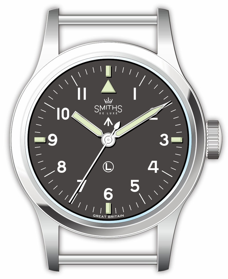
My view
it could be made 37mm but no bigger.
It must be 18mm lugs or it will look wrong.
It must be fixed bars,but if spring bars then no holes.
Smiths should be just the word no crown or name,like the original its a military watch.
What a great project to mull over.
That would be a dealbreaker for me. I have a Speedbird 1 but haven't bought any of the others because of the weird scripty logo.
Please God, no! I've yet to see any implementation of fake aged lume that looks anything other than like fake aged lume.
M
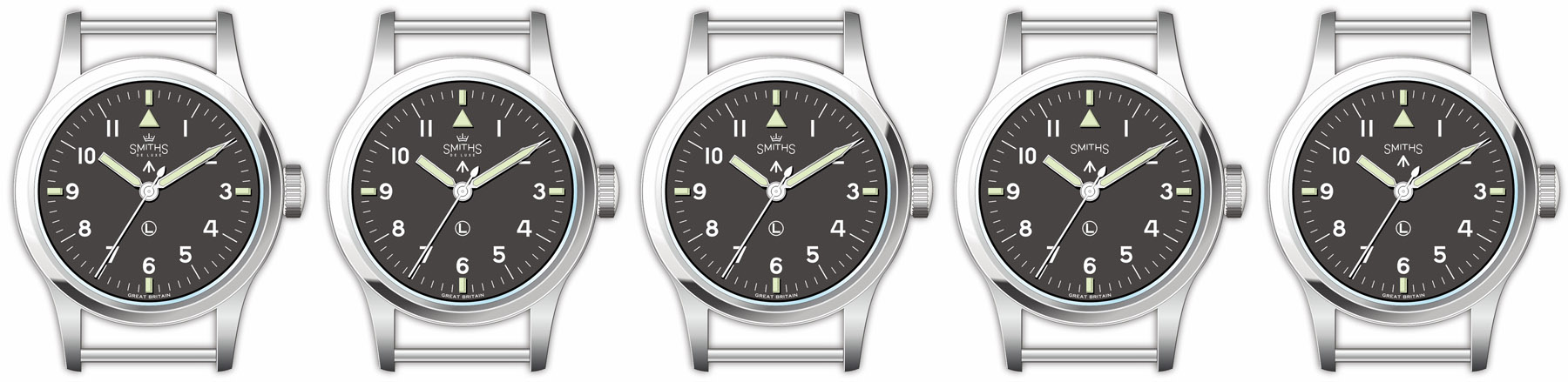
Some variations on a theme that absorb some of the suggestions made earlier in this thread, coupled to my own preferences.
From left to right: 1. Eddie's latest render. 2. Eddie's render with a shortened hour hand (personally I think this looks much better). 3. Variation 2 minus DE LUXE (in the interest of some decluttering). 4. Variation 3 minus the boobies (further decluttering). 5. Variation 4 with the pheon shifted up a bit, more in line with the arrangement on the IWC watch shown earlier.
I'm split between variations 3 and 4 but your mileage will inevitably vary.
Martin
imho the smiths text must be the same size all along in a straight line just like the IWC. ie. SMITHS or smiths
its a military watch and shouldn't be embellished.

I vote for number 4.
As above
As above.
F.T.F.A.
Out of those I prefer 3 over 4. It's hard to say why exactly, but I think if you just look at the top half only, there's a better balance with the SMITHS text as the focal point. Or another way to look at it is a balanced stack of elements creating a sort of vertical line up to the 12 marker, whereas on version 4 that line is broken in a peculiar asymmetrical way that doesn't align with anything in particular. Also, unlike some, I prefer the more traditional-looking logo given this is a vintage-style watch and other elements have not been modernised (setting the numerals in Helvetica, for example).
Number 5 fails on a couple of counts: firstly the pheon isn't high up enough to be equidistant from the pinion relative to the Ⓛ (although that could maybe be fixed by moving the Ⓛ up to the 1/3rd or 1/1.618 point instead of halfway). Secondly, it appears to be doing something unspeakable to the Smiths logo that I cannot, in good conscience, condone.
The logo could potentially be pushed up even further (it's really far up on the IWC), but I suspect moving the pheon down and replacing the Ⓛ would give a better result overall. IDK how essential that Ⓛ is. Is it part of the current RN spec?
I vote for variation 4.

The shorter the hour hand the better immo.. Regarding logo i like them all, can't decide.
Although the JLC ones weren't like that
I'd also lose the (L) personally.
See here:
http://www.gregsteer.net/IWC/Mark_11...3P0hABl-HXKFtM
The numbers seem to be from different typefaces, for example the 10 is quite condensed, the 4 extended.
I'd go with a Decimal by Hoefler&Co https://www.typography.com/fonts/decimal/styles as it was inspired by watch face typography.
Agreed, removing DE LUXE (3, 4, 5) leaving behind a residual arched SMITHS looks daft. SMITHS DE LUXE on a single row or just the SMITHS as Eddie envisaged for me.
Like RevO, Im not convinced about the L. Whats it for? Its odd as an embellishment because its not symmetrical. Why point out a watch has non-radioactive Luminova luminescence? The T was added to the MK 11 later on. It wasnt there from the start and had some purpose to indicate the change from one radioactive material to another.
Sent from my iPad using Tapatalk
Last edited by BillyCasper; 11th December 2019 at 17:42.
I think it should be like the original in dial form, so (L) at the bottom and the broad-arrow at the top... probably just SMITHS rather than SmithS DE LUXE?
I love the (L)... its a nod to the original whilst not falsely claiming the use of tritium.
Originally, the original didnt have an L or T
Sent from my iPhone using Tapatalk
This. (T) was an addition to show it had been redialled and wasn't even put on the RAAF ones iirc. There's no need for anything in between 6 and the pinion.
Boobies if it was a remake of the GS De Luxe but as it's not just SMITHS or SMITHS DE LUXE on a single row.
Simple and plain is the way to go.
I'm interested to see how the sapphire retains and respects the "flow" of the original, the line from bezel to crystal. And, of course, the distance from the dial, the curvature and any inevitable distortion.
https://www.biblegateway.com/passage...1&version=AKJV
I vote number 4, but with SMITHS logo in a straight line
Version 4 or 5, but the pheon looks like it is a more authentic position in 5 to me
Slightly OT tangent, but I happened to watch something about the making of that typeface not long ago. Mentioned here:
https://forum.tz-uk.com/showthread.p...hing&p=5248416
Until then I hadn't realised that watch typography didn't use typefaces as such, until relatively recently. They were presumably handled a lot more like hand-painted signs with each glyph being left to the designer's discretion for each dial. I'm sure many are still designed as one-offs in the same way today, but with a bit more rigour. Vintage watches are riddled with typographical inconsistencies. But sometimes because the glyphs are designed to fit exactly one use-case only, they can look a lot better than a more generalised typeface would. It also sets those older designs apart from cleaner-cut, modern designs that will tend to use very precise, consistent typefaces.
I have since wondered if that typeface is actually used on any real watches. It is inspired by watches, but not necessarily designed for watches. It is intended to be more general-purpose than that. It takes queues from a lot of different watches, but isn't intended to look like any specific one. I'd certainly be very interested to see how a mockup looks. It has a nice hooked 7 and the 4 is obviously balanced properly for each weight, but I'm not sure the 1 would work, as it's quite chunky.
I certainly think that if the crown goes, it should be the plain text version and not the stylised-text version. One or the other. I'd be interested to see what SMITHS DE LUXE all on one line looks like, but that might be getting just a bit too close to INTERNATIONAL WATCH CO while also moving further away from any pre-existing Smiths branding (AFAIK).
Youre right of course with these... Therefore I am ambivalent.
Yes also, the art is striking the right balance between clutter and too sterile which the MK11 achieved in all dial variants
Theres something about the L not being symmetrical that looks odd to me which is a bit sad. Bill Yao went with a Y, perhaps Eddie could go with a T for Timefactors.
Sent from my iPhone using Tapatalk
Boobies and de luxe but no circle L or pheon?
Abso-flamin-lutely. Yukety yuk.
Sent from my iPhone using TZ-UK mobile app
There are some subtler shades that soften the cold menthol look without going for the full nicotine-stained effect.
Trust Eddie on this one ;-)
I'd like to introduce into evidence, exhibit PRS-82. Not my cup of tea.
M
one of time factors best watches and one of the best divers around period.
I'm looking forward to this.....but here are my thoughts:
- I think if we didn't think of it as 'fake aged' lume/fautina and just as a colour then it would be more acceptable (I like it by the way, it makes a nice warm colour on the dial) - hours markers come in all sorts of colours so why not tan?! Also the new Omega Bond released a few days ago looks pretty cool to me.
- As for the dial, I am not a fan of the boobies logo and would prefer a simple SMITHS or SmithS as per Eddie's original post. The boobies didn't bother me until someone pointed them out and now I can't unsee it.
- 20mm lug width would mean I (and the rest of us) would have a far wider choice of straps. 20mm just looks a bit modern as well. However, on this 36mm case size maybe 18mm is better? Undecided on this. Actually no, 20mm please!
- Personally I think the lugs are too long so there is too big a gap between the spring bars and the case.
- The nice big crown is great, as are the hands and the finishing on the dial and the dial markers. The caseback is spot on (although the Smiths font on the caseback is not the same as on the dial which is should be).
Looking forward to it! (Although I have way too many watches....).
Last edited by muffle; 12th December 2019 at 21:04.
Im guessing that seeing as Eddies bought a pukka mk11 in order to get the case right, then the case will be pretty much externally identical to a mk11.
It is regarded as an all time icon of understated watch design, and people dont tend to spend 5 grand plus on a watch if they think that the lugs are too long, or close together.
If you need shorter lugs or a 20mm strap then TF already make that very watch, in the shape of the excellent Speedbird. Deffo inspired by a mk11, but with shorter lugs and a 20mm strap width already as standard.
As long as the case is spot on, i dont really mind whats on the dial logo wise. The case of a Mark 11 is a thing of beauty on the wrist, changing little details would turn it into a completely different watch.
 Posting Permissions