
 Reply With Quote
I think something to make it easier to distinguish between the two hands when reading from the glow of the lume is a good idea.Originally Posted by monogroover


I had the SW210 in my Christopher Ward and it is an excellent movement. Great pick Eddie.
- - - Updated - - -
I had the SW210 in my Christopher Ward and it is an excellent movement. Great pick Eddie.

I think something to make it easier to distinguish between the two hands when reading from the glow of the lume is a good idea.

Looks good to me. I shall follow this with interest.
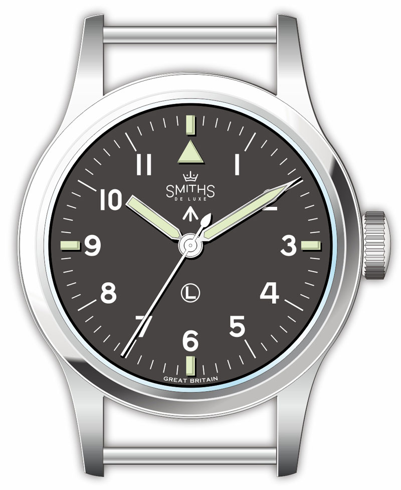
Black dial. No fauxtina. L2L<47. Longer lumed plot, less taper on minute hand. Please.
Sent from my iPhone using TZ-UK mobile app
Hallelujah no Miyota
(whirr whirr whirr)

Big tick in the box for the Sellita movement
Yeah, IWC f'd up the matching of the hands. Maybe THEY can somehow get away with it, but to duplicate their error on an homage to an obscure timepiece may not be the path to superior sales.
BTW, Eddie, it would appear you have outwitted the Grim Reaper and are on your way to recovery.
I wish you a full and speedy return to "normal."
What you say couldn't be further from the truth. The truncated hour hand was made so it couldn't at any circumstances get confused with the minute hand... as was the previous case of the double syringe hands.
For myself, I prefer the previous double syringe hands as on the JLCs, but that is another story.
Well I've just bought an original Mk XI to make sure it's done right.
Eddie
Whole chunks of my life come under the heading "it seemed like a good idea at the time".
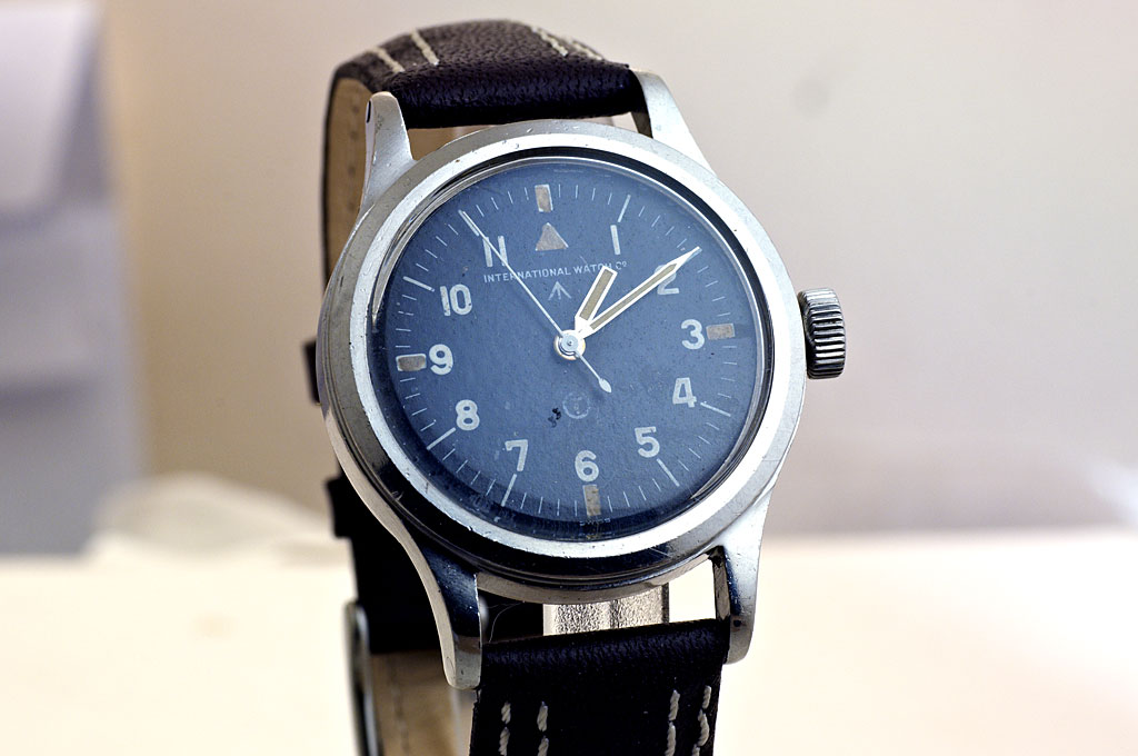
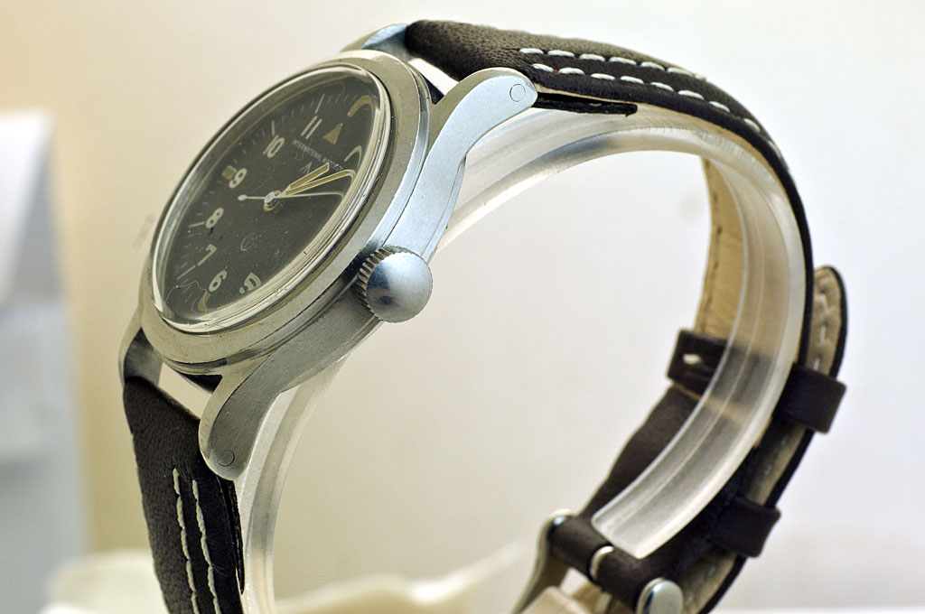
The shape of the bezel of the IWC is quite different to the Smiths military. It has an additional angle and that makes it look more square.

Lug width, please consider to make it 20mm. We had that discusson with the second reissue of the Smith Military, and there, for more consistency with the original and the first reissue, for many it seemed a good idea to stay with 18mm lug width.
But 20mm looks so much better, and will make the watch more versatile, imho. 18mm is just too slim. I have a Speedmaster reduced with 18mm lug width, looks great on steel, but not so much on leather, nato, or perlon. I owned a Stowa Partitio, and sold it because the 18mm lug width was just too "girlish" looking. For me, the classic winning proportion is to be found on the Explorer 1016: 36mm case, 20mm lug width.
Tomas
Last edited by TomasC; 4th December 2019 at 14:38.
I'm in for this one. It's been so long i don't post here that i had to register again since i don't even have same email nor i remember my user name but this watch made me want to rejoin TF family, my last Eddie's watch was the PRS29B, this will be next.
I completely disagree. For me 36/18 is perfect and 36/20 is disproportionate. If lug width is more than half the width of the watch it throws the proportions. Just like a 40mm watch with 22mm lugs - all wrong.
Sent from my iPhone using Tapatalk
Same for me, although there are few exceptions. Like the Smiths Everest - 36/20 and it does work very well. Or my CW C65 Trident Mk II - 38/20 and it looks fine.
Well, I'd find it hard to argue with any of that myself, particularly the last bit :-)
This is supposed to be a homage to one of the most iconic military watches ever made, the IWC MK11. Personally I want it to be as close as possible to the original (which is out of reach for me financially) and that means 18mm lug width. If it would have 20mm lug width, it would look more like a homage to a Rolex than to the MK11.
Consider me jealous. In my opinion it's the most beautiful military watch ever made. Any chance of some pics?
It would be fantastic if you can duplicate the cup-shape of the dial in the homage.
PC,
I've always been under the impression that the military aviation purposed "Type 48" dial/hand pattern used for most of the Mk XIs was these "obscure"(?/!/?) timepieces' most distinctive aesthetic feature. However, as Abraxas has already mentioned above, JLC early on made up some Mk XIs with various dial and hand sets [which can be seen at the same http://www.markeleven.com/ website DannyPN put up earlier in this thread] that were more congruent with the style of the WWII issue WWWs that preceded the post-war MkXIs and I always thought those rarer versions of the Mk XI looked nice in their own right despite my own particular preference for the "f'ed up"(??/!!/??) Type 48 style dial and hands
You may still be a bit out of sorts physically, Eddie, but your mind is obviously still clicking on all cylinders regardless. I hope you take a close look inside your just acquired original Mk XI and duplicate the ultra high spec internal case technology of these peerless pilot watch icons in the same manner you did for your beautifully done through and through first series PRS-29A recreation of the original late 1960s Smiths GS ref.4701 W10s.
I think that a "real" Mk XI from TF would be truly special in the highest horological sense and sought out by anybody who fully understood what it was even underneath the signature aesthetics for the same reasons military and commercial pilots and aircrew sought out the original IWC Mk XI and kept it in production basically unchanged for 36 years straight from 1948 to 1984
The original Everest confounds that statement. IMHO. There's more to it than mere numbers.

F.T.F.A.
There's only one way to get it right.
Eddie
Whole chunks of my life come under the heading "it seemed like a good idea at the time".
!!! Just made me realise that 36/18 and 40/20 is 2:1! Dont know why thats such a revelation, but it feels like it
37/19 ftw
Can't go wrong with that lovely example in hand.
Bring in 2020, I'm already pondering which one has to go for this coming beauty.
Got a new watch, divers watch it is, had to drown the bastard to get it!
Very, very nice.
I'm glad I never pulled the trigger on a MKII Hawkinge. If you get it right it will so much better. Can't wait.
Edit: any guestimate on when this could be available?
I quite like the oddness of the hour hand.
I know there's been homages to the Mk XI before but in my opinion the only thing any of them got right was the dial, they never got the case right.
Eddie
Whole chunks of my life come under the heading "it seemed like a good idea at the time".
Hmmm, DJ36/Explorer 1016 diameter 36mm, lug width 20mm. Probably two of the most iconic 36mm diameter watches ever. But apparently Rolex got the measurement all wrong....
Im not suggesting that this model should have 20mm lug width, just that theres some Ill-considered commentary on here sometimes.
Sent from my iPhone using TZ-UK mobile app
Wow. Im really impressed with this. Slap me, but Im in agreement about the minute hand but everything else is absolutely spot on. I too was eyeing up the MK2 Hawkinge but this completely outdoes it. I have a 29a and would defo buy this! I also think the Smiths name on it totally looks the part. Im rarely excited but this is brilliant! Cant wait for 2020 now!
Sent from my iPhone using TZ-UK mobile app
I love the handset. Personally I'm hoping for similar balance between hour hand and slim minute hand.
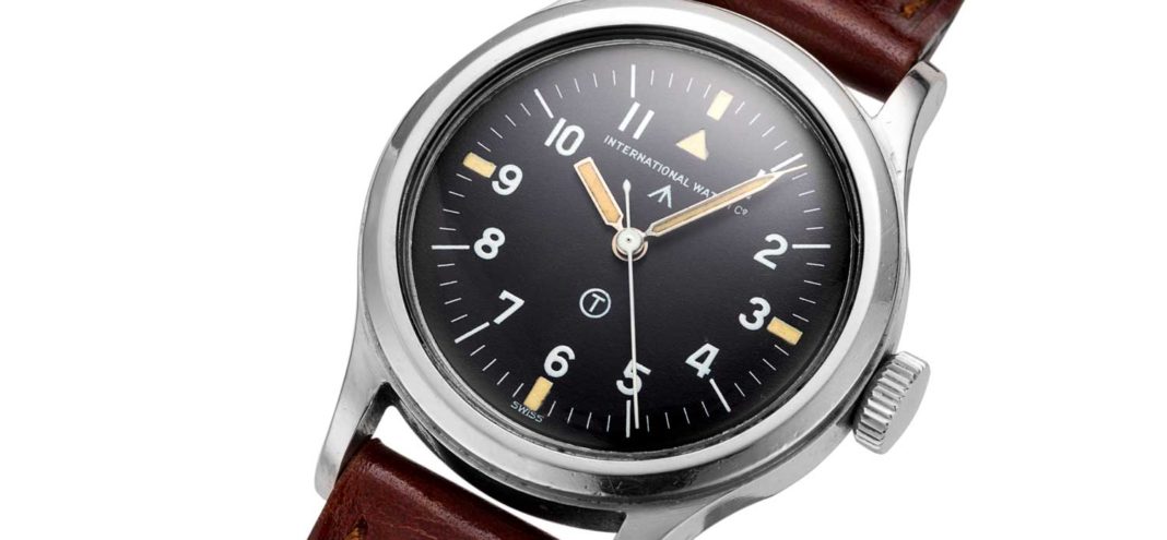
The hands on an IWC Mark XI are iconic. They define the marque. Legend has it that an RAF pilot had difficulty differentiating between the minute & hour hand on the prototype mark xi in the poor lighting conditions of the cockpit and asked for the hour hand to be truncated. It was literally cut short. The new design stuck...

Last edited by trident-7; 5th December 2019 at 21:47. Reason: image added
Oo, now you're gonna have to decide whether you go "hooked 7"!
So because Rolex did it it must be right? I dont accept that at all.
I dont mind if we disagree, not at all, but to me 36/20 is odd and throws the case off balance.
To me a watch needs a balance of proportion to look right.
Sent from my iPad using Tapatalk
36/20 - so weird that not even the 1016 managed to normalise it.
Although 20mm would give access to a wider choice of straps, if this is intended as a true to life homage of the classic IWC Mark XI then surely the lug width is already defined by history - irrespective of what Rolex did with the Explorer?
This said, looking at the drawings it seems that the dial is brass rather than soft iron, which left me wondering if this model have the Faraday cage as per the original?
Sent from my iPad using Tapatalk
It is all about balance in the design. One of my most admired watches, the Zenith DeLuca, is a smidge under 42mm, and has 22mm lugs.
No-one ever said the De Luca was imbalanced in that respect.
But all this discussion is ultimately unlikely to sway our commandant, he now has an original, so we are verly likely to be treated to a fairly exact homage.
And rightly so, it is lovely.
D
I'll be going with the hooked 7, a lot of the unhooked 7 dials are IWC service replacement dials (unless it's the rare white 12 dial).
Eddie
Whole chunks of my life come under the heading "it seemed like a good idea at the time".
There is one thing I know Eddie, you will get it right. So looking forward to this model and especially with the Smith's name on it.
I totally agree, I just love the proportions on the Everest. Can't seem to get it off my wrist, but its better that way.
That is a stunning piece Eddie. The perfect template. I just love that crown. Got to have a nice size crown on a hand winder.
Re the Mk XI: Shoulderless springbars with non-drilled lugs would be my choice but other than that, I love it.
Initially I thought it should have the boobies coronet but maybe save that for the Smiths GS De Luxe (in the fat Dennison 56 case).
There are so many little details about this that just make it both perfectly balanced and functional. Surprisingly few watches manage to pull off both for some reason. I am looking forward to seeing a new prototype much closer to this than the OP, which despite having almost all the same features, really doesn't look the same at all. For example, the amount of breathing space between the hour hand and the numerals. It's a tiny difference in terms of the measurement, but makes a huge difference in how it looks. Also the weights of the chapter ring lines in relation to the numerals. It is what designers would call very, very "tight". And hence, very easy to get wrong. Even the modern IWC seems a bit sloppy to me.
Personally I think this could stand to keep roughy the same proportions except for being scaled up to 38mm without increasing the bezel thickness. What's interesting about this case is that it's actually quite chunky looking in spite of the very basic design. At 36mm it would probably need to stay exactly the same or it would either lose the solid, toolish look, or in the other direction it would look a bit too brutish.
But by scaling it up just a touch, it could retain a fairly thick, solid-looking bezel, while at the same time adding some extra refinement to give it a more modern and distinctive look, as opposed to a straight copy which almost always disappoints compared to the original. I prefer the older ethos of homages that are very slight incremental improvements: not losing the original essence, nor trying to be a straight 1:1 replica.
I also think 38mm is an under-used sweet spot that's not too big and not too small, regardless of the trend having swung wildly from far too big, in completely the opposite direction. But I'm a bit biased because I think 36mm is just slightly too small for my own wrists, trend or no trend. I know a lot of people think it's the perfect size. In many cases it's the perfect size if you like perfect typography, because larger versions are often scaled poorly. But there's no law that says they have to be.
Yep, its one of mine! I think the chunky Dennison case on the De Luxe GS/6B would be v hard to reproduce but also not really popular either. As with some other Smiths (eg the Mk X) its a rather home-made and ever-so-slightly awkward and amateurish attempt at doing with the Swiss did effortlessly. (Smiths did get it right with the W10, though: everything about that is perfect including the mil spec cal 60466E movement with hacking seconds and blue h/s.)
The Mk XI is much more in keeping with modern tastes and a timeless classic.
Ahem... id also like to see the boobies...
..
.
Ill get my coat.
Seriously though, top notch! Just what ive been waiting for. Although i do love the boobies/angry duck coronet. Id love to see a mock up with it on the dial!
Keep up the good work
Rich
Me too but I don't think the old Smiths logo will fit between the broadarrow and the triangle at 12.
It still needs some work, the minutes hand isn't right, the counterpoise on the seconds hand is too short and it's the wrong 7.
Eddie
Whole chunks of my life come under the heading "it seemed like a good idea at the time".
Hmm, after seeing the mock up with the boobies logo I think I prefer the plain Smiths logo after all. With the broadarrow lowered to the center to make room for the boobs, it looks a bit unbalanced to me. On the original, the broadarrow and the circle T are the same distance to the center and that looks better to me.
I think Der Amf suggested putting Smiths Speedbird on the dial. I actually think that's not a bad idea since it has about the same length as the International Watch Co. logo and it provides a connection to its bigger TF Speedbird brother. Something like the Smiths Astral but then Speedbird instead of Astral of course.

Last edited by DannyPN; 6th December 2019 at 17:57. Reason: addition
Looking nice.
Minute hand needs to be slightly thinner, perhaps.
Longer conterpoise on the seconds, agreed, and perhaps a bit of a taper to the pointy end too would be nice.The original is very slim indeed.
Hooked 7, as you say, but also, I notice the IWC has one of the crows feet with all 3 limbs ending on the same horizontal line, on the Smiths dial the centre one extends lower.
Possibly the thickness of the (unlumed) hour markers could be slightly more than current, and I see that the IWC white hour markers extend a little bit beyond the minute markers.
Dave
Both designs looks fine.
Just thoughts:
1.0 Design 1
1.1 To make it closer to a Smiths style branding, switch the positions of the /|\ and L around.
1.2 To make it closer to an IWC style branding, have a longer single-line brand name SMITHS ASTRAL or SMITHS DELUXE or similar.
2.0 Design 2
2.1 To complete what looks to be essentially a Smiths style of branding:
2.1.1 Switch he positions of the /|\ and L around, or
2.1.2 Delete the L and move the /|\ from nearer to 12 to be nearer to 6 where the L was.
Another option: keep the boobs logo and broadarrow in place at the top but remove the circle L altogether (there are IWC and JLC dial variants with broadarrow but without circle T). Or make it a civilian version by keeping the boobs and removing broadarrow and circle L.
 Posting Permissions