
 Reply With Quote
A lovely thing indeed. Too big for me, mores the pity.
Sent from my iPhone using TZ-UK mobile app


I really liked the Bucherer Moser Heritage, but I like this even more:
(Taken from https://forums.timezone.com/index.ph...=0#msg_7634388)
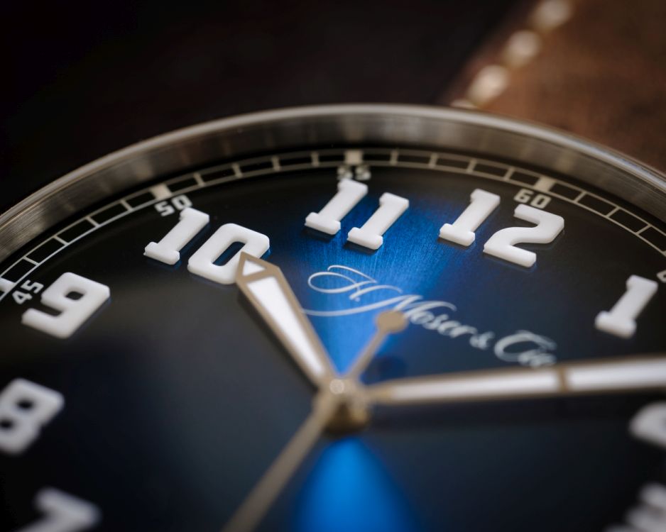
Look at those applied luminous ceramic numerals! I'm smithed - maybe time to sell my Pioneer?
I spoke to William & Son, it's about £13k in the UK.
simon
PS:There's also a review here: https://forums.watchuseek.com/f2/h-m...h-5077467.html
A lovely thing indeed. Too big for me, mores the pity.
Sent from my iPhone using TZ-UK mobile app

I love the look from the dial, but absolutely hate the case profile side on and Im not sold on the "wire" lugs.
It's just a matter of time...
Sorry, that is a big no from me for much the same reasons as above.
Reminds me of the Zenith Pilot, in a good way.
I'd like to see those numerals in hand too.
Vertex do the whole 'sausage' lume so much better IMO. Keep your Pioneer, a better watch!

I really like that in particular the 3D fully lumed numerals.
Dan
My issue is the juxtaposition of the scrolling signature against what appears to be some ultra modern numeral font for the hour markers.

Attention to detail is amazing
Originally Posted by gladders

on first sight there's a touch of the spare parts bin about the face, like the Airking, give it time it'll become a classic.
I am also a big Moser fan but this for me does not work (same with their recent perpetual dial configurations). Too many bits clash on this to make a cohesive design.
The Pioneer IMO is a whole different planet better so I would certainly be keeping that.
I think the issue for Moser is they are trying to broaden their appeal (which makes sense commercially) but so far only the Pioneer and the concept dials are working. I am sure they will keep experimenting and will eventually find the next thing.
 Posting Permissions