Reply With Quote
Very nice. +1 for upping the text size a little.


£330 im guessingOriginally Posted by Mouse

Sent from my iPhone using Tapatalk

Very nice. +1 for upping the text size a little.
Love it. Bargain at £330.
Sent from my iPhone using TZ-UK mobile app
Far better than the renders, and I was excited by those!
At a price of mid £300s, if Eddie gets this one anywhere close to the design 'as is' then the opening day sales applications will crash his server.
Last edited by Mouse; 16th June 2019 at 15:25. Reason: grammar!
I'd take the price of £300- 350 with a pinch of salt unless confirmed by Eddie.He only tells when it's on sale not before typically.
Sent from my E6653 using Tapatalk
Does the lollipop need moving out a smidge just so it sits right on the ring track of the stepped dial?
Or doesn't that matter?
(Or would it unbalance the seconds hand by putting it too close to the tip?)
But really if the text was an exact copy of the original (real, old) Smiths De Luxe and if the seconds hand keep the ever-so-slightly orangey red (i.e. not too dark) of the originals then I'm in.

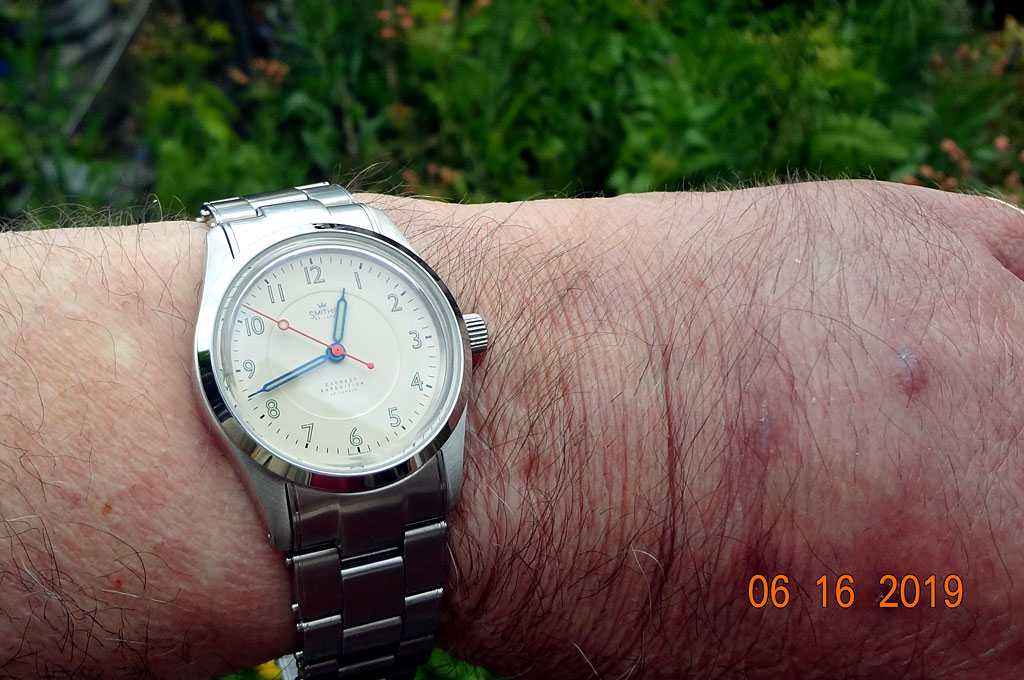
Quick wrist shot on 8.5" wrist (bracelet not sized).
Eddie
Whole chunks of my life come under the heading "it seemed like a good idea at the time".
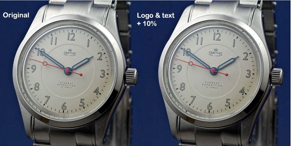
I enlarged the logo and text on the dial and here they are side by side. I think the lollipop is in the right position, the end of the lollipop just touches the edge of the sunken dial circle.
Eddie
Whole chunks of my life come under the heading "it seemed like a good idea at the time".

I reckon that's nigh on perfect - for me, anyway.
I think larger looks better
Hands - I'd have the hour hand ending at the dial inner lip, the minute hand ending at inner edge of the markers and the second hand to the outer edge of the markers. Lollipop position is fine.
Yes, on reflection I agree. The pop on the 1016s always looked just right to me at halfway down the hand.
Although I think I've detected two variants: on older (tritium) 1016s the lolly starts at exactly the halfway point between the pinion and the end (i.e. ignoring the ball-end counterbalance section). NB it starts there: the centre of the pop is therefore ever-so-slightly towards the track end.
I've also seen 1016s with luminova hands where the "pop" (centre) of the lolly exactly 1/2 way (7mm) along the 14mm hand (excluding the ball-end counterbalance section the other side of the pinion).
I guess it's possible that Rolex used hands that were +/- 5 or 10% or two over the course of the 1016's 35+ years. You could probably get a beloved daily wearer back with service replacement hands that were fractionally different and not even notice it.
So there seems to be a few very minor variants on that theme, all +/- 5 or 10%.
In both cases I think the circle of the lolly just about fouls the dial text but obliterates the Rolex crown and lines up above the Mercedes hand which doesn't really harmonise with the dial design particularly. (NB that certainly so on a trit 1016 with L replacement hands.)
And in all cases the lollipop size (diameter) at or just under 1/10th of of the length of the hand (again, excluding the ball-end counterbalance section the other side of the pinion)
Anyway, having just run a ruler over Eddies pics) is pretty much exactly the same proportions as the Smiths (+/- 5%)
tl;dr The lollipop is right. As you were!
Re the "SMITHS" script: the text on mine varies a little but is mostly about 4mm (I have one at 5mm) long or wide. The two end "S" letters are approx 1mm high (1.2ish on the 5mm example)
The DE LUXE fits underneath within the two terminal capital S. That inside space is about 3mm.
The gap between the "DE" and the "LUXE" varies somewhat: mostly it is slightly larger than the standard spacing between the letters space but possibly not what I'd called a full-on "new word" space. Maybe a double or 1.5 space? On one it really is a full word space.
Also the DE LUXE is all caps and the same point size -- no bigger for the initial D and L.
I'd go between 4 and 5mm for the SMITHS and the DE LUXE will take its size from that, having to sit between most inner- and outermost parts of the S and S (although on some of mine the edges of the DE LUXE line up with the M and H of SMITHS above it and on on others they go further and closer to the edges of the terminal S.
Finally, the upright / vertical of the I and T in the middle of SMITHS are the same length; the second upright / vertical of the M and the first upright / vertical of the H are shorter while the the first upright / vertical of the M and the second upright / vertical of the H are longer, this creates the curved effect.
Colours are hard to judge on computer monitors -- it might be that the seconds hand is just a tiny shade too light / bright / orangey. Mine are all a sort of cheap tomato soup colour!
But that said Omega have made orange cool and I could easily live with these, quite contemporary looking.
The larger text looks great. I think this will be my first Timefactors watch (if I can get in quick enough on release day).
The space between DE and LUXE is still wrong.
Sent from my iPhone using Tapatalk
Much better, Eddie. Did you try 15% as well?
This looks amazing. I would love to see it on a vintage brown leather strap.
Would be interested to see 20% too.
I think the text size is spot on now but think the lollipop on the seconds hand should sit directly over the sunken dial edge. I like the idea that the outside edge of the lollipop will be in line with the end of the minute hand
Hands and text look perfect to me, very excited for this!
Sent from my iPhone using Tapatalk

Curious about this too, especially after seeing the photo of the original above.
Yep 10% bigger looks slightly better. Think I'm in whatever.
Sent from my iPad using Tapatalk
With such fine font - I think a slightly larger (than it has been taken to above) - would work?
A very nice watch, so typical of its era.
I concur.
Sent from my iPhone using TZ-UK mobile app
Re 1/5th and 5 second markers as per the original: I think that would make the dial too busy and be very very hard to pull off well. This watch is a cross between the A404 and the A453 -- it has the dial of the former and the hands of the latter. As such, I think it's pretty much perfect.
Re the lollipop: See my comments earlier about the 1016; it will look all wrong if moved along the hand towards the edge. That said, it could possibly be a slid a mm or two along to sit just outside the edge of the dial circle. But then it would start interfering with the numbers. I'd leave it as is.
Re the SMITHS script: I, too, would like to see some photoshopped mock-ups of text +15% and +20% just to make sure, although I'd be surprised if it needs the full 20. A standard Dennison Aquatite cased De Luxe has a 28mm dial (26mm in the smaller cases with 16mm lugs) and I reckon Eddie's dial is 30mm, so it might need to scale up a tad: maybe 4.5 or 5mm wide for the SMITHS script and maybe 1.1 or 1.2 high for the two S's at either end. Just my guess. However, the text on an old Smiths is small by modern standards; if you want an authentic re-creation then the SMITHS should be about 4.75mm-ish wide; if you want a "modern" look then bigger (maybe 6mm? I don't know) or if you want an "updated" look then a compromise at say 5.25mm would do it. Whether that last is the best or worst of both worlds is a good question.
Isn't it fantastic to have to be encouraging the owner of the brand to enlarge the brand script, rather than having to stop them from making it too big????
I can't imagine this discussion happening too many other places.
Dave
Looks great. Agree re making the text bigger.
Not a fan of that strap at all though I'm afraid !
To be honest, as I mentioned earlier, Im new here and I think its absolutely brilliant that we (well those whove got way more knowledge and artistic skills than me) can make comment and feed into a products development. Not only that but the brands owner actually encourages that kind of input and directly engages with us. You dont see that very much at all these days. It makes a refreshing change and makes me want to buy one of these watches even more.
Sent from my iPhone using Tapatalk
Are those hands heat blued or chemically blued or painted?
Heat, iirc
If I can't get heat blued, they won't be blue.
Eddie
Whole chunks of my life come under the heading "it seemed like a good idea at the time".
I would love to see it on something like this (pic from the net)
Nice one :)
Bloody hell that's an ugly strap. Mine's going straight on a David Boettcher or possibly NOS one-piece nylon pull-though.
And with drilled lugs it's getting shoulderless springbars.
Mind you, the bracelet look good too.
I'm getting carried away. I can't remember the last time I was so excited about a new watch
Eddie: will the clasp have micro adjustment or glide-lock type fine-tuning?
All just opinions. My opinion is that I love that strap, and googling David Boettcher, god damn are they nasty looking.
And from the photos and posts, it looks like old fashioned micro adjustment. The glide lock style just makes no sense given the design of the watch, not to mention the crazy size.
Daft question? But what movement will this have?
Miyota 9039 I believe.
After about 10 pages of criticism in total of the on-the-fly glide-lock type option on the existing 36mm Everest, I suspect that's off the agenda here.
Though I found it very useful earlier today, I must say.
Black Eulit Perlon
As a matter of interest has anyone fitted shoulderless springbars to theirs?
If so which ones?
Personally anything with drilled lugs. I cringe when I see regular springbars on a drilled lugged watch.
^^ this
The "shoulders" can snag fabric straps (NATOs etc) and also just look plain ugly. You can use them on non-drilled lugs too but you have to cut them out with snips.
Cousins sell them.
Also makes any watch look more "military" and "vintage" if such things matter to you. For me that's just an added bonus.
I wish someone would make a reproduction of the old Rolex expanding brackets with the "sprung" links. So comfortable and lightweight
Last edited by Rev-O; 18th June 2019 at 09:49.
Any font size increase beyond the 10% shown will start to make the inner circular recessed area feel too small (perhaps it does already?). The central recessed area can't be made bigger as it would crowd the numerals (which were initially asked to be made bigger iirc) and change the balance with the lollipop position (personally, I could do without the lollipop). I suspect that, for me at least, the dial with the 10% font increase is as good as it is going to get.
I agree it's not really a watch for a bracelet, but it's also not for that strap illustrated with the funny stitching.
I agree with size11s: SMITHS @ +10% looks about right. I'd still like to see mock-ups at 15% and 20% increases as well just to be sure.
The three line of text below the pinion I'd like to see mock-ups at +25% and +50%, I think they could get away with being quite a bit bigger.
I too could live without the lollipop but equally I quite like it. Will make it more fun to read in the dark and easier to spot at a glance whether I'm looking at this watch vs real old Smiths (eg on ebay listings and forums etc.)
Hoping the red of "24 Jewels" matches the red of the seconds hand exactly.
All in all I really like this.
Though lightweight, some seem to regard this type of bracelet as being in the instrument of torture category. I suppose it depends on how thick your lower arm and wrist is, how much give in the bracelet and - last but not least - how much hair you have and whether strands keeps getting snagged and pulled. Ouch. I expect the Rolex ones were towards the better designed and implemented end of the range of expanding bracelets.
It would certainly be a 'brave' choice for Eddie here, though I appreciate you weren't actually suggesting that!
^^^ Now that had me nearly falling off my chair. Brilliant :-)
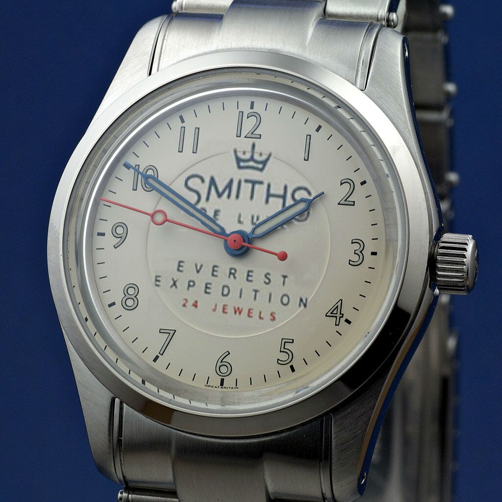
Original (left), +20% (right).

20% looks good to me
 Posting Permissions