Reply With Quote
Regarding the numbers for the hours on version C, one more remark. I would not only make them slightly bigger in size but also use the same font as that is used for the 3-6-9 on the "normal" Everest.
In essence something like this:


Ill buy one. Looks brilliant.
Definitely going to paint the seconds hand red once the warranty is up though.
- - - Updated - - -
Maybe just the tip, just past the lollipop.
/edit- just to say im voting for version C... just in case anyones confused & counting votes ;c)
Last edited by Synthpunk; 5th January 2019 at 03:56.
Regarding the numbers for the hours on version C, one more remark. I would not only make them slightly bigger in size but also use the same font as that is used for the 3-6-9 on the "normal" Everest.
In essence something like this
Last edited by DannyPN; 5th January 2019 at 00:14.
The more i think about it, the more i think Version C may well be the best idea for an ‘explorer’ style watch ever.... proper historical brand/design dna from smiths, in the 1016 case.... genius!
And a white dial to boot. As is proper for a smiths.... and with the whole did they/didnt they rivalry between smiths and rol£x .....even more genius!
So probably a more original yet legit ‘omage to an “explorers watch” i couldnt possibly imagine.
For some reason it just doesnt make sense in the black dial version for me...
Top notch!!
Rich
Ps also looking forward to the rivet bracelet.

Absolutely agree with you. Currently the numbers look a bit lost. Just a bit more size and i am fine with it.
Originally Posted by DannyPN


Is it likely that both B and C would make it into production, or is it an "either/or" scenario ?

A couple of minor tweaks.
Eddie
Whole chunks of my life come under the heading "it seemed like a good idea at the time".
As far as I understand, all the 3 versions (Version A, B and C) should go into production.

Really nice Eddie - its definitey shaping up. Good shout on the red too, I like the contrast.
You can see where it has taken homage from yet very much looks its own watch.
Well that will be the end of my only new years resolution,when it's released that is. On the plus side, it will be the longest a resolution has held steadfast until crumbling to dust.
Looks very nice
Oh yeah, it will still be a flick of the coin between the B and the C, the white faced exploreresque piece is also very nice.
Last edited by nickyboyo; 5th January 2019 at 13:01.
Again, very nice, Eddie. From a technical perspective, would it be possible - or desirable - to blue the second hand and have a red tip below (above?) the lumed lollipop?
Sent from my iPhone using TZ-UK mobile app
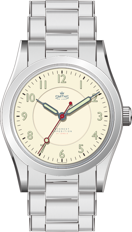
The bigger numerals are great and the red sweep seconds is a winner too. My only thought is that the lumed area of the hour hand could be a couple of mm longer, the 10 position occupies more space than all the other numbers so although it would reach within the 0 of the 10 it would still be right with the other numbers. Really lovely watch.
Last edited by size11s; 5th January 2019 at 13:25.
That's fantastic Eddie.
That new version of C is very nice ... making me wonder whether the red second hand and red text would work with option B as well. For sure the slimmer straight (i.e. "non-triangular") second hand is much better and I'd like to see that replicated on B, with or without a colour change.
I like it very much, although I would like to see you use the same font for the numerals as on the "standard" Everest (I think it would make a nice visual connection to the other Everests), but I realise I can't have everything. It will make a nice companion to my black one nevertheless.
Without being too 'SmithS' purist about it.... being centre seconds the dial is echoing the A454/A460 yet the outer minute track is that of the sub seconds A404/A409. The A454 has the finer, seconds graduations not just minutes as the A404.
It's not intended to be a copy, it's meant to combine a number of elements to reflect on its heritage.
Eddie
Whole chunks of my life come under the heading "it seemed like a good idea at the time".
.....and it does that really well. Lovely looking watch.
Which as the design is now reflecting it is clearly doing really well. Nice.
Perfect. New Years resolution canned.
Version C looks amazing.
That looks pretty much perfect! I will buy it.
I agree with a previous poster though in that I think the lumed section of the hour hand should be slightly increased.
I really like that just as it is... Is there intended to be a physical step in the inner ring on the face Eddie?
Hmm I'm up for one :-)
A
Yes, confirmed as a sunken inner dial in post 233.
I disagree personally. One of the reasons I also like the B variant. In the dark there needs to be very clear distinction between hands. Any longer and it might be the case that you need to focus your eyes to read the time at night rather than just know at a glance.
I didnt read anybody suggesting an increase in the length of the hour hand. It would be possible to increase the lume by making the hour hand a similar width to the minute hand.
Sent from my iPhone using TZ-UK mobile app
oops, missed that...sorry!
Even better then in my eyes.
A
This would give the hands balance.
Almost perfect Eddie, I have to agree with others that the hands be the same width to remain balanced (the hour hand could be 1/2mm longer perhaps?)
Les
For goodness sake, it's great watch. Personally i'd lose the lollipop and just have a straight red second hand, no lume required.
Yes, please. SUATMM.
Possibly. Less is more? But then, God is in the details
Sent from my iPhone using TZ-UK mobile app
So too many cooks in the kitchen. I just want to buy it. When may this be ordered? Cheers
Sign me up for this Eddie - it will compliment my 36 mm black nicely.
I do quite like the seconds hand only having a red tip rather than the whole shebang. Having said that I will still buy it regardless.
Well done Eddie - youre on fire
Sent from my iPhone using Tapatalk
Hello, first post here.
I've yet to buy a Timefactors watch but I am really, really interested in the white PRS-25 version C.
Is there any indication on when it should be available, and about the cost? Same as the black one?
Thanks.
Here's my Smiths A453 from 1952
Great article on these "Antarctic" models here:
http://www.mwrforum.net/forums/showt...e-Luxe-watches
Anyway, I like almost all TF watches -- some of them A LOT -- and I wear one as my daily beater.
However, while I like Eddie's watches I really love this one, so: yes, please, count me in!
Some old Smiths adverts
I've heard that the headline in the The Times was Hillary Fuchs off to the Pole -- pretty risky for 1955!
And when Fuchs went back to the South Pole a few years later it was "Dr Fuchs off to the pole again"
Hahaha!
F.T.F.A.
I've heard that the headline in the The Times was Hillary Fuchs off to the Pole -- pretty risky for 1955!
And when Fuchs went back to the South Pole a few years later it was "Dr Fuchs off to the pole again"[/QUOTE]
Made my day!
Sent from my GT-I9505 using Tapatalk
Really stunning - any chance it will be with a Hi-dome acrylic crystal?
For all harping on about the width of the hands - they're different here as well (albeit the other way round - the hr hand is thicker, minute hand thinner). It actually to me visually looks better and makes sense - easier to distinguish in the night. I think it's worth debating which hand should be thicker/visually more appealing. I'm unsure...
yup i noticed this also, the longer slightly thinner minute hand on the original looks better to my eye.
I agree, more balanced.
I wish. I despair that we'll never see an acrylic crystal again.
The sapphire domed crystal on the new PRS-25 is the best compromise in terms of robustness, scratch resistance and vintage look, IMO.
I tend to agree with you - I guess need to see a mock up as to whether it fits in the style of the new Everest. I'm not wholly convinced yet.
Indeed. IMHO the width of the minute hand is an important element in how a watch looks. Too wide is the worst, the hand then overpowers and unbalances the look.
Look away you lume lovers... but I think V3 would look great with glossy pained numerals.

The problem with the sapphire domed crystal is the milky ring - you don't get that distortion in the same way as you do with a Hi-dome acrylic crystal. If you look at pictures of the first PRS-25 with the acrylic domed crystal, you will see that the acrylic is clear around the edge, and it really is a crystal that makes the watch.
Compare this - https://wornandwound.com/review/smit...prs-25-review/ to this
https://uploads.tapatalk-cdn.com/201...7ecaf5e5dd.jpg
Do you see it?
Last edited by Mads Gorm; 8th January 2019 at 19:09. Reason: spelling ereor and added the word acrylic.
Maybe the long hand is thin and the short is thick in order to create balance, they take up the same amount of space and hence have the same "weight". I think the original is so damm nice, that one might consider a heritage reissued would be the best solution. Except with the oyster case and the bracelet :-)
But anyhow I also like the redesign, and I like that the hands have a different width.
As everyone knows germans are always yammering... Eddies latest design works really well, but the A453 dial is simply superior. I wouldn't change anything! Why no relaunch of this dial (especially the font and size of the numbers)?
Just my 2 cents...
 Posting Permissions