Reply With Quote
What 39mm? The Rolex Explorer? I agree, it would be a good mix!Originally Posted by Dave E


That looks really good. Wannit. Next Tuesday, eh?

What 39mm? The Rolex Explorer? I agree, it would be a good mix!

There, fixed. ;-)
F.T.F.A.
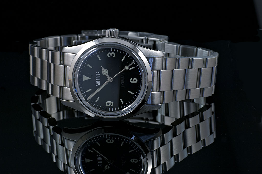
Dang it, got the size wrong. Ironic given I'm actually wearing my Everest today.
Dave E
Skating away on the thin ice of a new day

This looks great, but when did the 12 marker change from a triangle to two feet balancing on a ball? Im trying hard not to see it as I really want this.

That would be the seconds hand..

What's the thickness of the 36mm please?
Duh! Embarrassed face. And thank the deity.
Certainly not short-handedness, no.
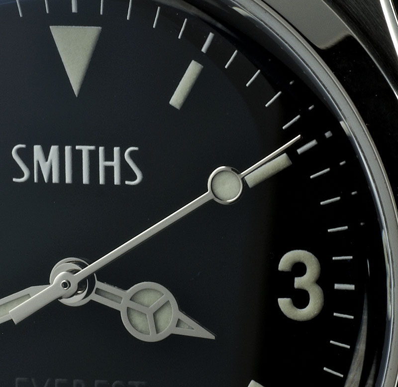
There's an awful lot to like, but to me the minute hand is a bit too long and the lollipop on the second hand *really* shouldn't be obscuring part of the indices. I think the larger version has the hand dimensions about right given the diameter of the watch.
Sorry to post something negative on what, for the most part, looks like a fantastic job.
I really like the aesthetic of the 16mm taper bracelet, but to what extent would the bracelet be adjustable for those of use with wee spindly wrists?
Aaagghh! Now I can't 'unsee' it
I hadn't noticed before.
Bugger, neither had I
Is it the same second hand as used in the 40mm Everest?
Now Ive noticed my gmt hand looks like a stretched Star of David. What have you started...

Last edited by greenandblack; 14th December 2018 at 01:18.
Still looks absolutely brilliant and I will still likely purchase but .....I cannot unsee.
Eddie,
Quick question, assuming all goes well, what time does the site start taking orders on the Tuesday morning? I have a meeting on Tuesday morning but I can delay or bring forward if needed :)
Cheers
Neill
0730 hrs.
Eddie
Whole chunks of my life come under the heading "it seemed like a good idea at the time".
I had but didn't want to poop the party :(
The minute and second hands are the same length as on the 40mm I believe whereas the hour hand has been reduced by 1mm from 8 to 7. They look spot on for the 40mm but are too long for the 36mm imo. Both the minute and second hands should almost touch the end of the minute markers as they do for the 40mm.
Eddie
Whole chunks of my life come under the heading "it seemed like a good idea at the time".
Loving that!
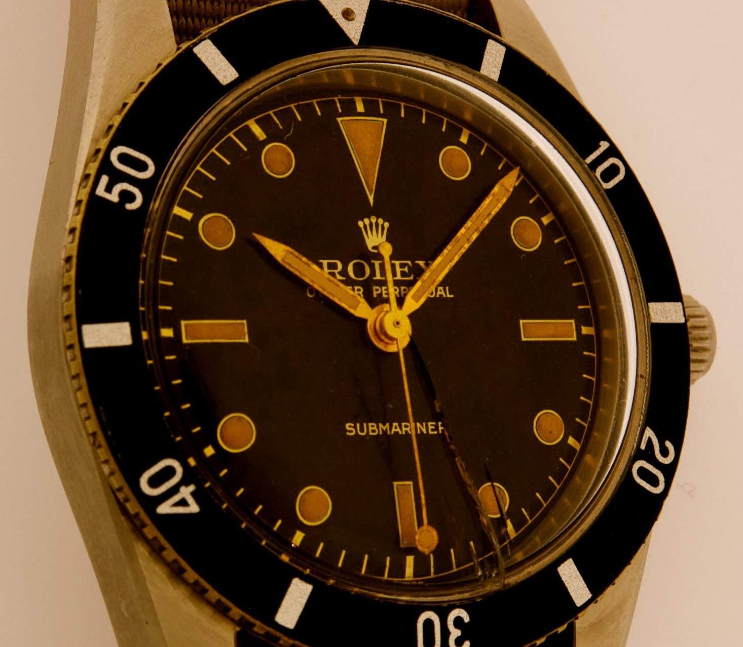
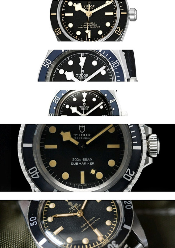
yup looks like the lollipop seconds hand proportions were not scaled appropriately to the 36mm dial. the "ball lume" shouldn't touch the triangle. For ref see pic in link below
https://www.fratellowatches.com/rolex-explorer-1016/
That would apply if the watch had been mooted as clone of the 1016, but like the first iteration of the Everest this wasn't the intention. Whether one likes the look or not is quite subjective.
I can see a practical idea for lume not overlapping lume, but I always feel it makes the ball look to low on the arm. I don't think it really hurts the look. I also think the long minute hand gives it quiets a slim elegant look.
Will be good to see the pictures flooding in this time next week from the lucky 50...
Time to start selling your Tudors
I like that the length of the lugs has been exploited, with the centres of the endlinks being recessed from their outer sections, rather than extending further beyond the end of the lugs.
The way that the bracelet fits to the end pieces means that the bracelet fits better on a smaller wrist.
Eddie
Whole chunks of my life come under the heading "it seemed like a good idea at the time".
That image of it looks great.
So simple.
i respectively disagree. The entire PRS-25 thread discusses a "homage" to the 1016. It is by far the best modern version of a 1016 for fans who dont want to spend $15,000+ for an excellent condition 1016. I have spoken to Eddie on the phone at length when he was deciding to make a 36mm and we talked in detail about the design of the 1016 , dimensions etc.
I think the minute and hour hands are perfect.
Don't get me wrong i will be buying one of these, although since i'm not UK based i doubt i will be able to get my order in on the first 50.
It is head and shoulders better than the first PRS25
I respectfully disagree. Its different, but not better. Subjectively, IMHO.
I think it looks very promising. Hard as ever to know for sure until its on the wrist of course. I think it would look lovely on a leather or a quality canvas or a nato. I'm now considering whether to buy one. Congratulations Eddie. Tf on a roll at the moment.
Good luck everybody. Have a good one.
I agree - this looks very promising and so well proportioned.
I don't really get the argument on the second hand, looks totally fine to me.
When we were discussing hand length, I asked the manufacturer to make the lollipop just touch the end of the indices.
Eddie
Whole chunks of my life come under the heading "it seemed like a good idea at the time".
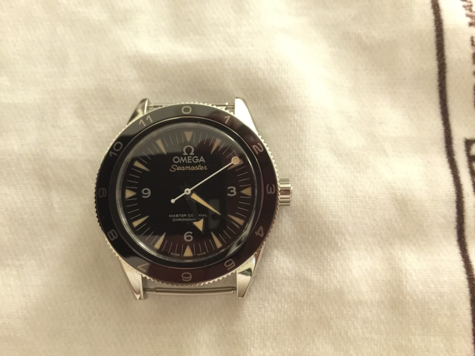
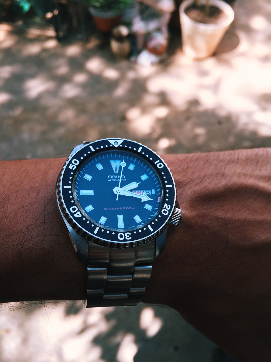
and your Rolex, Omega and Seiko
Eddie
Whole chunks of my life come under the heading "it seemed like a good idea at the time".
At least people can say this on this forum.
They'd get banned or binned anywhere else.
They are also free to start up their own microbrand. With such refined taste and attention to detail, I'm sure it will be a success :)
Good luck everybody. Have a good one.
Amen to that. It also helps when the Boss delivers a smackdown as above....
I think that is just about bang on the money Oh Fast One...
Will the white dialled version have blued hands and titties? (asking for a friend)
I think the watches speak for themselves
Eg, some people used to bang on about the short hour hand on the speed bird.
Complete non issue for me.
Good luck everybody. Have a good one.
I am liking this macro shot!
I like it & can't see anything wrong with the hands !
Sorry so to be clear, is that what they delivered for both models?
i.e.
The 36mm is as you describe and show there ...with the pop just touching the indices
Sorry to ask but its hard to tell from some of the photos due to the angle / crystal ... I assume but wasnt sure that macro was of the 36mm... and I want to be sure that I understand your meaning. Not well I *asked* them to do X, but we got Y... Appreciate it.
Last edited by redhed18; 14th December 2018 at 18:04.
That's the 36mm version and I got what I asked for. Sometimes I make subtle tweaks and don't mention them.
Eddie
Whole chunks of my life come under the heading "it seemed like a good idea at the time".
It might.
Eddie
Whole chunks of my life come under the heading "it seemed like a good idea at the time".
Please just change the dial colour and add titties
Sent from my iPhone using TZ-UK mobile app
You have got it spot on in my opinion so very well done Sir.
Exactly this.
"Hands too short on the old PRS25, hands too long on the new..." I have the old version and despite liking a longer-hand aesthetic, I wore and enjoyed that watch for years. I'm sure I'd like the 36mm Everest just as much. Is this iteration the 'ideal' PRS25? Not for everyone but it looks like a winner to me!
Well i love your tweaking on this.
Might try and book myself in for a tweak soon.
I'm won't skip out even if the white dial is the same, but I hope the hand sizes are adjusted a little on that one.
Also interesting how different the two angles are as far as how long the hand looks. The zoomed out pic makes it look like the lollipop would cover much more of the marker.
Last edited by acg2010; 14th December 2018 at 23:40.
But has nobody noticed the quality of the dial printing, the application of the lume and the finishing of the hands? Better than anything I've had in the past.
Eddie
Whole chunks of my life come under the heading "it seemed like a good idea at the time".
I think we've all assumed it was the same as the 'full size' version just released. But looking at that macro of the lume application and your pics of the 'full size', I'm actually not too sure now.
That's lume is indeed immaculately applied. I'm frankly not sure I've seen applied lume markers with as clean edges as that macro depicts, which is why I'm in regardless of hand size for the white version. I'd probably be in for a black one too, but I'd go broke if I picked up all the watches you have planned that I want - holding out for the orange Caribbean too.
 Posting Permissions