Reply With Quote
So about the same as a Black Bay.Originally Posted by swanbourne


I wonder too as Mrs Sish is stuck for a Christmas present for me
Sent from my ONEPLUS A3003 using Tapatalk

So about the same as a Black Bay.

Almost certain there is no chance anyone is getting this for Christmas... 2018.
Haha I think that's fairly obvious :) it would be good to know roughly when though.
Pointy lugs. Yes!

That is gorgeous! I'd be happy with any of the colors.
How did I miss this thread until just now?
I'm going to have to get a second job just to afford the next year's TimeFactors releases.
36 MM PRS-25
Speedbird III
Upcoming PRS-3
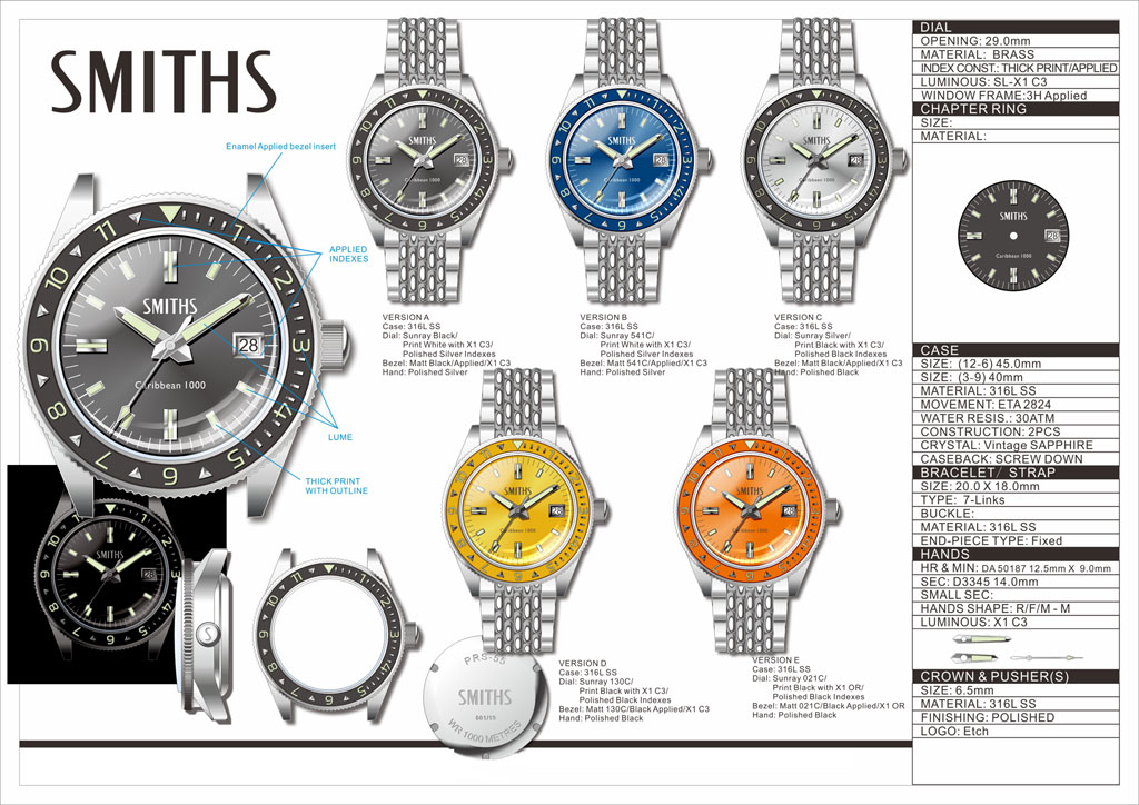
Caribbean
Oh, and there's the G10 coming back, and that chrono on the PRS-40 case...
Fantastic offerings of late, Eddie.
I really don't need another blue diver, but that is very nice.
At least two of TF's upcoming designs look very tempting, but I fear that the prices may be upward of what I'd want to pay.
I'll be happy to be proved wrong though
M
Well, I would very happily pay the extra to take 1mm off the thickness. Would it be possible to offer different options for the movement?
No because if I have to offer 2 different cases for the different movements, I have to make a minimum of 300 of each.
Eddie
Whole chunks of my life come under the heading "it seemed like a good idea at the time".
Drawing updated to include bracelet and sunburst dials.
Eddie
Whole chunks of my life come under the heading "it seemed like a good idea at the time".
This is the homage I've been waiting for, they look great.
Silver yellow or blue....Hmmm
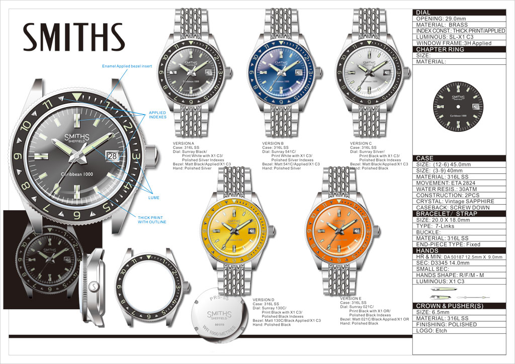
Yep, that's a cracker. If it were me I'd probably use a less shouty logo, either Precista or the arched Smiths one with the crown like on the PRS35/36/29AM but other than that it's pretty darn close to spot on.
Maybe the Smiths tits logo

Agreed. The current logo is very overbearing. I think the Smith 'tits' could work much better.
This has probably been answered before but how do you decide whether a watch is a Smiths, Precista, Sewills, etc?
I really dislike that Smiths tits logo I wouldn't buy one with that on it!
As per the FB post, I love that silver one.
40mm is ideal and the bracelet suits it perfectly.
I like the SMITHS logo but I also like the chest logo too as per my 29A.
Sent from my iPhone using Tapatalk
Eddie,
Liking it a lot, but then as a Caribbean fan, I always would. A ref. 702 case with 12 hr bezel is one of the best combinations IMO. I would prefer the watch as a Precista, rather than a Smiths though.
I appreciate that different movements would mean 300 more cases, but what about the bezel insert? The original Caribbean was available with 12hr, time-elapsed and decompression table bezels. Are you going to have other bezels made like you did with the PRS-17C?
Dave
I suspect I'm in the minority, but I'd be perfectly content with a 9015 instead of an ETA or Selita movement. Cost is an issue for me, and I've been pleased with the Miyota in my Everest.
I totally agree with you there the price needs to be right on this and as for movements I don't really care, the Miyota would be fine.
I really like this O&W Caribbean with 702 case. Points of detail are the pointy lugs & 3300 fts (note: not ft) on the dial.
If it wasn't 5k I'd buy it.
Case is 38mm. IMO 40mm is OK but I wouldn't want it any larger. And stick with the ETA at all costs.

Do bear in mind that the Smiths logo when posted on this forum is hugely enlarged (phnarr!) even with my glasses on, looking at my Air ministry now, I can just see a crown like thing, it doesn't say tits to me.
What do you think of this image of two stick men dancing? :-)

I really love the orange variant, but wish it was waterproof to 300m and 12mm thick - I don't think the rest of me could hit 100 atm underwater!
I'm with you, my friend, but I think that battle's been lost to the purists. Perhaps we could have a special imperial edition, the 'Caribbean 1000 inch'? Seems our last hope is for Eddie to use a slightly thinner movement.
Btw, welcome to the forum, nice to have a Peranakan cuisine enthusiast on board!
Eddie
Whole chunks of my life come under the heading "it seemed like a good idea at the time".
I don't disagree, the Miyota is a prefectly competent movement. The problem is, the case and crystal will not be cheap for this watch and it would make the selling price high for a Miyota powered watch but with the ETA or Sellita, it will be very reasonably priced for the movement it has (if that makes sense).
It's a bit like putting a Fiat engine in a Jaguar to bring the price down: nothing wrong with the engine, you just don't expect to find it in a Jaguar.
Eddie
Whole chunks of my life come under the heading "it seemed like a good idea at the time".
I think that logo looks much better now.
I like the smiths Sheffield logo, looks much less imposing on the dial.
Not such a fan of the Carribbean font, is it the same as the Sheffield one?
Sent from my Pixel 2 using Tapatalk
Someone who has seen Eddies cats in action would like that logo.
Sent from my iPad using Tapatalk
I agree, I think the lower text is a little bland.
I know the original has 'Caribbean 1000' on one line but it is also has a further 2 lines of text to add overall balance to the dial. Not claiming any marks for originality, but how about:
Caribbean
WR 1000m / 3,281ft
'Caribbean' should be centred and I think this would give good balance with the text in the upper dial. The font for Caribbean should be something more interesting - I had a play on 'Word' and thought quite a few looked good but I couldn't work out how to change the font here :(
Last edited by ColDaspin; 11th December 2018 at 10:20.
I prefer the arched Smiths, and I would suggest that the lower script is written
caribbean
1000
to give 2-line balance to the upper and lower portions without adding any extra script (because we all know that we dislike a novel on the dial).
The originals are not capitalised for caribbean (i.e. not Caribbean, but caribbean) and the font seems a little squashed.
Dave
Instead of Sheffield, replace with England...perhaps?
I certainly agree with the last couple of posts on the text...
I think the Smiths logo is starting to look really good in this format and would look great on all the watches under that mark.
For me I wouldn't want Sheffield Or England on the dial the Smiths logo would be better on it's own.
Im with Andy
Thanks! Any my username is actually from a childhood nickname - I wasn't even aware of the food link until recently!
That latest style of Smiths logo looks way better IMO. How about replacing the word Sheffield with Automatic.
Dave
Agreed, better than my suggestion, and then 'Made in England' at 6 o'clock.....perhaps?
I dont think its actually made in England though.
Id prefer Great Britain for balance instead at bottom, as on other models.
I think I like the automatic under the Smiths...
Sent from my iPhone using Tapatalk
I'm just going to leave this here, for reference.
https://heuerville.wordpress.com/201...-1000-ref-702/
good read, thanks.
Copy that & it'll be perfect
I like the 3 line dial:
caribbean 1000
1000meters
(3300 fts)
Would have to be fts not ft. That's if I was making it, which I aren't, so that's Eddie's prerogative.
Last edited by trident-7; 11th December 2018 at 20:30.
We all have different opinions on this :) for me any mention of England, Great Britain or Sheffield on the dial will stop me buying one as I just don't see the need for that at all and looking at Eddie's pictures the one with Smiths on its own looks by far the best, but I am probably in the minority but for me less on the dial is better so the Smiths on its own is the one I prefer.
Really like that. Smiths logo is better. I'm happy whatever movement, but prefer something that will be serviceable in the future. Black for me. Thanks Eddie.
Last edited by gerard; 11th December 2018 at 21:50.
I agree (Id rather have Precista on this one but it wouldnt be as big a deal breaker)
I might go with the booby logo yet.
Eddie
Whole chunks of my life come under the heading "it seemed like a good idea at the time".
Mrs T-7 used to work for a magazine publishing company. The surest way of boosting sales was to have a picture of a scantily dressed shapely young lady on the cover. Often with only some tenuous link to any of the content.
Excellent! Tits out would capture a touch of the original O&W logo and be my first choice.
I think then it'd then need more than one line of script in the bottom half of the dial to balance things up.
pretty much the premise/business model of the lads mag phenomenon. T and A sell.
 Posting Permissions