Reply With Quote
These new prospects are most encouraging.


Oh yes. 2 fantastic new iterations.
Lovely
Dave
These new prospects are most encouraging.

Those numerals look great.Originally Posted by Der Amf


Wish I'd bought a few more for my pension fund

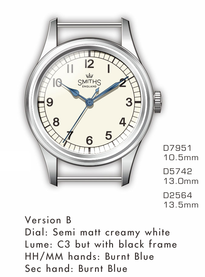
I really like the vintage lume version, but after seeing this latest render, all the elements in the dial looks so well balanced. It just looks right. Good job!
As a few others have said, maybe a more 'elegant' font for the numbers might be worth considering.
Will order for sure! :)
Last edited by leafy; 29th May 2018 at 18:53.
l leave this thread for a couple of weeks and now come back to this! Take my money!
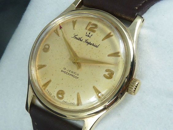
My only wish with the above is for the Smiths logo to be more like the original big boobs rather than this version which looks more like pecs. I mean who doesn't like boobs?
Would still also like the option of the 29a exactly as it was though, can't believe I got complacent thinking it would still be on sale when I was ready.
I always thought it was liked being stared at by an unimpressed duck

I will NEVER un-see that now! haha.

LOL!
Same here, had to look for a bit, but now I can't "unsee" it!
How do people notice these things? :)
Got a new watch, divers watch it is, had to drown the bastard to get it!
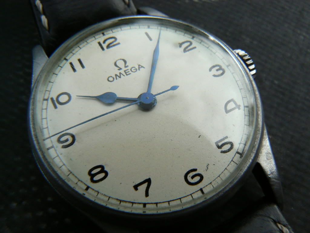
The hands on the Omega look to have a flatter, simpler finish, without the pronounced spine or vein running down the middle of the rendering. I think on this sort of design the simpler look would be better.
And I still love to have some sort of lume to enable me to read the time at night, whether a lumed dial or blue lume paint on the hands....
The font on the old Omega looks fantastic!
Tomas
The latest design looks fantastic Eddie.
I like it but can't help thinking that that the hands would look better lummed with a gloss brown metal edge.
n2
"Once is happenstance. Twice is coincidence. The third time it's enemy action."
"You gotta know when to hold em and know when to fold em".
Would the prs53 font be in keeping with the overall design?
I'd like hands lumed but with gloss blued edging!!
I'd like no lume on the dial or hands :)
+1. Should be exactly as the inspiration. Lume anywhere completely misses the point and I'm baffled why anyone would suggest it.
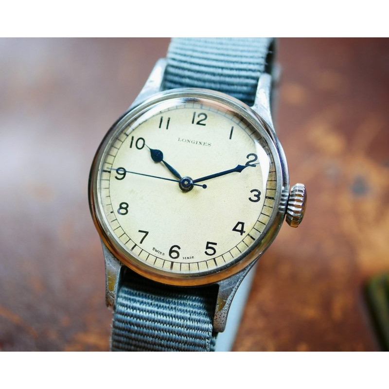
Me too. The Air Ministry watches were white dial with dark hands so you didn't need lume.
Eddie
Whole chunks of my life come under the heading "it seemed like a good idea at the time".
Ok,
count me in.
"Once is happenstance. Twice is coincidence. The third time it's enemy action."
"You gotta know when to hold em and know when to fold em".
The new Smiths Air Ministry drawing looks perfect! :-)
I agree that it would be interesting to find uniform-line weight sans serif font with "open" 6 and 9, but none showed up when I took a spin around the internet. But maybe the design can be made by printer on the watch face?
Gert

^^^ But nobody knows which font this is. Zeno made the watch and they don't know, they left it up to the dial manufacturer who is no longer in business.
Eddie
Whole chunks of my life come under the heading "it seemed like a good idea at the time".
I have been doing a lot of searching and I can't find anything resembling the font... I actually wonder if it was drawn from reference books?
(I worked with people who drew and designed fonts at the start of my career and its an amazing art!)
Swiss dial maker, open 6 and 9, did they once do work for 'another brand'?
Ah, I didn't realise there was a mystery. I have posted on a font forum to see if they can track down the font or one that is very similar. https://typography.guru/forums/topic...-open-6-and-9/
This is in Zeno's current collection. Did the dial manufacturer go out of business after the watch was introduced, or have Zeno been able to identify the font?
Edit: Or third option (only just added because I know nothing about these things), have they simply been able to shamelessly slap their logo onto the dial they had made for Mr Platts?

Last edited by Cornholio; 2nd June 2018 at 15:21.

The Zeno watches look alright apart from the vile logo! Shame.
Sent from my iPhone using TZ-UK mobile app
It's the latter, the caseback still says Precista.
Eddie
Whole chunks of my life come under the heading "it seemed like a good idea at the time".
This looks absolutely perfect to me;with drilled lugs it would be a dream come true!
This could be a lovely thing - and if pretty close to the originals, a near-essential thing.
With the latter in mind, Id keep the overall appearance but drop the lume and not have a pheon. The originals (and the Smiths prototype) didnt have the pheon and its absence is arguably a key distinguishing feature. I might also make the Smiths logo very slightly smaller. The case size will hopefully be modest.
But - very promising, long-awaited by many, and a project to follow. Thank you, Mr Platts.

This will be stunning if it doesn't have the boobs. It simply can't have the boobs.
I can understand the polar feelings about the Smiths crown logo; and sure enough in any enlarged images you can interpret the boobs,pecks or duck. However i can assure anyone concerned that i wear my 37mm Smiths PRS-36 every day and all i "see" is a crown design on the dial. I actually like the style of the older Smiths crown used on the Smiths Imperial too
The PRS-36 was one of my most eagerly awaited watches but I didn't buy it because of the logo. I guess it's just what people see; the visual equivalent of laurel and yanny.
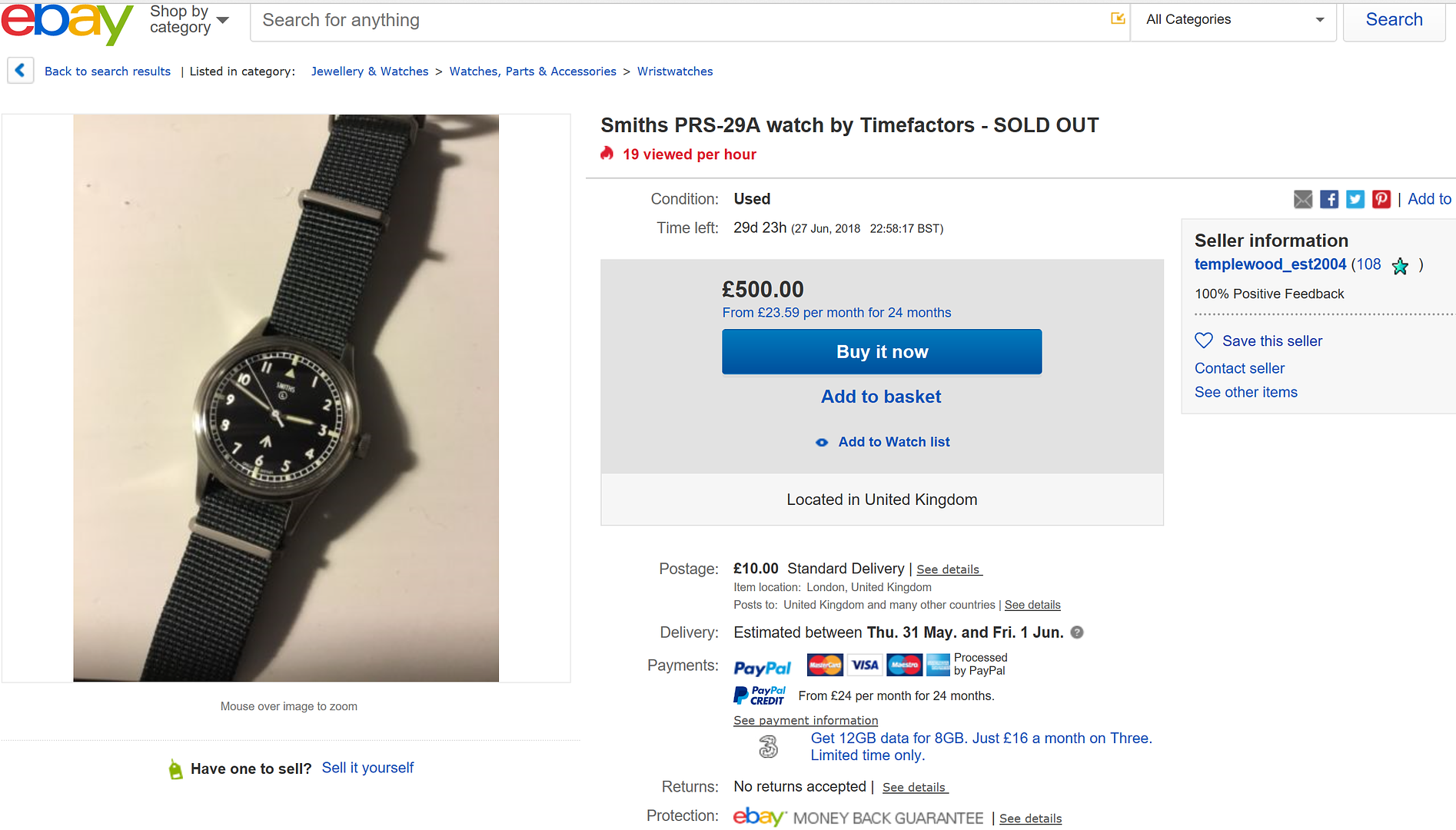
Regardless of where my watch interests take me, from G Shock to Rolex, I always seem to come back to the 29a.
I bought this one new in 2015 and since then its been off on its holidays a few times care of three forum members, though it always seems to find its way back to me one way of another so perhaps I should just hang on to it now.
Im wearing it today
Last edited by Velorum; 9th June 2018 at 09:24.
Something's are simply meant to be, stop fighting fate.
"Once is happenstance. Twice is coincidence. The third time it's enemy action."
"You gotta know when to hold em and know when to fold em".
If I had to choose one, I would go with the creamy white dial and blued hands. I also like the vintage Smiths logo. I am ready to purchase, as soon as Eddie starts accepting orders 🙂 👍
Last edited by alantingle; 8th June 2018 at 17:59.
Looking forward to see the finished products... Only wish is that this is as affordable as previous editions.
Sent from my E6653 using Tapatalk
Sorry if this is the wrong thread to ask, but Search didn't come up with anything relevant....
Will there be re-issues of the 29b?
Thanks!
I believe the A variant outsold the B at a margin of 4:1. I also think Eddie intimated that a B rerun was therefore unlikely. The post Im referring to is a few pages back I think.
I have never seen it as that,but since its been mentioned thats all I see.
Got that. Thanks!
This looks to be a very nice watch.
I guess I was hoping for some Lume on the hands but get the fact the original versions did not have it, nor probably need it if there is any ambient light about. I just like to know the time if I wake in the night! I suppose that is what my 29b is for though...superb watch, hence my watching this thread with a lot of interest.
My thoughts exactly!
Me too - if they are as affordable, I may be tempted into getting both colours
This could make me give up my search for a meaningful relationship.
PS I always wanted a 36mm marine/deck watch....
Oh my, I'm another one that needs both variants.
Tomas
Same here. Thats going to be another dent in the savings pot when they arrive! Its a tough business this watch collecting...
Sent from my iPhone using TZ-UK mobile app
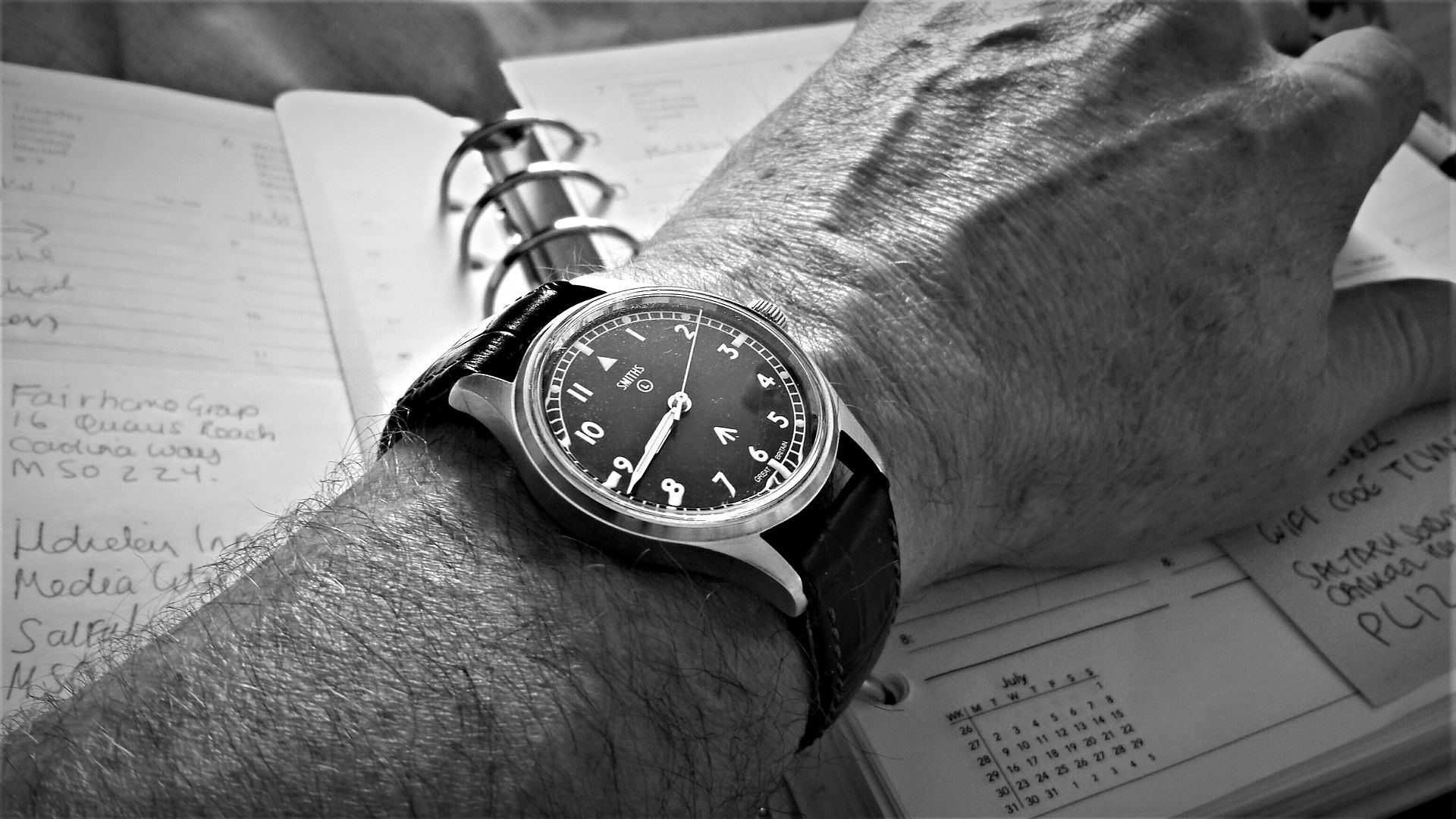
Just want to say what a great B&W shot that is! The 29A smartens up nicely too on leather.
 Posting Permissions