
 Reply With Quote
That really does look good. If the yellow deeper like amber it might help legibility of the hand on that sub-dial. But that splash of colour and the overall look together looks spot on to me.


Eddie
Whole chunks of my life come under the heading "it seemed like a good idea at the time".

That really does look good. If the yellow deeper like amber it might help legibility of the hand on that sub-dial. But that splash of colour and the overall look together looks spot on to me.

Love the way the day/night indicator looks, if you want a less obvious but still colourful contrast, perhaps light blue/navy, or sand/brown (root-beer inspired)?
I like it.
But I love most chronos!
I still need a PRS 5 though.
Last edited by Dr.Brian; 21st May 2018 at 14:02.
I tried pale blue but the yellow looks better (to my eyes).Originally Posted by Dark Side of The Loon

Eddie
Whole chunks of my life come under the heading "it seemed like a good idea at the time".
Fair, maybe light green (to match the lume)/dark green? Might co-ordinate well?
Here it is with amber (Pantone 3514CP).
Eddie
Whole chunks of my life come under the heading "it seemed like a good idea at the time".
That is looking very good
Agree^, amber looks stunning
Of all the colours I prefer the the Amber by some way
Sent from my iPad using Tapatalk
Amber is much nicer. It also provides much better contrast with the white hand.
I'd love to see a red central seconds hand, but i realise that might be a bit too far for some people.
Good luck everybody. Have a good one.

It looks very good. The only thing that could keep me from buying it is the dimensions. Something like 40/41x47/48 would make i perfect, especially on the bracelet. I feel that it would be more refined in a smaller case..
Sent from my iPhone using Tapatalk
Size is always contentious: no matter what size a watch is, some people will say it's too small whilst others will say it's too big. It's the same with strap or bracelet, fixed bars or springbars, sapphire or acrylic etc, etc, etc.
Eddie
Whole chunks of my life come under the heading "it seemed like a good idea at the time".
I really like the amber colour... less jarring that the white and nice to have a splash of colour. I always wonder why the night indicator isn't lumed, to help reading that dial at night?
I know, i know. Considering that it is my only complaint i think it might do okay regardless..
Sent from my iPhone using Tapatalk
Yes, its an endless debate as we all have our preferred target size, shape etc, etc and at some point someone [Eddie] has to go with what he feels best from all our comments! [or without our comments! ;) ]
Amber looks nice.
I think the amber looks good but instead of a red central Id highlight the amber via the tip of or the counter /back end of the second hand. Im not sure what its called but this should be clear enough.
Maybe I dont know but I think the colour should be someplace else on the watch to pull it all together.
Last edited by canuck; 21st May 2018 at 16:57.
Amber looks perfect, as does the rest of the watch. Ive started saving.
Apologies for the noobism.. I never considered a Precista, but I have to say, this concept looks Fantastic!! Ill also do some research on the movement as Ive never heard of it, thank you!
Sent from my iPhone using Tapatalk
If the yellow on the 24-hour subdial is supposed to represent daytime ...then shouldnt it be on the left side of the dial?
As it stands it is black (dark) from noon to midnight...
Sent from my iPhone using Tapatalk
Oh, haha, yes - with all my thinking about appropriate colours I'd missed that. Would presumably be horizontal from 6 to 18?
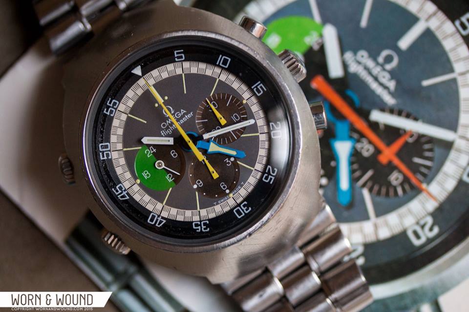
Edit: returning to look at the Flightmaster, it had the indicator coloured the same way as the current drawing. I presume it depends how you split the day into halves, following the numbers or the daylight. Do think that from 6 to 18 would make more sense myself, but then Eddie may well disagree - perhaps on grounds of aesthetics?
Last edited by Dark Side of The Loon; 21st May 2018 at 20:10.
I don't understand this, surely from 12:00 round (clockwise!) to 6 is surely day. It certainly is on the 5100.
As it is represents am/pm rather than day/night which should be divided horizontally.

Any chance lume can be added to the seconds hand(s)?
You can either have it as a AM/PM indicator (0 - 12 and 12-24) or day/night (6-18 and 18-6) depending how you print the subdial and apply the hand.
Eddie
Whole chunks of my life come under the heading "it seemed like a good idea at the time".
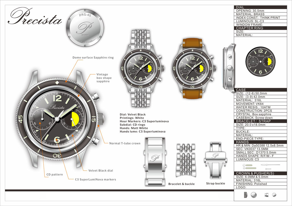
Sapphire bezel
Sapphire crystal
Amber subdial
42mm Case
Bracelet
All sounds perfect to me. I even like the idea of aged lume.
Personally I prefer the first images. I know the day/night indicator can add a bit of diversity and colour but really they're pointless; I always know whether it's day-time or night-time. For me it doesn't pass the 'so-what?' question:
Admirer - "that's a nice looking watch, what does the coloured section represent"
Wearer - "it tells me whether it's day-time or night-time."
Admirer - "do you often have trouble understanding the difference?"
Wearer - "er, no. Actually it is a bit pointless isn't it"
It's how I would feel anyway.
Might as well make some use out of the 24hr indicator, no?
I take it you won't be having one then :-)
Eddie
Whole chunks of my life come under the heading "it seemed like a good idea at the time".
id love to see a touch of red on there .
maybe on the subdial hands?
Good luck everybody. Have a good one.
I didn't say that ;)
I'd buy the first example in a flash, it's just the day/night thing I don't like.
Have you a rough indication on pricing, Eddie?
You wont get that until the day it appears in the shop.

Definitely drawn to this one, the amber sub dial certainly adds something and I like both the new clasp designs.
Have to say the day/night dial is a deal-breaker for me whatever the colour. It was just fine without.
As Dave says a splash of red, perhaps on the subdial hands even as tips to the hands (perhaps including the second hand) might work, but the iteration prior to the day/night dial looked great to me.
Last edited by SimonH; 1st June 2018 at 13:21.
I can think of several practical uses :-)
cave exploration, travel by submarine, space travel, as well extended stays in bunkers, or indeed wine cellars(!)
Gert
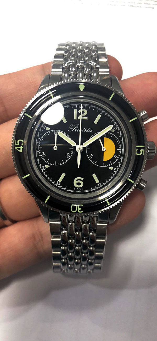
A quick and dirty phone pic of the prototype from the manufacturer. I should have the prototype next week and will post more pics.
Eddie
Whole chunks of my life come under the heading "it seemed like a good idea at the time".
I like this
'Against stupidity, the gods themselves struggle in vain' - Schiller.
Thats lovely!
Sent from my iPhone using Tapatalk
Looks superb!
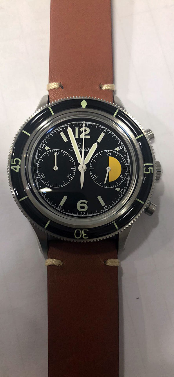
And on strap.
Eddie
Whole chunks of my life come under the heading "it seemed like a good idea at the time".
Very nice, although I am not in the market for a chrono, but I especially like the bezel, very Blancpain 50 Fathoms.
That really does look very special.
Lovely. But may i ask why the day/night quadrant is illuminating midnight to midday, rather than the more usual 6 am to 6pm?
The counterpoise on the second hand looks a tad large too.....
Dave
If it works for Omega, it works for me.
Eddie
Whole chunks of my life come under the heading "it seemed like a good idea at the time".
That looks incredibly smart
Interesting, fair point. Of course Mk 3 and 4 speedmasters shade the halves like i describe..........
It's largely irrelevant. If it was supposed to indicate day/night, it would have to change as the seasons change. In winter it can be dark from 4PM to 9AM whilst in summer it's 10PM to 3AM. As it is, it indicates first half/second half of the day.
Eddie
Whole chunks of my life come under the heading "it seemed like a good idea at the time".
Indeed. Its a chronograph, not a GMT.
'Against stupidity, the gods themselves struggle in vain' - Schiller.
 Posting Permissions