First rendition looks fantastic.
40mm, 1-12 bezel, no date.


First rendition looks fantastic.
40mm, 1-12 bezel, no date.

Hi Eddie,
I like the design a lot but would prefer the automatic Seiko movement. If needed I know someone with contacts.
The mecaquartz is nice but not a mechanical and I am not currently looking at anything non mechanical...
Originally Posted by Fuzuli

This.
Dave

The twin sub dial version is sheer watch porn, it's so hot it should be in the boys room.
Eddies second render of the two sub dial version is a big improvement, losing the tachymetre makes the design a lot cleaner.
Thank you Martin and Redhed for the scaled down to 40mm images, great effort guys.
Dave

Love The second rendering on the BOR bracelet. Looking forward to this one already.
Although I would also prefer a 40mm case size.

Likin this
Very nice, personally I like the original design the most, but its not clear what the profile of the crystal will be like. I hope it's domed, plus I would rather it was acrylic rather than Sapphire to be honest.
If you do opt for a 12 hour bezel instead, can we please have an inverted 6 instead. The current open 6 and 9 just does seem to be quite right imho.
Last edited by Andyg; 13th May 2018 at 07:59.
Whoever does not know how to hit the nail on the head should be asked not to hit it at all.
Friedrich Nietzsche
Personally I prefer the first images. I know the day/night indicator can add a bit of diversity and colour but really they're pointless; I always know whether it's day-time or night-time. For me it doesn't pass the 'so-what?' question:
Admirer - "that's a nice looking watch, what does the coloured section represent"
Wearer - "it tells me whether it's day-time or night-time."
Admirer - "do you often have trouble understanding the difference?"
Wearer - "er, no. Actually it is a bit pointless isn't it"
It's how I would feel anyway.
Might as well make some use out of the 24hr indicator, no?
id love to see a touch of red on there .
maybe on the subdial hands?
Good luck everybody. Have a good one.
I take it you won't be having one then :-)
Eddie
Whole chunks of my life come under the heading "it seemed like a good idea at the time".
I didn't say that ;)
I'd buy the first example in a flash, it's just the day/night thing I don't like.
Have you a rough indication on pricing, Eddie?
You wont get that until the day it appears in the shop.
Definitely drawn to this one, the amber sub dial certainly adds something and I like both the new clasp designs.
I can think of several practical uses :-)
cave exploration, travel by submarine, space travel, as well extended stays in bunkers, or indeed wine cellars(!)
Gert
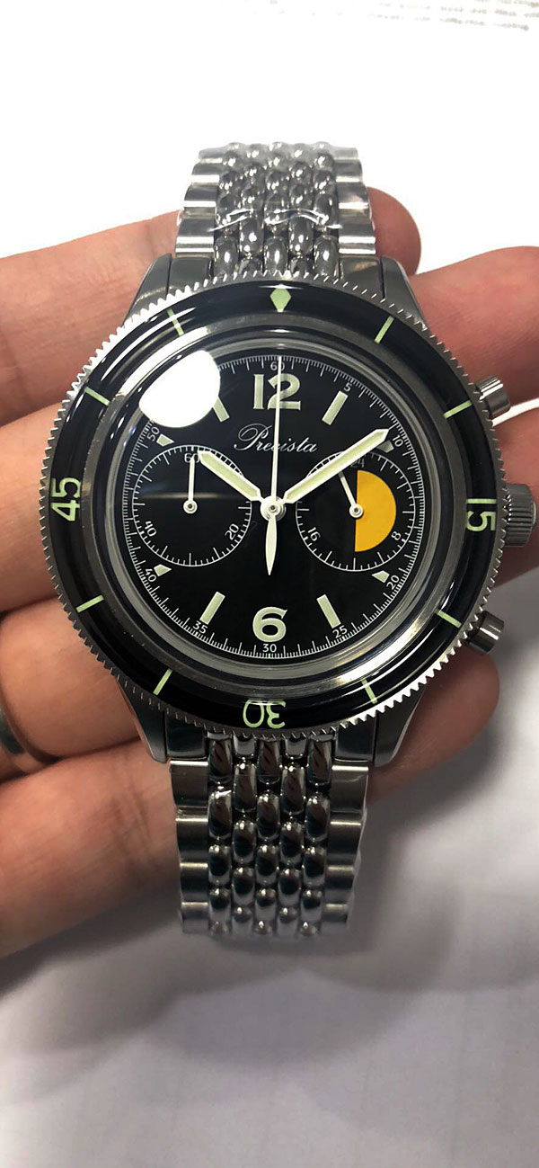
A quick and dirty phone pic of the prototype from the manufacturer. I should have the prototype next week and will post more pics.
Eddie
Whole chunks of my life come under the heading "it seemed like a good idea at the time".
Thats lovely!
Sent from my iPhone using Tapatalk
Looks superb!
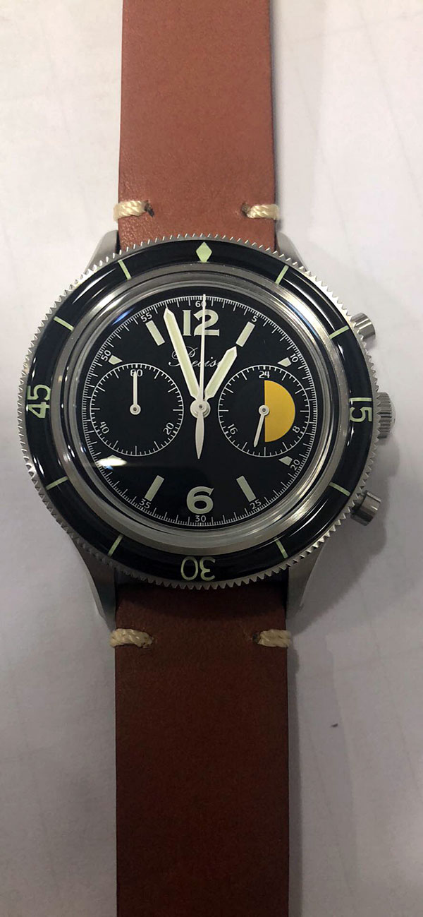
And on strap.
Eddie
Whole chunks of my life come under the heading "it seemed like a good idea at the time".
 Posting Permissions

 Reply With Quote