
 Reply With Quote
That is beautiful.
If the 40/42mm stands for two options, I vote for 40mm.
Not sure about the bracelet endpieces, though. Do you have a rendering from the side?


Eddie
Whole chunks of my life come under the heading "it seemed like a good idea at the time".
That is beautiful.
If the 40/42mm stands for two options, I vote for 40mm.
Not sure about the bracelet endpieces, though. Do you have a rendering from the side?
Very nice indeed, I like a splash of red. I'm with Raffe on 40mm being preferable if it is an option. Will be keeping an eye on this...

Could I beseech you to make a 36mm version as well, as with the PRS-29a/b?
Agree with above, a stunning looking watch, but if given a preference 40mm would be my choice.
Cor that looks nice
Bravo Eddie - not my usual style of hands but it works very well.
Another vote for 40mm.
And of course the usual question - possible release date?
That looks tempting.
That looks great. Can I ask how the dial will be finished - matte/silk etc? Lumed numerals?
Is that the date in that render positioned as if the case were 42mm? Would a black date wheel be appropriate to this style?
Love the case if 40mm. Needs a black date wheel, a longer seconds hand tail and a flat dial. Oh, and no duck face at 12.
Ta.
Needs a cyclops
Lovely modern fleiger, and deffo 40mm, not 42mm
Very nice! 40mm for preference, I wonder if the red highlights could be substituted with yellow? that might look quite nice too.
- - - Updated - - -
Very nice! 40mm for preference, I wonder if the red highlights could be substituted with yellow? that might look quite nice too.
I'm sorry Eddie but I'm going to go against the crowd.
I'm not keen on the red, the hands, the date position (although it may be better on 40mm) or the general design. It reminds me more of A Seiko dress watch than a pilots watch so the dial doesn't make sense.
With a plain baton dial and no date or red it would be great with either a black or white dial.
I like it. Would ditch the date altogether and have it at 40mm but the I'm nitpicking here.
Please Eddie a 'small' version maybe a 36mm.
I am down for one.
I'm sorry, but I don't like anything about it.
In my opinion, instead of a natural progression with the IWC theme.
Go back again, instead of forward, and have another play about with the MK XI design.
There's a gap in the market currently for another PRS-1 esque watch.
I think another visit to the MK XI would go down a treat.
I'd like to see different set-ups with blue script/markers, and also different hands - Those ones don't suit in my opinion.
Otherwise - a nice, clean design
Al

I'm definitely in the 'Baton Dial' camp. really like the case and bracelet and particularly where they meet.
Lose the arabics and i'd probably buy one.
I love the hands. They are going to be mega legible.
Agree that the date wheel should be black background or not at all.

I like it and would be happy with either 40 or 42mm. The bracelet looks like a step up.
I must agree I'm afraid.Originally Posted by Kiki Picasso

A combination of red white and black is always a good idea and whilst my head says there are too many obvious cues from other watches, I do like it very much.
One innovation i'd dearly like to see for this iteration is two sets of lug holes. One for the bracelet; one for a strap.
Nice. A black date wheel would be good and I'm not sure about the funky end links.
Too much red, and watches don't need anything but batons for hour markers imo. The end links are also a bit odd as memtioned.
I join the 'skip the date ' camp.
Someone who lies about the little things will lie about the big things too.
I like it a lot albeit would prefer numerals all round.
White or silver dial options, and drilled lugs?
Spot on Dave on all counts.
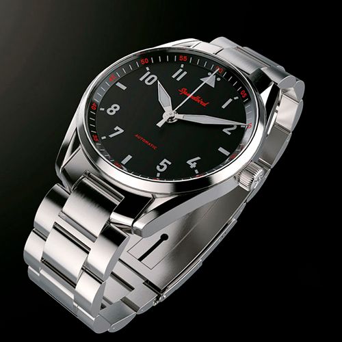
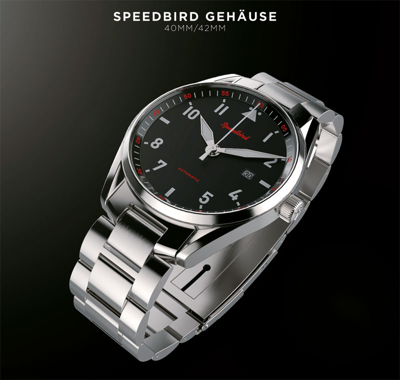
This is the first rendering. I gave a very loose brief to see what they would come up with as a starting point. I'm not sure about the red, the date wheel should be black, I'd prefer the bracelet from the SB3 and it will be 40mm only. I'm sure there will be more changes.
Eddie
Whole chunks of my life come under the heading "it seemed like a good idea at the time".
Very nice. A normal sized version 36-38 would have been good but I might just manage a 40.
I agree with the comments on the red and think with a bit of tweaking it could work very well, I look forward to following progress.
I like it, but the red numerals are just a bit too busy. One of the great things about the Speedbird is its clean, uncluttered dial.
I like that very much.
At last a thread in the TF forum to get our teeth into! The magic started by Swanbourne thread...
This looks promising! I'd really want it without a date though.
It looks nice and slim - very much like the Railmaster case with turned lugs.
That does look good. I would suggest lumed numeral/indices if possible.
Also with such a small date window, white numerals on a black background would look much classier.
40mm for me also.
-- Tim
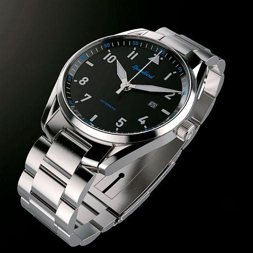
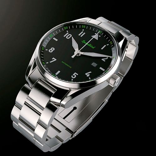
Here are a few colour ideas... plus how it might look with no date. Could be easy to do a few versions of this one Eddie, as you have done previously?
No date
Simple white, then some colour variations

I quite like the yellow.
Looks best in white though I think.
I also would prefer numbers 20-40 to face in towards the dial... another little OCD element that annoys (me of course!)
Cant lie i really like it. I would say black date wheel as that's what i like about the others
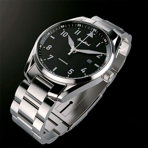
Here is a mock-up black date

I'll take the no date green please, where do l order??
Anything in 40mm or smaller diameter is most welcome. I really like the case
As for the hands and dial, I think they're a bit meh. It seems to me that the design is a tad generic.
Maybe with a some tweaking it could be more recogizable - for lack of a better word.
As this is still a very early stage, I'll be interested in following the development of this project.
I really like the lugs, which may or not officially be bombe. The lug-less, signed crown appeals, as does the black date, the hands, chapter ring and bezel.
I'm not so keen on the red marking, that green is nice, or the end link.
I'm making all sort of assumptions from a position of ignorance, but how about dispensing with the bracelet altogether in order to maximise the head, e.g. up the grade of the movement assuming ETA, sapphire crystal etc. because with those lugs there's a touch of the Speedy / Omega about it and we all know how well they work with a huge range of straps, bracelets. Leave that to the punters.
It looks good though.
Cheers
David
Yes. That's great looking.
Loving the white text render. White text and no date would be my preferred design. Really like the lugs.

as someone who loves the speedbird range, especially the mk3 (you need to make more by the way) . I feel the red numbers are a big no no, as is the shiny or polished case, for me it needs to be bead blasted matt case. Agree that this looks to dressy, what about a sinn 656 look, 12,3, 6, 9, numbers only, very legible or better lume, 200 meter waterproof and anti magnetic shield of mk3, i would buy that mr platts.
You could get two watches out of that; one closer to the previous Speedbird and one closer to Grand Seiko.
Both would be nice and could, in theory, use the same case.

Personally I prefer the Red with black date wheel. What thickness?
For me it looks a bit generic, non-descript. Too big, even at 40mm, the date window far too inboard, betraying a case far too large for the movement. The red colour accents are naff. If you wanted a bit of colour, then you could do a lot worse than ape the colouring of Jocke's latest Glashutte (see WT).
Sent from my XT1572 using TZ-UK mobile app
 Posting Permissions