Reply With Quote
I think sales are down down down. They needed to amortize the cost of that movement.Originally Posted by markrlondon


They had to do something to raise the price by a grand.
I think sales are down down down. They needed to amortize the cost of that movement.
According to this: https://twitter.com/James_UKWatches ... the rumours did materialize:
Anyhow, so far only the blue AT is to my liking. I certainly did not enjoy the asymmetry/ crown guards of the previous model. The new one is perfectly symmetrical and almost 1mm thinner (now it's 12,26 according to the WUS thread). I have no preference for vertical or horizontal lines, so that's not an issue for me. The new crown is also somewhat more interesting.
Cheers,
Christian
Last edited by Wooster; 22nd March 2017 at 17:30.
If you are referring to 02 instead of 03 then that is explained in the reviews- movement name change

This would be so much better on an Oyster bracelet:

I'm looking forward to seeing how large the BB41 wears on me...
What size wrist do you have? Mine are slim and I can manage an Explorer at 39mm. I think the extra 2mm on that style of watch would tip it over the edge for me.

Having spent the afternoon having a good slow look at all of the new models and without sounding negative I don't think there's anything there that particularly exciting that would make me part with my money personally. The Seadweller is the pick of the bunch, a little bit of a shame it has the cyclops a real break from tradition I think that Rolexes steel sports models like the subs are deeply embedded in historic content and the Red writing is a tribute but the cyclops is a modern twist too far for that model.
As with all things whether it's cars, watches, motorcycles every year it has to be more advanced new are brighter faster sharper but we all anchor after the real classics. I take a DB4 over a DB 11 any day of the week and I rather be in an E type jag than the Jaguar F pace but I can't deny that both of them are simply sublime
Instagram @blowersmayfair
Last edited by 100thmonkey; 22nd March 2017 at 17:57.
RIAC
6.75... so the early 2000's Railmaster fills my wrist really. I am assuming it will look like a plate on my wrist.
What a poor 2017 all rank, looks like the designers have gone home.
Rolex buys Breitling? ;-)
I wasn't aware that sales of the Sky-Dweller were down.
It was rather expensive, I guess, and complications are possibly less popular at the moment.
Seiko have by far the nicest offering IMO. That 62MAS and the GS 3 hander above are both stunning.

...and take 1-1.5mm off that oversized bezel all round, and you'd have the perfect size and proportions.
I have to agree..
Sent from my iPhone using Tapatalk
I don't have any inside info, but among my extended circle of collector friends there are probably 20 day dates and... zero skydwellers. It's really large and thick.
That GS three hander looks like an original vintage watch to me, too much wear, scratches on the indices etc.. I wouldn't be surprised if they reissued that one but I don't think that's it, correct me if I'm wrong.
Is this a special edition or a different size? What size is it?
QUOTE=-Ally-;4290112]^
[/QUOTE]
42.2mm, white gold, not steel
http://www.patek.com/en/mens-watches/aquanaut/5168G-001
Just seen 42mm in white gold
[/QUOTE]
Would look good without the Pokémon ball on it!
Sent from my iPhone using Tapatalk
It's nice, but it's VERY thick Oli
Should have read the whole thread :)
That Club Campus retails at £1100, so if you can show me the old one for £100 I'll take a few!
That is a cracker. Unfortunately it will have a price tag to match!
Sent from my XT1580 using Tapatalk
Seiko's prototypes always have the hands showing 8-9 past 10. Watches with date always show 6th.
See current stock pics: https://www.seiko-watch.co.jp/collections/en/gs/
So must be a new model. Non working prototype.
Last edited by Toshk; 22nd March 2017 at 20:42.
Another limited edition of the BP FF that's 40mm........If only they'd do the base model in this size I would get one. Sadly, this is like the other one, will be way out of my price range. Grrrr
Sent from my iPhone using Tapatalk
Sorry, I misread something earlier on their pricing
In fairness the new Club with the Neomatik movement have increased to ~£2300 so, yeah, about a grand-ish. The one previously posted though is the new Campus model with the Cali dial that, if you believe the press release, they are "subsidising" to get it to the price point it's at.
Unfortunately neither solves the issue with the long lug length which ruins the watch for me. Otherwise a manual wind datum would be my daily wearer for a long long time.
That's the one I was reading about (Club Neomatik 200m)
Yep. I like it, new movement, proper WR...just the lugs. A real shame.
Almost every watch ever photographed has the hands in that position - they must all be Seikos!
Really liking the blue dial SkyDweller
Check both the GS and 62MAS from today. Even the seconds match.
Any more photos of the 62mas?
Sent from my iPhone using Tapatalk
This is rather nice:
Me too. That watch wears large though. It's a big thick 42mm.
What is that circular thing? It says it's a water tightness indicator?
Sent from my iPhone using Tapatalk
Total dumbass question... but... what's the thingy for?
I actually really like this one!
Sent from my iPad using Tapatalk
Interesting the 62MAS re-release seems well received here...
I think it looks very poor compared to the original. The original is such a beautiful watch and they got the Lume markers so right on that watch. The new version doesn't even look a tenth the price it's listed at. $3800!
I would say it looks like the 62MAS replica dials you can get for the 7s26-0040 but It's not even that good.
I don't really get what has happened where it's considered fine to see a cheap looking Seiko sorts watch in steel on a rubber strap for $3800. And I'm a huge Seiko fan and have a large collection of them.
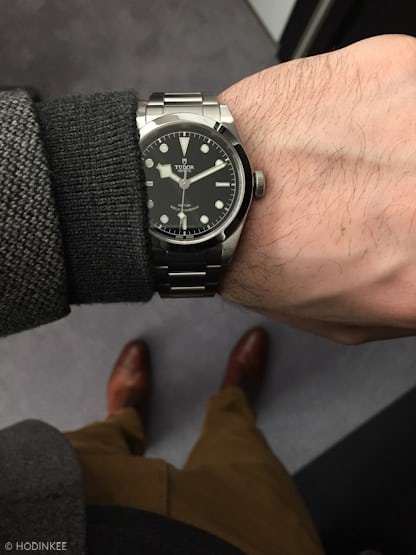
So... still no GMT from Tudor?
Is it just me, or has the best release to date been the new Oris Chronoris Date?
A cracking looking watch and a good price to boot!
https://www.hodinkee.com/articles/or...te-introducing
Confirming the rumors on Grand Seiko:
http://asia.nikkei.com/Business/Comp...n-Swiss-rivals
GS logo at 12, higher prices, 3 year guarantee, first GS historical model re-release, new sports watches, more ladies watches.
Not sure about the 'higher prices' part, unless western AD prices can be brought in line with import prices - particularly for 9F models, unless they develop a new movement. But I guess it's the lesson Omega learned, compete on price and you're perceived as a lesser brand. A pragmatic decision on the logo in the end too.
Some of the military issued versions used to have a disk in the same position that changed colour if moisture entered the case.
It looks as if they have replicated this disk.
GS divers.
Catalin
I would have gone for GS on the Dial or Grand Seiko but not both...
I'm inclined to agree, they are doing a bit of a Squale doubling up. Not a deal breaker though.
It's true, there's still a certain amount of repetition. I'm hoping that the dressier models just use the Grand Seiko writing in the manner of the first GS that looks like being reissued.
As for those divers, pretty ugly to my eye, those hands look like Swiss clock towers. But chronos and divers have never been their strong point, for me at least.
Grand Seiko novelties here - click reveal entire thread to show all the photos.
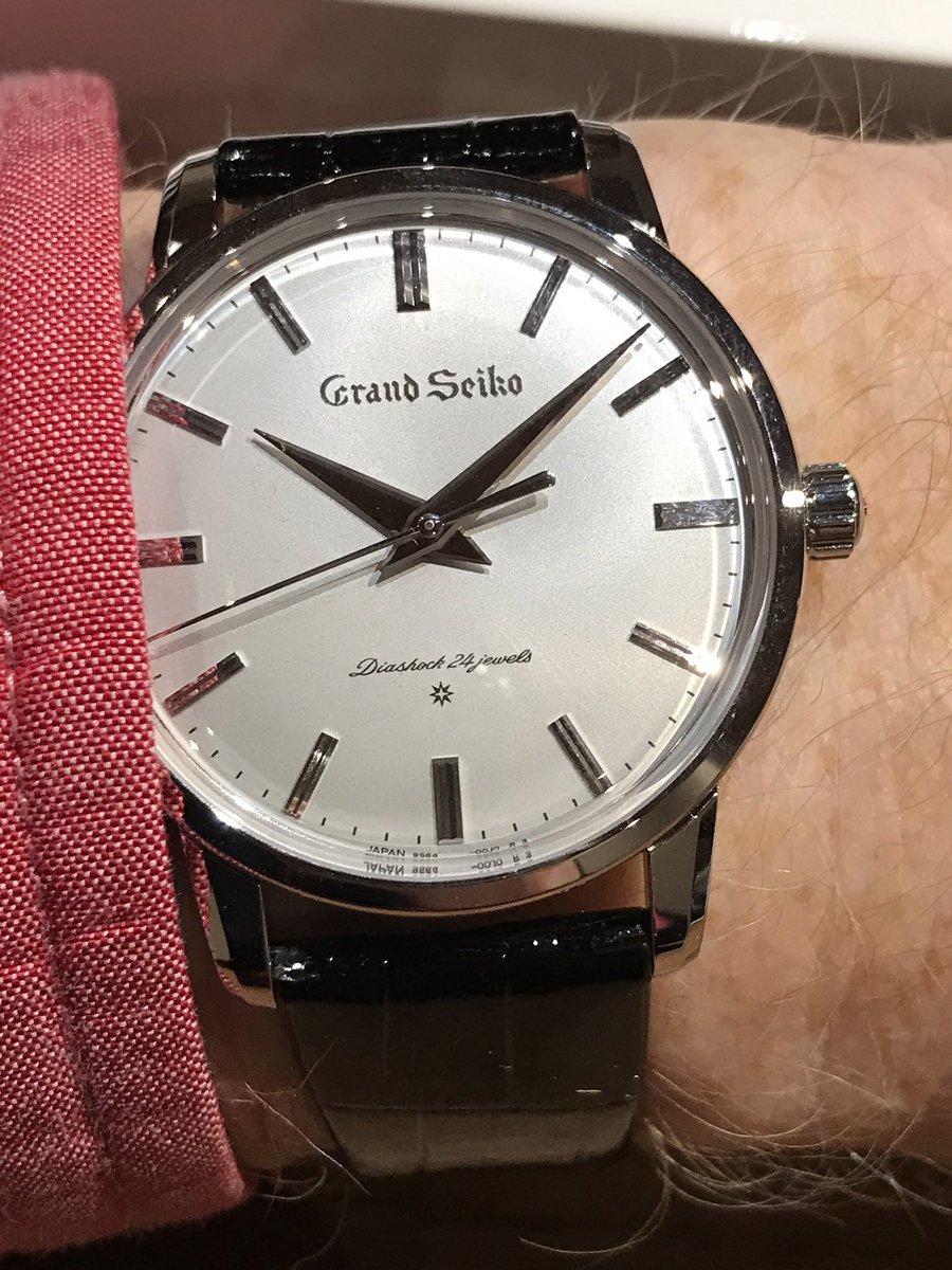
First GS re-issue as expected, platinum, gold, stainless steel. Plus a modern makeover. And some weird ceramic shenanigans. Does the new logo make the dial feel ever so slightly unbalanced? Otherwise the change doesn't feel too dramatic really.
Last edited by Itsguy; 23rd March 2017 at 11:19.
 Posting Permissions