Reply With Quote
Just looks like a mash up of whatever parts were left over!!??Originally Posted by Inq24

Sent from my iPhone using Tapatalk


God it's ugly and huge... Parts bin special?!
Catalin

Just looks like a mash up of whatever parts were left over!!??
Sent from my iPhone using Tapatalk

Sorry, I don't have anything witty to say about the expansion of the BB range, but I am wondering which movement they'll have used to get the 45 minute chrono register?
think they missed the boat with this chrono it shouldn't have round indices and those hands,much prefer the old Big Block chrono
It's the new in house colomn wheel chrono caliber.
Catalin
That Tudor is a complete dogs dinner.
It's in house and not modular, so that bodes well for the future. Don't like the design though :(
Sent from my iPhone using Tapatalk
That is truly awful. All of it.
That snow flake hand does not work.. surley you need a thin hand so as to not obscure so much of the sub dials?
Yes, but Tudor is a fashion brand now. Function is low on the list of priorities.

The new Paul Newman Daytona in 40 years? :)

Don't understand why they had to use snowflake hands, it blocks the subdials. It's a real shame considering its on a brand new inhouse movement.
Sent from my iPhone using Tapatalk
The crown and the pushers dont seem to match either for some reason....
Catalin
Last edited by Inq24; 21st March 2017 at 22:16.
simply awful!
Will be interesting to see how much hype HODINKEE give it. Positive spin because it's Tudor.
Standby for an almost panda dial next year, then the PVD version. I think the loss of David Cerrato is leading to a lack of ideas and direction over at Tudor, which is a bit of a shame as I love my Blackbay. And that denim strap is flipping horrible.
They whored up the Black Bay line in every way possible: bronze case, larger size, numeral dial, and now, a franken looking chronograph...
Catalin
Whatever the design, the innards gives some hope of interesting stuff going forward
D
Sent from my iPhone using Tapatalk
I actually like the Chrono on the strap and would prefer it to non ceramic Daytona
Those guts could eventually end up in all of of Tudor's Chrono's, creating a kind of "reboot" of its chronograph models.
Last edited by Operation Grandslam; 21st March 2017 at 22:58.
I have a white dial DaytonaC already.
That Tudor is utterly fugly, a total Omega rip off.
While I don't like Omega per say, I would buy one everyday of the week instead of that thing.
I don't mind the look of the Tudor chrono on the strap. Bit big though.
Interesting that the new steel black bay with a date is still 41mm . I though it was going to be a steel version of the bronze. That must still be to come.
Supposedly in house and integrated. Kudos for that. Dogshit for every other part of the watch.
It's the chronograph for the person who doesn't use a chronograph at 3 or 9 o'clock.
I actually don't mind the look of the Tudor chrono but it is too big.
There's something going on with Tudor and it's not good. This BB looks a little better than the chrono though...
Catalin
I think this looks alright, but it feels like Tudor is moving back towards the sort of designs that failed for them last time around (thinking hydronaut era)

Omega Speedmaster 60th Annerversiy

2017 Railmaster and Aquaterra
Sent from my Pixel using Tapatalk
Where are you guys tracking the new releases?
Agreed btw, the new chrono looks godawful on the bracelet although I must admit it's less awful on the strap. Either way snowflake hands on a chrono are a terrible choice...
New Oris Chronoris, I kinda like this one and the 39mm case means it will wear ok.
Catalin
Breitling navitimer rattrapante...
https://youtu.be/ppTNuoZqP0I
That new Railmaster is weak. Very disappointing.
Sent from my iPhone using Tapatalk
I think that is the LE, at least two more versions are going to be released according to a post on the omega wus forum.
One of the non-LE RMs has a lollipop hand and 2 stick (non-broad arrow) hands.
The other non-LE has a silver/gray kind of vertical brushed dial (avail on NATO).
Catalin
Last edited by Inq24; 22nd March 2017 at 09:27.
I get companies making new watches that are a nod to the past, but I don't get them also thinking they have to make the watch look like it has "aged".
Sent from my HTC One_M8 using Tapatalk
I have to say that looks pretty cool.
Sent from my iPhone using Tapatalk
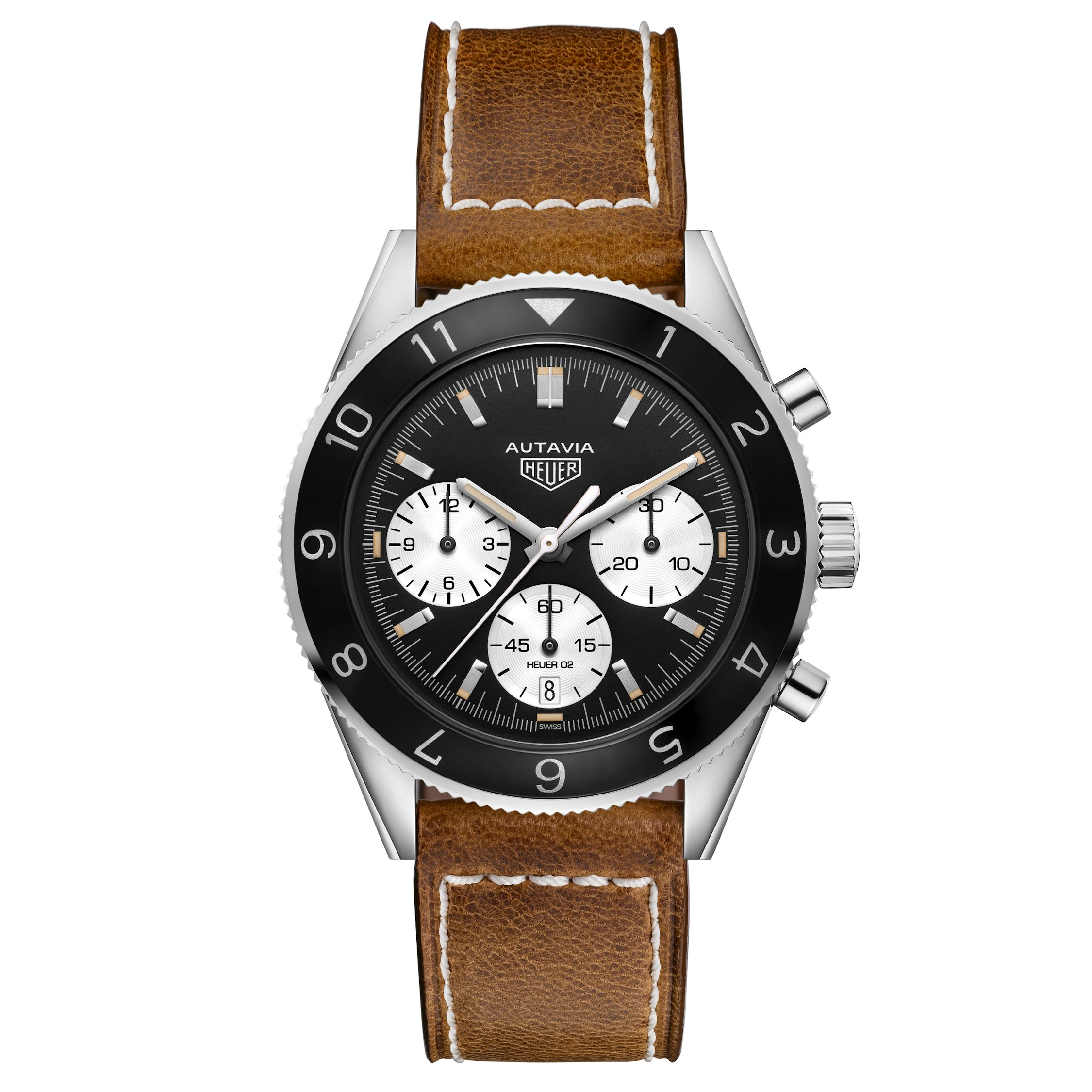
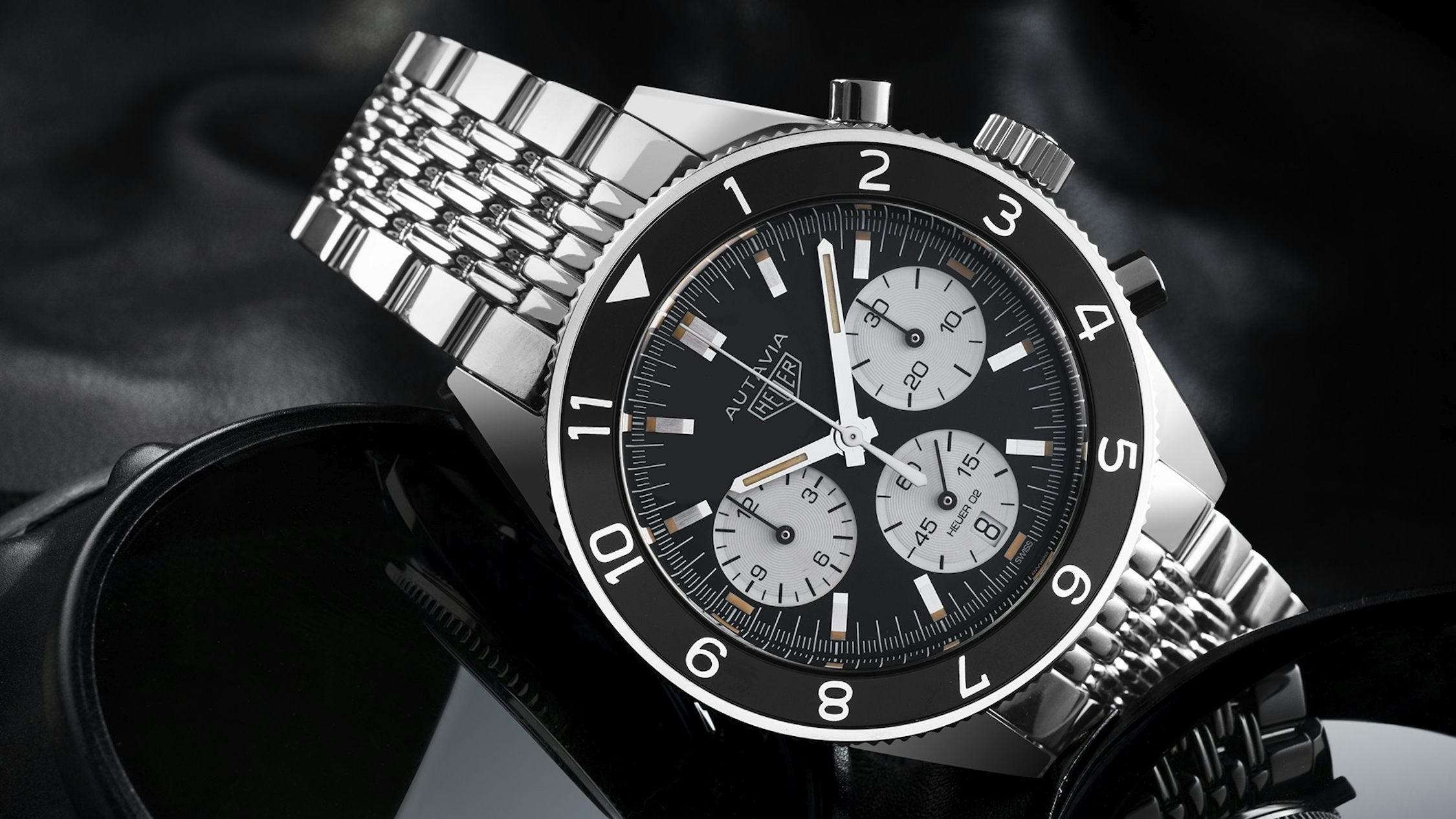
Other than the hint of faux lume, to me this is an outstanding release.
Courtesy of hodinkee
I feel really underwhelmed from what i have seen so far.
Nice Autavia - I like that, and better imo than Omega's efforts (so far).
I wonder how long before they notice the mistake on the minutes subdial?
At least they have ditched the smiley face...
what's the mistake sorry i can't see it!
Sent from my iPhone using Tapatalk
You can't track the minutes between the 5min intervals?
Catalin

Isn't that a joke, 8 instead of 30.
Confused too: assume the right hand sub-dial is minutes, same as a Speedy. In that case, the markers between 0-5 are showing 2.5 mins and between 10-20 are showing at 7.5 minutes etc.
Last edited by tom waring; 22nd March 2017 at 11:10.
Lovely, gives the Speedy Tuesday a good run for its money. Slight shame about the faux lume which seems to be becoming the new standard though.
What is the case size? [EDIT] 42MM. Same as the Speedy but I suspect this might wear a little larger.
Last edited by Tetlee; 22nd March 2017 at 11:08.
What's also ridiculous is that when the prototype was given to a bunch of people to play with a few months ago, none of them reported it either. Will be interesting to see shots of the actual watches at the fair.
 Posting Permissions