
 Reply With Quote
I have the same on a Archimede Pilot. I know it's so it's lined up with 4:30, but I'd prefer it to be 2/3 degrees difference and not trimming the top of the 5.Originally Posted by asteclaru


Agree. I would love a ND SeaDweller.

I have the same on a Archimede Pilot. I know it's so it's lined up with 4:30, but I'd prefer it to be 2/3 degrees difference and not trimming the top of the 5.
IWC 40mm 3239 - the oversized crown guards, which blend in with the case / bezel from head on creating a 44mm mis-sharpen lump of steel. Certain GS have the same issue due to the polishing, while it's not an issue on sports Rolex.

This not being a 3, 6, 9 dial. Would've nicely filled the hole left by the Explorer's recent swelling:

Interesting, I'm currently torn between an SUN025 (which I fear will be too large for my wrists) and an SARB017. A GMT would be useful as I travel with work, but then I have an iphone (sorry, just facing facts!). I had thought of using the compass bezel as a sort of substitute for a GMT hand.
I found that the bezel turns too easily on the Alpinist (had it twice but couldn't get past the bezel). Good excuse to buy a dedicated GMT watch though! Ever considered a world time watch, maybe a Citizen?
Subtle real subtle!
Thought of another one
The WR on a Speedy Pro.
It would be Sooooooo easy for Omega to make the Speedy Pro 100m WR, then I would buy one.
It is the only Lemania-powered icon I have no plans to own, for that reason (well, if I am honest it is also because everyone thinks I should own one, and I am contrary like that).
D
So every Spring Drive should be made as manual wind only?
I suspect your idea needs further contemplation and refinement.
Been there! It was too fiddly and fragile...
Sent from my iPhone using Tapatalk
Was it anything like this?
The crown isn't screw down and the folding part of the bracelet isn't the solid type but other than that I thought it was very solid.
Edit: Sorry I just remembered it's a second time zone you want to track and not completely change to a different time zone.
People that do not like Roman numerals. Why? I like them.
Power reserves. I don't like them. Because I think they take up dial space for no good reason.
Sent from my SM-G935F using Tapatalk
Last edited by sammyl1000; 10th January 2017 at 19:57.
I couldn't agree more, and I owned a BLNR for a year before it struck me (when trying on an older 5 digit reference Explorer ii) - it was the death of the whole range for me!
SEIKO ... written 3 times, in 2 fonts and as an initial letter
SPRING DRIVE ... a foolish term, because almost all mechanical watches are driven by a spring ... here in another font, sans serif
GMT ... with serif
And, finally, another font for the writing around the 6 index
What a mess!

No Date on the cosmograph! Got to have a date for me.....
Watches with MASSIVE crown guards are a turn-off. They may, on occasion, be functional but just not for me.
I also agree with all those below who dislike power meters.
I agree most seiko's with serifed fonts look kak just because of that otherwise they'd be nice watches - times new roman belongs elsewhere!
Roman Numerals
Overly fussy dials
My wrist size
Unfortunately for me a lot of modern watches, that I like, swamp my small wrists. I'd love a Seiko Tuna, but 6.2 says no.
Having said that I can look at a lot of vintage pieces without worry.
Sent from my HTC One_M8 using Tapatalk

Agree with all your points Tink, some shocking design there.
Add in of course that awful scar-like power reserve dial.
Cheers,
Neil.
To me, that seems like one of the better examples of typographic competency out there, and it has some obvious attention to detail. Breguet even went to the trouble of matching the date wheel to the dial, which very few bother to do any more.
It's far from being a mess compared to most chronographs of this style. While there's some (desirable, IMHO) variation in the elements, they integrate well, and it's leagues better than the lazy Windows-default crap that's too often seen from companies that really ought to know better.
Speaking of which, here's what a true mess of a dial looks like:
:)
Cant stand Faux patina. If they removed it alot more watches would make the short list. Like the JLC Deepsea boutique edition, Tag Heuer Monza PVD, LH Pelagos with Beige markers.
How did it take until post 48?
Mercedes-Benz hands for me to.
Oyster bracelets or whatever there called.
Even though I am forgoing it on a few watches. Of course always around on a Rolex though.
Also bezel watch surrounds the look like a spring has been wrapped around it.
^ coin edged bezels (the spring looking ones)
Actually, I've come round to your way of thinking in the past couple of days. It almost should be a mess, but it manages not to be.
As for the Patak, I've never noticed the reduced size of the 5 and 27 before. Probably related to never holding one, but I do think that would annoy me every time I looked at it.
Well yes, Seiko are clearly utterly incompetent. That's why no-one buys their watches. They need some designer with your skills and then they might sell a few.
Uhoh. Overly defensive owner alert.
I have returned two brand new Rolexes to ADs because there were obvious differences in the widths of the lugs - visible to the naked eye and measurable with a digital caliper. A lot of others I have seen in ADs have the same problem - it is particularly noticeable on the 36mm DateJusts and OPs. The cause is apparently the hand finishing - but for £4000 plus I find this unacceptable.
Right hand lugs are usually thinner on Rolex / some tudors. It's just the case shape.
Top right can occasionally make a person very twitchy indeed ;)
Don't know about the ceramic or supercase sizes but it's certainty true of the older models.
Anyway. Came to add Roman and Arabic numerals.
PCLs on so many of Rolex's current range are a massive turn off to me.
Most Nomos watches have one feature that puts me off - the thin lugs and wire lugs on some really bother me.
The polished section on the Grand Seiko bracelets is annoying. I have a speedmaster with a similar bracelet and I really don't like it.
Sent from my iPhone using Tapatalk
I've thought of another one. The A. Lange & Sohne 1815 Up/Down. A beautiful watch, except for the unnecessary GANGRESERVE text. It destroys the symmetry of the otherwise perfectly proportioned dial, and once you see it, it can't be unseen. In short, it's a monstrous carbuncle on the face of an elegant friend.

This week I have been wearing my 16700 GMT Master and I do find the crown rather small.
I'd prefer it if it had the same sized crown as the Sub but I'd guess the smaller case and gap between the GMT's crown guards would make that impossible.
Last edited by Shakespeare; 12th January 2017 at 00:18.
I dont understand the dislike for Roman numerals. Why do people hate them so much?
Sent from my SM-G935F using Tapatalk
Snowflake hands
I understand the right hand lugs were both equally thinner on the old models to balance the crown aesthetically, but on brand new models a lot of watches I have seen have one random lug or often the top left and bottom right lug much thinner than the others.
The subject of the thread has flipped over from watches that you almost like but for one detail, to the usual list of betes noires.
Now it has been pointed out, I can't warm to the SMPc due to the painted index marker next to the date, when the others are all applied.
Did this occur on any other Rolex models?
Please remember the title of this thread: "Watches you'd like if it weren't for one detail."
I admire Seiko watches and I'd love to have an automatic (but not 'Spring Drive') Grand Seiko. Sadly for me, however, the hotch-potch on the dial stops me.
(I suspect that Japanese designers would do a much better job in Japanese.)
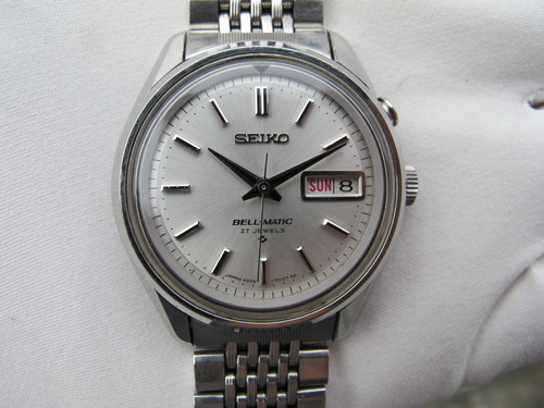
In contrast to the Grand Seiko above, the script on my old BELL-MATIC is quite elegant.
SubC Date fractionally different but again visible to my eye.
Taking a dislike for the text on a modern Grand Seiko doesn't imply a sweeping disdain for Seiko if what you really want to see is something like this:

Tudor Heritage Chrono, who decided to do pushers that have to be unscrewed? I love the watch but that detail is just poor and is the one thing that has stopped my buying one :(
Elegant, too.
Sinn 556 - 'Automatik' in German, and 'Made in Germany' in English.
That's a common sin committed by Sinn
The U1 is the same
I find this to be a huge usability fail. But I still like my Arktis :)
Sent from my iPhone using Tapatalk
Outside AR-coating.
Tudor dive watches
if they were 1-2mm smaller diameter and thin enough to fit under a cuff then i would probably be wearing one right now.
I'm not quite sure what you mean by '..it's so it's lined up with 4:30', but I thought the reason why the window doesn't fall exactly between the 4 and 5, is that the date wheel is slightly too small for the case it's fitted in.
It's one of my pet hates and you see it a lot on budget boutique divers.
Gary
German-manufactured products have been marked "Made in Germany" since 1887, even the domestic-market-only ones. There's no "Hergestellt in Deutschland" label.
 Posting Permissions


