
 Reply With Quote
I've always suspected that Orient Star's sales are half driven by people just wanting to avoid the Orient logo.


I hear many nice things about Orient Watches and how they are value for money especially for new watch enthusiasts like myself. But there is something that somehow puts me off buying an Orient Mako.
I have pondered for while and have realised that what actually holds me back from going for an Orient, especially their dive watches, are their logo and their cluttered dial.
Their current logo/trademark of two lions holding up a crest, doesn't make sense. They are a Japanese company, but the logo is trying to be European. Can't they be proud of their Japanese identity and heritage?
The dial uses too many typefaces:
1) The Orient brand name
2) the cursive typefaces of "Water resist" and "Automatic" which all look seemingly archaic and dated
3) the Typeface for the depth limit
All these different typefaces clashes with each other and adds mess to the dial that is already cluttered by having the day/date displayed. In my opinion, these chaos on the dial, makes the watch look less premium (I know that it is not) and gives it a bit of bargain-bin feel to the watch.
I am not sure if actual owners feel the same. Whenever I see a photo of the Mako and imagine myself owning it. I probably thing to myself, You would have to look at the dial everyday noticing the chaos of the logo and the fonts sub-consiously thinking "Oh I have an Orient Watch, why can't I afford something more fancy", Instead of "Hey my watch is an Orient and although it is not a fancy Rolex or Omega, it looks premium and I am proud to wear this" (When proposed changes have been made in this case).
I know my so called complaints about Orient Watches may seem shallow but these simple changes can really make a big difference to the look and feel of their watches, most especially the Ray and Mako. It will make the consumer feel they are getting more out of their purchase.
I would like to suggest to Orient to make some changes to improve their branding and imaging focusing on more modern asthetics, Japanese heritage and practicality.
My suggestions that they need to change on their watch dials:
1. Use the typeface of the Orient brand all through out the dial.
2. Change their confusing logo to something makes them show that their proud of their Japanese heritage. Like a using a Japanese Lion icon instead of the medieval style crest. They are Japanese and not European afterall.
3. Probably they should consider changing their Brand to "ORIENT WATCHES COMPANY 1950"
4. They should proudly state the model name like: "MAKO MARK III"
5. They should also proudly state the movement they are using as it is in-house. It should appear on the dial "CALIBER F6922"
6. Instead of showing "Water resist 200m". They should just say "200 METERS"
7. Lastly, they should (proudly) state that the watch is MADE IN JAPAN in the same manner Swiss Made watches are indicated.
I hope you are listening Orient. Please consider my comments. Thanks!

I've always suspected that Orient Star's sales are half driven by people just wanting to avoid the Orient logo.

The logo is a bit cigarette packet for me too but ...
"The left lion in our company's facing-lions symbol mark represents our company, and the right lion represents our dealers and partners. The crown in the center represents our customers [...] Because none of our competitors use a symbol mark with this type of motif, I personally think it is extremely stylish" -Jun Watanabe, president of Orient Watch Co., Ltd.
From http://automaticwatchlovers.blogspot...t-logo_09.html
Also lions feature all over Japanese and Asian culture, eg https://www.tofugu.com/japan/japanese-lion-dogs/
Paul
Orient are a pretty obscure brand in the West.
I suspect they know exactly what they're doing and it's designed to appeal to a different audience...
If they wanted to become a bigger player in the US and Europe, you may well be on the right track, but I don't think that's what they want.
M.
I completely agree, they make some potentially good watches but I've always been put off by that ridiculous shield. Presumably they are trying to appear more European to a far Eastern audience? I've learned to love the Grand Seiko gothic font, but a man has to have limits.
Not so sure on the suggested logo though, for me just writing ORIENT would more than suffice, it works for IWC (unless they want to change the brand name, which wouldn't hurt). And now on to Tudor - they've got two logos and a brand name, and all three are rubbish! And of course Tag-Heuer, one too many brand names and another rubbish logo. I see a pattern forming here - shields and watches don't mix.
Last edited by Itsguy; 27th April 2016 at 14:51.
I have to disagree with you on this. Having bought an Orient Mako the other week because I liked the look and the layout of the dial. It is neat and tidy and easy to read - IMHO.Originally Posted by epicunderstatement

free picture upload
free image host
click image upload
The dial colour is stunning and shimmers in the sun - I tried to capture a little of that in the final image above. Yes, cheap if you want to use that word or exceptional value for money. Mine was £95.00 inc RMSD from SC and it hasn't been off the wrist since. In fact after a few days of ownership I sold my Speedmaster Automatic as I felt that I no longer had room for it.
The build quality is equal to the likes of Steinhart and all in all it is an excellent watch.
"People who wear them are poor" - I don't share that view at all. Having owned a DRSD it is lovely to not have to worry about insurance, servicing (cheaper to just buy a new one), not worry about scratching or denting it or even losing it and you are unlikely to be mugged for it.

Have to agree the typeface and crest on these otherwise-good-looking watches has put me off these in the past, and would again.
I don't think so - are they? Distribution in Europe is not exactly widespread.
If you want an austere, Swiss-German brand with a simple brand design, then plenty of Sinns and IWCs etc are available. Orient isn't in that market. Also what is wrong with the name? What would they change it to - Seiko? If that's what you're after, why not just buy a Seiko!Not so sure on the suggested logo though, for me just writing ORIENT would more than suffice, it works for IWC (unless they want to change the brand name, which wouldn't hurt).
...but what do I know; I don't even like watches!
I would mostly agree. However on the Bambino the logo works for me.

If the changes were made on the Mako III:
http://s32.postimg.org/npju43lv9/ORIENT_Mako_III.jpg
Surely those involved in medieval reenactments dont wear their watches whilst play fighting?
Thatd be totally against befitting of the time period's costumery, and charged with bringing the whole thing into disrepute.
Let me try to post this again.

Last edited by epicunderstatement; 27th April 2016 at 16:21.
I agree that it actually works on the Bambino, especially the script typeface. This is because the Bambino is a dress watch and the script typeface is definitely not out of place.
The Mako is a sports watch, casual and rugged so in its case, the script typeface is definitely out of place.
Personally, I wouldn't want the essay on the bottom of the dial...
And, whilst (ignoring the verbage) it's taken away anything that might offend, it's left a dial as bland as dry porridge...
M.
I've had a couple of Makos and didn't find the dial cluttered at all. I sold them because the day crown was too pronounced and the bezel awkward to operate.
I see the new Mako has done away with the day pusher, but is the bezel any better?
It is because it is missing a logo? Or the typeface is bland?
Both I think - Or at least the lack of a logo means there's too much 'bluespace' whilst the typeface looks (as it is, of course, and that may be the problem) like you've just pasted it in with an image editor.
Again, though, I think you're missing the point of Orient - It's NOT for Westerners bought up on a diet of cold and clinical, it's for an Asian market who think their watches looks 'Western' and classy, even if that's now 30 years (or more) out of date.
If you want a watch that looks that sterile (or has that much writing on the dial), take a look at the Tudor range...
M.
How about this? With a different logo.

There you go, fixed that for you....

I was nodding in agreement with this. I live in Thailand and Orient are very popular here. I think the Seiko connection helps. I love the blue Mako and thought I'd have no trouble picking it up here but have never seen it. I reckon they're bought up by all the dealers for selling to you guy's! I asked about why they weren't available anywhere in one of the major stores in Bangkok, which has a large selection of Orient watches to choose from. The guy behind the counter simply said, 'out of fashion'. I didn't now how to respond to that! However, now the new model is out, I'll be on the hunt again.
Completely agree. With these changes it looks more like a generic chinese £15 eBay watch.
Its a diver / work watch, the things you need to see at a glance are all perfectly legible, hands, markers, day and date.
I don't need to be able to read the teeny writing on the dial every time I look at it.
And I think the font and logo look good and differentiate it from the others. (and I also like a lot of the "other" watches too)
There are plenty on Amazon if you are interested in ordering one:
https://www.amazon.co.uk/s/ref=nb_sb...ds=Orient+mako
Criticisms of Orient's style and designs (the pusher is a common complaint) are very common.
I've simply come to the conclusion that one either likes them one doesn't. They certainly seem to know what they're doing: They sell well and their customers largely seem to like them.
I agree Mark, afterall we are talking about an everyday watch in the lower hundreds. Mine has the pusher and I have had no issues with it - really easy to change the date and when you tighten the screw you cannot accidently change the date.
I don't like the suggested changes and as others have said it makes the dial look bland, even boring.
Each to their own etc, it would be a dull world if we liked the same watch.
Not sure of the point of this thread, go on-line or into any large watch shop and there are hundreds and hundreds of watches - if you don't like Orient buy something that you do like.
I think Orient are a pretty good brand the Mako I thought was actually better built than the Seiko 007/9 which at the time I bought one was about a third cheaper than the Seiko. It may well have been someone who posted here who a few years ago said their logo looks like a cigarette logo and in all honesty since then I cant look at the Orient logo the same I just think of a 70s cigarette brand.
That being said, I do like the Orient star handwind watch they have out and the more up market Royal Orient that for the price I think is a pretty good watch. There was a similar question to this on watchuseek a while back and generally it was said that Orient are very popular in Asia, they sell to customers in that part of the world so designs we in the west may not be fond of are very popular over there.
I disagree, in fact, I think the shield at 12 looks classier and more restrained than the coronet at 12 on oysters, though I quite like both...
I have owned a few different Orient watches, but suspect that this comment is probably correct.
My Orient Star was probably the best looking, due to the lack of logo.
The Mako is fine the way it is. Making it a look alike for something else would simply make in uninteresting and irrelevant.
I agree!
Thanks, but I want to see it in the flesh, just to make sure. I bought a blue Seiko 5 diver sight unseen in the flesh from Amazon - the watch actually came from Singapore - and as much as I liked it, I ended up letting it go, selling it on another forum before I returned to the UK for a couple of weeks last year. And that's the problem, if I don't like something, being where I am, it's harder to sell. And besides that, when I'm in Bangkok, I love visiting the various watch stores / boutiques whilst the missus is at work, so I'm sure I'll get lucky at some stage!
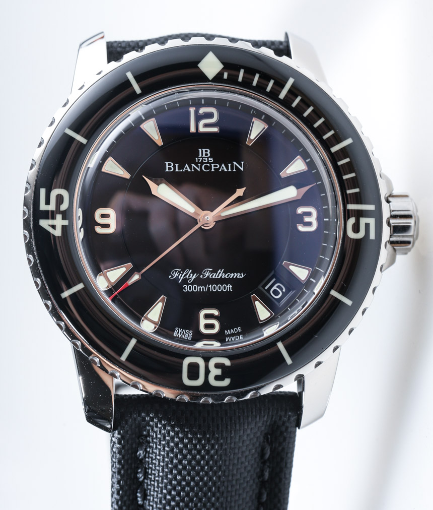
Thanks for writing this up. It's all about opinions of course. I think that cursive script can work very well on a genuine dive watch. Here is my favourite for instance:
An interesting discussion - thanks for the trigger of the original post. I have always thought Orient divers a little fussy in terms of the logo and text - though even more so by the ones that have a reserve indicator. But this has made me think again. Maybe I will see what living with one is like - the legibility of the things that matter is a strong draw.
ATB
Jon
I suspect the OP won't like that much, though.
What, 5 different fonts?
M.
PS and now you've posted that I'm going to buy a Euromillions ticket!
EpicUnderStatement (?what?), don't take this as hostile, it's not meant that way, but if the people who own, administer, staff, design and engineer the watches, etc., at the Orient watch company ARE Japanese, and, with all due respect, I assume you are not, why not let them decide for themselves, as actual members of Japanese culture, the logo, marque, or font, or whatever they want heralding their own products.
Specifically as to the lion flanked crest you decry as misappropriated from Europe's heralds of feudal era chivalry, Japan had, just like Great Britain and Europe, a feudal period that lasted for centuries with a parallel and incredibly intense and strictly honour coded warrior culture they called Bushido, if I recall it right from my history student past (I may be remembering some of Akira Kurosawa's film classics and the mini series "Shogun" too?!).
More to the point, the Samurai of Japan's own chivalric period not only wore their own take on armour (composed of relatively light interlocking and flexing plates of thick hardened leather, etc., IIRC) and wielded and carried their finely forged and crafted steel swords as both weapons in combat and as integral symbols of their warrior status and of their own selves, but they also apparently, again IIRC, carried crested flags into battle so perhaps such a crest as Orient deploys on their Makos, etc., is not historically all that un-Japanese.
As to Orient's economy class divers, it was never the crested, etc., dial treatment of the quite affordable, and I thought neat looking mechanical Makos, etc., that put me off giving them a try based on these watches' apparently quite good reputation on the forum as high VFM beaters, it was that Orient put all the, I very much think, extra and unnecessary complexity, production costs, and vulnerability to moisture into the Mako's design just to incorporate, by the most technologically inefficient and, perhaps, "inelegant" way possible, imho, the superfluous day-of-the-week function no dive watch needs anyway.
Apparently, they've finally started dumping that very questionable way of providing a pretty much useless day feature on a econo-mech diver, but I still can't figure out why they EVER did it that way in the first place
My omega smps have many dial fonts, not a problem for me. Also I'll let it go that they use a Greek letter when they are Swiss...
I think that without it, it's lost a bit of character. I appreciate it's an extra hole in the case. However to the extent that dive watches are used as regular watches when out of the water (are dive watches only worn when in the water, and then very specifically removed and stored upon completion of the dive, not to be used until the next dive?) the day is not much less relevant to the typical wearer than the date, both of which can be useful when the watch is worn as, well, a watch.
Last thing it needs to look like is a some sterilised microbrand WIS-designed gener-o-diver with a hip logo. Stacks of those around already.
...but what do I know; I don't even like watches!
Bizarre OP post IMO. The watch looks fantastic as is.
And presumably the issue of an extra hole in the case would only be a problem if the crystal was compromised anyway!
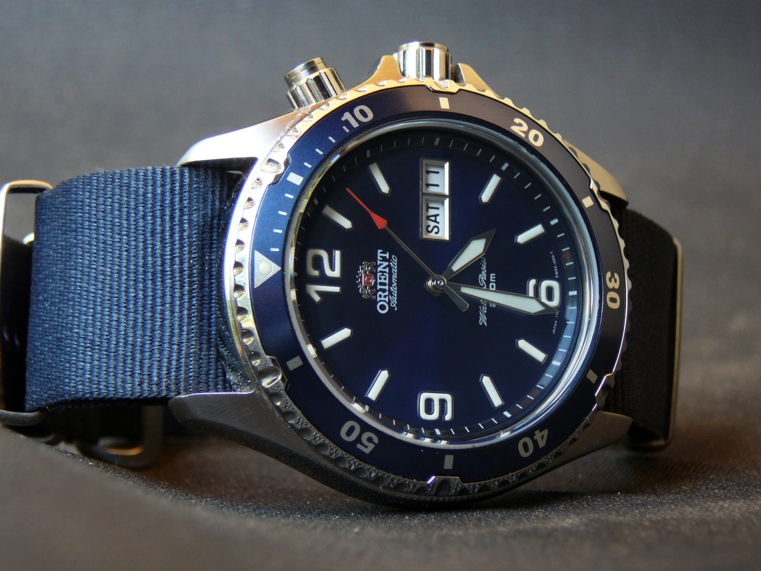
And after seeing bedlam's shot, I'm tempted to buy one!
M
Last edited by snowman; 28th April 2016 at 12:14.
If you can have an opinion on his post, cannot he have an opinion on that watch....?
I have absolutely no problem with the OP not liking the current lay-out of the watch and suggesting his proposed changes. He is entitled to his opinion and that opinion is respected even if I personally disagree.
I did think the OP was wrong to lable people who buy such watches as Rolex or Omega wannabes or that they are poor. That in my opinion is totally unacceptable - he has no way of knowing the motives of the people who buy such watches or indeed their financial situation.
^^^^I was replying to the person whose text I quoted
I appreciate that and I wasn't having a go at you in anyway. I was simply agreeing that the OP had the right to question the watch, but in my opinion he was wrong to go further.
I don't know how old the OP is, but I wonder if that thinking is common amongst younger people who see watches as a fashion accessory or status symbol, rather than a functional object? How often do we read "I use my iPhone if I want to know the time"?
That kind of thinking isn't ingrained in older people for whom it wasn't an option - Wearing a watch was how you ensured you were on time for meetings, trains, dates, not a way to show how cool, successful or wealthy you were, therefore everyone (more or less) had a watch, some wore dearer ones than others, a bit like suits or shoes, but everyone had one for a purpose.
Perhaps a common assumption nowadays is that EVERYONE wears a watch to impress and if your watch isn't a 'premium brand', that's only because you can't afford one?
Luckily I'm wearing an Omega today, although I'm sure that's only because I'm a Patek wannabe!
M.
If he'd stopped at being derogatory about the watch perhaps. Its bizarre to run people down for liking it though.
Aside from that, I don't like the aesthetics of his suggestions particularly. Given the popularity of the Mako over a long period it would seem Orient has done a fair bit right.
Last edited by bedlam; 28th April 2016 at 15:29.
As a graphic design (not the only one on here it seems) I get particularly fussy about fonts, logo design, scaling and overall dial composition. I had an Orient Ray (more or less the same as the mako without the numbers) and it was never the logo not the blend of fonts that bothered me about the watch. In the end it was the scaling of the date window to the indices and the bezel design being too fussy with those wee notches, too polished and too delicate for me. I prefer a slightly more stripped back and functional design in a dive watch.
The orient watch that bothers me the most is the Nav B flieger style one they do (maybe called the orient flight?). The logo looks very out of place and crammed in.
Many far more expensive watch manufacturers are guilty of worse crimes against design in my opinion. However, we have already covered that one several times.
Everybody is entitled to an opinion , but i like the watch the way it is .
Apologies to all if my opinions in original post came across as harsh. I was too occupied with my (probably ignorant) preconceptions about the watch and the brand based on my personal observations which mostly pictures available on the Internet. Personally I have not seen an Orient Mako in person and it is quite rare to find one being worn in the UK or perhaps I am not really looking/paying attention too much. Having seen the great photo posted by Bedlam, I am more and more persuaded to give the Mako II a try.
I think this post brought a lot of different opinions to the table which is nice to hear.
Glad to see you've not taken some remarks personally - It's a friendly place on the whole and I think most people welcome a discussion which isn't about Rolex vs GS for a change
M.
Hi Andrew -- I completely agree with you that it's a subjective choice, as I assumed was clear in stating that ".... imho, the superfluous day-of-the-week function [is a feature] no dive watch needs anyway. ........................ ".
To put it another way, I do sometimes have use, even need for the date for signing legal documents, avoiding missed deadlines, etc., etc., and so put a measure of value in having the date complication for watches sometimes. For whatever reason, though, I always seem to know what day-of-the-week it is and, even if I didn't, one doesn't need to know the DOTW to write out a check or whatever. In fact, I don't think I've EVER ONCE felt the need to consult my watch for the DOTW whatever endeaver I'm at wearing the watch.
What I for my own self primarily find ridiculous about the classic Mako design is the "extra hole in the case" for nothing as far as I am personally concerned.
If anybody feels otherwise, and I'm sure plenty do about these neat looking and very affordable mechanical divers, I'm more than fine with it and can even myself feel the urge to try one out every time I see a picture of a Mako like some of the ones members put up above
Snowman, you have me extremely curious at why a leaking gasket at the extra crown WOULD NOT BE A PROBLEM as long as the crystal was O.K.
Could you please explain what you mean? THANKS
My misunderstanding - I thought the concern was the day window, not the extra crown!
M.
 Posting Permissions


