Reply With Quote
I like it very much but it needs a date.Originally Posted by Reeny

Eddie


I like that

I like it very much but it needs a date.
Eddie
Whole chunks of my life come under the heading "it seemed like a good idea at the time".
Hmmm.
That means something would need to make room on the dial at 3 or 6 o'clock.
The picture I posted was an attachment by Imbrex.
Maybe one of those wonky, awkward looking dates at 22 minutes past 4 would work.
Calling Imbrex, Calling Imbrex.
No rad / and a date please.
It has to have a rad or H3.
Eddie
Whole chunks of my life come under the heading "it seemed like a good idea at the time".

I like that A LOT! I think a date window at 6 would look pretty cool.
You can put me down on the list for it.

Stealthy date added.
Sorry its an attachment; I havent got around to setting up a host site.
Here you go:

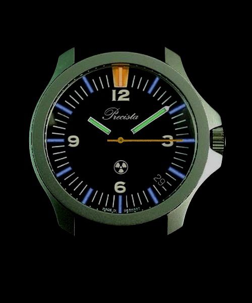
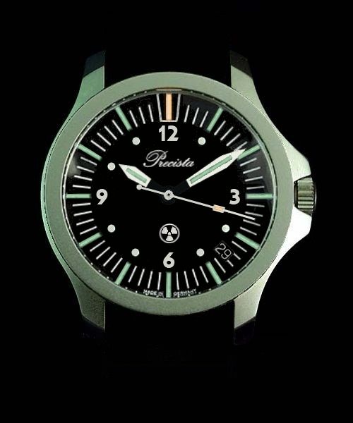
Looks great, but I can't help thinking the block of orange at 12 seems to overpower it. I don't know much about these tubes and how they're used but will there be any lume on the dial or is it just the tubes? Either way, in daylight you can see where 12 is, and at night you'll only see the tubes with the orange indicating 12 (unless the whole orange block is luminous).
Could someone do a mock-up of the orange block reduced to more of an arrow, with the end of the tube as the blunt tip of the arrow? If that makes sense (it does in my head)... Or how about with no orange paint at all and just the tube?
Everything else looks spot on though
What model of Heuer is this? I must have one!
Good job, Imbrex!
I agree with Eddie, date and H3 (maybe in red?) on the dial would be nice.
I think the hands need more work.
The font for the numerals needs to be considered.
Should it be "Great Britain", "Sheffield England" or something else?
Should the second hand be orange?
And what about the case, that will need to be simplified to keep the cost down.
Bars and lugs, how will it sit on a nato?……………………………
……………………This is a whole new level of watch obsession; time for a cup of tea!
Sorry about that, thinking about all the possibilities got the better of me.
Last edited by Imbrex; 8th December 2012 at 10:28.

That latest mock up reminds me of the auto Seiko SUS watches that are rare as hen''s teeth. Nice.
The more I see this the more I love it - please give this one serious consideration Boss.
- - - Updated - - -
Noooo! The radiation symbol ruins it - sorry.
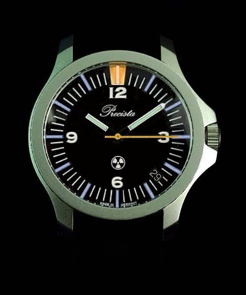
Case, dial and the hidden date look very nice.
That it will get tubes is also great, but I think it has too much colors with the blue, green and orange at the moment.
That latest mock up looks brilliant, the case style is excellent for a military/ tool watch watch and as long as the dial is kept simple it will look great, I prefer the date at 3 or 6 but if its done with a round hole like the 17 then 4:30 is okay, it should be a black on white wheel though. To be a modern W10 could it be in titanium? its lighter which I think matters for this application and looks much like stainless when beadblasted.
I had not seen the Seiko SUS before, but that is more or less of what I had in mind for the bezel.
Last edited by Imbrex; 9th December 2012 at 11:56. Reason: Typo
Very true, that's probably one of the reasons why I like it.
It would be cool if it also had the same "stonewashed" case finish, just like the Seiko SUS.
One for the golfers - a lightweight beater / non diving watch.
I thought I didn't need one of these - I was wrong.
The Mini Dreadnought design has changed my mind - I definitely need to get one.
Two orange tubes for a double width 12 marker to keep the Mini-Dreadnought theme alive.
Low profile Rad symbol or H3 - in orange or red.
Any design of hands to suit the masses.
with a combination of dial markers & hand colours which works
(although I quite like the mock-up as it is - with the contrasting hands & markers).
I was beginning to wonder how long it would be before someone mentioned the D word.;)
I like this design very much. Clean and simple. A watch that can be picked up, worn, beaten up, and not worried about.
It's horrible,to me it has to many colours and just dosent look right,hands,dial just don't like it.
Sorry to say
I think that looks great. Really like the case design, coloured trit tubes. This could be my first Precista!
What sort of price will this one be?
The colours were inspired by the Speedbird GMT; I believe that they have sold out.
I have just realised that the above attempt at a joke may not read as intended. All comments are, of course, appreciated.
Last edited by Imbrex; 13th December 2012 at 11:37.
Orange second hand?
Please excuse the lack of digital editing skills....
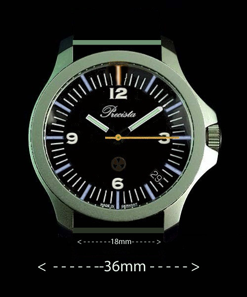
Fixed bars and 36mm. To be honest, I preferred the more oval shaped cases shown earlier, but for something modern I have made a few adjustments.
Andrew
On second thoughts, it was a mistake to shorten the minute hand - back to original size, or even longer (to the outside of the minute markers?).
Andrew
It’s better than my first mock up attempt for this watch.
jb1.jpg
I have also been thinking about a smaller military watch, but it’s a completely different design that doesn’t really fit this project.
https://forum.tz-uk.com/showthread.php?t=246512
Last edited by Imbrex; 6th January 2013 at 22:27.
i'd say no tubes ..

care to explain why?
Why not 38 or 39 mm? Battery hatch?
Last edited by Ventura; 22nd December 2012 at 20:34.
Make it with a matt or a black case. I have plenty of use for a non-shiney watch.
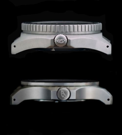
It seems to be harder to get water resistance with a battery hatch - although I can't see why a hatch can't be properly sealed with O rings.
Andrew
They can be properly sealed, it's just that squaddies often don't bother replacing the "O" ring when they change a battery.
Eddie
Whole chunks of my life come under the heading "it seemed like a good idea at the time".
I've often wondered why watch companies don't sell these as a package - like Suunto does for the D4, D6, D9 etc.
It needs bigger hands. My attempt:

Last edited by andamanen; 29th December 2012 at 22:56.
Shown with PRS-18 for scale.
Looking good!
I think you nailed it!
Looks like a Heuer 980.004 diver without its bezel ring
Thanks, Imbrex, for bringing such excellent visual images of the creative process for all to view and discuss.
Thanks also to our host, Eddie, for permitting us the opportunity for input.
Thank you Michael, I would also like to thank Eddie for the opportunity to get involved.
Its given me a new apparition of what goes into designing a watch, but I suppose weve only really scratched the surface talking about the ascetics. Whatever Eddie decides to do with this project, it will be interesting to see what else is involved in getting to a final design.
Is this project still "live"?
i hate to say it, but compared to all the other watches that have gone before its not very desirable.
i just dont like it at all.
I took the time to reread this thread yesterday and spent some time tweaking the design. I think this addresses most of the issues raised:
^ im sorry, but i really dont like the sword hands on that mock up, the dial starts to look too cluttered with the round interval markers at 1,2,4,5 etc - i just dont see what function they have
Last edited by seikopath; 13th March 2013 at 15:25.
Good luck everybody. Have a good one.
That was the one for me. The sword hands etc don't have a place IMO
Nice as these designs are, the new PRS-10 will most likely be based on the PRS-17.
Eddie
Whole chunks of my life come under the heading "it seemed like a good idea at the time".
Glad to hear it.....
same for me.
I'd go for that- nice.
How long do you think before it's ready to market? (another newbie qustion)
 Posting Permissions