
 Reply With Quote
I prefer the logo without the t@ts out for the lads!


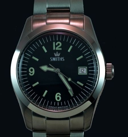
I was curious to see how this dial and hand configuration would look:

I prefer the logo without the t@ts out for the lads!

Not sure about that. I love the triangle at 12 and the lack of date window. Only downside of PRS-25 is the size, if it was max 38mm it would be almost perfect watch. If I deliberately wanted to find another "flaw" besides that, I guess the Smiths text could be slightly smaller font, but that would be just nitpicking.
Fair play, I think it looks just as good as Eddies version - I actually prefer the 12 to the triangle. Although I do like to have a date on my watch, I think a no date version is more faithful to the original Smiths Everest.
if the '25 is an Explorer homage, then this is a Tudor Ranger homage.
I had a Ranger for a while - nice little watch (and significantly cheaper than a vintage Explorer I).

I love my 25 but would love it even more if it had a date - leave everything else the same though.
David
different strokes for different folks... i personally like the "original" one better...
Not bad. I could live without the funny logo, but the rest is very nice. If this were to materialize in a moderate size (no bigger than 38mm), I'd be seriously tempted.
Last edited by dschaen81; 24th December 2012 at 21:33.
Like it - love the hour hand. Keep it to 38m.
You know what, I've been wearing mine all day and having seen the mock-up with the date I do actually prefer it without.Originally Posted by TaketheCannoli

David
I've thought a few times about putting gilt hands on mine. Anyone know what ones would fit?
I quite Ranger look with these hands but I think it would look better without the date.
I got mine because I like the simplicity and plainness of the face. I think a date would make to too busy.
I'm also fond of just the single word 'Smiths' right in the middle. In use I can barely even see the Everest unless in the right light.
I love the look, well done!
 Posting Permissions