Reply With Quote
Eddie


to be blunt, I don't care for it. It looks like any other generic chrono you can get from seagull, or some of the microbrands.
I think most of Eddie's watches have something special about them. I don't see that in this model ...yet.

Eddie
Whole chunks of my life come under the heading "it seemed like a good idea at the time".

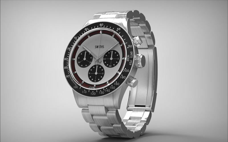
Black dial or white dial, nothing wrong with it IMO.
Available by the time Christmas rolls around, by any chance?
(I still haven't learnt not to ask questions like that, haha)

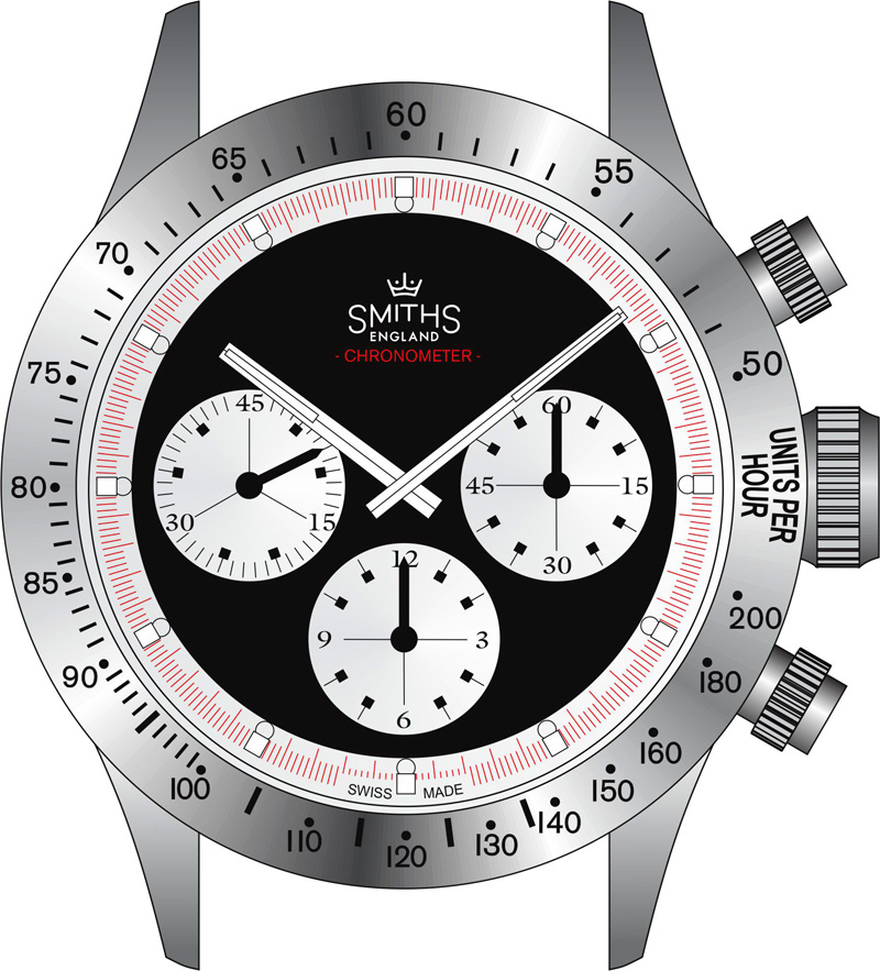
I really like the black dial version and agree there is a bit too much space at 12 o'clock. Perhaps "SMITHS" and "Automatic" would make a nice combination?!
Move Smiths up and add Chronograph below it. Very nice by the way.
Fixed.Originally Posted by Cannop

Eddie
Whole chunks of my life come under the heading "it seemed like a good idea at the time".
When you acquired the name did you also get the right to use the old Smiths crown logo? Or perhaps you can just use it anyway, as I suppose Smiths Industries are not using it.
This watch will definitely be available by the time a Christmas rolls around.
F.T.F.A.
Eddie
Whole chunks of my life come under the heading "it seemed like a good idea at the time".
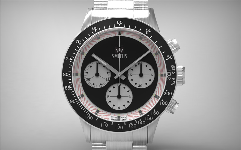
That really does look super-duper now. At the risk of pushing my luck, how about reviving another of the old model names - to put alongside the Everest - Astral, Deluxe, Imperial, Empire?
Yes please with the logo
sorry double post.
Needs the logo. Maybe in red?
"Bite my shiny metal ass."
- Bender Bending Rodríguez
Yes, that would be nice! Print it under SMITH plus "Chronometer" so that it would not look so blank. Also, "crown" logo on the crown would be another A+.
Oh yes, that it perfect! The crown fills in the space perfectly and the outer red minute/second track is ideal (more legible imo than the other dial colour combination). Fantastic.
No need for the crown logo to be in colour and no need for any other text. It's good as it is.
I really like that Eddie.
That 'like' will definitely translate into a sale should this make it onto the shelves at Flatts Towers.
Bam! Perfect.
Another Homerun.
The waiting. Argh. Always the waiting.
Martin
That is great Eddie, balance and smplicity.
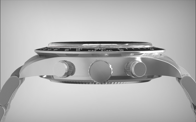
What size is this going to be?
Sean
Actually, I need to do a Columbo.
. . . . . just one more thing . . . .
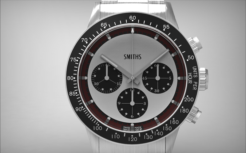
Has that hour hand grown a bit?
Martin
I was just about to say the same thing (again!). The hour hand looks too long in this latest rendering but the addition of the crown over the logo looks very good indeed. And the white dialed version looks fantastic.
Martin
The crown above the Smiths text looks tops IMHO, perhaps our esteemed host could try something similar on the next batch of PRS 25's.
Perfect present or my brother in law for his 50th, will it be available by July next year?

Amazing what difference a small detail makes...without the crown didn't like, this is great :)
One more thing, would the back case has big "SMITHS" and nothing else. That would be cool. How would the case finishing? Mixed brush and polish?
Hi Eddie,
Did you forget to add ''Chronometer'' below the Smiths ? ;-)
- - - Updated - - -
Hi Eddie,
Did you forget to add ''Chronometer'' below the Smiths ?
:)
Hi Eddie,
Did you forget to add Chronometer below the Smiths ?
:)
- - - Updated - - -
Hi Eddie,
Did you forget to add Chronometer below the Smiths ?
:)
Hi Eddie,
Did you forget to add Chronometer below the Smiths ?
:)
very nice looking watch but [prepared for a flaming]...
no from me, sorry too much of a "homage" like the everest. Would liked to have seen more obvious design cues more from "Smiths" earlier work [not that I'm an expert] How would a Smiths W10 42mm chrono look? Even try the Sinn/Heuer/3H bi-directional bezel ?
Eddie
Whole chunks of my life come under the heading "it seemed like a good idea at the time".
It looks very dutyfull in the dial. But kind of resembles a home mod that anyone can make up.
The body is there but the sole is not IMO.
Still, It catches me in as I can see potential in it.
How to make it modern with original quirks that soften and make the dial appear as spirited a mint coin?
I dunno,,,, polished Beveling on hands and indices with stacked on lume?
Could you extend the indices into the black dial to make them a little bolder?
Last edited by Jemlok; 8th October 2012 at 10:30.
That last iteration looks like it to me..it may seem over the top, but there is a need for some balance between the quarters of the dial and that seems to do it.
Smiths by itself did look a little naked, unless it was a lot bigger - which must upset the balance of the whole again.
Having a look at a bunch of other chronos with that layout, there is a tendency to follow this approach on achieving balance in the dial; similar problem, similar solution!
The 17C has a different spacing of dials, the PRS5 and 12 have less case adornment to balance against, so I suspect the 4 lines of image / text does work well here.
Last edited by Hubs; 8th October 2012 at 10:53.
Love the last design and the logo is perfect.
Hi Eddie, I like the direction in which this design is going but be careful not to use too many different typefaces on the watch. In your last version posted there looks to be 4 different styles, from to traditional to more modern styles.
Also, whist 'SMITHS' had various styles of logo over the years, I would recommend your reincarnation of the brand should opt with one, consistent version, and stick with it across all your Smiths models.
Chris
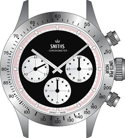
I tried different mock-ups of the last picture Eddie posted and to me the best was the one with out the crown. Clean and balanced
I think this latest one has gone too far into Sewills territory (i.e. a whiff of Sunday supplement about it). I think the previous version with the existing SMITHS logo and crown looked really good - understated, forward looking and somewhat cool! Possiby an additional line of text, either England or Chronometer would look ok but both is too much and I would lose the red altogether.
Martin
I'd be curious to see how it would look without the red, perhaps with blue or black in place of the red chrono track.
Very nice and reminds me of the old Daytonas.
That's the one! I was trying to think what it reminded me of.
Eddie
Whole chunks of my life come under the heading "it seemed like a good idea at the time".
I'm getting that ( increasingly frequent, sadly ) feeling that I'm about to ask something exceedingly dumb, but ... that tachy scale beginnng at 3 ?
Decorative ?
A test of mental agility ?
Chrono seconds resets horizontally ?
A cunning plan to trick the competition into ordering 100 similar cases ?
A crowd-sourcing experiment to determine the relative value of the presence of a crown or the height and font-family of logo text vs a functionally usable chronograph ?
Got a great deal on these, and they're made of genuine TruBronz ?
I resignedly await my well-deserved and humbling learning opportunity.
Enfeebled,
Tokyo
Really not sure but I assume it's a slow Tachy scale. Seeing as we rarely get the opportunity to time something travelling at 600mph it's more useful to go down to 50 on this watch.
Say for 1 mile distance you set the second hand running.
Mile is covered in 12 seconds (fast scale) Speed = 3600/12 = 300mph (read off bezel) on normal Tachy watch
Mile is covered in 72 seconds (slow scale) Speed = 3600/72 = 50mph (read off bezel) on Eddie watch
Eddie's Tachy gives readable output for 50-200mph
Normal ones 60-500mph
I've decided to show this as a smaller image, I think it makes it easier to get a sense of scale and balance.
Eddie
Whole chunks of my life come under the heading "it seemed like a good idea at the time".
I'm liking this. All she needs is to have the Smiths crown logo in white metal appliqué, and perhaps a fitting model name printed in an arc above the 12-hour subdial?
I rarely post on here (usually just lurk) but that is worthy of comment.
It's stunning, that final picture is just lovely. I wouldn't change a thing.
Dave
I think the "Chronometer" text is unnecessary. Personally I feel that "Smiths" and the crown are sufficient to properly fill the space -- not too much and not too little.
Apart from that it's perfect.
Really nice Eddie.
Must say I prefer the first renditions with the lighter coloured dial and the black subdials/bezel. The vintage Smiths logo with the crown is perfect also. Wouldn't get too carried away with the text though as too much would spoil that beautiful dial.
Are you planning to give this one a plexiglass crystal?
Michael
I saw this today on Facebook and it got me wondering? Is it going to be Handwound, Auto or Quartz?
Yes yes and yes. Added to my Christmas list, now just a question of which Christmas???
Andy
Automatic I believe.
.
How about drilled lugs?
john
Costume jewellery. Ouch!!!
Isn't the hour-hand a tad too long?
john
Costume jewellery. Ouch!!!
 Posting Permissions