closing tag is in template navbar
timefactors watches


TZ-UK Fundraiser
Results 1 to 17 of 17

Thread: Gilt watch features.

  1. #1
    Master
    Join Date
    Sep 2011
    Location
    location, location
    Posts
    3,816
    Blog Entries
    1

    Gilt watch features.

    For some reason I just can’t warm to them. It’s bugging me now on the BB58. Reason I flipped the last one.

    Is it just me that thinks gilt doesn’t really work?

  2. #2
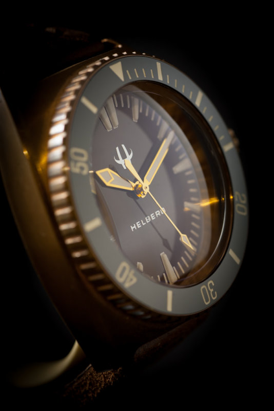
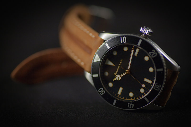
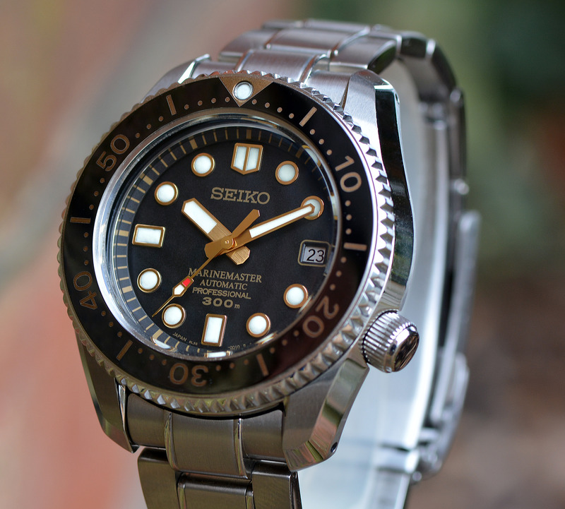
    It depends on the watch, IMO but a modern watch with gilt details jars a bit, whereas it works on a vintage design. Oris 65 and marinemasters look good, black bay is a bit borderline to my taste but the SLA057 looks weird.

    I can’t imagine a gilt SMP for example.

  3. #3
    Journeyman
    Join Date
    Apr 2018
    Location
    UK
    Posts
    87
    As poster above, it depends on the watch for me too. Funny you mention Seiko, I have an SPB239, it's got gilt hands and few other nods.

    Was in the shop, looking at that, the SPB147 (even more gilt) and the SPB143 (sans gilt) and took a while but ended up with the 239 and am still smitten a year later.

    Agree also, the SLA057 just doesn't work for me either. Guess it's down to personal taste (as always!)

  4. #4
    Craftsman
    Join Date
    Mar 2022
    Location
    South Wales
    Posts
    399
    I certainly wouldn’t want it on all my watches, but think it can look good in moderation. I like it on my Commander and am on the look out for an gilt Everest to keep it company.

  5. #5
    Grand Master Sinnlover's Avatar
    Join Date
    Sep 2014
    Location
    London
    Posts
    11,101
    I think it can look great on a vintage watch but on most modern watches it never looks right. (Looking at you BB58)
    There is gilt and printed to look like gilt.
    With a gilt dial and hands the brass discolours / dulls down over time. This improves the looks / makes it less garish. On dials that have gilt coloured printing this won’t happen. The print is either bright gold or a strange brown.
    The thickness of the etching / printing also comes in the play.
    For example a vintage 5512 has rather fine etching meaning the exposed brass is only visible in thin lines, combined with the discoloured brass it’s quite a subtle effect.
    On modern watches that have a gilt dial, the etching tends to a bit thicker as they want it to be known it’s a gilt dial, this combined with the shiny brass means the whole aesthetic is a bit clumsier.

    I agree that the SLA057 is not much of a looker but the SLA025 - oooo now that how to do a gilt dial.
    Just my 2p
    Last edited by Sinnlover; 21st March 2023 at 07:47.

  6. #6
    A lot of people don’t like 2-tone steel and gold, to me it’s a micro 2-tone situation on the BB58 and I like it - in comparison the blue dialled version looks flat and uninteresting imho - which surprised me. I think it depends on the watch and your own taste.

  7. #7
    Grand Master Sinnlover's Avatar
    Join Date
    Sep 2014
    Location
    London
    Posts
    11,101
    Quote Originally Posted by RobDad View Post
    A lot of people don’t like 2-tone steel and gold, to me it’s a micro 2-tone situation on the BB58 and I like it - in comparison the blue dialled version looks flat and uninteresting imho - which surprised me. I think it depends on the watch and your own taste.
    Agreed there is no wrong or right. What the wearer likes is the only thing that matters
    I think a glit dial B58 with stainless hands, lume pip surrounds (or even printed dial lume preferably) and bezel insert markings could be a winner for me.
    Last edited by Sinnlover; 21st March 2023 at 12:59.

  8. #8
    Master
    Join Date
    Sep 2011
    Location
    location, location
    Posts
    3,816
    Blog Entries
    1
    Quote Originally Posted by RobDad View Post
    A lot of people don’t like 2-tone steel and gold, to me it’s a micro 2-tone situation on the BB58 and I like it - in comparison the blue dialled version looks flat and uninteresting imho - which surprised me. I think it depends on the watch and your own taste.
    You might have a point, I would love a black 58 with silver vice gold bits. When done though it may look at bit flat and boring.

  9. #9
    Master
    Join Date
    Mar 2009
    Location
    North of nowhere
    Posts
    7,443
    The gilt Everest looks gorgeous, and so does the gilt San Martin SN021. I love the look myself.

  10. #10
    I have a PRS-54 Trans-global with the ice blue dial and the gold hands and indices. I think it looks great, but perhaps as another poster said it just looks better on vintage designs. Likely why it also works well with the PRS-25 gilt.

    Sent from my SM-G991U1 using Tapatalk

  11. #11
    Quote Originally Posted by Sinnlover View Post

    I agree that the SLA057 is not much of a looker but the SLA025 - oooo now that how to do a gilt dial.
    Just my 2p
    Yup. The SLA025 is a bloody brilliant looking watch. For me, probably the ultimate Seiko.

    Then again, I slightly prefer the SLA039. All irrelevant as both are just too big for wearing (for me), I would love to see either in my watch box though.

  12. #12
    Master reggie747's Avatar
    Join Date
    Oct 2013
    Location
    The Mersey Riviera
    Posts
    7,208
    I'm partial to a bit of gilt in my modest collection in the right measure...

    Helberg CH6


    Kemmner 007


    Raven Vintage 40


    Seiko SBDX012 MM300


    GS SBGX069

  13. #13
    Personally, I absolutely love it on the BB 58, and the earlier BB 41mm ETA divers.
    It's just a matter of time...

  14. #14
    Master
    Join Date
    Jul 2019
    Location
    Kent UK
    Posts
    2,449
    I like gilt for that vintage vibe. I think the gilt hands work well with the brown/copper dial of the Seiko and while the Baltic doesn't have any gilt is appears to a quick glance.


  15. #15
    I find gilt very off-putting. For some reason, in my mind, it's not just another kind of trim but fake gold. If you like yellow gold (which I don't), go for it. Brass, all right. But gilt, no.

  16. #16
    Master
    Join Date
    Feb 2012
    Location
    Here
    Posts
    1,081
    No strong view one way or the other. I'm not a fan of it on the BB58, I find it makes it look little twee, and prefer the crisper look of the blue. On the other hand, on the Seiko SBDX012 MM300 above and the SPB315, I like it.

  17. #17
    Craftsman aamaci's Avatar
    Join Date
    Oct 2018
    Location
    EK UK
    Posts
    505
    I love the Black Bay's gilt dial.


    A

Posting Permissions

  • You may not post new threads
  • You may not post replies
  • You may not post attachments
  • You may not edit your posts
  •  

Do Not Sell My Personal Information