Reply With Quote
My big one is a make Im not in a position to buy, but every time I see one it niggles me and that is Hublot with the screws on the case not aligning


Like many of you, I have been looking at new watches lately....
Now I may be extraordinarily fussy, but there are certain details that ruin certain watches for me, well maybe not ruin, but certainly lessen their appeal. I am going to start this thread with one pet hate, too much information on the dial, with three lines of piffle above 6 O'Clock. That particular faux pas has ruined every modern Rolex since they phased out the 'Precision' line in my eyes. It is also the main issue I have with the Tudor Black Bay 58...
Am I being unreasonable? As it goes I have other pet hates, but is it just me?


My big one is a make Im not in a position to buy, but every time I see one it niggles me and that is Hublot with the screws on the case not aligning
For me its the gap between the lugs when you take off a bracelet and pop on a strap . An OEM end link would be nice .
Sent from my iPad using TZ-UK mobile app
If only my Mk XII didn't have a date.

Paint the date wheel black.Originally Posted by monogroover

"Once is happenstance. Twice is coincidence. The third time it's enemy action."
'Populism, the last refuge of a Tory scoundrel'.
I disagree re: too much text on BB58 but the lack of on the fly clasp adjustment stops the blue version being perfect imo.
As I've got more into watches I'm really liking no date dials more and more. I'd happily drop the date from my Mark18. It wouldn't make it perfect as the flat and long lugs would need trimming down first.
Cheap watch and a small detail, but.
My Nite Alpha looks great in black PVD, with a black dial.
The white date wheel really annoys me.
So I asked Nite whether I could buy a black date wheel (current models have this).
Unfortunately, they tell me the date wheel has recently been re-aligned from 43.5 to 45 degrees (ie exactly 4.30), so no, not unless I want to have it mis-aligned.
Grrrr
Well the too much text thing is totally personal I accept, but for me the smiley face black bay was far more suited to the 58, the irony being that the new movement seemed to push Tudor the other way. I think what bothers me more is superfluous text. For instance, what is the point of saying 'Chronometer Officially Certified' when you could just say 'Chronometer'. Officially certified pretty much goes with the word...
I have an Oris 65 and love it but really, why would you write 'Water Resistant' on a watch that is called Diver 65?! I also object to the water resistance on the dial in feet and meters and or ATM or bars. Just pick one measure and put it on the back!
Totally agree on non colour matched dates. Hate them. But then then colour match dates that are so small you can't read them once you pass 45 are a bit pointless too...
I don't have any minor niggles on any of my watches.
A bit of extra text, colour variation etc etc - some of you are too fussy/verging on OCD.
Cheers,
Neil.
Only verging!?
Faux riveted bracelets, Id have a BB58 in a heartbeat if it had a normal oyster bracelet.
The lack of zero, just a blank disc on the ALS big dates really grinds my gears. It's not the only thing that stops me buying one of course
Sent from my SM-G988B using Tapatalk
Dates at 4.30. Just no.
I see this comment a lot and dont real get it. Everything about the 58 is retro, its a modern watch with retro design features. The rivets are just part of the package. I wasnt that keen on them initially but in reality you dont see them. They only really notice on photos on the internet.
Date window at 3.
Zenith Rainbow Elite 670 1998
39mm; 9mm thick. Model 02.0473.670
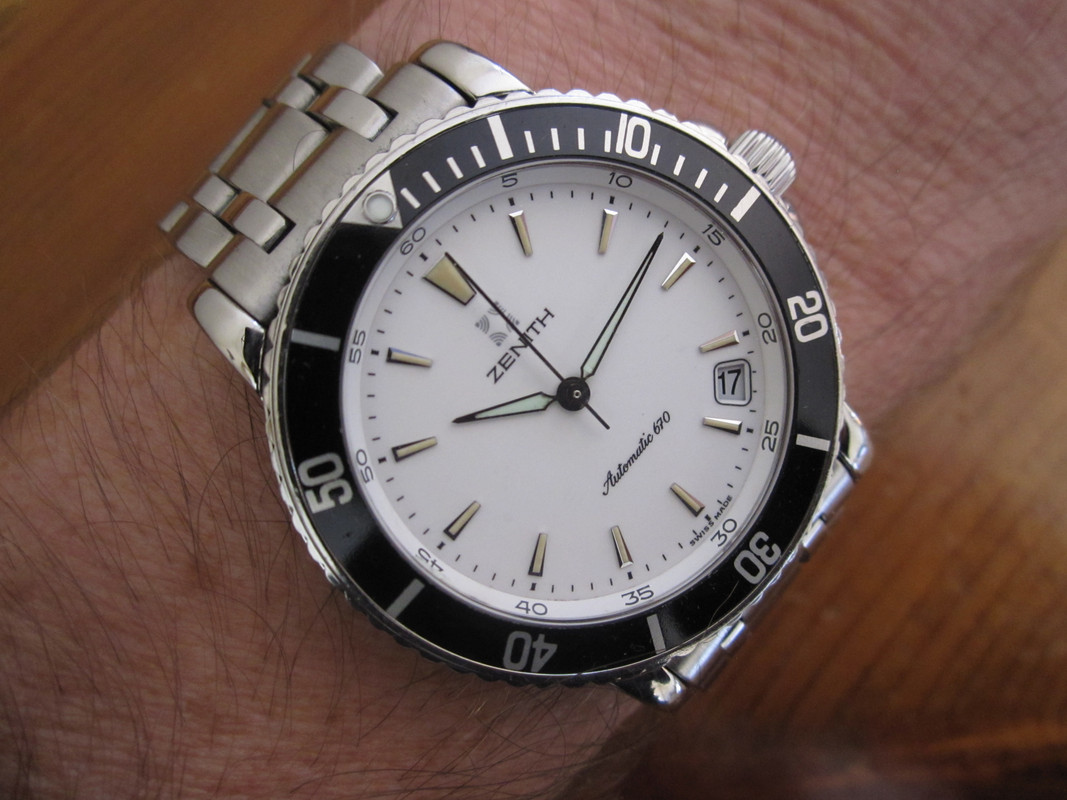
Ordinarily date at 4 would not appeal but that Zenith looks great...
Agreed, Ive just had to check my bb58 bracelet to remember if it has the rivets - never notice.
Micro adjust bracelet and itd be perfect, as said above.
The main killer for me of a watch is thickness
Whereas I think they look great - new Omega Seamaster with a date at 6 on the other hand has stopped my from buying any of them, until a non-date became available.
It's just a matter of time...
24mm lugs - unnecessary.
Sent from my Pixel 4a using Tapatalk
I could name dozens of nearly perfect watches all with one thing wrong The price!
The squashed / over sized / over lapping sub dials of some El Primero Watches seem silly. The movement is too small for a lot of the cases used and the sub dials are too large, leaving the the dials look cramped.
I would have bought one by now if it were not for this feature.
I’m fussy but...
Magnified date bubbles are a total disaster to any watch, whether on top or under the crystal. Anything other than head on you can’t read them, and either make the date bigger or get rid of the date completely.
Faux rivets on bracelets or real ones for that matter.
Deployants which leave the strap tail on the bottom of the watch look wrong.
Very long lugs on a strap.
And hands which don’t match at the stem like the SLGH011, once you’ve seen it can’t be unseen.
I dont mind dates at odd angles but for gods sake have a custom date wheel that keeps the numbers horizontally aligned rather than on the wonk.
I prefer dates to be at 6 with an internal magnifier or to be a big date complication so my aging eyes can see the bloody thing.
In recent years, Ive really gone off having a day and date on a dial, particularly at 3 O Clock as it affects the symmetry of the dial. Just a date window at 12 or 6, if at all, looks much nicer in my opinion.
Sent from my iPhone using Tapatalk
Tudor, does a dive watch need crown guards? If yes, put them on the 58, and remove the bracelet rivets. Then you've got the perfect watch.

The (to me) useless 24hr subdial on the Damasko DC86. It serves merely as an AM/PM indicator. If it was independently settable I could condense the features of four of my watches into one.
F.T.F.A.
Aaah, he would still be missing the 3 :)
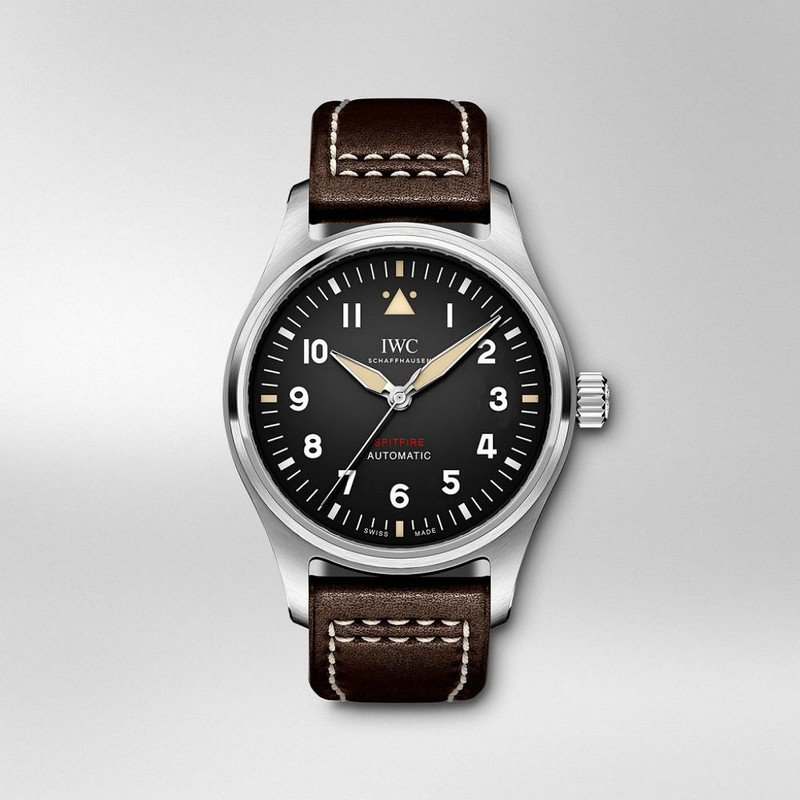
The date function is why I don't own an IWC. If they ever offer a reasonably sized 3 hander sans date I will be a buyer.
That does solve the issue that bugs me.
 Posting Permissions