Reply With Quote
My first reaction was 'What the hell's that strange logo?' and 'why doesn't it say C Ward on it?' !!! It looks reasonably nice, though I presume wildly overpriced. Lets hope they've got the text lined up properly this time....


Saw these released earlier today and have to say I think they look very tasty. My recent first experience of CW has been really good in terms of quality and value.
They are clearly listening to their customers with the Christopher Ward text now removed from the dial and replaced with the twin flag logo. These watches are 41mm with 12.5mm thickness in the light catcher case, which I know from experience is very well finished. Sapphire bezels too. Some nice colour schemes, personally I like the GMT version in sand white with blue bezel.
https://www.christopherward.com/aquitaine?start=0&sz=24
Sent from my iPhone using Tapatalk
My first reaction was 'What the hell's that strange logo?' and 'why doesn't it say C Ward on it?' !!! It looks reasonably nice, though I presume wildly overpriced. Lets hope they've got the text lined up properly this time....
The dive version on rubber is 895, which you can reduce to 770 by using the Loupe discount code, I wouldnt say that was vastly overpriced. GMT is about 1200 on the bracelet and the bronze COSC model a bit more, cant recall now.Originally Posted by MrGrumpy


Yay they've got rid of the crappy CW text on dial, I may now take a closer look
"Once is happenstance. Twice is coincidence. The third time it's enemy action."
'Populism, the last refuge of a Tory scoundrel'.
The twin flags logo makes the world of difference! I like the blue three-hand auto. Quite brave of them not to have a black dial in the line-up.
Last edited by TaketheCannoli; 21st April 2022 at 14:40.
Like the white with green bezel.
https://www.christopherward.com/retr...technical-data
Not sure I like it enough to buy one but it's different, reasonably sized and decent value with the voucher
Wish my sealander GMT had that logo rather than Christopher ward
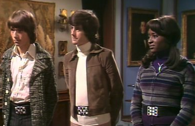
Yes that's a lot better. The logo is clearly a cut out of the Swiss cross but it also reminds me, and I appreciate this is probably a niche cultural reference, of the belts worn by Tomorrow's People, the main characters in a children's' sci-fi series from the 70s.
They were the next evolution of homo sapiens, who had the ability to "jaunt;" namely to transport themselves instantly anywhere they wanted, simply by thinking about it. Now that's a really useful power - no more commuting, no need for cars, no more airports. Going on holiday? Just think about it - you're there.
Only problem was, they needed the belts, to stop themselves rematerializing into objects that someone had placed where they wanted to land, for example they went home and their mum had moved the furniture around. Each character had their own belt design.
I'll get me coat...
Why would you assume that?
Whether you like CW or not as a brand, they've a record of selling watches of a certain spec well below the competition's prices.
The days of 50% sales are long gone (and even then, they were a true bargain at those prices - An ETA 2824 movement watch for £250?).
My initial feeling was I wasn't mad on the colour options and they look rather too much like the Spinnaker Fleuss, but pricewise (starting around £1000) they look fine.
M
Breitling Cosmonaute 809 - What's not to like?
^^^ Ah yes I remember the tomorrow people. IIRC I had a rather fetching cardigan like the chap on the left.
As to the watches, I think the twin flag logo at 12 is an improvement. It has been stated by the brand as being the default going forward.
CW make decent watches. I will likely buy one of the new models. I have always found that they coexist quite happily in the same box as more expensive stuff.
I rather like this; my only niggle is that I think the hour markers need to be "pushed out" towards the minute markers a bit more.?
Indifference from me on these but as a CW fan I think the logo only is the way to go, although the name on the dial was never a big issue for me.
Sent from my iPhone using TZ-UK mobile app

I think that logo on the dial is bloody ugly.
The origin CrWard was my favourite. This just looks like Lego bricks.
Excellent! Although it could have been worse. I recently saw, for the first time, a photo of myself in 77 with a not dissimilar haircut. To be fair, I didn't look happy.
David
Infinite Diversity in Infinite Combinations
I dont mind the full Christoper Ward logo once theyd centred it like on the new Sealanders (I own the white GMT model). It was when it was at the 9 marker I didnt like it. I still think they need to integrate the word Ward into the twin flag logo to make it complete.
That takes me back, I used to love that TV series as a kid - even made my own Jaunting Belt out of my grandads old St Bruno tobacco tin!
https://www.watchpro.com/christopher...-fathom/?amp=1
I'm not convinced they are overly fifty fathoms alike, but they are nice. I like my CW but glad I bought it on the forum and not new

Good theyve tried something but another miss for me, looks like an 8bit frog doing a poo.
Meh.
I think CW are at the best when theyre doing something different, like the super compressor, the W&W colab or the wild thing chrono.
These look pretty middle of the road (IMO, of course).
I've never really looked twice at Christopher Ward just because of the clumsy name and it's many permutqtions, but these look really good.
Glad to see the flag logo return, hopefully used more going forward
I share your sentiment, is also way too close to the Tissot logo imo , which would also look odd on the dial on its own.

CrWard wasnt the original logo
Glad they got rid of the C Ward writing on the dial!
Sorry dont see it myself.
I think the double flag logo of England and Switzerland is neatly done and marries nicely with their English design, Swiss built positioning.
So much better than any use of Chris Ward on the dial.
Some really nice looking watches there.
This was the original logo:
This was the most disliked:

True,
The second logo was when they went "luxury item, old English font" and were selling wallets, bags etc.....
Makes sense that they just dropped the logo completely to stop people moaning especially as I believe Chris has moved onto other things.
These look great but I'd like a green bezel & cream GMT with matching colour date window. Still tempted by the blue & cream though.
I think the light catcher case is one of the nicest designs in their & much higher price points.
CW HQ used the CW forum as some sort of focus group for development of the Aquitane.
I am a recent convert to CW watches. Never was interested in the brand until the Super Compressor and Dartmouth were released, both of which I own, and both of which I think punch way above their weight.
I dont think CW got it quite right with the Aquitaine, and strange there is no black model from the outset.
The forum wasnt involved in the development of the Aquitaine.
It was however asked for views on potential improvements to the Trident C60 range. The new version of the C60 has yet to be released.
I agree with you about the Dartmouth and Super Compressor and like you own both.
Ah, yes. My bad, it was about the new Trident.
Excellent. I remember really wanting one but didn't have the nouse to make my own.
David
Infinite Diversity in Infinite Combinations
I really like Christopher ward watches in general. Decent quality, very good value and some nice designs. In this case I don't like the cream dial, quite like the green dial and really like the blue dial, especially the blue on bronze.
The logo, I'm not so sure about. I get the idea and it's not a bad logo but I don't look at it and think Christopher Ward, I look at it and scratch my head. If I had the option, the logo either wouldn't be there or it would be different.
the one thing that I really don't like about CW is their constant barrage of emails about sales or vouchers. Stick to a price point and get on with it. By all means have periodical sales if they feel the need but at least half, possibly more, of the emails I get from CW are about a discount of some sort. I'd be more inclined ti buy if I received rotating emails about their various models, opened an email and thought, I'd forgotten about that one. I receive an email about a discount and send it straight to trash as when I feel inclined to buy, I know that there will be another one just around the corner.
Wasnt keen on the original colours but I think this hits the mark.
Pic stolen from their website.
Sent from my iPhone using TZ-UK mobile app
For a BP FF- inspired watch, Ill stick to this, personally
https://i.imgur.com/tlIY4lN.jpg
Simon
I agree that the text on the dial needed to be changed and they were right to redesign their logo but I still dont think theyve nailed it. Great watch for the money but the dial would bother me too much
Agreed

From what I've heard and on their forum it would seem that the Chr was the most popular
I do think the bezel needs markers for every hour. I can't think of any other brand that only puts 12 markers on a 24 hour bezel...
Last edited by redmonaco; 2nd June 2022 at 20:21.
What exactly would bother you about the dial?
The logo- I cant get on with the design of it.
Fair enough. I like it, especially compared to what went before.
I like how uncluttered the bezel is. Its not
like its too difficult to work out.
 Posting Permissions