
 Reply With Quote
Me thinks the COMMANDO text is too "in your face" contrasting to the boob logo


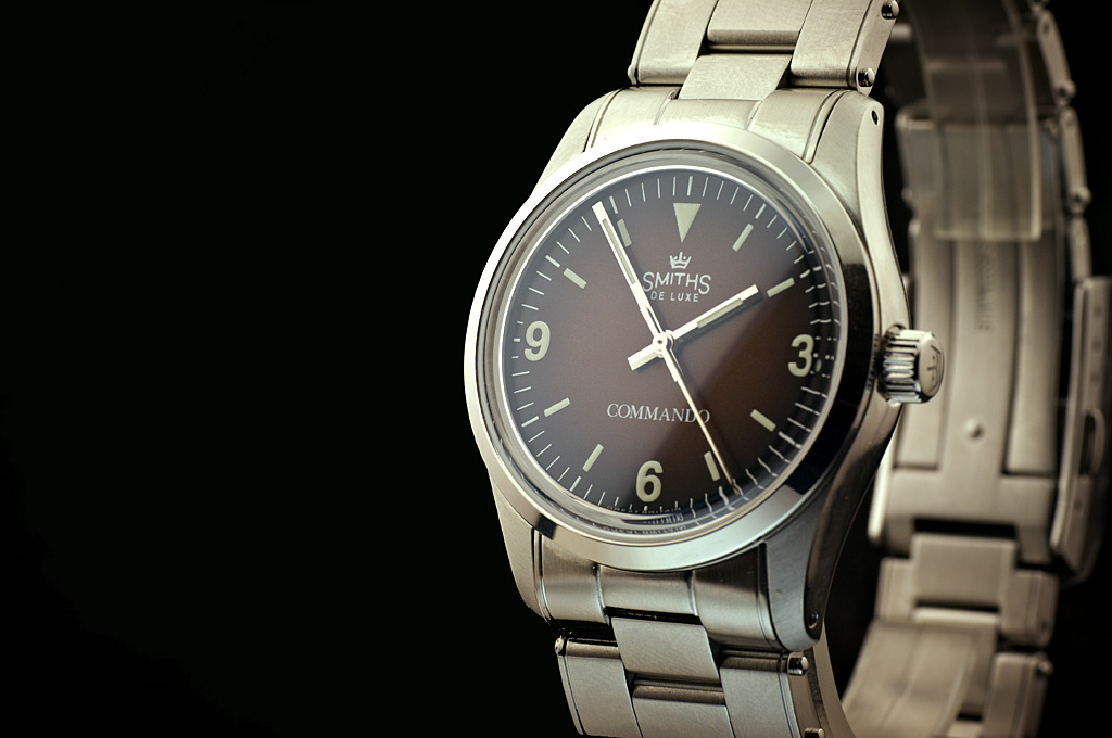
Tropical dial and slimmer minute hand.
Eddie
Whole chunks of my life come under the heading "it seemed like a good idea at the time".

Me thinks the COMMANDO text is too "in your face" contrasting to the boob logo
I rather like that.
Dave E
Skating away on the thin ice of a new day

Now that, I really like!
T.G.

When's this one hitting the shop?
Love that. Really cool dial colour as well
Sent from my SM-G950F using Tapatalk
Fume dial. Yummy.
THIN is the new BLACK
Is this version 36mm or 38mm?
36mmOriginally Posted by gerrudd

THIN is the new BLACK
I know I am jumping the gun here but a dark green fume will have to be in the books.
THIN is the new BLACK
Ohh, now there's a thought.
The dial does look great and the hands more balanced.
Looks good to me, but it would need to be at least 40mm for me to purchase one
Commando text looks right to my eye.
Commando
To my eyes it doesnt match up with the Smiths logo text and is too big. It needs to be made smaller and less dominating.
Not a watch for me but I like the new dial, and the fact that the tropicalisation (if that term exists) is quite subtle, not graduated to a much lighter colour. Do I detect a slight vintaging of the lume too???
D
Agreed, it'd be a neat thing to my mind that IF it absolutely has to be there, if it were done in the subtle, 'now you see me now you don't way' of the original Everest logo.
Be interesting to see some more pics.
Last edited by Passenger; 26th July 2021 at 10:24.
As above.
F.T.F.A.
I have to disagree here, I think the white commando text is a big plus for me. I would rather it remain as is as opposed to being like the Everest. Makes everything look more symmetrical. And is as it was on the original Rolex commando.
Fair enough.

same here
Looking good.
I like the hands, but in my eyes their shine somehow doesn't match the toned down lume/print shade -- I'd probably either want the print much brighter or the hands less shiny.
Also, the name should read 'Go commando' and be placed right under the boobs (which in turn should be made more prominent).
If you want it as per the original then it should really be 34mm and manual winding.
Hum, i do realize there are many differences, the crown logo at 12 for example but I dont necessarily want it to be the original but I do like that aspect of the original and would rather it remain as is to keep the balance of the dial. I feel the Everest could also be improved upon by using white text as opposed to the current text print.
Last edited by theflyingfisherman; 27th July 2021 at 04:41.
I'd have to agree also with the EVEREST text in white, I have been saying this for quite some time now as you can see the difference it makes to dial symmetry, with the gilt version of the Everest.
That's the problem. The Rolex and the Commando fonts are very similar (maybe even the same?) unlike this Smiths Commando font combination which is quite far apart aesthetically.
Zero point?
Too Walter Mitty for me, I love some of the Glycine Combats but I don't own one for just this reason.
Maybe this is just me, but it seems like Time Factors might be a little over developed on 36mm diameter watches?
I realize Eddie has carved a very nice niche in that size; either perfect timing to trends, or perhaps even driving the trend. And there's that old expressions "if it ain't broke don't fix it".
On the other hand, there's mainly the Speedbird III left that is bigger than 36mm. The vintage craze means everyone seems to have 40mm diameter cases out there. But I don't see nearly as many 38 and 39mm watches, especially with short cases, i.e. </=46mm case length.
Seems like many of these Smiths and Precista's now only in 36mm would look fantastic, might hit another unmet sweet spot, with slightly larger case sizes as options. Historically I'm not the expert you all are, but it seems many military watches in the 50's through early 80's were 38 - 39mm?
Maybe even add in Sellita SW200 Top grades? That adds a price point tier as well, to join the Speed bird.
Just a thought.
I was fortunate enough to bag a gilt Everest in a Sunday melee some time ago. I sold it here on sc for the original price plus postage as 36mm was just too small for me, 38mm and I'd definitely still have it now. Probably hardly ever take it off, a truly gorgeous watch.
But 36mm v 38mm is a moot point when Eddie can sell all he can ship in literally a minute or two.
Sent from my SM-A105FN using Tapatalk
R's right of course. Personally, between the sizing and the melee it's become more entertaining/rewarding to be actually buying watches elsewhere for now, though still interesting to observe the development process here.
 Posting Permissions
