Reply With Quote
Ouch so that's why you won't part with the prototype Carabbian?Originally Posted by swanbourne


It coasts $2000 for prototypes.
Eddie
Whole chunks of my life come under the heading "it seemed like a good idea at the time".
Ouch so that's why you won't part with the prototype Carabbian?
"Once is happenstance. Twice is coincidence. The third time it's enemy action."
'Populism, the last refuge of a Tory scoundrel'.

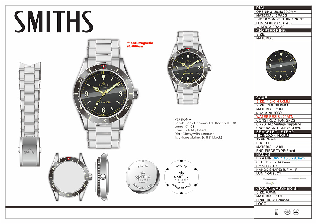
The change to a 45mm lug to lug is a big improvement and pretty much spot on for a 38mm watch. Thanks for taking the suggestion on board.

When's the scramble to try and throw money at this? Would complete my smiths trio perfectly

I know it's not a "pretty" movement but does anyone else think a display back would be good? At least as an option.

Not a fan in general of display backs and definitely not on ones with 20,000 A/M
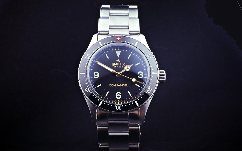
Overall I think it looks great but I've preferred the original numerals of the 1016 Explorer dial to the font used on the Everest. I expect that the designer has chosen something similar on his PC, which for me lacks the character of the 'original'. The numerals on the bezel look small compared with the Sub, Black Bay, or the new Seiko 149s.
I also dislike the caseback with 'WR 200 METRES', that seems unusual on casebacks, more often the Metres is abbreviated and Water Resistance written in full, at a much smaller size than than currently shown. But either way it's going to be a hugely popular watch.
My take on it...

That's cracking Chris. A few posts back I said I couldn't get on with the Explorer dial but this is a different story. I take it all back.
Below is my very amateurish attempt from a couple of months back - I think we had similar ideas?
WOW. They BOTH look fabulous.
This looks like a bb58 with a 3-6-9 dial?
Sent from my iPhone using Tapatalk
I like that. Proportionally perfect.
Sent from my moto g(8) plus using Tapatalk
Pretty much, but with smaller crown, Submariner bezel insert and Everest dial and handset (with 1016 numerals). It seems that the Black Bay 58 hit a sweet spot for size. Well, we all knew that anyway, its close to the 5513/14060 etc.
You shall from here on be known as the "Diverest".
For me, this absolutely nails it. Feels like something Smiths themselves might have made in the late '50s.
Well this is all very exciting isnt it? A well priced vintage inspired diver that is correctly proportioned. Cant wait.
Sent from my iPhone using Tapatalk
With apologies to Chris for hijacking his outstanding artwork, but how about an A and B variant?
Nice watch good to drop the Everest name from a dive watch but Commander just feels like a Bond wannabe name, why not just put the water resistance there.
+1
Costume jewellery. Ouch!!!
How about calling it the Muirfield, supposedly the worlds tallest underwater mountain in the ocean.
I agree, personally even the Commando feels a step too far, but consider their commercial success and the market niche these pieces occupy...no disrespect, I've owned a couple of Everests, nice watches, but there is a touch of wannabe about them, they are homages after all... though the Smiths branding/ historical associations keeps them to the right side of the divide imo.
Perfect idea.
"Once is happenstance. Twice is coincidence. The third time it's enemy action."
'Populism, the last refuge of a Tory scoundrel'.
I suggested Commander as I thought it was an obscure enough reference not to be a Bond wannabe.
This is clearly a dive watch and not an Everest, per se, and personally I think a named watch is nicer than one with only a model number.
The boss will decide either way.
D
I think it looks great. Dimensions are on point. There is a big market for moderately sized divers with vintage aesthetics - just see how the BB58 took the market by storm.
Personally I still prefer a non-riveted bracelet. I get the look and vibe of the rivets, I just think it looks better and cleaner without them. I do think the faux rivet bracelets is a trend and most people would prefer a non-riveted bracelet in the long run. But I might be wrong and biased by my own opinion here.
Something else to consider would be mil-sub swords hands, which would look great as well. But that changes the theme of the watch and might something for a different project.
Agree 100%. I didn't mind the Everest on there, but I thought Commander was a nod to Bond without being too on-the-nose. I'll line up for this watch either way but I like the change to Commander.
This is shaping up really nicely!
Following this with great interest. Looks great, going to be my 4th Eddie purchase for sure.
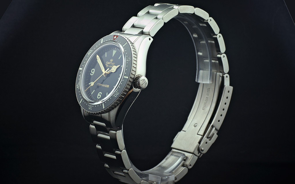
Is crystal flat or domed? (I am also not greatly keen on the Commander line - a little too Walter Mitty for me)
Basically love this, though not sure about the bezel.
a) larger numbers, like those found on the Tudor BB58 bezel, would look better imho.
b) I'm also not a fan of lumed bezels full stop (don't mind a lume pip at 12 but that's all), though I suspect that I'm in a minority and let's face it, I'll buy one anyway
Great to see a taper bracelet
I fully agree with you on that. It makes the watch look like a child's toy, and very embarrassing IMO.
Costume jewellery. Ouch!!!
Embarrassing? What an odd characterization. Lume on a bezel can be useful - remember when a watch's utility was a factor in its value? It's not right for every bezel -- not even right for every diver -- but some of us seek it out not for its appearance but for the functionality it adds. You might not need that function but I can't for the life of me understand how it could be embarrassing.
Last edited by finnegans; 20th May 2021 at 12:26.
I love the version A with the 3 6 9. I would like to see the depth rating instead of the Everest logo too.
This reminds me of the Mkii Nassau 369 version.
I love the smaller size too. Thanks Eddie!
.
Variant A is the winner for me. Love the 369 and the proportions.
Another stunner! I get black bay 58 vibes from this, and the second I realized it my lizard brain went: blue version WHEN?
36 too small? 38 too big? The size should, of course, be 37mm. I'm serious.
I just got myself a Baltic Aquascaphe in 39mm, nice, not too big. Lug to lug 47mm, 12mm height. My Rado Golden Horse dress watch from last year in 36mm, on the other hand, does not look noticeably smaller with its bold lugs, but wears a *lot* more comfortable.
I think, to be special this new diver should be kept under 38mm. If Oris or Rado would have made their small divers with 20ATM, instead of only 10, they would be a serious consideration for those of us looking for the nostalgia and superior comfort of olden times, when cars and watches were sharp, instead of just big and bulky. In a size of 38mm and above, the playing field for divers is already crowded.
It's true. The Zeno Seahunter and the Kemmner small Flieger were absolutely perfect at 37mm.
Any update on this? Does it still have that Commander text on the dial, I hope not.
Can't wait!
Will there be a date variant?
I agree as well, becomes too busy in low light at least for me, especially without glasses : 0
I think lumed bezels are great, one of the most useful additional facets of my Pelagos is the lumed bezel, and the fact that it matches the rest of the lume so perfectly. The lume makes the whole bezel usable in low light (rather than having to count up the scale from a lume pip).
As lumed bezels can be applied to metal insets, ceramic inserts and even under sapphire inserts, they can be specified to suit the watch perfectly. But the lume merely adds functionality.
One of the most surprising omissions on my (otherwise perfect) Scurfa is the presence of a sole lume pip, a fully lumed bezel on that would make it almost perfect.
Agreed, 369, variant A, much stronger presence in my book! By the way, Nikola Tesla said if you know the significance of numbers 3, 6 and 9, you have a Key to Universe.
For me 38mm size is perfection, proportion feel that is balanced and anchored by 369 and the triangle to the historic vintage lineage, just ah... Then if the hands are not tied to the historic "Commander" with baton hands why not go with the other synonym, "Superior", for a name, that has many other superlative meanings as well?
The prototype photo on Facebook is stunning:
https://www.facebook.com/timefactors...10922935586268
Last edited by williemays; 11th August 2021 at 01:22.
Hopefully it is only a prototype and still open to tweaking. As good as it looks, there are few design oddities/clashes to my eye that throws it out of balance.
The Commander insignia looks out of place, and as much as I love the baby dreadnoughts oversize minute hand, it doesn't transfer to this type of watch quite as successfully.
The width and length of hands should be fixed from the get go, none of this mk1 mk2 mk3 palaver, i'm sure your own eyes will tell you what looks best.
Great drawing starting point, but I don't think I would have been so bold to have it made a prototype as it is in its present form.
Good luck Eddie, tweak away and sincerely really looking forward to the final outcome.
I agree looks great Eddie.
I wanna see more pics. Especially the case profile. I agree with others, the COMMANDER doesn't work. It cheapens what otherwise looks like a purposeful piece of kit.
Eddie
Whole chunks of my life come under the heading "it seemed like a good idea at the time".
Im liking that a lot.
T.G.
To my eyes, this is absolutely perfect.
I havent bought a watch all year but will do my very best to break that disgusting habit when this one goes on sale.
That is extremely good. I know we started with 36mm but I surrender. 38mm is more versatile and of course more popular. It has been such a pleasure seeing this watch come to life.
By the way, why isn't it on a jubilee bracelet?
John
Last edited by abraxas; 16th August 2021 at 14:30.
 Posting Permissions