Reply With Quote
LolOriginally Posted by gerrudd

Sent from my iPhone using Tapatalk


Righty I think Id still go with the commander text. But either way its a looker, the Smiths Commander has a nice ring to it.
Sent from my iPhone using Tapatalk
Lol
Sent from my iPhone using Tapatalk

Well, it's a Smiths with a black bezel. How about calling it an ASTRAL ?
Defo oyster
Sent from my SM-G950F using Tapatalk
UWOTM8?
Got a new watch, divers watch it is, had to drown the bastard to get it!
Definitely the oyster Bracelet mate :-)
Sent from my SM-G950F using Tapatalk

I just think a watch with a name is nicer than one identified solely by a model code.
This concept started as an Everest variant, until it was poined out that an Everest Diver made no sense.
I came up with Commander because it was JB's Naval rank, and it seemed appropriate to this design as an 3-6-9-dialled sub homage.
It was not conceived to give the impression of military capability, and anyone who thinks it was is both wrong and perhaps needs to consider their own attitudes.
D

The name is great. I think it would look better in a nice subtle script instead of the block letters identical to the Commando. Maybe the one line of script with a red 200m underneath?
Well done Eddie! Ive been following this thread and have been wondering for a couple years when you would make something like this.
I have no objection to the name either, just preferred the subtle smaller print on the revised model
T.G.
I really like this one and I think that it will be a huge success in the resale market. It would certainly be worth adding £100 to the sale price here.
Why not Oyster and Jubilee?
Youve sold watches with more than one strap option before, why not two bracelets?
I agree with that logic!
Brilliant suggestion!
T.G.
Cost. The minimum order is 300 watches and also 300 of each type of bracelet.
Eddie
Whole chunks of my life come under the heading "it seemed like a good idea at the time".
I actually meant that you could supply the watch with both bracelets rather than just the one. Obviously the cost of the second bracelet would mean a higher price than with just one bracelet but, judging by prices achieved for your watches on eBay, the higher price is unlikely to be an issue.
Of course, it all depends on what the bracelets are costing you.
But I have to pay up-front and such an order is likely to cost me around 200k.
Eddie
Whole chunks of my life come under the heading "it seemed like a good idea at the time".
That does seem rather ouchy.
Dave E
Skating away on the thin ice of a new day
That is a huge outlay.
If Ive read another thread correctly, Eddie is putting these into production imminently ?
T.G.
Guess thats a no then.
Is there a ball park or actual price confirmed on these bad boys yet, anyone, thanks.
This sort of price increase would discourage enthusiasts more than profiteers, and it would not make it any easier to buy a watch when the shop is open.
Think of the profits though, and if only half of those profits went to the fundraiser
If it discourages buyers then it wont be so difficult to buy a watch in the Sunday afternoon bun fight.
The wrong people are profiting imho.
IMG_0967.jpg
Theres some healthy competition coming by the looks of it. What I find a bit puzzling is why not try and mimic a nice five digit case . More elegant.
The trend on this proposed San Martin case and the case on their current existing vintage diver (with the regular 6538 dial )is sort of a mini bb58 style case .
Eddies rendition seems to have a nicer case and a glossy dial contrary to san martins tropical dial
Also as an observation in the interest of historical accuracy and emulation is the big ball lollipop hand and ball on the counter poise more accurate on the San Martin ?
Sent from my iPhone using Tapatalk
Last edited by bond; 26th August 2021 at 11:49.
I just had a quick look. As you say, the San Martin is the chunky Black Bay look (that everybody hates, by the way). A five-digit case will make it look like every other diver on the market. The "Commander" is based on the 6202 turn-o-graph and that makes it far more elegant.
Yes I forgot or misunderstood it was emulating the turn -o-graph hence the differences - Thanks for pointing that out
Sent from my iPhone using Tapatalk
Any estimate on when these luscious things might make it onto the shop?
I was thinking the same thing this evening - whether to try and get a Caribbean or hold out for these if they are coming soon.
Sent from my iPhone using Tapatalk
And the shop is open this weekend...(far too hopeful thinking on my part, for both their arrival and managing to buy one in seconds!)
Lots to like with this one. I'm in the depth rating on the dial camp as far as the dial is concerned. Happy with either bracelet too. I wonder what the thickness is overall? I think I'd have liked a thinner bezel given the smaller overall diameter but this may look ok in the hand. The new models are just coming thick and fast which is great too.
Any new photos or news regarding this one Eddie?
Sent from my IN2013 using Tapatalk
Funnily enough I just spotted these on Instagram:
Sent from my iPhone using Tapatalk
Sent from my iPhone using Tapatalk
That's does look really nice. I can't wait for this to be available.
Sent from my SM-G973F using Tapatalk
They should be available early in the New Year, there's too much else going on in the run-up to Christmas.
Eddie
Whole chunks of my life come under the heading "it seemed like a good idea at the time".
Looks the business Eddie
Sent from my iPhone using Tapatalk
Proper tidy that
Sent from my IN2013 using Tapatalk
I love that dial. Gloss black and gilt. Wonderful.
Sent from my iPhone using Tapatalk
I've only just noticed this watch, but Eddie: can you please create a version of this (future model) that has a 1-12 bezel? A watch like this with a 1-12 bezel allows it to be the most all round watch, because the 1-12 bezel allows it to be easily used as a timing bezel, but also a quick TimeZone bezel too - making it the perfect "the one" watch. Thanks.
I finally got around to reading this entire thread, and I'd like to provide feedback:
I really like the latest version of this watch. I think it's near perfect. If I could ask for one change, and that is to include a folding divers extension (not one of those sliding ones). First, the folding divers extension is quite inexpensive to include, second: it legitimizes a watch as a divers watch, since you can easily deploy it and wear the watch over a wetsuit.
There are many dive watches that include features that 99% of divers won't use, like the helium escape valve, but for sure the divers extension is the most useful diver-specific feature (other than the timing bezel). I think this watch is excellent, but for it to be 100% perfect, as opposed to 95% perfect, it needs the divers extension IMO.
Out of all the diver watches out there less than $3k, I think this watch is the best, especially because it has the 20k A/m protection; that's why I think it should have the divers extension because it is such a good watch, and deserves it.
For the bracelet, my vote is for the oyster style. The jubilee doesn't look right on a sports watch IMO.
I dont know if others agree, but at some stage it would be nice (I think) to introduce plain end-links for the oyster bracelets. I dont mind the faux plates and rivets on the bracelet links themselves, but it would look cleaner (and more correct imho) if the end-links were free from the faux plate detail.
I would agree with many of the earlier posts on this thread that the crown needs to be bigger. Not just bigger, but it should have the oversized knurls and curves of the original 6538, the current version seems just too flat and square.
There are some practical reasons for a smaller crown in that it is unobtrusive but i think the main reason the original 6538s are so sought after is that the big crown is so idiosyncratic it gives them character that just can't be beaten. Changing the crown on this watch could really elevate it to another level.
regards
siggy
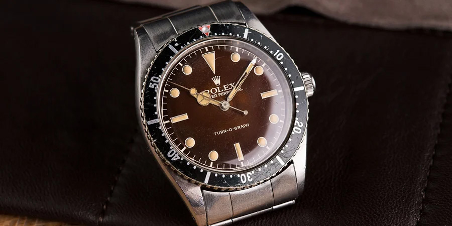
This watch is based on the 6202. Check the crown on that.
This one is looking really good Eddie. I'm pleased to see the dial numbers typeface was updated (I'd like to see those used on the next gen Everests too), it's going to be a very popular model and will certainly give watches like the Seiko SPB143 a run for its money.
Well done.
You do mean SPB147. As for the rest I fully agree. This watch is going to be extra popular. We will soon see a fume tropical dial version. I am waiting for that one.
Last edited by abraxas; 13th October 2021 at 12:34.
Eddie
Whole chunks of my life come under the heading "it seemed like a good idea at the time".
,
ah, ok, thanks. Hope it goes well.
regards
siggy
Behave now Eddie, come on mate, just release the commander asap please....
Sent from my IN2013 using Tapatalk
I love the big crown idea too :)
Sent from my iPhone using Tapatalk
Don't you think the crown on the Commander is big enough?
By the way, going by the pics I've seen, I think it is.
I think the fume on the tropical commando looks better than that.
Inspired me to mess around in Lightroom. Wrong hands of course.
Sent from my iPhone using Tapatalk
 Posting Permissions