I think this deserves its own thread. I loved the idea of the Commando and I think the tropical dial would suit the watch, but (you knew there was a but on its way) I don't think the current version is optimal.
The handset overpowers the dial. Specifically, the hour maker is too long, but in general, the hands need to be slimmer and a bit more refined. It is the reason I sold my watch. The handset looks better suited to a 39mm dial.
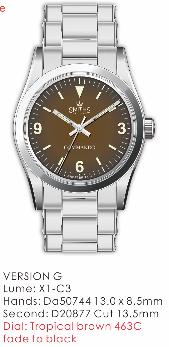
I'm not a huge fan of vintage lume, but if you are going for an aged dial, then aged lume makes sense.
The commando font shoudl be smaller and slimmer.
A bigger change and less likely, but I'd love a redesigned rivet bracelet, lighter, more flexible, and with a better clasp.

I agree with the proposed changes! :)
Plus boobies crown
I really liked the Commando when it came out even better than the Everest but decided to hold off for now from buying one. I decided to ask Eddie if there would be more to come and he put out yes but with a Tropical dial. I really like the idea of this but have to agree that the hand set could be a little more refined. I will leave it to Eddie because he had really made some awesome tweaks to the Everest with hands and logo choice so it is obvious that he does listen to the customers here in the forum and threads.
I am looking forward to a picture of a prototype if that is Eddies plan. Either way I see the Commando as a welcome member of the Smith's branding.

I really wanted to get a Commando as well, but decided against it for the reasons the OP mentioned. The hands just seem a bit too thick and too long for the dial. I am also not a fan of the "Commando" font. I understand that it is true to the original, but on the original the font matches that used for the Rolex logo, but not here. I would love to see the "Commando" text a bit smaller and using a font that matches the Smiths logo.
I am overall excited to hear about the tropical dial version of the Commando. I have the black dialled Everest so a different dial color would be the perfect excuse to also get the Commando. I hope that minor improvements are possible to this version to make it an even more attractive watch.
Here's my Everest:

Im in two minds over it, I think using the new logo along with the commando text really works. I find the font size to be fitting and Im happy Eddie used the same font as on the Rolex and it adds a nice balance to the dial having the text in white. The long seconds hand stretching out over the dial fits real nicely. The hour hand is indeed seems a little longer from photos and maybe slightly wider but with the folded hand set maybe thats a little harder to do. Would be interesting to see the crown logo at the 12 as per the original Rolex commando but I dont know how Id feel about losing the triangle at 12. Plus the smiths text would need changing and I think the dial would lose some balance.
Im looking forward to seeing the tropical dial. Kind of sounds like these will be smaller run pieces though so maybe there will be small changes made over time with runs of say 100. And the Everest line will obviously remain the main attraction. With its smaller production amounts like the jubilee edition.
Last edited by theflyingfisherman; 14th March 2021 at 22:46.

Would maybe a gilt hand set with the slimmed down dimensions described, and with the aged lume and dial tone,... probably a step too far, especially given the original Rolex model had kinda intentionally humble origins. Then again the dial says De luxe.
Last edited by Passenger; 14th March 2021 at 22:45.
Myself I'm more than happy with the Commando as is, though I just wish Eddie would stop adding nice updates like Gilt and Tropical dials, can get a bit costly keeping up
Eddie
Whole chunks of my life come under the heading "it seemed like a good idea at the time".

I think the thickness of the hour hand is fine as it is. I would only remove the metal above the lume as in the original:

Eddie, will the next batch of Everest have the "EVEREST" text in white? I know this is not the thread, but I don't really know where else to ask, moreover we are talking about changes, so I thought why not.

I like the sound of that, it works so well on the Gilt dial, balances it beautifully....Originally Posted by cap_riccio

Sent from my iPhone using Tapatalk
Last edited by TheGent; 16th March 2021 at 14:09.
I think the dial is missing some horizontal lines to give some visual anchor while checking the time. Some people mock the lines of text on the Rolex, but I believe they help to give that visual reference.
I think the shorter hour hand in the new render is much more balanced. If was possible to have a handset with more lume and less metal at the end even better.
I know you're are not a fan of vintage lume Eddie, because of the performance trade offs but I think it would complement the dial colour.
I for one think an acrylic crystal would really complement the tropical dial.
Sent from my iPhone using TZ-UK mobile app
That could look very nice indeed. I've been looking more at the Commando, I quite like the change to the hands there.
Dave E
Skating away on the thin ice of a new day
 Posting Permissions

 Reply With Quote