Reply With Quote
Does that look like glue-seepage around the outside of the cyclops?
You wouldn’t get that on the kosher item
The “Y” in OYSTER overlaps the “O” In the top one too.


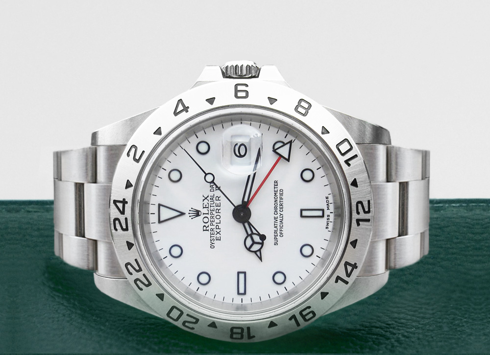
I came across this S series (1993-94) Rolex 16570 on Chrono24, from a supposedly trusted dealer (over 400 good reviews). However, the dial looks a little off to me - the II looks quite wide and extends to the left of the D on top of it (see picture 1), however almost every other 16570 from the same era I could find has a narrower II that stays well within the D and the A (such as example in picture 2). The two lines of chronometer fonts look slightly off too.
The dealer has insisted that its all original (not a service dial either). But what do you guys think? The movement looks fine to me but the dial just feels a bit off..).
Forgive me if this has been covered or is common knowledge! Thanks for your input :)
Cheers,
Tommy
Sent from my iPhone using Tapatalk
Does that look like glue-seepage around the outside of the cyclops?
You wouldn’t get that on the kosher item
The “Y” in OYSTER overlaps the “O” In the top one too.
Last edited by blackal; 26th December 2020 at 23:19.
The crown doesn't look thick enough either, or at least they differ.
‘Seepage’ is just the hands magnified in the cyclops.Originally Posted by blackal

Not that I’m saying it’s kosher. I don’t know enough about them.
The Rolex Crown symbol looks very different as well.
Is it a bricks and mortar dealer?
Started out with nothing. Still have most of it left.

Run. Must be a ton of these around, why bother with a dodgy sample ...

Example picture 2 the crown does look too small and the lugs don't look right, picture 1 looks okay but a higher res image of the dial would be better, the Explorer font is different but this could be a change by Rolex, below is another S serial -

I would advise filtering for all 1993/1994 16570 on chrono24 and just compare them, paying particular attention to the most expensive and best examples, there are 20 of them in that date range on there. My hunch is that there has been little study of these particular models of the 1990 vs others, so might be a case of doing own due diligence. Pioneering the way!
well spotted..
They have a shop in Hamburg (with good reviews too) under a different name, which also has been changed once in the last few years it seems
They have a shop in Hamburg (with good reviews too) under a different name, which also has been changed once in the last few years it seems
This looks fantastic - congrats if it's your watch:)
Tried to do this just now and saw a few variations (small things here and there) so thought I'd ask on the forum.. will study them a bit more tomorrow:)
Last edited by tommyzzj; 27th December 2020 at 01:47.
Ask yourself this.
If it all goes tits up will you be able to get your money back?
Is it... so cheap/such a good watch/the one you have to have... or could you buy one in the UK from a shop or Watchfinder etc.?
How much do you trust the seller?
Started out with nothing. Still have most of it left.
I've owned three of these and I see absolutely nothing wrong with the crown. Looks just perfect.
These always have some variation in the dial print, just like other sports Rolexes.
I see nothing wrong with the watch, either.
Looks just as nice as my white version. Mine is just newer, SEL version.
There's only one thing... in this picture the watch looks like it has different (smaller 1675-type) winding crown than in the other picture (which looks perfect). There should be no gaps between the crown guards and the crow when the crown is screwed in. Is this the same watch?
https://uploads.tapatalk-cdn.com/202...f3d2352800.jpg
Last edited by JPE; 27th December 2020 at 06:07.
I think people are confusing the pictures, the OP posted image 2 as an example from the web, this one has the small crown but is not the watch the OP is considering, image 1 is the watch.
In which case I think the OP is comparing his target watch with an imperfect example in the second photo. The second picture for example, has a cyclops that doesn't look the correct size. The top one does.
Does anyone have any references from the Mondani books to see about ExpII dials?
Was just using picture 2 as an example for the font situation I was talking about - didn’t pay much attention to much else when choosing that picture. Sorry if that added a bit of confusion:)
I think even if I have the watch in person I would still have the same questions (as they show many pictures of the watch on Chrono24) - hence wanted to ask on the forum first:) It's just that I'm looking for S series in particular and there aren't that many I can find within the UK. think I will stay away from this one though
Last edited by tommyzzj; 27th December 2020 at 11:16.
Yes indeed
Sent from my iPhone using Tapatalk
I've taken as look in the David Silver vintage book but all photos are set to 01:50 so the hands block the explorer text.
Nothing wrong with that.
Dials vary lots depending upon where they were manufactured. Around the cyclops is merely fluff and dirt.
Im not trying to put you off what may be a genuine watch but Id hate to see anyone make a mistake with that amount of money. Perhaps someone with enough knowledge may offer an opinion on it.
Started out with nothing. Still have most of it left.
The more I look at these the more I want one!

I dont know a great deal about these things but Id expect the tritium to be far more creamy on that age of watch and the filling on the 12 o clock marker isnt what Id expect either.
Like I said though, Im certainly no expert.
Looks fine it's not a vintage Matt dial Rolex, If was service dial would more than likely be swiss only at bottom.
Sent from my SM-G970F using TZ-UK mobile app
Laying in the sofa with wifey and nicked hers off her wrist for a quick pic.
This is a U Series so 4-5 years newer and she practically wears it all the time, no need for the dressy YM these days.
Enjoy
Pitch
jalaluddin rumi poems
OP I really dont think its anything to worry about. I bought my 16570 4 years ago and did a lot of comparisons from pictures etc and found that on a lot of dials,the II after explorer extended past the D in date and in a lot of others it didnt so nothing to worry about
Sent from my iPhone using TZ-UK mobile app
Nah, you really want one of these.................

Started out with nothing. Still have most of it left.
 Posting Permissions