

 Reply With Quote
I know nothing about the brand, but that looks interesting.


Tentative from GGB depending on level of interest, 38mm hand winder @ <£500
I'd go for it for the legendary packaging alone, but I do think it's a rather good looking thing.
Render:
https://gasgasbones.forumchitchat.co...pid=1321687687
Don't just do something, sit there. - TNH

I know nothing about the brand, but that looks interesting.
Nice case shape but the dial is a bit of a mess
I like it, takes the idea of the military watch but plays with it a bit. After looking at the previous watches, and the packaging as mentioned, I've put my name down as interested.
I like Carl's personal spin on classic designs.

Don't just do something, sit there. - TNH
I suspect I am not Carl's target market, as I prefer mil watches a little plainer and not so stylised, but that has a few more details than needed, imho. And lume that green just reminds me of the really useless stuff plastered onto the dials of 1970s Sicura chronos.
But the core of a very nice looking watch design is there with the minute track simplified, the inner ring made thinner and the lower dial script minimised.
D

I like the look of it, military style with a little twist!
Sent from my SM-N976B using Tapatalk
I'm sure it's quite deliberate, but I'm not keen on how the hour hand ends exactly on the inner track. I do like Carl's work though and good to hear he's back as I thought he'd taken a step back from GGB for a while.
I don't know whether Carl has seen this thread, but some of the comments and suggestions are reflected in the final render. 'Upkeep' refers to the bouncing bomb used in Operation Chastise.

Last edited by Mr Curta; 22nd January 2021 at 17:47.
Don't just do something, sit there. - TNH
I got the email today notification. I like some of the changes, but I preferred the 'mark XI" style second hand on the earlier render. Is the case bead blasted, I assume so, but didn't see any detail.
That is a fine looking watch. The dial and hands are both clearly improved upon the ones you posted previously Matthew. Carl's logo is super, I have an enamel badge of it. Hand winding is also fine by me.
Think I'm going to have to put my name on one of these, be a nice memento of my time with the BBMF and also completing the 50th Anniversary walk across the Mohna Dam while stationed in Germany in 93; the local German walking club invited our Station club to take part.
Ooooohhh..........
I like it a lot.
The updated render looks much better
It's just a matter of time...
If Carl is reading this, suggest he removes the speech marks from around UPKEEP. It doesn't need speech marks or inverted commas.
And in answer to my own question, the case is brushed.Originally Posted by gerrudd

Hi folks
Mr Curta pointed me to this thread.
Thank you very much indeed for your comments and suggestions.
@AlphaOmega Good feedback which I have taken note of. The dial is being drawn up over this weekend before sending to the dial guys so good timing. It actually looks better to be fair as it boxes in the text nicely !
Thank you
Carl
UPKEEP

Personally I like the speech marks, sort of draws your eye/gives presence to the code word

Oooo I do like finding another quality micro brand!
Oh cool. I will watch this with interest. I follow Carl on Instagram but have not seen his posts on my feed for ages, more to do with Instagram and the fact I am busy.
I like this a lot.
Then you like typos.
I don't like typos, but I do like a Typex.

Don't just do something, sit there. - TNH
^Looks like an Enigma machine. Wonderful stuff.
There's a good reason for that
https://en.wikipedia.org/wiki/Typex
Don't just do something, sit there. - TNH
^Ah, I haven't heard of Typex. I know the German Naval version of Enigma was a bit better than the Army version. And the Japanese Purple was advanced. Didn't know we developed a version, too. Very interesting.
I should say, IIRC we have the Polish to thank for doing a lot of the heavy lifting in cracking Enigma.
Absolutely. Thanks for making this point.
https://www.nature.com/articles/d41586-018-06149-y
Theres a permanent exhibition in Poznan detailing the Polish contribution to cracking the Enigma codes.
And the container seems absolutely epic!
Sent from my iPhone using Tapatalk
Excellent article, I'll look forward to reading that. I knew about Rejewski but not the others.
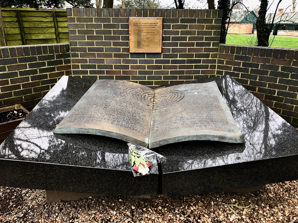
This is the Polish Memorial at Bletchley Park, we always pause and pay our respects.
Don't just do something, sit there. - TNH
Being Dyslexic written English is a mystery to me
^Do you feel the punctuation makes the script easier to read? That would be interesting to know and something I could bear in mind when I'm being blunt about typos in future.
I also think it looks a lot better without the speech marks.
I would agree, I think it would look better without. Unless for some reason they were always used in every reference to it?
It's just a matter of time...
Yes to me it focuses the eye on the word Upkeep rather than 6B No. 4
Though possibly using single quotation marks rather than double in this instance would be more correct, mind its probably all changed since but as a youngster I was taught to use single marks to highlight a particular word of importance within a sentence/paragraph and still do on the very very rare occasions I have to write anything these days.
No need for either speech marks or inverted commas on the watch.
In prose though, you're right - if you're referring the reader to a word in a sentence then inverted commas are fine IMHO but some people dislike them. Also, US rules are a little different from ours.
Well, that's my first post Brexit UK purchase settled then... It looks lovely, can't wait!
A shame the speech marks have been consigned to the bin, still think I preferred with but still a great watch.
Last edited by Ed875; 31st January 2021 at 19:57.
See the first twenty-five have been snapped up already and the renderings have also been updated to without those speech marks.
Don't just do something, sit there. - TNH
 Posting Permissions


