closing tag is in template navbar
timefactors watches


TZ-UK Fundraiser
Page 1 of 3 123 LastLast
Results 1 to 50 of 104

Thread: Christopher Ward New C65 Super Compressor

  1. #1

    Christopher Ward New C65 Super Compressor

    Just been released today but I don't see it as a winner.
    It just looks boring and no different to other compressors at cheaper prices.
    The Ocean Blue doesn't look to bad on the bracelet but at £1000.00 it just seems expensive for what you get.

    https://www.christopherward.com/retr...-S0WK0-B0.html

  2. #2
    Master Tetlee's Avatar
    Join Date
    Jun 2014
    Location
    Somerset
    Posts
    3,001
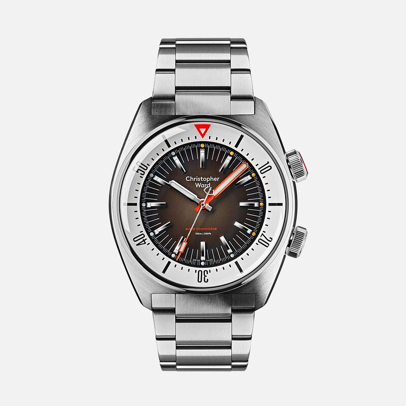
    "The C65 Super Compressor is the first genuine super compressor diving watch in 50 years."

    That's a lofty claim, my understanding was only cases manufactured by EPSA were genuine Super Compressors and that the name was trademarked. I don't see any Brevit numbers.

  3. #3
    Well apparently this makes it a genuine super compressor.

    (The C65 Super Compressor is the first genuine super compressor diving watch in 50 years. With every metre you descend, its ingenious mechanism increases water-resistance. Turn it over, and the exhibition caseback – a first for a super compressor – shows you the all-important compression spring and diving-bell logo.)

    Sent from my SM-N960F using TZ-UK mobile app

  4. #4
    Master sweets's Avatar
    Join Date
    Jan 2007
    Location
    Bristol - UK
    Posts
    6,056
    I like it, and appreciate the restraint shown in the design. I like the polished to brushed and back again contrasts on the case chamfers, which is genuinely like the EPSA cases used by so many companies back n the day.
    But what I really like is the fact that they understand the "Compressor" name and have re-used Piquerez's original concept of a case that deforms slightly with increased pressure, pressing ever more tightly on the seals to resist the increasing pressure.
    2 crowns doth not a compressor make, and CW understand that, unlike many others.
    Dave

  5. #5
    Master
    Join Date
    Apr 2015
    Location
    Stockton, Teesside, UK
    Posts
    1,506
    Well, IMHO its the best looking CW watch ever! (is that damning with faint praise??). Ignoring whether its a good diving watch or not, I quite like it, but I don't like the price at all!

  6. #6
    I like it.

    One of the best looking watches they have released for ages.

  7. #7
    Quote Originally Posted by sweets View Post
    I like it, and appreciate the restraint shown in the design. I like the polished to brushed and back again contrasts on the case chamfers, which is genuinely like the EPSA cases used by so many companies back n the day.
    But what I really like is the fact that they understand the "Compressor" name and have re-used Piquerez's original concept of a case that deforms slightly with increased pressure, pressing ever more tightly on the seals to resist the increasing pressure.
    2 crowns doth not a compressor make, and CW understand that, unlike many others.
    Dave
    I agree.
    As far as I know trademarks will expire after a certain number of years unless they are maintained in use.
    I think it's a nice looking watch and worthy of the Super Compressor name.

  8. #8
    Master Tetlee's Avatar
    Join Date
    Jun 2014
    Location
    Somerset
    Posts
    3,001
    Quote Originally Posted by MrGrumpy View Post
    Well, IMHO its the best looking CW watch ever! (is that damning with faint praise??). Ignoring whether its a good diving watch or not, I quite like it, but I don't like the price at all!
    Love your negative tint at the end there just to keep your username valid

    I agree with you though, looking at the proper pics it certainly does look great and I like the fact the crowns are correctly spaced which is a bugbear of mine worth most modern Super Compressor style watches where they are too far apart which IMO kills the design.

    Regarding price, there are always sales with CW so just wait for a bit. Not sure how long it is until new models appear in the 50% off. 30% shouldn't be too long though I wouldn't think.

  9. #9
    Master
    Join Date
    Sep 2004
    Location
    West Sussex, United Kingdom.
    Posts
    7,998
    good move with the logo returned to 12 too :0)

  10. #10
    Master Thewatchbloke's Avatar
    Join Date
    Dec 2010
    Location
    Oxfordshire UK
    Posts
    7,246
    I'd like to know exactly how the back deforms given that it's almost entirely a flat sapphire crystal, I'd expect the crystal to fail before it deforms. Good effort though, the best design I've seen from CW to date.

  11. #11
    I really like that. On tropic strap it’s £895 and with a £100 discount voucher £795.

    Starts to become very appealing.

  12. #12
    Grand Master SimonK's Avatar
    Join Date
    Apr 2007
    Location
    Paris, France
    Posts
    19,498
    Quote Originally Posted by Stanford View Post
    I agree.
    As far as I know trademarks will expire after a certain number of years unless they are maintained in use.
    I think it's a nice looking watch and worthy of the Super Compressor name.
    Also, E Piquerez SA, whose design it was and who presumably trademark protected and copyrighted it, went into liquidation in 1991.

  13. #13
    Master
    Join Date
    Jun 2008
    Location
    The corner of Miles and Gil
    Posts
    1,463
    I quite like it - which is a first as most of their watches leave me a little cold.

    Two problems for me:

    I have never liked their logo. Small thing, but seems to make a huge difference to me for some reason!

    I really don't like display backs.

  14. #14
    I quite like it and agree 100% with Sweets’ post.

  15. #15
    Master
    Join Date
    Sep 2006
    Location
    Hereford
    Posts
    1,685
    That is the first CW watch that has appealed to me. I like it.


    (Still hate the name though).


    Sent from my iPhone using Tapatalk

  16. #16

    Christopher Ward New C65 Super Compressor

    Blue or ‘Black Sand’. What’s your preference?
    Last edited by Mr Tetley; 28th August 2020 at 13:25.

  17. #17
    Master
    Join Date
    Dec 2007
    Location
    Sunny Manchester
    Posts
    1,288
    Very similar in design and price to the Farer Aqua Compressor-
    https://farer.com/collections/aqua-c...sor-automatics

  18. #18
    Love that it’s a true compressor case. They deserve credit for that, in the face of multiple compressor-style watches (one of which I own)

    The overall aesthetics leave me a bit cold. Personal taste and all but I can never get excited about CW watches despite some great work.


    Sent from my iPhone using Tapatalk

  19. #19
    Craftsman
    Join Date
    Apr 2017
    Location
    Plymouth
    Posts
    479
    I'm not a christopher ward hater, I actually don't mind the brand, yes the logo fiasco stinks...
    That's a fairly nice watch at least they are trying to innovate and bring something different to the market,it looks like they've put some effort in unlike a lot of established brands who seem content to rest on their laurels and churn out the same old stuff in different colours etc.
    I wouldn't buy it as its just a bit too expensive, as has been said in one of the inevitable sales it may be more attractive.

    Sent from my SM-G960F using TZ-UK mobile app

  20. #20
    Journeyman
    Join Date
    Aug 2017
    Location
    farmborough
    Posts
    185
    Quote Originally Posted by inthered View Post
    Very similar in design and price to the Farer Aqua Compressor-
    https://farer.com/collections/aqua-c...sor-automatics
    I think that makes the Christopher ward a bit more impressive, considering the farer is a compressor only in looks.

    Sent from my SM-G970F using Tapatalk

  21. #21
    Seems convenient but I just received the £100.00 off voucher in the post.

    I've had quite a few CW over the year's but never kept one longer than 4 month's.
    I will look out for the blue one in a few month's time as they will most likely pop up on eBay at a few hundred quid less.

    Sent from my SM-N960F using TZ-UK mobile app

  22. #22
    I quite like it too. I’d be interested to see examples of other true compressor watches as I suspect the OP was referring to cheaper compressor style watches.

  23. #23
    Quote Originally Posted by Mr Tetley View Post
    Blue or ‘Black Sand’. What’s your preference?
    Blue

  24. #24
    Master
    Join Date
    Mar 2009
    Location
    Wokingham
    Posts
    2,099
    First CW watch I've seen that I want to own. I'd prefer an SW300 but for £1000 it's a hell of a lot of watch for the money.

  25. #25
    Correct.

    When I first looked at it it was the Black version that put me off. It just seems plain but the more I look at the Blue one the easier on the eye it becomes.
    Like I said in a few month's time I will look to get my hands on the Blue one.

    In the meanwhile if anyone wants the £100.00 voucher let me know and I will post it to you.
    Quote Originally Posted by jmarchitect View Post
    I quite like it too. I’d be interested to see examples of other true compressor watches as I suspect the OP was referring to cheaper compressor style watches.
    Sent from my SM-N960F using TZ-UK mobile app

  26. #26
    Master
    Join Date
    Jan 2014
    Location
    Yorkshire
    Posts
    2,329
    Deserves a pic


  27. #27
    It's interesting to see a "proper" compressor case - most brands haven't bothered to mimc /recreate the ESPA case, as there are probably better ways of doing it. But points for historic accuracy.
    However, is it just me, or did anyone else think of the Bulova / Accutron Deep Sea (and similar models) (sans date) when they saw the photo?
    Cool thing. Probably.

  28. #28
    Master
    Join Date
    Nov 2012
    Location
    Lincoln
    Posts
    2,054
    This is a great watch for several reasons, first cw i have felt like I might buy for a long while. The twin crown is cool, the movement is not just clever but beautiful and it looks like a genuinely good tool watch, price is reasonable and although I’m not a fan of the ocean blue necessarily the black face is very nicely balanced with the orange

    Well done cw in this case from me, way better than those horrid sapphire watches they last released


    Sent from my iPhone using Tapatalk

  29. #29
    Craftsman
    Join Date
    Feb 2014
    Location
    Ashbourne, UK
    Posts
    391
    I like it a lot, particularly the blue dialled version. I've owned a CW watch in the past, the Makaira, and thought the quality for the price was great. As others have said, the logo/name never seems to work, although this with the name at 12 looks much better.

    Sent from my SM-G950F using Tapatalk

  30. #30
    Master
    Join Date
    Jun 2019
    Location
    UK
    Posts
    1,113
    I have had several CW watches, and all have been moved on. I really liked the GMT Elite, but the CW branding at 9pm just does not work, so this having the name at 12 def does work better.

    I think with the £100 they are not bad priced at all. It is interesting that they actively promote that the mark up on their watches is 300%.

    I think it is unlikely you will see these at the 30% discount for a while yet.

    I do hope that all future models do revert back to where the name should be.

  31. #31
    Master
    Join Date
    Nov 2012
    Location
    Lincoln
    Posts
    2,054
    Quote Originally Posted by s1wnw View Post
    I have had several CW watches, and all have been moved on. I really liked the GMT Elite, but the CW branding at 9pm just does not work, so this having the name at 12 def does work better.

    I think with the £100 they are not bad priced at all. It is interesting that they actively promote that the mark up on their watches is 300%.

    I think it is unlikely you will see these at the 30% discount for a while yet.

    I do hope that all future models do revert back to where the name should be.
    That’s what they want you to think .. I’d be interested to se an exact costing because in reality after numbers have been massaged it’ll be much much higher


    Sent from my iPhone using Tapatalk

  32. #32
    Master
    Join Date
    May 2016
    Location
    London UK
    Posts
    1,969
    Quote Originally Posted by Thewatchbloke View Post
    I'd like to know exactly how the back deforms given that it's almost entirely a flat sapphire crystal, I'd expect the crystal to fail before it deforms. Good effort though, the best design I've seen from CW to date.
    It’s not the back that deforms but the whole caseback assembly gets pushed tighter against the seals as the watch goes deeper due to the pressure exercised on the case.


    Sent from my iPhone using Tapatalk

  33. #33
    Craftsman
    Join Date
    Jun 2017
    Location
    Merseyside
    Posts
    896
    I like it, prefer the black to the blue dial, first CW I've considered owning to be honest.
    Isn't / wasn't CW a member here ?

  34. #34

    Christopher Ward New C65 Super Compressor

    Someone pointed out on WUS that the ‘Super Compressor’ text is not centred. Needs moved right a bit. Once you see it it’s hard to unsee. Maybe it’s just on the images though and the production models are ok.

  35. #35
    Master
    Join Date
    Jun 2019
    Location
    UK
    Posts
    1,113
    Some real life images in this review

    https://wornandwound.com/review/hand...er-compressor/


    Sent from my iPhone using TZ-UK mobile app

  36. #36
    Grand Master snowman's Avatar
    Join Date
    Nov 2012
    Location
    Hampshire
    Posts
    14,553
    I like it, no if or buts, except that having a couple of vintage super compressors, I won't be buying a new one.

    I must admit my first impression was it was a bit dear (and that's probably just because the CWs I've had have been bought in their 50% off sales), but on reflection £795 (with the voucher - no coincidence, the letter with it mentions the release of the super compressor) seems a decent enough price given that CW watches are actually better quality (especially these days) than many give them credit for. Like an earlier poster I have a Makira and it's a well made and finished watch.

    I think the black sand on the tropic strap is the best looking, too.

    One thing, though, 150M WR seems an odd figure - Does anyone know if there's a reason for it?

    If I didn't have vintage super compressors, I'd definitely keep an eye out for one of these in a sale.

    M
    Last edited by snowman; 29th August 2020 at 09:47.
    Breitling Cosmonaute 809 - What's not to like?

  37. #37
    Grand Master Onelasttime's Avatar
    Join Date
    Oct 2014
    Location
    Everywhere, yet nowhere...
    Posts
    13,814
    A compressor with a glass case back? Close, but no cigar CW.

  38. #38
    Craftsman Jpshell's Avatar
    Join Date
    Oct 2015
    Location
    Peterborough
    Posts
    344
    I’ve been toying with this Farar for a while but I do like the CW, have to say, especially on the orange leather

    https://farer.com/products/leven

  39. #39
    Master
    Join Date
    Jun 2008
    Location
    The corner of Miles and Gil
    Posts
    1,463
    Quote Originally Posted by Mr Tetley View Post
    Someone pointed out on WUS that the ‘Super Compressor’ text is not centred. Needs moved right a bit. Once you see it it’s hard to unsee. Maybe it’s just on the images though and the production models are ok.
    How did no-one at CW notice that?!

  40. #40
    Their's one on eBay with about 3.5 years warranty remaining. Currently sitting at £511.00 Black strap tho.
    Quote Originally Posted by Jpshell View Post
    I’ve been toying with this Farar for a while but I do like the CW, have to say, especially on the orange leather

    https://farer.com/products/leven
    Sent from my SM-N960F using TZ-UK mobile app

  41. #41
    Craftsman Jpshell's Avatar
    Join Date
    Oct 2015
    Location
    Peterborough
    Posts
    344
    Quote Originally Posted by sickie View Post
    Their's one on eBay with about 3.5 years warranty remaining. Currently sitting at £511.00 Black strap tho.

    Sent from my SM-N960F using TZ-UK mobile app
    Thanks for heads up

  42. #42
    Master
    Join Date
    Aug 2018
    Location
    Surrey, U.K.
    Posts
    1,512
    Differs from the new version in that it has a steel case and ETA movement vs the ti / Sellita that the new ones are specced with (should you care).

  43. #43
    Master Tetlee's Avatar
    Join Date
    Jun 2014
    Location
    Somerset
    Posts
    3,001
    Quote Originally Posted by Mr Tetley View Post
    Someone pointed out on WUS that the ‘Super Compressor’ text is not centred. Needs moved right a bit. Once you see it it’s hard to unsee. Maybe it’s just on the images though and the production models are ok.
    Arrghhh! Must be just the renders surely? What could be the reason for not centring it?

    Good job I wasn't considering one, that would have 100% been a deal breaker for me.
    Last edited by Tetlee; 29th August 2020 at 11:34.

  44. #44
    Master
    Join Date
    Nov 2012
    Location
    Lincoln
    Posts
    2,054
    Quote Originally Posted by Tetlee View Post
    Arrghhh! How on earth? What could be the reason for not centring it?

    Good job I wasn't considering one, that would have 100% been a deal breaker for me.
    That’s not the style of watch though, that’s just the sloppy nature of cw churning new watches out every 2 minutes that we have come to know and love, the super compressor style is excellent


    Sent from my iPhone using Tapatalk

  45. #45
    Quote Originally Posted by Tetlee View Post
    Arrghhh! Must be just the renders surely? What could be the reason for not centring it?

    Good job I wasn't considering one, that would have 100% been a deal breaker for me.
    Based on the Worn&Wound photos it’s not just the renders. Although they may have been reviewing a pre-production model.

  46. #46
    Nicest CW I’ve seen! 👍

  47. #47
    Just got the £100 voucher when you spend £500 through the post - anyone wants it?

  48. #48
    Master Thewatchbloke's Avatar
    Join Date
    Dec 2010
    Location
    Oxfordshire UK
    Posts
    7,246
    Quote Originally Posted by Ar.parask View Post
    It’s not the back that deforms but the whole caseback assembly gets pushed tighter against the seals as the watch goes deeper due to the pressure exercised on the case.
    Apologies as I didn't explain myself particularly well, I understand how the system works, the spring keeps the back secure whilst allowing for further movement to compress the seal as the pressure increases.

    My point is that the super compressor cases were designed for diving whilst a super compressor case with a display back really isn't. As nice it is to view the movement I'd rather see a solid caseback on this type of watch as it could then be a practicable dive watch capable of far deeper depths than 150m. It wouldn't take much more pressure to crack a flat sapphire glass as opposed to a solid caseback which will deform or give as the pressure ramps up.

    To be honest I suppose it's all moot as I doubt any of these, solid or display backed, would seriously be used for diving purposes!

    I do actually like the watch, even as it is, even though my preference would be a solid back with the diving helmet logo.

  49. #49
    Master
    Join Date
    Apr 2015
    Location
    Stockton, Teesside, UK
    Posts
    1,506
    Quote Originally Posted by Mr Tetley View Post
    Someone pointed out on WUS that the ‘Super Compressor’ text is not centred. Needs moved right a bit. Once you see it it’s hard to unsee. Maybe it’s just on the images though and the production models are ok.
    I suspect that this is some sort of optical illusion - I see what you mean, but if you count the characters, they do balance I think. A classic print expert might be able to tell what's going on (the mysterious art of kerning, I believe). It could be something in the exact characters and density of the text in 'compressor' and the gap between super & compressor. Or maybe CW designers are blind or think its arty!

  50. #50
    Quote Originally Posted by MrGrumpy View Post
    I suspect that this is some sort of optical illusion - I see what you mean, but if you count the characters, they do balance I think. A classic print expert might be able to tell what's going on (the mysterious art of kerning, I believe). It could be something in the exact characters and density of the text in 'compressor' and the gap between super & compressor. Or maybe CW designers are blind or think its arty!
    I’ve had a good look at the characters and IMHO it is too far to the left. I don’t think it’s a kerning issue as look at how it aligns to the 5 and 7 markers. Would be interested to see one in ‘the flesh’.

Posting Permissions

  • You may not post new threads
  • You may not post replies
  • You may not post attachments
  • You may not edit your posts
  •  

Do Not Sell My Personal Information