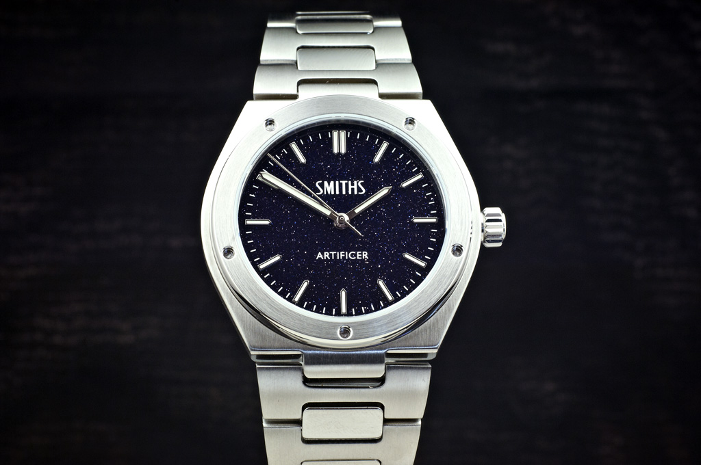
Aventurine dial
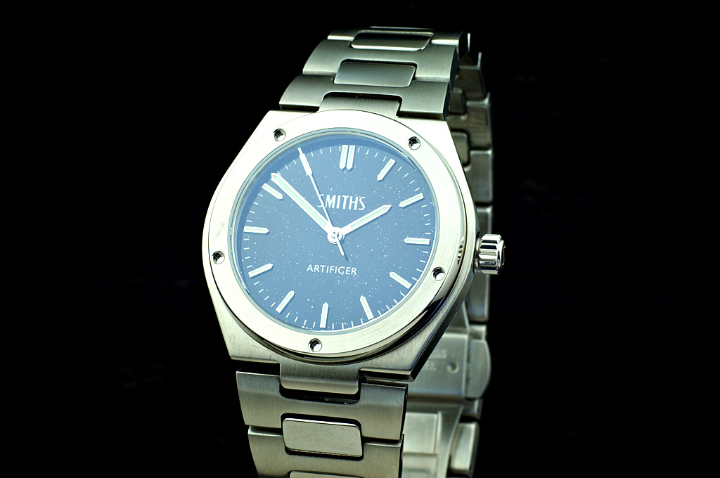
Waffle dial
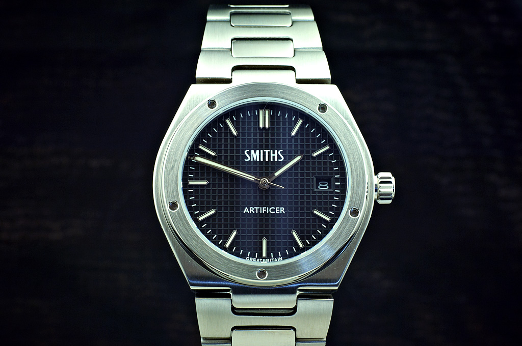
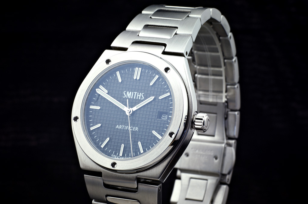
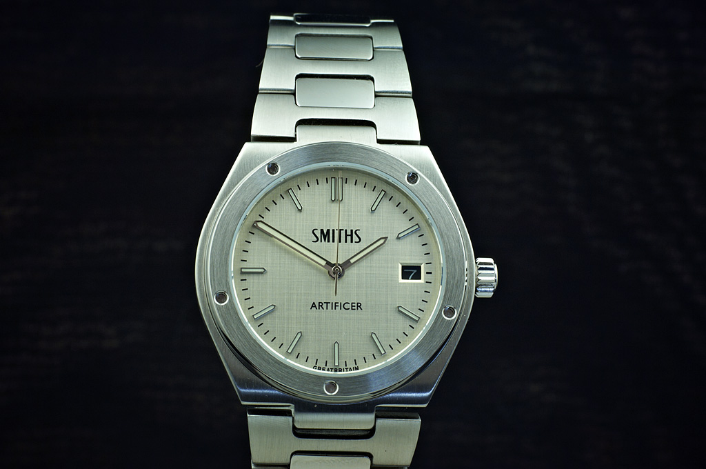
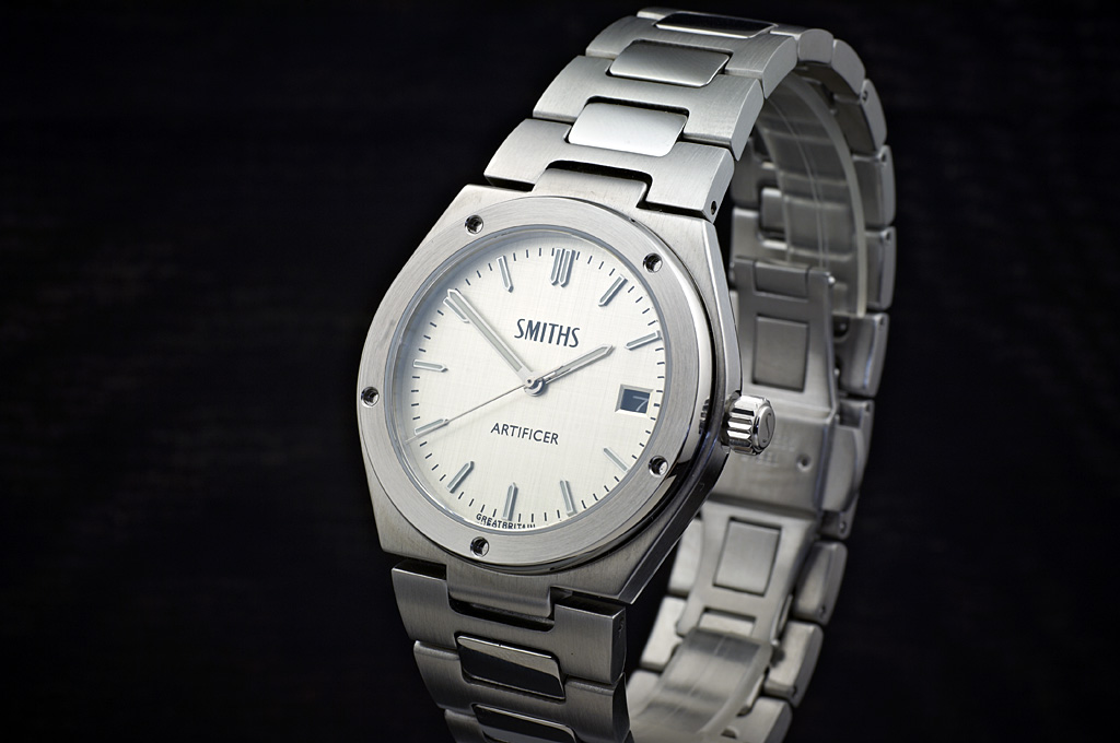
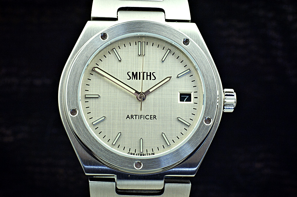
Linen dial
Eddie


Aventurine dial
Waffle dial
Linen dial
Eddie
Whole chunks of my life come under the heading "it seemed like a good idea at the time".

Those galaxy and linen dials look lovely. Any chance the galaxy version could have a date window?
Also, I think the date background on the linen should be a light color instead of black..

Nice! Pleased to see that the bezel is a little asymmetrical, spoils the Inge look otherwise.
Blimey Eddie, you really are on a roll. I think a date window would spoil the Aventurine. And I agree the date wheel could do with being silver on the linen one.
The only way you can show off an aventurine dial is on video. This is a poor video because I couldn't see the LCD screen because of the sun but you can get an idea.
Eddie
Whole chunks of my life come under the heading "it seemed like a good idea at the time".

Really nice!
Cant wait until they are released
That is lovely Eddie. I agree, no date window on that one...Originally Posted by swanbourne

Cheers,
Adam.
Sent from my moto g(7) using Tapatalk
That looks magical!
THIN is the new BLACK
That looks amazing. I'd buy one on that basis alone
Wow - that does look beautiful 👍
Nice!
Sent from my iPhone using Tapatalk
Nice. Especially the waffle dial.
Any estimate on release date ?
z
Very nice, a tough choice but think I'd take the Waffle out of the three...
Cheers,
Adam.
Sent from my moto g(7) using Tapatalk
Waffle dial is looking good.
Sent from my SM-N960F using TZ-UK mobile app
Like the Waffle and the Linen Eddie.
Either the Aventurine or the Waffle dial would be lovely to have. This looks like another amazing release.

YES!
Superb - I've been waiting on tenterhooks for this and am very excited. Straight in with the linen one for me... I really like that.
Everything on the dial is spot on and the hands are great. I don't feel strongly either way re colour of the date - but I like having the date for sure.
But in particular, I like the crown - very clean. And, of course, the taper of the bracelet looks so good.
A total winner for me... I can't wait!
PC
PS Any chance of a side-on photo?
Very nice. I especially like the waffle dial, but they are all good.
What size is this watch?
Linen dial looks classy. The aventurine looks great, but would drive me to distraction in no time flat!
Overall though, nice options - assuming you're going to offer them all..... I know....... NO!
Best Regards - Peter
I'd hate to be with you when you're on your own.
https://forum.tz-uk.com/showthread.p...ight=artificer
The waffle dial looks amazing!
Thanks, size looks to be perfect.
My dad started his navy career as an ERA (engine room artificer).
All very nice - what did the case height come out at in the end ?
This is a great piece in a great size, a better size than the original in fact. The aventurine dial looks amazing, I hadn’t expected it to work quite so well. I can’t agree with those complaining about the symmetry of the holes, for the reason that when Genta designed the Ingenieur, a feature of the watch was that the bezel would screw down in slightly different places on every watch, making each one unique to its owner and recognisably theirs. The holes are not decorative, they were for a special tool that was used to screw down the bezel, and Genta deliberately made it with five holes instead of the more obvious six, to accentuate the asymmetry.
The only thing that jumps out at me, and feel free to tell me I’m wrong, is that I wonder about the relative sizes and placements of the type on the dial. I had a play in photoshop to see what was bugging me, and my version is the one on the right, as compared to the real prototype on the left. Personally I feel that large type vs small type is always going to look better, as well as introducing some fine detail, and for me the logos felt slightly too close to the middle. Perhaps that’s a matter of opinion, either way I hope that’s constructive feedback...
This should be a cracker, I used to own a 34mm ‘skinny’ Ingenieur quartz and it was a beautiful thing. I’d have kept it if it had been the same size as this one.

I agree, your one looks a lot better. Subtle, but it makes a big difference.
Me too - the difference in font size looks good.
PC
A very good point! Your mockup seems to balance the dial space well and looks excellent imho.
Any chance the legibility of the linen dial version could be enhanced by with some contrasting inlays along the lines of this:

Last edited by dschaen81; 7th September 2020 at 19:39.
Where are we at at modifications to the prototype in the Artificer?
Crown increase to 6.5mm?
Symmetrical bezel or distinctly asymmetrical, rather than just slightly off symmetrical?
Cream/white date on the linen dial?
Adjust the typeface slightly thinner and as per Itsguy suggestion post #64 below?
Definitely the linen dial is the one for me.
PC
That aventurine dial looks incredible. I would honestly go for one of these, so long as it has no date. The pure simplicity and symmetry of the dial is really appealing.
Waffle dial has come up very well.
What bezel screws?
I'm liking these a lot.
Don't just do something, sit there. - TNH
Thought the same as Der Amf re the minute hand looking a fraction too long.
Anyone know what the case height is please?

My only suggestions/query would be to make the font slightly thinner. If I'm not mistaken and when comparing the drawings alongside the photos, the drawing font appears slimmer. IMHO the real thing looks slightly unbalance with thicker font. It's nit picking I know, but I think it still makes significant difference.
Is a non-date Waffle dial likely?
I agree with this suggestion, a slightly more subtle font or text size would look good.
And is there a way to minimize the gap between the case and the first link of the braclet? Or would that hinder the movement of the first link?
But overall it's a great looking watch!
+1
It looked better in the original renderings, as per post #26.
THIN is the new BLACK
I wonder if there are any updates for this project... and any chance that it will look great in a green dial?
Drawn between the black waffle and the linen dial on this one. Having seen the gilt dial Everest I think the linen dial would look incredible with gilt handset and markers. It could work on the black dial as well but there would be, for me at least, a strong association with the black and gold livery of JPS formula 1 in the seventies. That’s a good thing I think.
+ 1
THIN is the new BLACK
I don't know how well a gilt minute track would print on the waffle & linen dial.
Eddie
Whole chunks of my life come under the heading "it seemed like a good idea at the time".
Ill second this, any updates on a time frame for this project?
Wow!
I'd totally ignored this from the renderings, it didn't appeal at all in those, but in photos it looks totally different!
Like a lot of others, my first thought was the waffle looked best, but then I saw the Aventurine video and that could be the USP for this watch!
Eddie, will there be a premium for Aventurine dials?
Looks like another winner to me.
M
Breitling Cosmonaute 809 - What's not to like?
Waffle has pole position - certainly like the aventurine dial but it looks too dressy for this case/bezel?
I find the name of this one a bit off putting, probably just me.
Big problem for me is the clasp. Butterfly clasps suck, especially with links as big as these. It won't fit 80% of wrists without microadjustments (for those who like "just right" fittings).
I also think that the minute hand looks a bit disproportionate and could do with sliming down a smidge.
Don't just do something, sit there. - TNH
Really lovely range - yet again! Imho, both minute and seconds hands look a smidge too long when compared with the IWCs shown in this thread.
Agree that the minute hand seems wider in the photos than the hour hand again in contrast to the IWCs.
Sent from my iPhone using TZ-UK mobile app
You should do a special REME version as they have the rank of Artificer Sergeant Major (ASM).
TZ-UK mobile app
Does anybody know how easy it is to get straps to fit centre-lug watches like these? The design is great for reducing overhang on small wrists but a quick Google search doesn't throw up many options at all.
TZ-UK mobile app
Last edited by fm.tz; 24th August 2020 at 23:30.
Adapters are in the pipeline so you can fit regular straps.
Eddie
Whole chunks of my life come under the heading "it seemed like a good idea at the time".
Even better
 Posting Permissions

 Reply With Quote
