
 Reply With Quote
Definitely red. Unless the light is doing something extreme. Not keen myself, but it's certainly different to what you usually associate with AP.


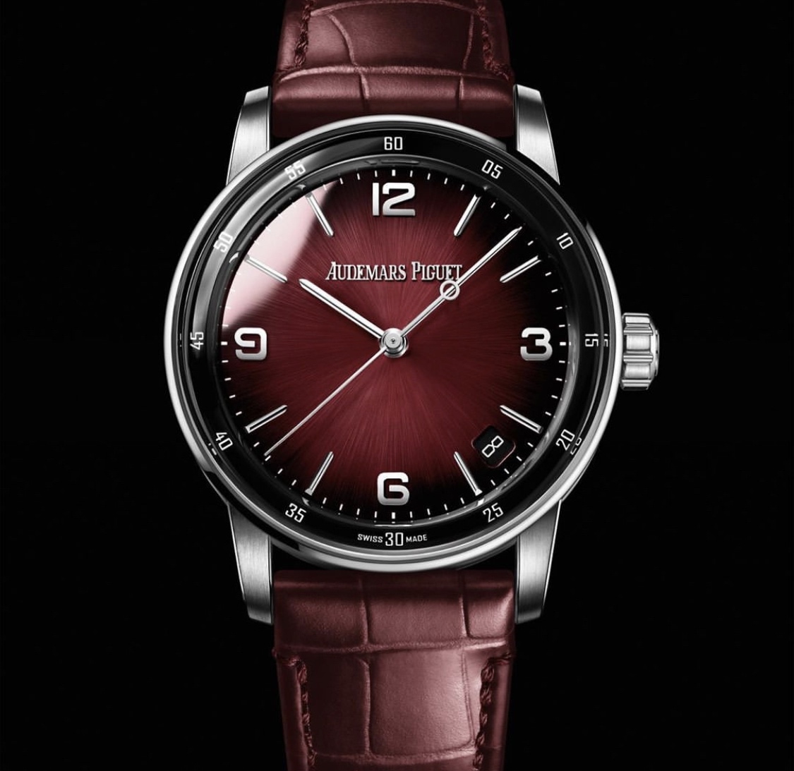
I might be the only person in the world who actually likes the first releases of AP's Code 11.59s. Now it looks like I might own a rare first edition - AP have changed the date font and made the dial "fumee". I quite like this apparently purple one (although to my color blind eyes, it looks red):
(taken from: https://www.watchprosite.com/audemar...1201.11988061/)
simon
Definitely red. Unless the light is doing something extreme. Not keen myself, but it's certainly different to what you usually associate with AP.
Well, there's at least two of us then, and that is fing lovely - if the colour I'm seeing (pretty much claret) is anywise an accurate rendering of the realityOriginally Posted by gladders


It's red/claret fume. The watchprosite has another which is purple in yellow gold.
This watch in two-tone looks amazing - one of the best TT implementations I've ever seen. The date font change seems to make a different, less jarring; though I still think it should be without a date!
Wow, they really are doubling down with that subtle little number.... Paging Mr Wonka, your watch has arrived.

My stupid eyes! I thought the purple one was blue, and the red one was purple.
Well, red/claret looks great to me in that case. I think the date font might be the same font used to mark the minutes around the outer ring. Looks rather nice too.
Right, I'm off for an eye test!

The red/claret is lovely. Again one the few who like these but i cant hide it.

Theres a Bolshoi edition with a blue dial as well, although not the updated date wheel. Those dials really help filling up all that negative space and bringing some much needed interest.
It does, but not sure the fume is as nice as Moser, all the fades go to black and dont seem as harmonious as Mosers implementation.
Sent from my iPhone using Tapatalk
The red and blue dial looks lovely to me
Just looking at that two-tone now... Wow.
Definitely different to what we usually see and what AP typically have associated to them.
Intriguing!
Thanks
S
That's lovely!

I love it. Shades of Moser and maybe those funky Glashutte models
More info here: https://watchesbysjx.com/2020/07/aud...ials-2020.html
Its certainly a fine looking watch, although I think itd look better without the outer number track.
I quite like them, especially the blue and black dials. I always reserve judgement until Ive seen them in the flesh. Over the years Ive seen photos either enhance how the watches look or dont do them justice.
When this line was originally released I took an immediate dislike. They looked to me like mid-tier fashion watches (Michael Kors-esque). Last week I saw a blue-dialled version in the flesh at the AP Boutique, and got the full sales spiel. In fact they are considerably nicer than I had expected. I particularly liked the Royal Oak homage in the mid case. This was something I hadnt been aware of. The dial / numerals and handset are what lets the watch down for me. The salesman made the point that when released, the Royal Oak was deemed ugly and poor sales figures, so who knows how popularity of this watch will go. I still wouldnt buy one, but I do have a better impression of them than I previously had.
Sent from my iPhone using TZ-UK mobile app
I really wish AP would ditch the whole “date at 4.30” thing. It’s just s**t. The Code has a lot going for it otherwise, and much nicer in real life. I like these new dials.
I do like this watch but it seems strange coming from AP. If it was Moser or such I would think thats nice.
I know exactly what you mean re Moser. I can only assume that AP wanted to freshen up the rest of their offering. Everything except their brand-defining Royal Oak just doesnt cut it stylistically so they tried to move things in favour of a younger audience. I have my doubts but lets see if it works. Time will tell!
Sent from my iPhone using TZ-UK mobile app
Seems to be a fair bit of the dislike of the 4:30 date thing on here. Personally I like it and prefer it to watches that have a number removed on the dial like the 3 or the 6 or even worse something is chopped in half to make way for the date.
I have a 4:30 date on my BP FF and find that when I look down at the watch the date tends to be horizontal and there is no sacrifice to the balanced look of the dial. I would say there is some clever planning in placing the date in that position, but each to their own.
 Posting Permissions
