Reply With Quote
It looks good on the nato


Well there is no price hyke which is good. Personally for me its a lovely watch. I always like and owned a Pelagos but found it too big. I also love the Rolex sub smurf. Ill be buying this one. I also like the way its not just a random colour choice and it harks back to an earlier watch. Well done Tudor.
https://www.tudorwatch.com/en/watch-...ay-fifty-eight
Stu

It looks good on the nato
Looks as cold and uninviting as the 41 Blue BB.
Much prefer the black to be honest.
Sent from my iPhone using Tapatalk
I will reserve my judgment till I have seen one. Looks good but not stunning.
No price rise is always good news.

I really dont understand this - they are my favourite brand - producing a watch in my favourite colour and in my perfect size.
.....and Im feeling.....nothing. Nada. Zilch. No inclination to buy it whatsoever and I dont know why.
#Feelsweirdman
So near - and yet so far...sigh, the dream continues.

Last edited by number2; 1st July 2020 at 08:06.
"Once is happenstance. Twice is coincidence. The third time it's enemy action."
'Populism, the last refuge of a Tory scoundrel'.
Close but no cigar.
Originally Posted by Stuno1

I agree . I like everything about it , from the colour to the size . And no price rise , well done Tudor .
The shade of blue might be the same, but the modern sapphire with AR presents it in a different way. Without the acrylic to add a dimension to the colour it looks relatively flat.
To give an equivalent visual lift without the benefit of the acrylic would probably require a deeper, more alluring blue. But then they wouldn't be able to show the link to the historical model.
Last edited by Der Amf; 1st July 2020 at 08:20. Reason: Striking out AR as I've been corrected below
I've always found the BB to be a bit....meh. It's a lovely watch but it's just a bit too refined for a diver. I looked at the new blue model and thought it looked quite nice but then the photo with the old blue Sub for comparison reinforced my feelings of meh. Just do a re-issue of the old Subs and they'll have the best seller they've ever had.
Are you sure its Sapphire with AR. My black bay certainly does not have AR at all, the reflections are insane and annoying.
Yes it is indeed another Black Bay.
I've said this before - I've never put my name on a list for a new watch, but a reissue of the blue snowflake would have me queueing like an iphone buyer.
"Once is happenstance. Twice is coincidence. The third time it's enemy action."
'Populism, the last refuge of a Tory scoundrel'.
I've never spent that much on a watch but I think I'd be in the queue with you!
Tudor have been very careful with ensuring they carve themselves as an independent brand and not the 'poor man's Rolex'. The square plots would have in my mind worked better, but I think it is unlikely we see it.
On the colour, someone else posted this link showing the colour in real life pics, the blue looks a bit deeper. https://barkandjack.com/2020/06/30/i...ef-79030b-001/

Just love everything about it... the nod to the past... the size... the movement..the way the 58 sits on the wrist compared to its larger/Bulkier stablemates.. Bracelet/strap options to suit every style and no price hike as yet.. what's not to like i'm sure it will be just as successful as the black version.
It will undoubtably sell well but as I've said on the other thread, they've removed the warmth and charm that drew me to the original. Just too generic looking this time around.
Ive never felt the need to say "reflections are insane and annoying" whenever Ive glanced down at my watch to look what time it is!..........is it really as you say,really!.
I just accept it,but having said accept,I would say it never enters my head to even think that.
Its easy to say what you said comparing the two watches together in the comparison pics
I agree,but not insane and annoying to me.
Last edited by P9CLY; 1st July 2020 at 10:47.
Fully agree - the rectangle/square plots from the old tudor subs are a lot nicer match aesthetically.
Last edited by crazyp; 1st July 2020 at 09:14.
Definitely something missing for me. I've been hankering for this since the original BB58 was announced but now it's here...
I think in my mind I'm still chasing that render of a deep crisp black, bright white lume and subtle red text.
Is nice but in my opinion have looked for better with a black dial.
I like it, it is the right blue.
I'll not be buying, but I like it loads.
Well done Tudor for keeping it Navy blue.
D
That is the design language reserved for the Pelagos, the more pure Diver in the range.
The exact wording i used was over the top i agree. My one is flat and it does seem to reflect to a great deal of enthusiasm lol.
Ive stayed away from the 58, and this will be the same for me, but its good to have another option for buyers.
I really think they should offer a different hand set and modern look bracelet alternative - then they can keep a heritage line, but sell a current up to date diver too, as an alternative to the Pelagos.
It's just a matter of time...
Looks great on that new blue flannel strap, but there's not enough going on there to open my wallet.
It looks good and is very cheap - I think it will sell very well indeed. Good value for money.
Collecting mine today. Cant wait.
When did you put your name in the hat, out of interest? Was it a long standing "the next in the 58 series regardless"?
Looking forward to a wrist shot
The AD put one aside for me assuming I would want one! I am not a big spender but have bought jewellery and 4 watches from them in the past. Tudor is their most expensive brand. They only got two in. Its a fraser hart.
Great stuff! Throw a photo in when you get home
Rang a couple Ej, Fraser heart today and was told with deposit its about 4-6 weeks.
Spoke to goldsmiths who said its a register your interest piece and quote 6-9 months. Confirms why I think goldsmiths are the worst, a proper we dont know or care attitude.
I remember literally stopping in my tracks when I saw the original black bay blue (41mm) in a Jewellers window. I eventually went to try one on, prepared to make a deal there and then, but it just looked huge on my wrist. As many have said before, the 39mm oyster case is the sweet spot in terms of size, and this highlighted that point. On my wrist the 41mm looked like a child wearing his Dads watch! The proportions were almost comedic. And the thickness made it unwieldy. But the colours and design were so subtle and it was stunningly finished.
When the BB58 came along I was just waiting for a blue version to be released, and here it is. My personal circumstances probably dont allow me to make a purchase but I will definitely try one on at some point to see how it compares. I think a part of me cant help but feeling it would be a substitute for a 14060 which is what I always wanted, despite this watch having a design and heritage all of its own.
So in summary, mixed feelings, a watch I always wanted but maybe not right now!
Sent from my iPhone using Tapatalk
Goldsmiths have always been the same. I think they're in for a rude awakening in these troubled times.
And a quick one outside away from the bright lights

agreed. I took great pleasure in telling them a store across the road from them can get one by end of July and would be getting my money. I don't wish the recession on anyone, but these firms will feel it harder and faster and i won't be crying for them.
- - - Updated - - -
Lovely pic, thanks
In Japan, the blue 58 on bracelet sold out in around 30 minutes, as it went on the shelves/display at 16:00 Japan time and by the time I called around ALL the ADs in Tokyo, which was 16:30, it had sold out.
I really like it. Ive had an eye out for a blue dial for a while.
I would have preferred the square markers but you get what you get I think.
Agreed.
I really like it. I liked the original too, but having so many black dial watches in my collection didn't make sense to add another.
This one is tempting...also sounds from some of the above comments, that availability will not be as bad as it was with the original.
I like they new, blue one. Not as much as the vintage, but then again, it's not as expensive.
Andy
Wanted - Damasko DC57
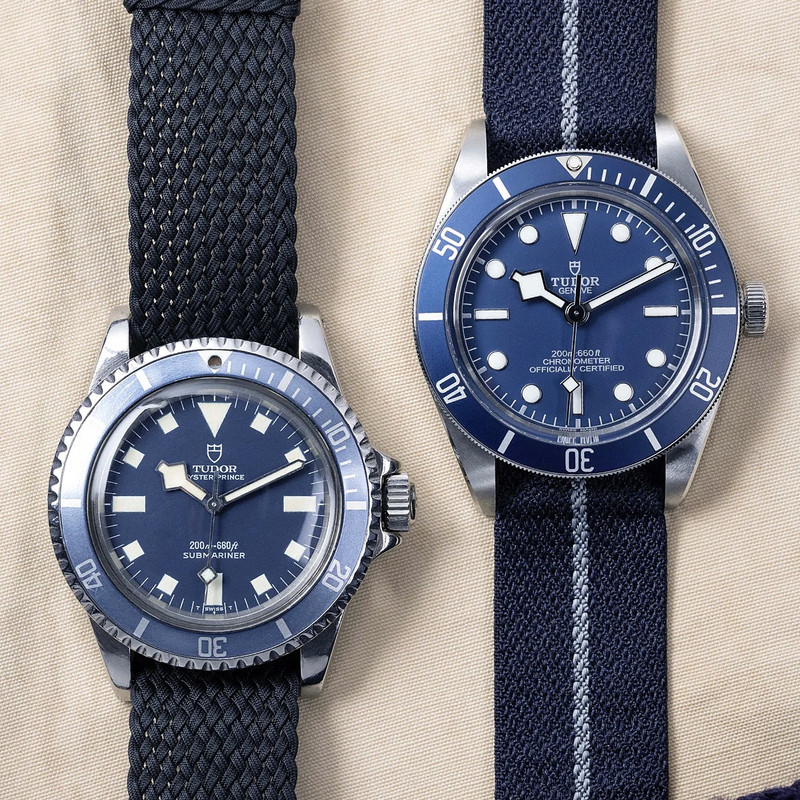
Side by side with the original BB58

Will be picking mine up this afternoon assuming the blue tones are what I want. I had dreamt of creamy square lume plots and acrylic but knew I wasn't going to get them, not for £2700 anyway!
I moved my BB58 on a few months back on here having started to find the gilt highlights a bit kitsch.
I have a feeling this will be a big hit for Tudor, 39mm, no faux lume patina and a nice tribute to the MN Snowflakes although lacking the original pieces warmth and personality.
I think they've got the colour spot on, thanks for posting a side by side, hoping to pick one up in the future!
I certainly think the 58 Blue will be a big hit as was the 58 gilt but both do lack originality, warmth or personality.
Surprised you think the bb58 lacks warmth
+1. Strange comment.
Sent from my iPhone using Tapatalk
 Posting Permissions