

 Reply With Quote
I have both and I find myself wearing the traditional dark numbers on light background the majority of the time. I just personally find it easier to use/read the time etc. If I only had one that would be it.


As per title: I'm in the market for a cheap(-ish) G-Shock. But I'm not certain about the dial; what to choose? Dark background with white numerals or the other way around. All my previous G-Shocks had the light background and dark numerals. I was pretty happy with that. What's your experience / opinion regarding the background colour?
(btw, I don't have my phone in dark modus)
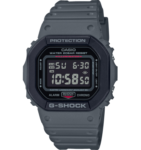
E.g. like this:
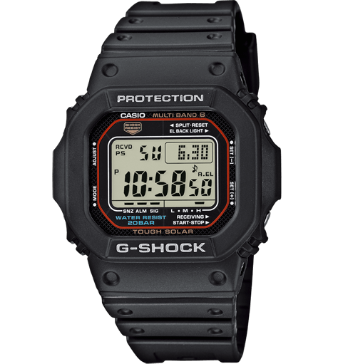
Or:


I have both and I find myself wearing the traditional dark numbers on light background the majority of the time. I just personally find it easier to use/read the time etc. If I only had one that would be it.
Dark numbers on light background (so called "positive" display) is much easier to read on the cheaper Gs. The "negative" displays are hard to read in low light but look cooler.
More expensive Gs have less difference in overall readability.

The inverted displays have become much better in recent years, even on the cheaper models. For example, I personally never found the very model in your post hard to read.
Ive only ever had negative display (dark background) g-shocks and never had any complaints about legibility. While Im sure the positive displays are easier to read, Ive never felt like I was missing it.
Also, not sure what your budget is for a cheaper g-shock but some of the newer modules eg GWB-5600 have automated back-lighting when you turn your wrist to look at the time/picking up your watch from the night stand in low light. I find myself doing it all the time just to see it light up!
I sold my negative display G-Shock, often just too hard to read unless you angle it right.
Sent from my iPhone using Tapatalk

Bought the 5600 negative display on a bracelet last year as a beater to replace my SKX. Very impressed with the thing and never considered legibility an issue. Subsequently bought my father the positive equivalent as a present and whilst it doesn't look anywhere near as cool. I have to admit it's far easier to read
For various reasons I've had four GW-7900s which I think are a fantastic model for features and affordability. The first one I bought was the negative display as I thought it had the best aesthetics but I sold it pretty quickly due to how difficult it can be to read in low light, even with the automatic back-light. I find the positive display very easy to read.
Incidentally, the 7900 has all the features and more of the GW-M5610 but with buttons that a larger hand can operate much more easily and all for the same RRP.
Last edited by BSB; 28th June 2020 at 08:08.
 Posting Permissions