Eddie


Eddie
Whole chunks of my life come under the heading "it seemed like a good idea at the time".

Looks very sharp! Like Versions A & B the best.
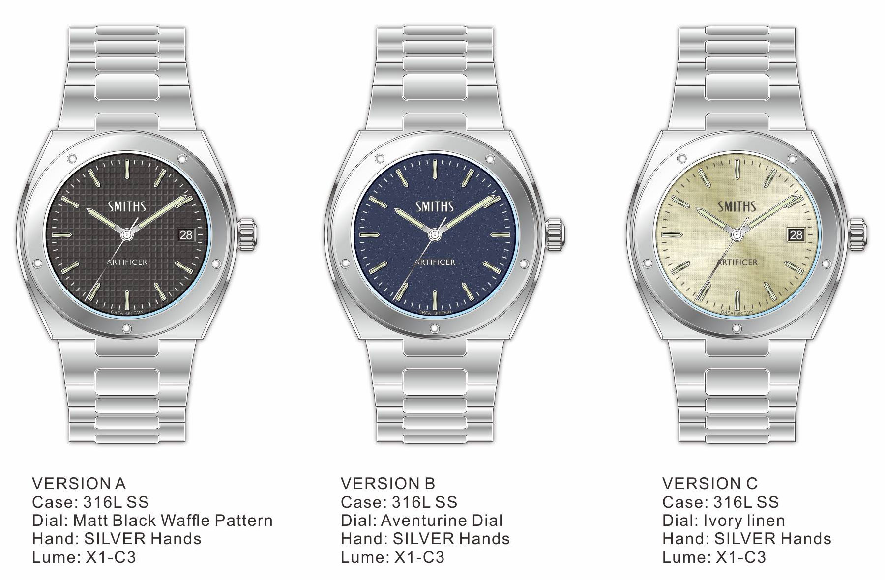
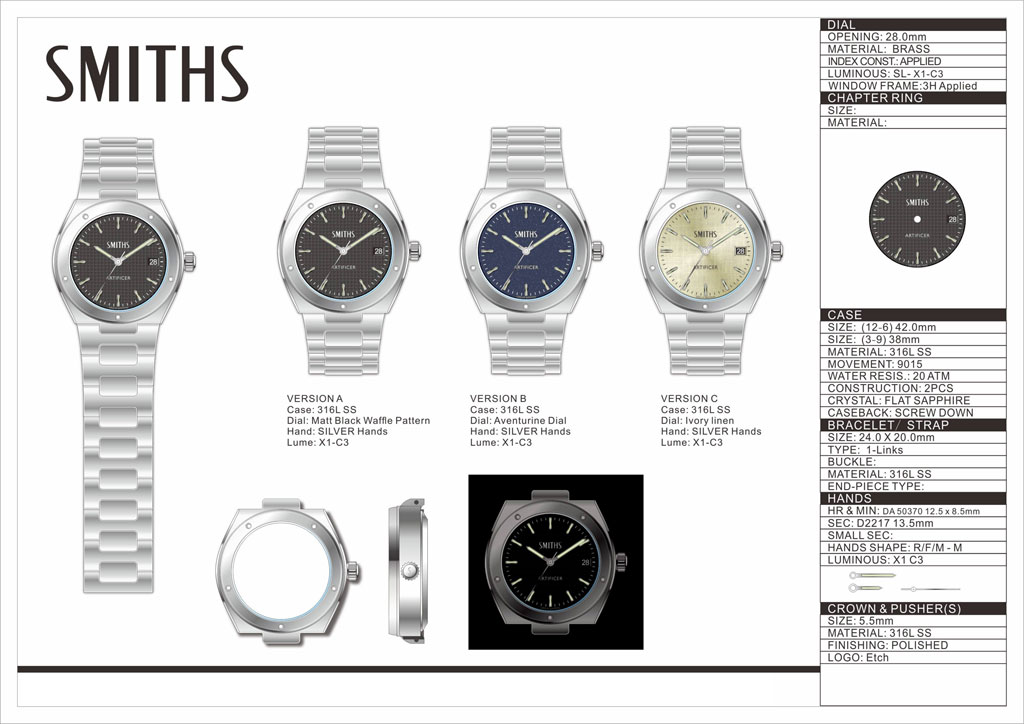
More detail of the dials.
Eddie
Whole chunks of my life come under the heading "it seemed like a good idea at the time".
Meaningless post to remove the advert from the picture above.
Eddie
Whole chunks of my life come under the heading "it seemed like a good idea at the time".
It's a yes. Still like versions A & B best. Could be a wonderful everyday watch. Apart from the health issues going on at the moment, how likely is this?Originally Posted by swanbourne

Very nice, an homage to this old Inge from the '70s I think:
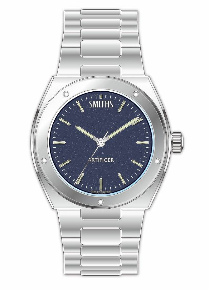
The blue dial / no date combination is a winner for me personally.
Like A, but maybe better with a grey dial and maybe a light blue secondhand. Just think its missing something and struggling to put my finger on it. Would love to see a mock up
Of what I suggested, as it might just work.
Very nice that. Version A is my favourite.
Really like that, Eddie. Definitely Version A for me. Love a waffle dial
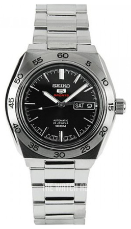
If it were up to me, I'd add functionality by making the marker at 12 unique somehow (so it's easier to read the time in darkness, otherwise you only have the date gap in the date models as a point of reference).
It doesn't have to break the aesthetics, eg in this Seiko:
(where other markers have no lume whatsoever, but that's another story).
Might be me, but I've passed on two Sinns 556 because of that, and probably on a few other watches I can't even remember.
FWIW.
When a watch is on your wrist, can you not tell which way up it is?
Definitely takes longer when I'm half-asleep and can't rule out misreadings. Can't remember the exact situation and watch that gave me this kind of trouble, but it must have been annoyng enough for me to start paying attention to that detail.
What if it's not on your wrist?
When i want to look at my watch in the middle of the night (on my bedside locker, not my wrist) it is easier to check orientation if the 12 marker is distinct in some way, such as the common triangle marker.
Also have the pip at 6.
I think they're just hollows, not luminous pips?
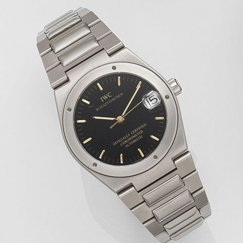
Based on the IWC Ingenieur 3505?

I am really looking forward to the Navigator MK11.
Was just a thought, but I wondered what the dial might look like with the brand logo at the 12 position, like the IWC:
The IWC also has script in the regular place which balances the whole thing. The mock up looks unbalanced but thanks for doing it.
What does Artificer mean? Id like to think this wouldnt be on the actual watch.
Has the potential to be a stunner
I think you're right about the logo being up there, having come back and looked at it again an hour later, it definitely needs to come down a bit.
As I recall from a recruitment ad I saw in the early '80s, the Navy uses that term for engineers and mechanics - so I guess it's a nod to the 'Ingenieur' designation on the original. I like it.
The more I look at Eddie's artwork the more I like it - handsome, purposeful and formal without being overly dressy.
I like A with the bevel detail on the date window of C.
Indeed, a specimen of a man. His leather waistcoats are a bit sketchy though
Maybe the Boobies logo in the position where the script is on the IWC would balance it...............or just make the dial too clutterd?
Really liking this idea, could the number of screw/fixing points on the bezel be 6 and positioned at 12, 2, 4, 6, 8 and 10?
I like symmetry.

Hi Eddie - is there any progress to report on this one?
Thanks, PC
British Army
Artificer sergeant major is an appointment held by a warrant officer class 1 in the Royal Electrical and Mechanical Engineers (REME), the corps of the British Army whose function is the repair and recovery of all mechanical and electrical equipment. The ASM is normally the senior tradesman in large REME units and is the technical advisor to the unit; the senior tradesman in smaller units such as light aid detachments is normally a warrant officer class 2 (artificer quartermaster sergeant).[2] An ASM must have passed the artificer training course and served as an artificer electronics/weapons/vehicles or similar discipline as a staff sergeant and warrant officer class 2 (holding the appointment of artificer quartermaster sergeant) prior to promotion to WO1.[3]
"a skilled mechanic in the armed forces"
Ivory linen...... I'm excited.
Sent from my SM-G950F using Tapatalk
Am I right in thinking an Aventurine dial is like the Omega Stardust?
Renders are never going to capture how lovely that will be
D
I much prefer C. So very different to the usual 'black' dialled watches which are everywhere.
Best Regards - Peter
I'd hate to be with you when you're on your own.
Here's a thought that might divide opinion: I don't like the bezel to be symmetrical on an Inge. My own 3521 has the holes distributed around the dial in a pleasingly random fashion, like this one:
.. and I think this piece would look a lot nicer with the bezel in the artwork rotated by 10 degrees or so. In either direction.
Great looking watch, but no waffle dial for me, thanks. There are enough hommages out there with a waffle dial, I'd much prefer something glossy, to give it a dressier design
I like Version A, but not feeling overly inspired by the ungainly term "Artificer" ... I get what it means, but it's not really speaking to me in any emotive "buying signals" way.
What's the case height coming out at btw ?
I have to use words which don't infring anyone else's intellectual property.
Eddie
Whole chunks of my life come under the heading "it seemed like a good idea at the time".
I like that linen dial.
Sent through the ether by diddling with radio waves
Does this mean you are going to have to force yourself to buy an ingenieur like you did the MK 11? What you sacrifice for us is amazing Eddie!!
Now this is something Id save up for! As much as I love my 36mm Black Everest, I want it on the strap and the bracelet at the same time! The integrated bracelets on these beauties would mean the strap would stay on my Everest more.
Another exciting prospect for this year
Sent from my iPhone using Tapatalk
Eddie, if theres any way for this to make a fitted high quality rubber strap, with a mulled clasp rather than pin and buckle, Im sure thered be a great deal of interest!
I like version C.
Could you fit a date cyclops like the 3521?
Having a date as an option would be good.
I like the blue dial a lot!
Fantastic! Cant wait to see some pictures.
Your wishes are granted.
https://forum.tz-uk.com/showthread.p...cer-prototypes
THIN is the new BLACK
When I too often see a generic-looking bright white date background that doesn't match the dial I want tobeat it with a stick! Really like the dark background date wheel.
Very nice. Artificer was actually my chosen career at one point but for various reasons it never happened. Id happily wear any of the three and pretend....
Sent from my iPad using Tapatalk
Very nice, probably blue for me.
Sent from my VOG-L29 using Tapatalk
I always thought the five bezel indentations were a distinct IWC motif, so see it as a bit naff for it to be replicated on this model to be honest. Christopher Ward's C20 was a more palatable rendition of the IWC Ingenieur and it would have worked just as well with or without the bezel indentations. Plus it had a tapered bracelet, working with the integrated case style and low case height to make it a very comfortable piece to wear.
Now that looks really sharp!
My two suggestions would be:
- more pronounced taper on the bracelet, maybe down to 18 mm instead of 20 mm
- some black inlays for the hands and indices on the linen dial for added legibility and an even classier look
 Posting Permissions

 Reply With Quote