closing tag is in template navbar
timefactors watches


TZ-UK Fundraiser
Page 7 of 9 FirstFirst ... 56789 LastLast
Results 301 to 350 of 426

Thread: One for 2020

  1. #301
    Apprentice nortonofmorton's Avatar
    Join Date
    Apr 2017
    Location
    Manchester, United Kingdom
    Posts
    31
    It's a bit soon to share survey results when hardly any time has passed. In any case, boobies for me.

    Hooray for boobies.

    Sent from my CLT-L29 using Tapatalk

  2. #302
    Administrator swanbourne's Avatar
    Join Date
    Oct 2002
    Location
    Sheffield, England
    Posts
    47,490
    Quote Originally Posted by BritWatchFan View Post
    It does look 40s although the watch is 1950s isnt it?

    I agree its a discussion forum so when some posters jump on the new guy for sticking his head above the parapet its a bit rich. Eddie made the right choice with his 1st dial choice in my opinion. No harm in stating a preference before the final watch is ordered and paid for.

    Design is design its an iterative process. Forwards and backwards there is no cut off. Or the Prs29 wouldnt have had so many detail changes in its history.
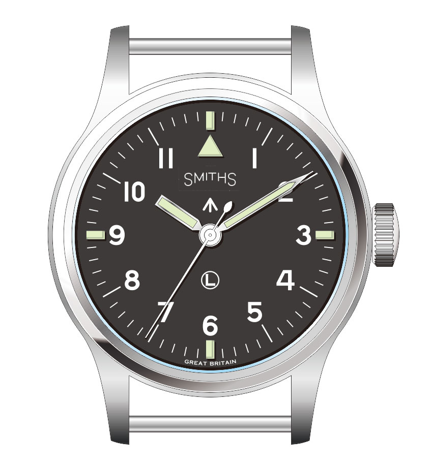
    It was first issued in 1948 and knowing how slow the military acquisition process is, it would have been designed and specified several years earlier. I intentionally didn't go with the straight plain lettering because that's how the original is and I wanted to avoid comments that I was even copying the lettering.

    Interestingly, the first ones didn't have the blunt hour hand, this was introduced following requests from RAF pilots who reported difficulty in differentiating between the hour and minute hand.

    Eddie
    Whole chunks of my life come under the heading "it seemed like a good idea at the time".

  3. #303
    Journeyman Synthpunk's Avatar
    Join Date
    Oct 2018
    Location
    No longer in London, UK
    Posts
    71
    I agree. 1940s design.
    I also look to history for the justification for boobies->
    The first smiths mil watches beig the 1940s mkX design was sterile. NO branding at all.
    then in the 1950s the deluxe with coronet. Then i the late 60s the straight script came in with the w10.

    Rolex and omega and (some) lemanias had logos o their dials by that point. Would a mine clearance diver become distracted by lookig at the logo ontheir seamaster or sub wilst working at depth? Of coarse not.

    Boobies forever.

    (Apologies for typos btw my keyboard is nacked)

    Just my 2 shillings worth....

  4. #304
    Quote Originally Posted by BritWatchFan View Post
    It may be too late but I believe the boobies request was a bum steer for this particular watch.
    One man's bum steer is another's home run.

    Martin

  5. #305
    Apprentice
    Join Date
    May 2020
    Location
    Glasgow UK
    Posts
    16
    Quote Originally Posted by nortonofmorton View Post
    It's a bit soon to share survey results when hardly any time has passed. In any case, boobies for me.

    Hooray for boobies.

    Sent from my CLT-L29 using Tapatalk
    Plain Smiths logo was good enough for Norton... just saying ;)

  6. #306
    Craftsman
    Join Date
    Dec 2018
    Location
    CIRENCESTER, UK
    Posts
    460
    I like both designs very much. My thinking was that the plain one liner sans boobies leaves the field open, or clearer, for the possibility of the GS De Luxe at a later date as otherwise they could have quite similar dials. Should it ever be seriously considered, of course.

  7. #307
    Grand Master abraxas's Avatar
    Join Date
    Oct 2002
    Location
    London
    Posts
    33,748
    Quote Originally Posted by Synthpunk View Post
    .... Then i the late 60s the straight script came in with the w10.


    .....


    I just love this way of branding the (IWC) Mark X. I understand it is called a replacement Nato dial.
    Last edited by abraxas; 13th May 2020 at 15:52.

  8. #308
    Quote Originally Posted by alx.lago View Post
    I agree with BritWatchFan and would also vote for the no-frills Smiths logo on the black dial version. I think the boobies logo indeed looks the best on the cream dials - just compare PRS-29A vs PRS-29AM or the black vs white Everest.
    I agree, plain Smiths on the black, boobies on the white.


    Sent from my iPhone using Tapatalk

  9. #309
    Administrator swanbourne's Avatar
    Join Date
    Oct 2002
    Location
    Sheffield, England
    Posts
    47,490
    I tried a couple of plain typefaces for the straight script but couldn't find one which looked "right", I think the straight Smiths used on the Everest is too bold for this one. The W10 typeface might work but I don't know which it is.

    Eddie
    Whole chunks of my life come under the heading "it seemed like a good idea at the time".

  10. #310
    Apprentice
    Join Date
    May 2020
    Location
    Glasgow UK
    Posts
    16
    Would the font used for the latest Prs29 work? It looks great on that watch I agree the one on the Everest would be too bold on this dial and steal space. If you are growing Smiths as a brand having two fonts moving forward for dials would help strengthen the brand. The crown topped Smiths and the PRS29 plain Smiths.
    Last edited by BritWatchFan; 13th May 2020 at 17:54. Reason: More thought on font

  11. #311
    Journeyman Ogdensnut's Avatar
    Join Date
    Nov 2017
    Location
    Leicester
    Posts
    239
    I love minimalism. The less clutter the better. The 29a ‘Smiths’ would work I think. I’d be interested to see a semi sterile dial - text in the same vein as the ‘Everest’ on the errr Everest. But I guess you are kinda then getting into the realms of the speedBird?


    Sent from my iPhone using TZ-UK mobile app

  12. #312
    Master
    Join Date
    Dec 2013
    Location
    Coulsdon
    Posts
    1,263
    Hmmm...🤔 I just think that 'Boobies' version stands out as being different.

    I agree also that if its too sterile it will look too much like the Speedbird and/or something that is just anonymous.

    Eddies current proposal (Boobies) adds character IMHO.

  13. #313

    One for 2020

    I’m not sure the association with boobies will be good for the long term image of the brand or this watch. Not in the market for one, but would sure put me off if I was.


    Sent from my iPad using Tapatalk
    Last edited by BillyCasper; 14th May 2020 at 13:21.

  14. #314
    Grand Master number2's Avatar
    Join Date
    Jul 2011
    Location
    North and South.
    Posts
    30,684
    Quote Originally Posted by KAS118 View Post
    Hmmm...ï¤â€ I just think that 'Boobies' version stands out as being different.

    I agree also that if its too sterile it will look too much like the Speedbird and/or something that is just anonymous.

    Eddies current proposal (Boobies) adds character IMHO.
    Given the 'who got to the top of Everest first debate' I think that the 'booby crown logo' sort of 'cocks a snook' at these boys -

    To me this looks good
    But this looks perfect
    Last edited by number2; 14th May 2020 at 09:20.
    "Once is happenstance. Twice is coincidence. The third time it's enemy action."

    'Populism, the last refuge of a Tory scoundrel'.

  15. #315
    Apprentice
    Join Date
    May 2020
    Location
    Glasgow UK
    Posts
    16
    So the survey has gathered 26 responses and has slowed in the last 12 hours only adding one more response. It might need bumped or we can draw the conclusion that most interested parties have participated already.

    What do you think ? Will we keep it going longer or do you want to close it and hear results? I dont think I can make the results published unless I close it, but I can obviously tell you what the current standings are if you want.

    The crown topped logo is great. Very distinctive and suits lots of watches, that isn't my argument. On the everest it would be killer but for a military issue watch I think its superflous and makes this particular dial layout more compressed. There is already a lot going on in a small dial, a circled L (must have) a broad arrow (must have) a Smiths logo (must have) and an ornate crown above that is pushing the space a bit visually (superflous). It is just pulling against the military aesthetic, nothing wrong with boobies but they arent needed on an already classic dial layout.

    I dont want another Speedbird reissue, sterile is fine but having a branded Smiths dial is actually more balanced and pleasing imo for this watch. Im always looking to the IWC Mk11 as the yardstick because its the watch everyone would buy in a heart beat if they were affordable. A well engineered and specced Smiths Mk11 homage is going to sell like hotcakes whatever the fine detail of the dial design is. But according to the survey results most people who will buy this watch would prefer the plain Smiths logo, I am willing to bet that most reviewer such as tool watch enthusiasts on Wornandwound would comment on this too.

    I think its reasonable to extrapolate the survey data and say that this thread represents Eddies typical market, its a military watch and its market appeal is knowledgable military watch enthusiasts and Timefactors repeat customers. Personally Id be happy to wait a bit longer and get a better watch than than to get a still great watch but one that I would look at the dial and think I wish it had the logical choice of logo for the style of watch it is.

    I am greatful to be able to air my opinion here, I know its last minute in the design process and that Eddies decision is final, he has made great choises and his watches sell well and are sought after.

  16. #316
    Apprentice
    Join Date
    May 2020
    Location
    Glasgow UK
    Posts
    16
    Quote Originally Posted by number2 View Post
    Given the 'who got to the top of Everest first debate' I think that the 'booby crown logo' sort of 'cocks a snook' at these boys -

    To me this looks good
    But this looks perfect

    On an everest it would be perfect or on the white dial variant of the new watch.
    On the black dial, so far, people seem to prefer the no crown plain Smiths logo.

  17. #317
    Craftsman
    Join Date
    Oct 2019
    Location
    Charlotte, United States
    Posts
    512
    Personally I would leave it up to Eddie, and besides the old saying that you can satisfy some of the people some of the time but not all the people all the time really rings true when it comes to how a watch is designed. I think this watch is going to be a very popular watch, especially with collectors of field/military watches and I know that I will be happy with whatever design Eddie offers. He can always make small tweaks down the road as he has done with the Everest, and need I say how popular that watch has become.

  18. #318
    Apprentice
    Join Date
    May 2020
    Location
    Glasgow UK
    Posts
    16

    Why are CWC watches with the plain and simple logo more sought after?

    Its not just for this watch, most British miltary watches that were made post Rolex suit sober logos, this was an era of efficiency and sterility and one that watch enthusiasts prefer look at CWC as an example.
    Why does a 80s Fatboy demand so much more than an 82 Fatboy? Both were issued and rare and could feasibly have seen combat but the plain one just looks way better on this military dial.


    Last edited by BritWatchFan; 14th May 2020 at 11:29.

  19. #319
    Apprentice
    Join Date
    May 2020
    Location
    Glasgow UK
    Posts
    16
    Quote Originally Posted by kneadking View Post
    Personally I would leave it up to Eddie, and besides the old saying that you can satisfy some of the people some of the time but not all the people all the time really rings true when it comes to how a watch is designed. I think this watch is going to be a very popular watch, especially with collectors of field/military watches and I know that I will be happy with whatever design Eddie offers. He can always make small tweaks down the road as he has done with the Everest, and need I say how popular that watch has become.
    Of course its Eddies choice, didnt a forum member shout boobies 1st though? I guessed that most people who are eagerly anticipating this watch would leave the boobies at home and so far the survey backs me up.

    73% prefer plain logo on black dial

    80% prefer crown logo on white dial

    You cant satisfy all the people all the time. You satisfy the majority, especially when the original choice mademade by Eddie looked better!
    Maybe its too late but maybe its not.

    Last edited by BritWatchFan; 14th May 2020 at 11:40.

  20. #320
    Apprentice
    Join Date
    May 2018
    Location
    Boeblingen, Germany
    Posts
    24
    The watch will look a stunner whatever logo is used, of course, but for me, I think a very good choice would have been the "boobies without boobies", as seen on the SMITHS 'Black Shadow' PRS-38. Besides, this leaves extra room for the broadarrow.

  21. #321
    Administrator swanbourne's Avatar
    Join Date
    Oct 2002
    Location
    Sheffield, England
    Posts
    47,490
    There's always this.


    Eddie
    Whole chunks of my life come under the heading "it seemed like a good idea at the time".

  22. #322
    Apprentice
    Join Date
    Mar 2020
    Location
    Bucharest, Romania
    Posts
    30
    Quote Originally Posted by swanbourne View Post
    There's always this.


    Eddie
    Looks really good and well balanced to me.

  23. #323
    Apprentice
    Join Date
    Mar 2020
    Location
    Bucharest, Romania
    Posts
    30
    Quote Originally Posted by BritWatchFan View Post
    Its not just for this watch, most British miltary watches that were made post Rolex suit sober logos, this was an era of efficiency and sterility and one that watch enthusiasts prefer look at CWC as an example.
    Why does a 80s Fatboy demand so much more than an 82 Fatboy? Both were issued and rare and could feasibly have seen combat but the plain one just looks way better on this military dial.


    Man, I was thinking about the same yesterday when comparing the CWC Mellor-72 and T20. Besides the movement, it's the same watch but the logo on the Mellor looks so much better with a simple sans-serif font.


  24. #324
    Master
    Join Date
    Dec 2013
    Location
    Coulsdon
    Posts
    1,263
    Quote Originally Posted by number2 View Post
    Given the 'who got to the top of Everest first debate' I think that the 'booby crown logo' sort of 'cocks a snook' at these boys -

    To me this looks good
    But this looks perfect
    Ahhhhh - thanks for that.

    I've been trying to work out why it was called Boobies - as I thought it must have been something to do with the curvaceous 'S' s - but of course its the Crown,

    Yeah - lets stick 2 fingers (or even nipples) up at Rolex 🙂

  25. #325
    Quote Originally Posted by swanbourne View Post
    There's always this.


    Eddie
    Works for me.


    Sent from my iPhone using TZ-UK mobile app

  26. #326
    Grand Master abraxas's Avatar
    Join Date
    Oct 2002
    Location
    London
    Posts
    33,748
    Quote Originally Posted by swanbourne View Post
    There's always this.

    [IMG]ttp://www.tz-uk.com/pics/mkxicurved.jpg[/IMG]

    Eddie
    Love it!

  27. #327
    Quote Originally Posted by swanbourne View Post
    There's always this.


    Eddie
    See option 4 in post #125 (link)

  28. #328
    Apprentice
    Join Date
    May 2020
    Location
    Glasgow UK
    Posts
    16
    Quote Originally Posted by MartinCRC View Post
    See option 4 in post #125 (link)
    I like it a lot better Eddie it give the dial more space, but my ultimate preference is the logo as used on PRS29 Black dial or something straight
    Last edited by BritWatchFan; 14th May 2020 at 16:33.

  29. #329
    Apprentice
    Join Date
    May 2020
    Location
    Glasgow UK
    Posts
    16
    Quote Originally Posted by BritWatchFan View Post
    I like it a lot better Eddie, but ultimate preference is the Logo as used on PRS29 Black dial.
    Or with this sort of Font

  30. #330
    Apprentice
    Join Date
    May 2020
    Location
    Glasgow UK
    Posts
    16
    And if I was really lucky ( I know this is a matter of taste and Timefactors dont tend to do this! )
    A vintage lume version with a broader arrow and circle ended seconds hand.

    Last edited by BritWatchFan; 14th May 2020 at 16:46.

  31. #331
    Quote Originally Posted by MartinCRC View Post
    See option 4 in post #125 (link)
    Prefer 5, shift /|\ up to close gap with SMITHS


    Sent from my iPad using Tapatalk

  32. #332
    Apprentice
    Join Date
    May 2020
    Location
    Glasgow UK
    Posts
    16
    Quote Originally Posted by BillyCasper View Post
    Prefer 5, shift /|\ up to close gap with SMITHS


    Sent from my iPad using Tapatalk
    Me too

  33. #333
    Apprentice
    Join Date
    Mar 2020
    Location
    Bucharest, Romania
    Posts
    30
    Quote Originally Posted by BillyCasper View Post
    Prefer 5, shift /|\ up to close gap with SMITHS


    Sent from my iPad using Tapatalk
    Hmm, I tend to agree. This way the pheon looks more integrated into the overall dial design as if it were a part of Smiths logo.

  34. #334
    Grand Master magirus's Avatar
    Join Date
    Nov 2003
    Location
    Up North hinny
    Posts
    39,473
    Quote Originally Posted by swanbourne View Post
    There's always this....Eddie

    That's the one.
    F.T.F.A.

  35. #335
    Apprentice
    Join Date
    Feb 2019
    Location
    Pennsylvania, US
    Posts
    45
    Like it!


    Sent from my iPhone using Tapatalk

  36. #336
    Journeyman Synthpunk's Avatar
    Join Date
    Oct 2018
    Location
    No longer in London, UK
    Posts
    71
    Dear Eddie- please take my money...
    That one totally works for me.

    Quote Originally Posted by swanbourne View Post
    There's always this.


    Eddie

  37. #337
    Craftsman canuck's Avatar
    Join Date
    Feb 2013
    Location
    Nova Scotia
    Posts
    671

    One for 2020

    Best one yet I think. I very much like that it isn’t directly like the iwc given the variation in the font size. And if anything it kinda ‘dresses it up’ a bit. Perhaps then the white one keeps smiths in one font size and drop the logo all together.
    Last edited by canuck; 14th May 2020 at 21:00.

  38. #338
    Journeyman Ogdensnut's Avatar
    Join Date
    Nov 2017
    Location
    Leicester
    Posts
    239
    Very Nice Indeed!!


    Sent from my iPhone using TZ-UK mobile app

  39. #339
    Grand Master Daddelvirks's Avatar
    Join Date
    Jul 2007
    Location
    Leiden- Netherlands
    Posts
    39,916
    Blog Entries
    1
    Quote Originally Posted by magirus View Post
    That's the one.
    Agreed Bob.
    Got a new watch, divers watch it is, had to drown the bastard to get it!

  40. #340
    Apprentice Oroccoco's Avatar
    Join Date
    May 2020
    Location
    Australia
    Posts
    5
    Hi, longtime lurker and Everest and fixie-29 owner, signed up to report my excitement about this one. I don't need any more watches, but I'll find that stumpy hour-hand irresistible. It's a more refined design than the later W10 - I like it with the old logo, but agree better without the coronet. Just another opinion however! Looking forward to seeing photos.

  41. #341
    Craftsman
    Join Date
    Oct 2019
    Location
    Charlotte, United States
    Posts
    512
    Quote Originally Posted by Oroccoco View Post
    Hi, longtime lurker and Everest and fixie-29 owner, signed up to report my excitement about this one. I don't need any more watches, but I'll find that stumpy hour-hand irresistible. It's a more refined design than the later W10 - I like it with the old logo, but agree better without the coronet. Just another opinion however! Looking forward to seeing photos.
    Welcome to the forum, although in appears you are no stranger to Smith's and TimeFactors. Good point about not needing another watch, but as watch enthusiast nothing is black and white. This is a special watch as can be attested to in all the feedback on this thread.

  42. #342
    Apprentice
    Join Date
    Mar 2020
    Location
    Bucharest, Romania
    Posts
    30
    Quote Originally Posted by MartinCRC View Post
    See option 4 in post #125 (link)
    So folks, it looks like we are down to these 2 options. In my opinion, the right one looks the most coherent and balanced. What do you think?

    https://prnt.sc/shc8op
    Last edited by alx.lago; 15th May 2020 at 13:34. Reason: Image link fixed

  43. #343
    Grand Master Der Amf's Avatar
    Join Date
    Oct 2015
    Location
    UK
    Posts
    11,958
    Quote Originally Posted by alx.lago View Post
    So folks, it looks like we are down to these 2 options. In my opinion, the right one looks the most coherent and balanced. What do you think?

    https://prnt.sc/shc8op
    On the right it looks like the arrow is part of the logo, rather than an entirely separate piece of useful information.

  44. #344
    Craftsman canuck's Avatar
    Join Date
    Feb 2013
    Location
    Nova Scotia
    Posts
    671
    Quote Originally Posted by Der Amf View Post
    On the right it looks like the arrow is part of the logo, rather than an entirely separate piece of useful information.
    Agreed

  45. #345
    Quote Originally Posted by Der Amf View Post
    On the right it looks like the arrow is part of the logo, rather than an entirely separate piece of useful information.

    +1

  46. #346
    Grand Master abraxas's Avatar
    Join Date
    Oct 2002
    Location
    London
    Posts
    33,748
    Quote Originally Posted by Der Amf View Post
    On the right it looks like the arrow is part of the logo, rather than an entirely separate piece of useful information.
    I am with the one on the left.

  47. #347
    Apprentice Oroccoco's Avatar
    Join Date
    May 2020
    Location
    Australia
    Posts
    5
    Yes, logo needs room to breathe.

  48. #348
    Apprentice
    Join Date
    May 2018
    Location
    London, UK
    Posts
    17
    Quote Originally Posted by alx.lago View Post
    So folks, it looks like we are down to these 2 options. In my opinion, the right one looks the most coherent and balanced. What do you think?

    https://prnt.sc/shc8op
    The one on the left for me

  49. #349
    Craftsman redhed18's Avatar
    Join Date
    Oct 2013
    Location
    Canada
    Posts
    351
    Quote Originally Posted by alx.lago View Post
    So folks, it looks like we are down to these 2 options. In my opinion, the right one looks the most coherent and balanced. What do you think?
    I think we need to account for the position of the hands in making this consideration.
    The stock photo at 10:10 makes a very tight V in which the logo and arrow sit...

    If I bodge an attempt to get the hands out of the way (sorry "2"), this is what I get:


    With this view, I prefer the one of the left...
    the one on the right looks like Der Amf posted above (that the arrow is part of the Smiths logo/branding)
    but neither one is a deal breaker for me.
    Last edited by redhed18; 15th May 2020 at 16:26.

  50. #350
    Grand Master abraxas's Avatar
    Join Date
    Oct 2002
    Location
    London
    Posts
    33,748
    The "arrow" and the "circled L" could swap positions.

Posting Permissions

  • You may not post new threads
  • You may not post replies
  • You may not post attachments
  • You may not edit your posts
  •  

Do Not Sell My Personal Information