Eddie


Eddie
Whole chunks of my life come under the heading "it seemed like a good idea at the time".
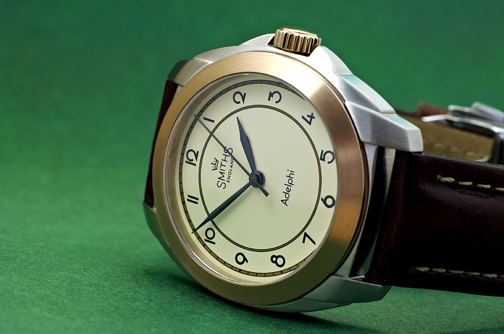
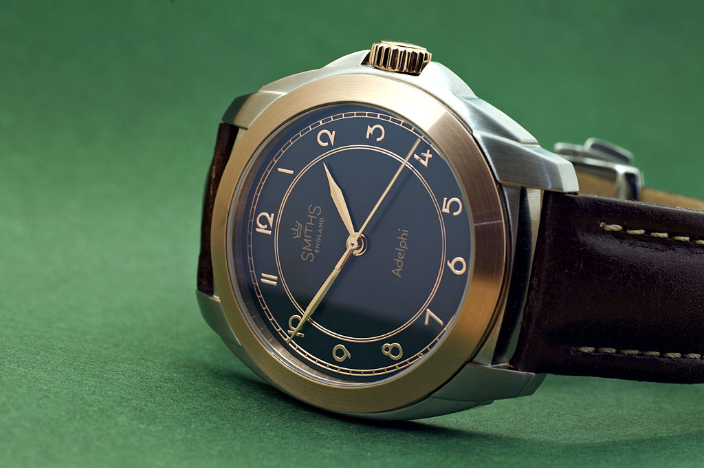
I'm not much of an art deco fan, but I do like the contrasting crown.
R
Ignorance breeds Fear. Fear breeds Hatred. Hatred breeds Ignorance. Break the chain.

IMO The Dark faced one really stands out, looks well.
Regards.
Keith.

In conflict again as both of these prototypes look Two tempting to resist.
Great job btw!
That dark faced one looks superb.
I really like the cream one, no date to spoil the dial and the font is perfect.
Cheers..
Jase
The dial instantly made me think of a Dunhill art deco clock

The black one is a real looker, lovely contrast with the gold hands and numbers
Got a new watch, divers watch it is, had to drown the bastard to get it!
Any chance of some details regarding materials, movement, diameter, thickness, lug width etc?
Sent from my iPhone using Tapatalk
Cor!
That's really striking (in a good way).
I am somewhat reminded of the Bulgari Octo in terms of the case shape.

Black and gold for me.
The dial of the ivory one reminds me of the PAM00791.
Superb, both look fantastic!
Another very interesting watch and agree the black dial is very striking.
Im not really a fan of the Art Deco era but the black faced one (it is black isnt it? Im very poor at telling dark green/blue/black apart) with gold hands/numerals is blooming lovely.
Im really, really not allowed to buy any more watches but this and the Expedition are massively tempting!
Sent from my iPad using Tapatalk
I think you nailed the design concept there Eddie, very distinctive, balanced and bold.....and kind of cool looking.
I love both of these. Great job, Eddie!
I really like the look of those - particularly the dark dial, as many have said. I do think that the case needs to have sharper, more defined edges though. With the flowing case shape, I think crisp edges would give it more definition.
Absolutely and totally. Super-sharp edges are very much in at the moment. Those rounded edges make it look like cheap-ish '80s... and it is the type of metal finish that never existed in the art deco period.Originally Posted by RichS

I'm not sure who the target audience would be for this one & think it may be quite limited to be honest.

Eddie that's lovely, please slow down, my budget can't keep up with new releases
The black dialled one is rather nice.
M
I was about to same the same thing the black and the gold is very retro and my taste entirely
Is the 2 tone bronze by the way.. Its a subtle gold otherwise
Sent from my LYA-L09 using Tapatalk
Really like them both, but can I ask why the train tracks sorry dont know the proper name on the light dial are coloured in I would of liked them open as in the dark
It's unlikely to see the light of day as it hasn't generated much interest. Still, that's why you do prototypes to test the market without making expensive mistakes.
Eddie
Whole chunks of my life come under the heading "it seemed like a good idea at the time".
I agree with your decision... while I do really like them, I don't think I'd ever buy one. I was thinking you might take a bath on these had they come into a full production run.
When you do a prototype are they just dummy shells or do you have a movement added in?
This could of been a nice face, as suggested above
Good to see you are well enough to be thinking about TF designs again! :)
It's a full working watch.
Eddie
Whole chunks of my life come under the heading "it seemed like a good idea at the time".
Congrats on a successful (I presume) 'service' Eddie and welcome back.
Not unexpected about the watch not making the starting gate but it was a creative and brave bit of design. Maybe another time might suit it better.
Welcome back Eddie.
I thought both of those designs were stunning personally, and as was mentioned above perhaps another time they will see the light of day.
But they are stunning.
Sent from my MAR-LX1A using Tapatalk
This watch would be a great idea, all of the time!
 Posting Permissions

 Reply With Quote