Reply With Quote
The Olympic offering from Omega are never amazing but they have hit rock bottom this year


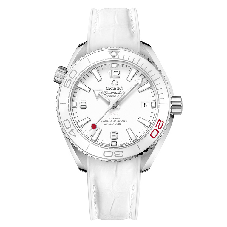
Omega unveils two Seamaster watches for the Olympic games Tokyo 2020 .
https://monochrome-watches.com/omega...n-specs-price/

Last edited by Tazmo61; 24th July 2019 at 16:09.

The Olympic offering from Omega are never amazing but they have hit rock bottom this year
RIAC
Wish they would stop putting writing/graphics on the display back - completely spoils it.Stick to engraving the caseback.
Sent from my E6653 using Tapatalk
I like that! But agree about the back. But then who ever looks at that?
Last edited by Foxy100; 24th July 2019 at 17:16.
"A man of little significance"
Pah. At least if you like it you'll be very unlikely to see another
Gray

I'm not a fan of the irregular pattern on the dial.
Do we have an 'Ugly Watch of the Year' competition?? If so, can I nominate this for the 2019 prize???
Crazy paving anyone?Originally Posted by Gerald Genta

Nope, not my fave offering of the year.
Loved those Olympic Japan market quartet of Speedmasters that were released last year, but this isn't to my liking at all.
Pet hate, print on clear case back. Nobody has ever done it well.
Reminds me of the bottom of a swimming pool seen through the ripples, is that the idea? I quite like it, in a ‘couldn’t imagine actually wearing it’ way, along with various other recent Omega special editions. Apart from, let’s see... size, polished centre links (WHY? Everyone hates them unless it’s on a Nautilus), cheap looking printed logo on the glass (either do a proper rotor engraving or leave it alone), and considering the last issue, price. So that’s me out. I’d be interested to see how the dial looks in real life though.
Last edited by Itsguy; 24th July 2019 at 17:32.
I really like some of their other Olympic watches but these are just so....meh.
Im not sure if this is a blip or more symptomatic of a general trend towards designs that are miles away from those of 3-4ys ago. Cant think of any new Omega design Ive actually liked over the last 2 years (and Im a bit of an Omega fanboy)
Sent from my iPhone using Tapatalk
I liked the blue speedmaster they did, but not this one
Sent from my ONEPLUS A6003 using TZ-UK mobile app
That 'tapered' crown.....YUK.
Sent from my Nokia 3.1 using TZ-UK mobile app
Well, I'm going to go against the flow and say that I like the dial design and colours. I do agree that the exhibition back should be left alone and clear.
David
Infinite Diversity in Infinite Combinations
Im not fussed about the writing on the back. The dial looks good to me, different to anything before and quite pleasing to look at. I might be persuaded.
Started out with nothing. Still have most of it left.
Looks like the tiler was pissed when doing the bathroom floor

Oooooh.. thats ugly!!
OO GOODY!!!
Yet another LE / SE from Omega, what a novelty........ no, no wait, it's the other thing.
Yawn
I'd like the strap for my Skyfall AT. You can keep the rest though
Big Omega fan although these special editions get worse and worse. Devalues the brand.
They even put an additional "A" on the back of the 50th limited edition moon landing watch but that's another story...
Ugly and overpriced.
https://www.hodinkee.com/articles/th...imited-edition
now this I like.....
Sent from my ONEPLUS A6003 using TZ-UK mobile app
Though still rather expensive
 Posting Permissions