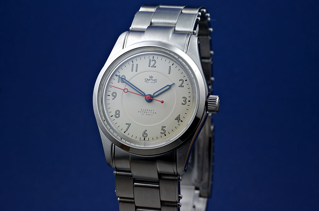
I think the logo is too small and perhaps the text on the lower part of the dial.
Eddie


I think the logo is too small and perhaps the text on the lower part of the dial.
Eddie
Whole chunks of my life come under the heading "it seemed like a good idea at the time".

Possibly a little small, perhaps an increase of 20%?
Otherwise looking very nice indeed.
I dont think the text is too small
I think it looks good.

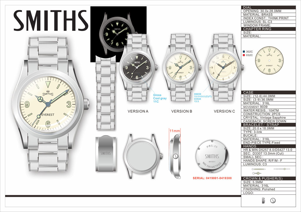
Really nice. I wouldnt go enlarging the logo by much. Is this the exact same case and strap as the 36mm Everest?
Sent from my iPhone using TZ-UK mobile app
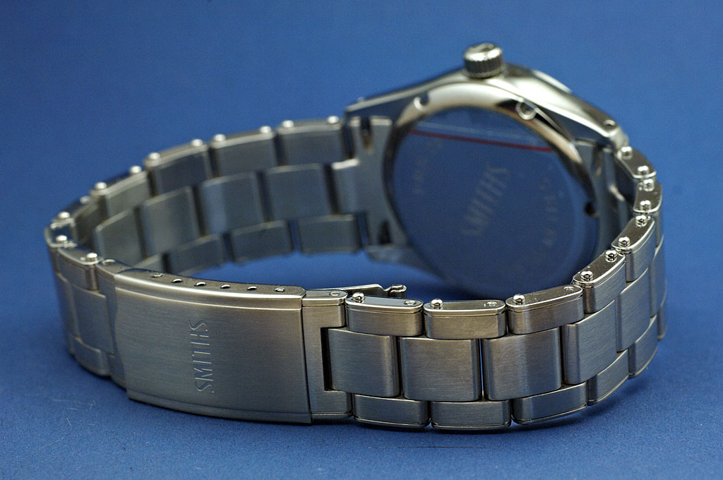
And the bracelet. The clasp will be similar but better quality.
Eddie
Whole chunks of my life come under the heading "it seemed like a good idea at the time".
Dial detail.
Eddie
Whole chunks of my life come under the heading "it seemed like a good idea at the time".
It gives me that warm yesteryear feeling, looks really good.
Got a new watch, divers watch it is, had to drown the bastard to get it!
Looks splendid
Great to see these white dials getting closer
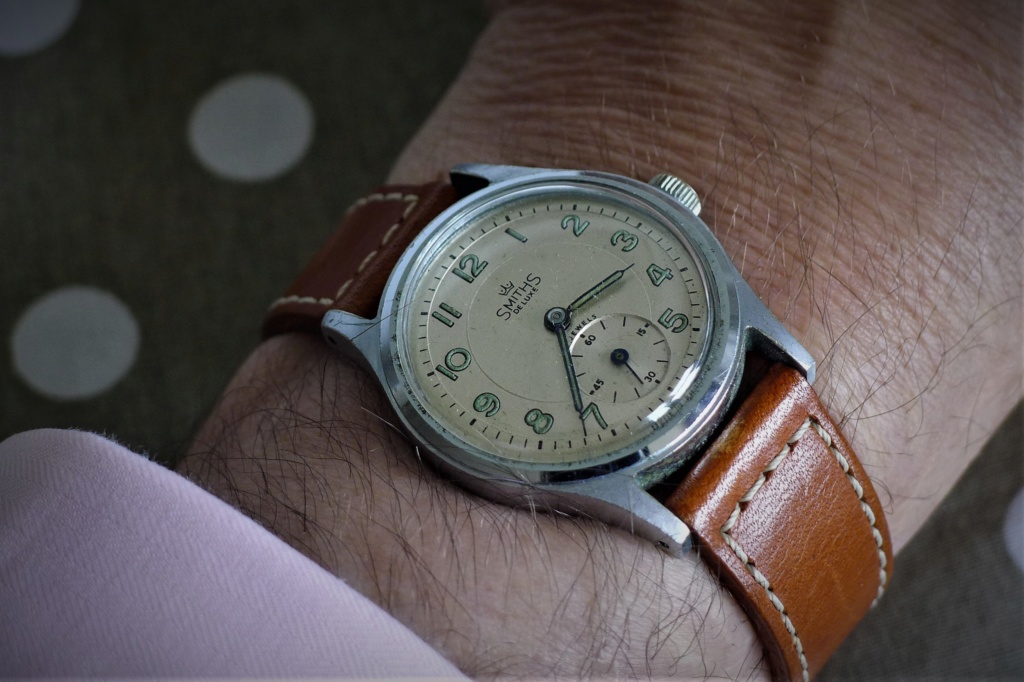
In your original picture you had the lume on the second hand directly over the inner circle:Originally Posted by swanbourne

Just mentioning it to check that the slight change was deliberate.

I'm impressed.
Looks lovely.
Love it.
Love it! Logo definitely NOT too small - it's perfect. Text maybe next font size up. Would prefer a deeper red seconds hand.
I think that the dial looks pretty much spot on, the logo/text does not overpower the dial. Maybe try just the Everest/Expedition txt one size up, leave the 24 Jewels as is (the red is superb).
But I do prefer the hands as shown in the original concept picture (left). The coloured, 'softer looking', hands just don't seem to suit the character of the watch imo.
That's a good point - it's looks quite good on the original picture, where the lume on the second hand is like a planet, and the inner circle the orbit.
The new place is better as it gives a longer point.
Will the clasp receive the same (or similar) Smiths logo as the dial. It would be fantastic if they could be matched!
Sent from my iPhone using TZ-UK mobile app
I'm on the side of the logo being a touch larger and the lower text remaining as it is.
Will this be interchangable with the current PRS-25 clasp? If someone wanted to put the current Everest clasp onto the Expedition?
No.
Eddie
Whole chunks of my life come under the heading "it seemed like a good idea at the time".
Thanks Eddie.
So, um, when, please? I have a few pennies I can use for this just waiting, pulsing in the penny box.

That's gorgeous.
Sent from my Pixel 2 using Tapatalk
Never had such a small watch, I love the look of this and will make it my mission to try something this size to see if I can live with the size.
Great job Eddie. These will sell quickly I am sure.
Beautiful watch. Logo and text look perfectly sized, I would not increase the size of either.
I wish it had a different crystal though.
And that you had used the same font for the numbers as on the other Everest models.
Last edited by DannyPN; 15th June 2019 at 17:45.
I agree. If changed you may well get my vote money...
I like the logo the way it is.
The size IMO suits the style of the watch.
Cor! Yes, please. I agree that the fonts should be marginally bigger but definitely not shouty modem big. Cracking job, Eddie.
Sent from my iPhone using TZ-UK mobile app
Dial lettering is perfect - more original,vintage and not in your face which seems the typical style in modern watches.
Sent from my E6653 using Tapatalk
I like that. I wouldnt make the font larger or bolder. Perhaps the space between E and L in DE LUXE is too wide and the D and E are too close to the S and S and should be more aligned with the M and H of SMITHS.
Sorry, I havent been following development, but were 1/5 second markers or a ring connecting the markers considered?
Sent from my iPad using Tapatalk
Last edited by BillyCasper; 15th June 2019 at 18:42.
Curious about this too, especially after seeing the photo of the original above.
Re 1/5th and 5 second markers as per the original: I think that would make the dial too busy and be very very hard to pull off well. This watch is a cross between the A404 and the A453 -- it has the dial of the former and the hands of the latter. As such, I think it's pretty much perfect.
Re the lollipop: See my comments earlier about the 1016; it will look all wrong if moved along the hand towards the edge. That said, it could possibly be a slid a mm or two along to sit just outside the edge of the dial circle. But then it would start interfering with the numbers. I'd leave it as is.
Re the SMITHS script: I, too, would like to see some photoshopped mock-ups of text +15% and +20% just to make sure, although I'd be surprised if it needs the full 20. A standard Dennison Aquatite cased De Luxe has a 28mm dial (26mm in the smaller cases with 16mm lugs) and I reckon Eddie's dial is 30mm, so it might need to scale up a tad: maybe 4.5 or 5mm wide for the SMITHS script and maybe 1.1 or 1.2 high for the two S's at either end. Just my guess. However, the text on an old Smiths is small by modern standards; if you want an authentic re-creation then the SMITHS should be about 4.75mm-ish wide; if you want a "modern" look then bigger (maybe 6mm? I don't know) or if you want an "updated" look then a compromise at say 5.25mm would do it. Whether that last is the best or worst of both worlds is a good question.
Isn't it fantastic to have to be encouraging the owner of the brand to enlarge the brand script, rather than having to stop them from making it too big????
I can't imagine this discussion happening too many other places.
Dave
To be honest, as I mentioned earlier, Im new here and I think its absolutely brilliant that we (well those whove got way more knowledge and artistic skills than me) can make comment and feed into a products development. Not only that but the brands owner actually encourages that kind of input and directly engages with us. You dont see that very much at all these days. It makes a refreshing change and makes me want to buy one of these watches even more.
Sent from my iPhone using Tapatalk
Can't agree with you there Eddie, it's perfect. If i want something to read i'll buy a book
Well, I was just going to go for the black dial with the tapered bracelet and revised hands, but this is very tempting. Is there a (sub)conscious Union Jack thing influencing the colour scheme?
Exactly what I was thinking flicking through the thread. Was set on the black dial but this is really making me think about things
I'm in the 'a tad small' camp for the logo and lettering, but not by much. Here's my Deluxe and the logo and Smiths name seem to fill the space a bit better, in my opinion.
My preference would be for all the lettering to be just a touch larger.
And even if no changes were made I'd still want it.
Last edited by Sandpiper; 15th June 2019 at 19:13.
Looks brilliant, and I love the bracelet. Is this the bracelet that will be on the 'Explorer' version as well?
The logo could stand a small increase in size, but I wouldn't go too big on the text.
I'm actually leaning more towards this version now. I know what will happen though …
Last edited by Onelasttime; 16th June 2019 at 09:22.
The watch looks just fantastic. I don't think the size of the font looks too small at all, but maybe it can be a tiny bit bigger.
The top font - the Smith's logo - is closer to the the circle than the text in the lower part of the watch - The everest Expedition text. Would it look better, if the to pieces of text were in the same distance to the circle? Maybe move the Smiths logo down just a tiny bit?
And soo cool with the small hand thick, and the long hand thin. I will have to buy this, despite the sapphire glas and the milky ring:)
Really great looking watch.
Unffffff!
Fududududud...
Yes please.
I like the hand colours as shown, very fun ... nice red!
Yep, the text and logo could stand being a smidge larger.
Another winner from the Smiths/Timefactors stable in the offing.
I think it looks great, really good.
It is possible that a slight increase in size of text is possible, but I wouldn't change the position, it looks great.
I think the red looks epic but it may look a tiny bit more traditional if it were slightly more scarlet, and less towards the orange end of the scale.
The numeric font and the black outlining look fantastic, even though it is not the same as the vintage font.
Somehow the hand bluing looks lighter than I think it might, lighter than the PRS-29AM?? Is this a chemical bluing rather than a thermal bluing?
The tapering bracelet to thin clasp looks great.
Dave
Agreed about the colour of the second hand - it's a tad to orange on the pictures.
It probably depends on ones device/screen and the colour temp/balance set. I dont see any hint of orange, but lets just agree thats what we want... bright postbox red, no orange.
Quick photoshop:

Good job andamanen. This is perfect.
Will the bracelet end-pieces be changed from male to female also here on the Expedition? (Personally I would be happy with either but I'd prefer female end-pieces.)
This looks bang on to me with the slightly larger text
I really like this watch Eddie, it looks even better than I expected. Great job!
Sent from my iPhone using Tapatalk
 Posting Permissions

 Reply With Quote