Reply With Quote
Definitely not noticed that with my SS models, but never had a DJ before...


As you know, I've been an Omegan for some time, but have just acquired my first Rolex - an SS DJ41 with rhodium dial.
I love it, the fit, the finish, the pleasure it gives me, its performance.
And yet... in certain lights I find the dial hard to read, due, I suspect, to the lack of contrast between the dial & the WG hands. I also wonder if the hands are smaller or thinner than other brands.
I accept that having switched to a DJ from the 2254 & Moonwatch that I wore hitherto may impact legibility & indeed I can read the DJ perfectly in some lights (with or without my reading glasses).
I often find myself having to look for the lumed bit of the hand as I struggle to distinguish the WG hand from the dial.
It's the only niggle in an otherwise beautiful watch.
ETA: I tried a no date Sub in watchfinder yesterday & thought the hands were a bit small. Sales guy agreed, said other people had said that too.
Last edited by Speedy2254; 2nd June 2019 at 16:10.

Definitely not noticed that with my SS models, but never had a DJ before...
Ive been put off Subs due to their hands. Find the Mercedes hand old fashioned and the minute hand over thin.

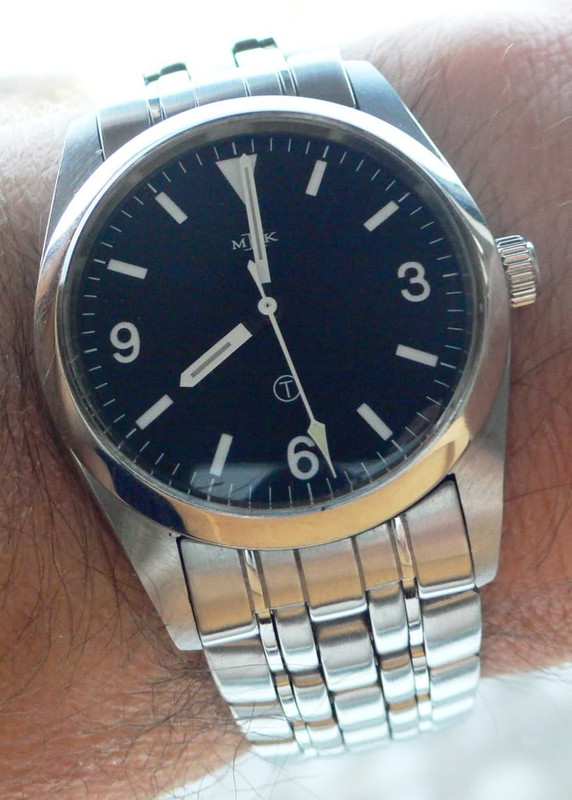
39mm mk1 explorer did, rolex identified the problem and when they ran out of small hands they brought out the mk2...which is perfect
Interesting question, to me anyway. Let’s have a look at the 41 with rhodium dial
Can’t say I’ve noticed a particular problem, although obviously it doesn’t have the clarity of a dive watch.
Perhaps it’s just a matter of adjusting to a new watch. Incidentally, one of the most compromised Rolex dials is probably the Daytona......all that script on the dial doesn’t help.
A good example of dial design, I would suggest, is the classic 37mm Grand Seiko. They know about dials...
Or even the humble Citizen.
So, I’d suggest Rolex dials tend to be quite good for visibility...but they often could do better.
Sent from my iPad using Tapatalk
Last edited by paskinner; 2nd June 2019 at 18:05.
I love the idea of the Sub, think it looks great in photos etc but it looks awkward on my wrist.Originally Posted by Mark lowman

The DJs in the top 2 pictures I can see clearly. Out of bright light, I can see my dial perfectly. I suspect that you're right, 3 weeks with the DJ against 11 years with the 2254 and Moonwatch (which is a byword for clarity of the dial) means there is bound to be a period of adjustment.
I agree totally about the Grand Seiko & the Daytona being at opposite ends of the dial spectrum...
Never heard anyone say that but it really depends what you are used to and what your expectations are. I find the hands on the "Professional" models perfectly legible. The other models less so, depending on the dial colour. That image of the Daytona illustrates the potential problem - and certainly, as much as I love the look of the Daytona, I'd struggle to use one as a watch!
Rolexes with Rhodium dials are not very legible as there's not much contrast between dial and hands.
Exactly what I've found. Dull or neutral light helps readability, bright light (sunlight, shop lights etc) reduces it. I've come to the DJ from a Moonwatch so that needs to be taken into account.
David,
I was comparing the Sub to my Seamaster 2254 & Moonwatch. Against them I found the Sub hands to be thin & less readable.
It seems like an unfair comparison. The Moonwatch is, to all intents and purposes, a military watch. As such it is configured for instant legibility in all situations. When you look at the watches that Rolex created to fulfil a military or quasi military role, they are the very definition of readability.
At this point Rolex are not producing military watches, they are producing, in the main, what I call 'Gentlemen's watches' and, as such, should really be compared to them. Comparing a solid lume hand with a polished steel inset hand isn't fair.
Mind you:
I defy anyone to beat this setup!

I fully agree with you, however Rolex followed an already established DefStan for their Milsub.
As such the change of hand set was unlikely to be a Rolex driven change but more likely an MOD request.
There was a reason the hands were changed and that is because they were likely not deemed suitable for the task.
The Rolex minute hand on their divers watches always looks to short and thin to me.
Of course its entirely a personal opinion. I was just saying that Id never heard anyone mentioning legibility of a Professional models hands - or calling them small. I think a black dial inevitanly helps. I really like the clarity of the Speedmaster dial and hands.
If you want watches that are legible, then buy legible watches . . .
. . . ;-)
F.T.F.A.
It's not though because I'm long sighted!
You're definitely right about the black dial, thing is, I've got a few black dial watches so I went for the different style & colour of the DJ. I accept that I might be in a minority about the hands of the watches in the Professional range - maybe it's the other way round & the Seamaster 2254 might have big hands & it's just that they are what I'm used to...
I know someone else here who has an issue with their 16600 being hard to read.
Myself, I look at my 14060 and have no problem at all, reasonable size hands with quite a lot of lume on a black dial, I do think it gets a bit more of an issue with the date subs and cyclops, once the hands go under the cyclops then different angles can throw it off.
A lot of these issues just come down to eyesight, the older we get the more legibility we need!!
Sent from my iPhone using TZ-UK mobile app
I find it hard to see the time on my silver dial DJ, but then who wears a Rolex to tell the time? Thats what iPhones are for. 😀

I think the issue here is the polished hands.
Polished steel/white gold can look a variety of different colours depending on the light conditions. This means that theres always a time when the hands dont contrast with the dial and the watch becomes difficult to read.
Grand Seikos are particularly prone to this too.
Certainly lots of writing or chrono sub dials dont help either.
Strangely enough though, I find that my polar explorer with white dial and black hands is more difficult to read than my 16710. The reason being that the contrast makes the GMT hand more legible on the 16570 whereas it fades into the background on the 16710 and you only see it when youre looking for it.
You've definitely got a point about the polished hands & the way they react with the dial & the light.
Fair one. I can always call my butler & ask him the time.
Legibility on the pre Maxi dial Rolexes is uniformly mediocre, imo. The hands are quite thin and, in general, polished metal hands will always have problems under certain lighting conditions / viewing angles - it's just the nature of the beast. The maxi dial has helped but, then again, anything with a cyclops will suffer. I've yet to see any DJ where legibility is good. In fact, only the 42mm Polar Exp 2 springs to mind in the whole Rolex range as offering excellent legibility.
I agree, that Rolex hands are quite thin. Legibility of white Explorer II in most situations is good, but sometimes in a low light situations I have to search for a minute hand. Never had anything like this with Seamaster GMT white.
That's one reason i bought this as it is so easy to see in any light.
I do think the hands are too small on some of the Rolex sports models.

So glad to see I'm not in a minority of one!
It's something I'll get used to I'm sure. It doesn't spoil the enjoyment of the watch, unlike the reproachful stare I get from the Speedmaster in the morning when I open the box & pick up the DJ!
I find that theres a technique to using mirror finished hands. Get the angle wrong and you have no chance, but at the right angle visibility is superb even in low light conditions.
By coincidence, I caught precisely what I mean earlier in the month - consider the way the polished Seiko logo appears and disappears.

Which I'm wearing as I type.
No but some fat guy with orange hair who is in London today does.
I agree with some of the points on hear but not all
Daytonas probably the worst watch for seeing the time
Subs never had a problem
Speedmasters fantastic but only base model ltd editions with shinny hands are hard work
Sent from my iPad using TZ-UK mobile app
I remember this interesting observation from ralphy about the hands on the PRS-68.
There is a gray area literally - when it comes to the legibility of dive watches.
In daylight the indices and hands contrast well against the dial and at night the lumed components take over to provide the vital legibility. The transition from day to night at dawn and dusk happens relatively quickly on land, but underwater it takes far longer and that gray time poses a problem for many dive watches.
But the PRS-68 has proven to me on recent dives that it has overcome the problem: by way of the beveled borders around the hour markers and along the hands. These highly polished facets capture and reflect back any available light, producing great contrast that lasts well into the period of the lumes appearance. The effect is further improved by the dial texture having a degree of matt to the surface, thus making it look a more darker black and so enhancing the contrast.
The available light when descending on a dive fades over a long period and renders so many dive watches illegible for an uncomfortably drawn-out time. Not so the PRS-68 though: I was able to read the time throughout ascending and descending on dives better than any others I can recall and it really became a bonus on de-compression stops, where you can find yourself hanging around in the gloom counting down the time before you can ascend to the next stop.
Whilst this significant advantage on legibility works well underwater it is not solely confined to diving: I appreciate that most owners do not dive however the benefit is also apparent above water. I noticed it when outside on starlit nights, under canvas, hotel rooms and in many other low-light situations.
I hadnt seen any mention of this practical solution in the various reviews of the PRS-68 on the forums, but to me it is such a great feature of the watch and so I wanted to raise awareness of it.
Image from LTF's website.

LOL
 Posting Permissions