


 Reply With Quote
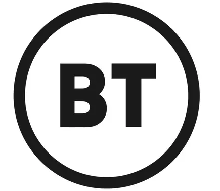
Would have been better if they used the previous it simply moved the letters BT into the globe? Also preferred the previous font to the totally generic one theyve selected.


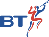
The BT logo over time.
and now this.
This is an example of a company making their logo simpler, so that it works well on mobiles etc. It's been described as looking like either a chemical warning symbol on a tanker lorry or a meat inspection stamp. Probably cost them thousands!

Would have been better if they used the previous it simply moved the letters BT into the globe? Also preferred the previous font to the totally generic one theyve selected.
Laughable, I predict that cost £250k plus in marketing consultants, committees and management time to get to approval.
I hate BT and this logo seems fitting. It says nothing.
I'm sure you're right in terms of the costs and time "the committee" took to select it. It apparently presages some "new bold" directions the CEO wants to take the company. I've read that part of that, is giving all staff £500 in shares to improve morale. Phil Jansen the CEO is on £2.1 million. Hmmm.Originally Posted by mondie

I've tried to avoid them whenever possible, professionally and personally, as they're too big and bureaucratic. Unfortunately most ISPs have to run their lines over BT infrastructure, so in a former job one company I looked after were taken off line, even though we were with VM, as the BT engineers sliced through our fibre in the distribution point. It took three weeks to arrange a site survey for a red care alarm line, in a building with three existing red care alarm lines. Bloody awful company.
I’ve got a BT fibre running through a conduit in my front garden with an inspection hatch in my lawn which serves all of the National Trust offices on the estate,I’ve also got a completely separate fibre just over the wall in my back garden which goes to the pub over the road but despite my best efforts to increase my broadband speed above 3m BT claim its just to possible for me to have either ftc or ftp to my house.
I’m thinking about putting a slight tight kink in the fibre as a protest.
Isn't it just sooo.....now...though........like yeah......
Started out with nothing. Still have most of it left.
Thousands, you say? A few years ago I won a national industry award for marketing, having spent £35k on a complete rebrand. The other finalists were Romec/the Royal Mail (who spent £900k) and one of the big FM companies (£1m+). Both were similar rebranding projects.
Just saying...
So you won on quality, not quantity. I can relate to that. :) I know from my time in an ad agency that even the simplest logos, like the new BT one, can take a lot of work. It's just that the end result does not necessarily reflect that.
Fibre is AWFULLY fragile....

Pedant Alert! - Don't confuse BT with Openreach - it is the latter that own and operate all the physical infrastructure. BT just sell telephone and data services.
the logo is actually not black and white but animated with colours.
i shot some development work and BT products with the new logo nearly 2 years ago for the design agency who pitched for the rebrand, cant believe its taken this long to see the light of day.
was obviously under NDA so not been able to show people the work I did on the account.
You are of course correct. It was OpenReach engineers that took down the company I worked for, for a day.
Very interesting. There was some articles today saying that it was in 2016 when this first started. They changed CEO at the start of this year so that may have added to whatever delay there was.
https://www.theguardian.com/business...ional-champion
Laughable. In a time when they should be focusing on their internal management and improving customer service they have spent money doing this.
Ive been trying to sell my BT shares at a decent for a few months now and it just keeps on slipping down. This wont help either.
Wonder how much they paid for that! Jesus.
Its not just what they have paid for the design but think of all the vans, uniforms, paper etc they now need to change.
BT/Openreach, together or separate, I would not give then the time of day anymore after experiencing their truly appalling and abysmal customer services a few years ago. As for the new Logo, a ten year old child could have done that free! These organisations that get so big that they consider customers to be nuisances should remember that customers departing after being given crap service have long memories!
Openreach is a wholly owned subsidiary of BT, despite the long overdue management separation agreement agreed with Ofcom a couple of years ago. All of the network assets are also still owned directly by BT.
I expect this rebranding will literally cost millions to implement.
Here's a link to BT's new logo is a thing of incredible beauty..."All the charm of a motorway stop sign".
Bloody Terrible.
 Posting Permissions