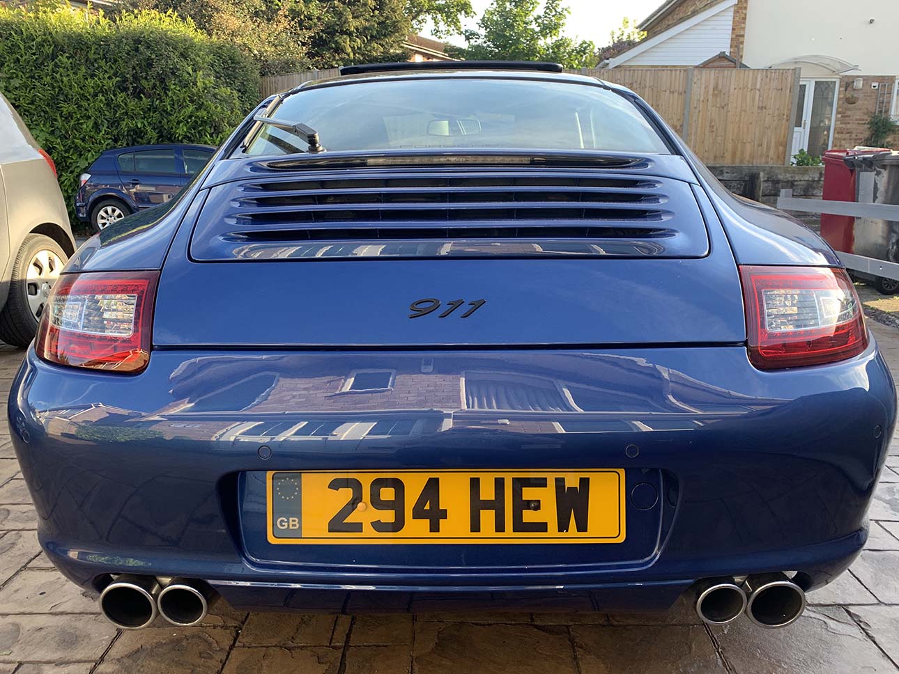
I decided to tackle the Carrera S script on the engine lid of my 911, I'm never really been a fan of the mis-matched lettering and to me it always seems unbalanced.
I thought it would be a simple enough job so I ordered a new 911 badge in black, when it arrived I got to work removing the old script.
I was left with a bit of polishing to do so out came the Rupes DA and I got to work, however the intervening 12 years meant that even after mucho fine polishing I could still see a shadow where the old script had been.
No amount of fine or medium polishing improved that shadow which meant I was going to have to get the lid painted to overcome the problem. With this in mind I threw caution to the wind and moved up to a coarser pad and paste. After 10 minutes or so the inevitable happened.
I managed to get through the clear and the colour coat but that damned shadow was still visible where the paint was hanging on!
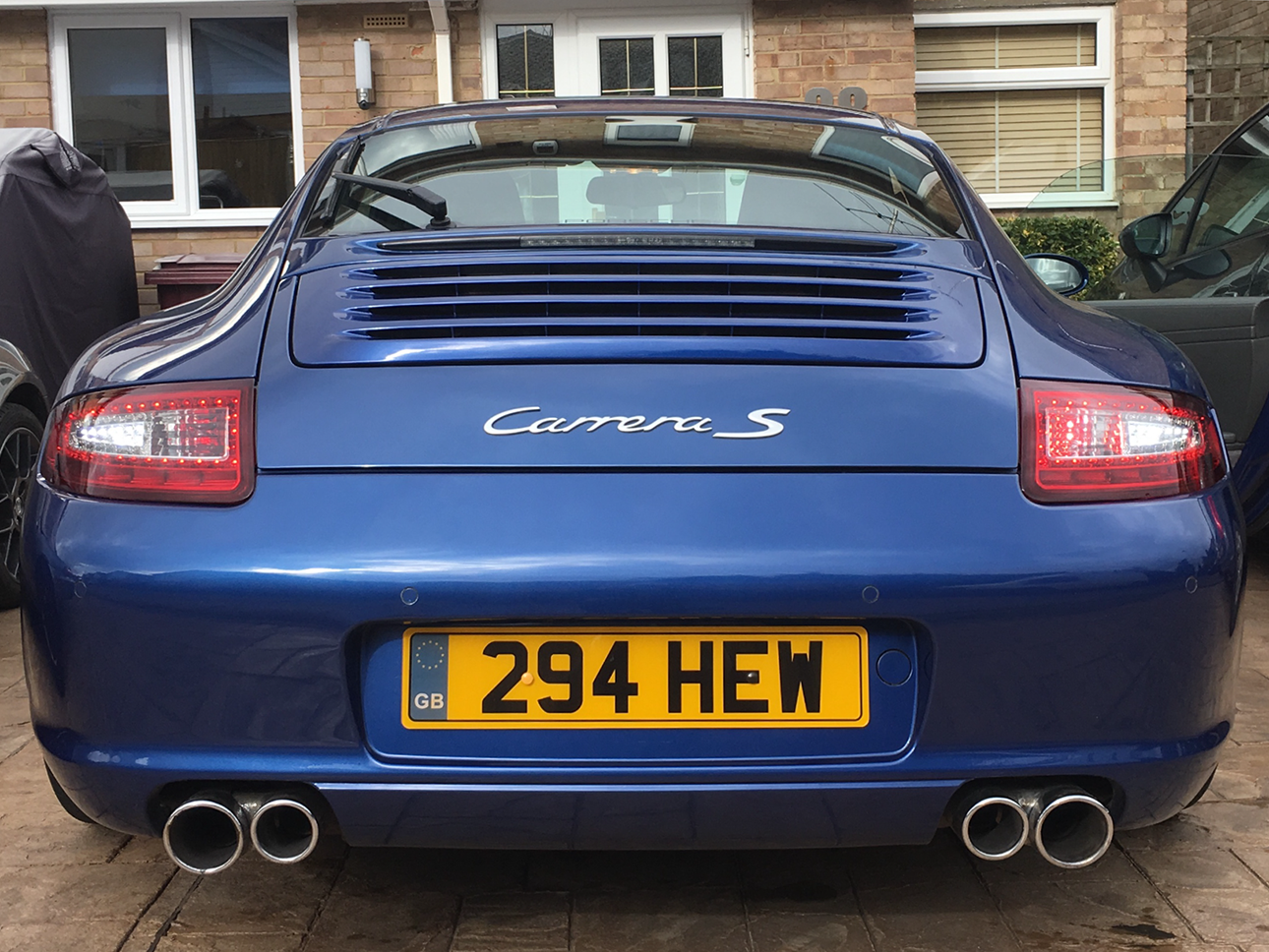
I got the car back from the painters today and finally fitted the new badge over a week after I started the job.
I'm very pleased with the result but it was definitely a case of sod's law, nothing's ever as straightforward as I'd like it to be!


 Reply With Quote