Reply With Quote
I know what you mean!
As my sight has deteriorated with age, unless the hands are a decent size and with lume which makes it much easier to view. I tend to go for lighter coloured dials.


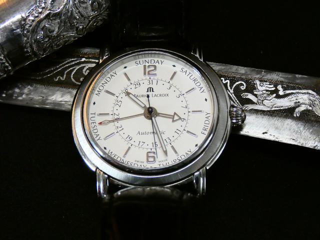
I find it difficult to quickly glance at the 1655 and see the time accurately due to the cluttered markers on the dial. Whereas the Sinn makes it really easy. This shot shows the issue. Does anyone else find this frustrating just a bit?
Sent from my SM-G925F using Tapatalk

I know what you mean!
As my sight has deteriorated with age, unless the hands are a decent size and with lume which makes it much easier to view. I tend to go for lighter coloured dials.
Definitely.
I had a white dial Daytona which I was very pleased with.
I was at a party feeling pretty smug with my new watch until I realised later in the evening that I had to use my phone to tell the time!
I sold it shortly after.
Legibility of dials is now a major factor in choosing a watch.
Of course this has nothing to do with my age and failing eyesight!!!
Mark
Sent from my iPhone using Tapatalk
^^^^In my opinion, the Daytona is probably the worst candidate for legibility in the watch world.
I don't personally find the 1655 that bad despite it being a common complaint with that model, as in practice I tend to mentally round up or round down. Exactly the same as for a watch with no minute markers, you'll be within a pretty close ballpark just from a quick glance.
Yes, definitely one of Rolex's worst, although I think a lot of the Datejusts can be quite poor too. I found reading my (5 digit) SD and Sub (and Exp 1 for that matter) all pretty difficult in poorer light conditions. Of course, the Cyclops never helps. The change to the maxi dial in the 6 digit sports models has helped legibility enormously.Originally Posted by reggie747

PP are no slouches though. One of their world timers is virtually illegible from all angles and under all lighting conditions. "You never really tell the time with a PP ..."
Maybe that explains the success of Daniel Wellington and friends :)
I've just posted this picture in the GMT thread, but maybe it illustrates my main problem with this GS GMT - that sometimes the GMT hand is more legible than the minute hand, and that's just not right!

Agreed. I'm considering painting the GMT hand to make it less prominent!
In general though I do put legibility high up on my list of things in a watch. That's why I love GS, and also the simpler dials.
Last edited by KingKitega; 22nd January 2019 at 15:41.

I find that the problem is worst with polished steel (silver metal) hands on a dark dial - they often just disappear, and unless the lume plot is large, the hands merge back into the dial.
The Speedmaster pro uses white hands to increase legibility, and I think many other watches could follow suit to improve legibility.
It is nothing clearer than white on black, or black on white. Anything in between is redusing the contrast.
Of course the 1655 does use white and black, but it makes the error of having the odd hour indices for the 24 hr scale making confusion with the 12-hr scale,
Dave
I agree with your QW, that would reduce legibility significantly and is an odd choice by GS. On their black dial, Chrono the main hands are a combo of polished and brushed to make them stand out and the GMT hand is very slim with a small red arrow that if anything could do with being a touch bigger. Its not like GS dont pay attention to these details but for some reason on that GMT design they didnt. Odd.
Legibility? Don't be so pedantic
Martyn

That position was usurped long ago by Richard Mille.
I find this problem with my YM2, White gold hands on a white dial do not make for an easily legible watch.
Still live it tho. Man jewellery
Sent from my SM-G920F using Tapatalk
I was often irritated by the 1655 because the simple truth is that the 12 hour dial is very often mistaken for the 24 hour dial, so it is dead easy to be 2.5 minutes out if you take a quick qlance and this is a well known error. The "disco dial" as it was commonly known is even worse when you consider that it was designed to be read down in deep and dark caves where only torch light was available.
For this reason the 1655 was next to impossible to sell and now it is fairly rare due to the low volumes sold.
I stuck it out with mine and after a few weeks you do get used to it, I simply concentrate on the inner 12 hour markings and now find it dead easy to read and never make mistakes or at least I don't think I do.
The 1655 is now my favourite watch and I hate putting it back in the box, so persevere with it. It is just a gorgeous looking watch and I love it.
As regards to the Daytonas, buy yourself a 16520 (Zenith version) and that will be fine, the sub dials have a much better contrast and I have no problem in reading it at all. I agree that all the following models with the grey sub dials are very unclear.
The most legible watch I have is the 214270 Explorer, it is a simple face and incredibly easy to read. A much under rated model.
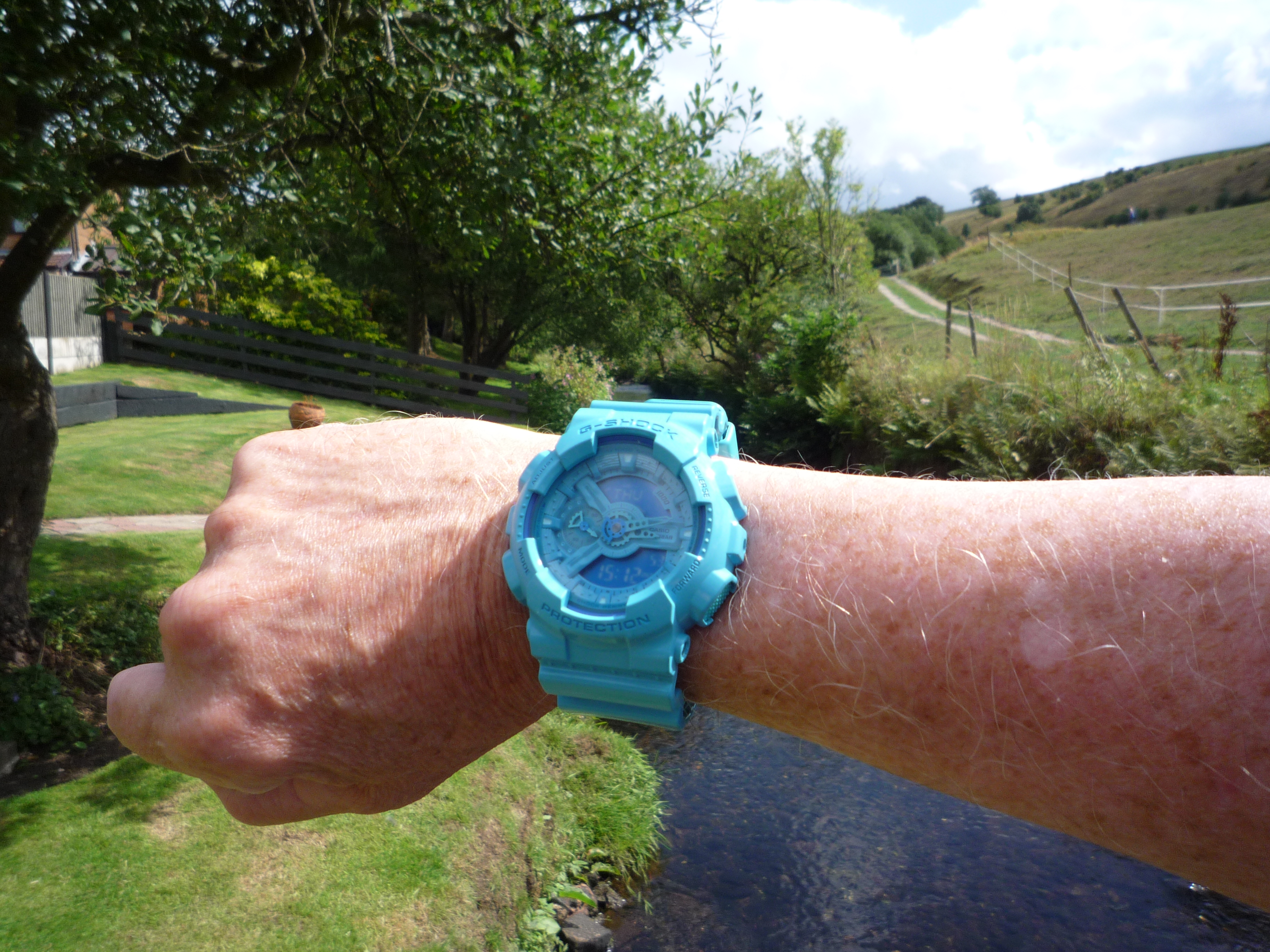
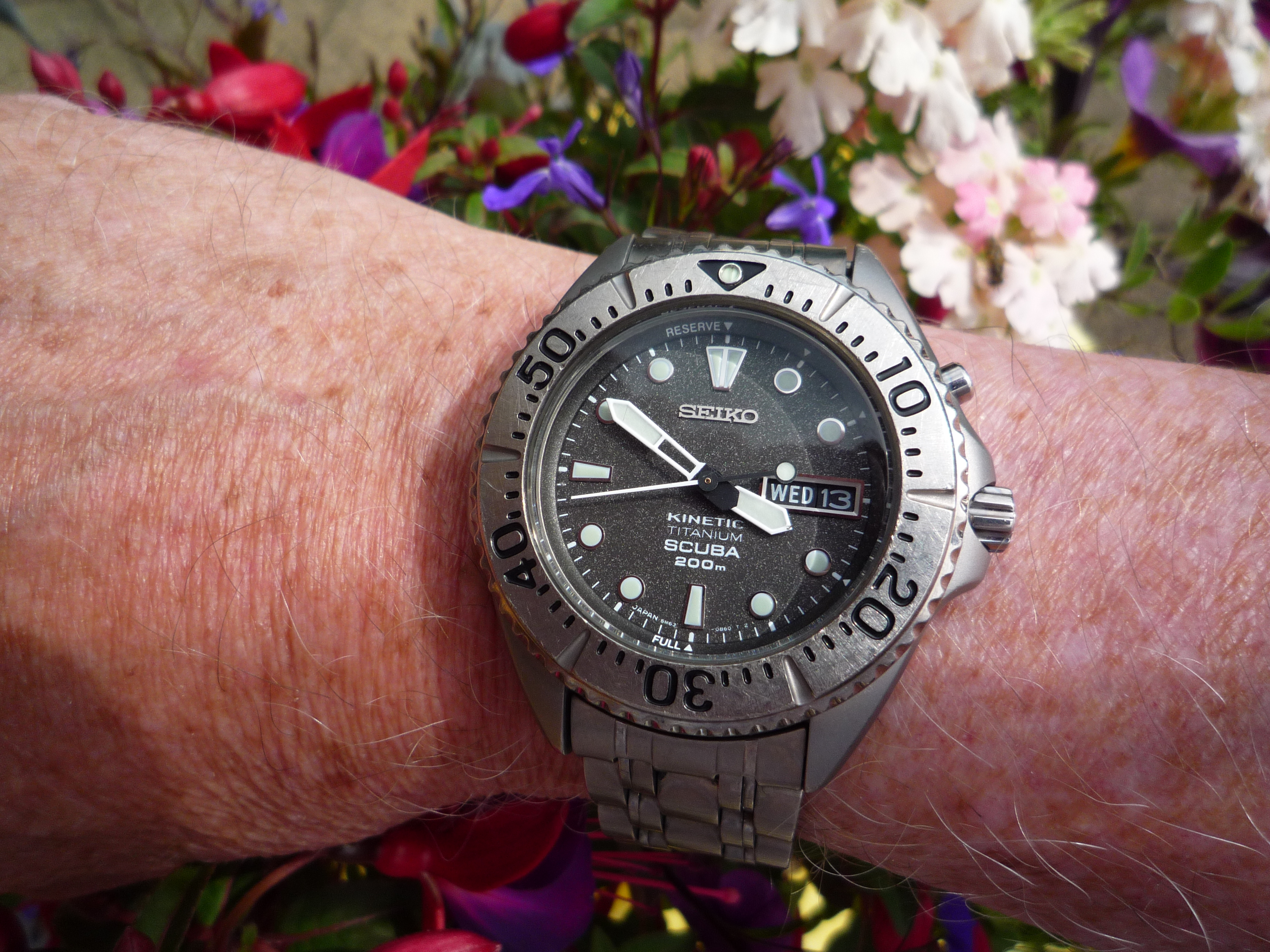
Light dials can also be a legibility nightmare. I love the look of this watch, which I am wearing today, but it isn't easy to use for its intended purpose with just quick glance.
Sent from my iPhone using Tapatalk
Ageing eyesight is a problem, I struggle to read some of my watches in certain light conditions and it is frustrating. One of the worst is the Zenith El Primero I finally got around to sorting out over Christmas, its a superb watch and it looks great in photos etc, but the combination of a busy silver/ white dial with thin silver lumed hands makes it nigh-on impossible to read in subdued artificial light. I looked at changing the dial and handset but the cost (almost £400 for the parts) put me off.
I have a few vintage Omegas that arent easy to read, but I like the watches so I accept that, but for an everyday wearer I orefer something I can read at a glance.
Legibility is a must or a watch isnt practical, eg . . .

F.T.F.A.
Quarter past Six?
There can't be many watches as difficult to read the time than the Seiko Silverwave with Starburst dial.
Especially when you consider this forerunner to the 62mas watch was intended for snorkelling. This watch is hard enough to read at any time, under water it must be impossible:

I loved the look of this watch:
I loved its motor racing history. I thought (and still think) that it was an extremely attractive watch; and an iconic model to boot.
So why did I sell it?
Couldn't see the hands under any circumstance. Fussy dial. Lack of contrast. Thought to myself one day "why keep a watch that you can't use to tell the time?" Maybe after a spell of intensive scrutiny in the comfort of my home or local I could spot the hands, but if driving for instance, forget it.
A Railmaster came along; chalk and cheese. Bought the Railmaster, justified the expenditure by selling the Twinjet.
Wow that really is bad
Sent from my iPhone using Tapatalk
I was hankering after a grey dial watch , was considering and had tried on in shops one of the new breitling colts and OP39 , when a DJ 41 rhodium dial came up at a good price and I could p/x , so no hesitation and it was bought, now since owning it its not the most legible for instant time telling of my collection with 62 year old eye sight especially in room/ low light, in the sunshine its not a problem, still who wears a watch to tell the time

I had the old GMT- master and both black and white dialled explorer IIs at some point in the last 20 years and all got moved on pretty quickly - I just find a 4th hand distracting and lowered legibility - I found it easier to glance at eg a Submariner and subtract 4 hours than try to work out the position of the 4th hand etc. And this was with late 20s early 30s eyes! Now Im nearing 50 I probably need a Panerai dial just to see what hour it is !
Sent from my iPhone using Tapatalk
I really like the look of a Daytona but it's definitely jewellery rather than a timepiece if you have eyesight like mine.
I see a Navitimer already mentioned above - I have the Sinn equivalent, a 903 in blue. For a pilots watch, it's amusingly difficult to tell the time at a glance, with the hands often disappearing into the sub dials. Not a patch on a Speedy legibility wise, nor my Hanhart, which is probably about the best I've had chronograph wise (although it only has the two sub-dials) for legibility, probably down to the drastically different shaped hour and minute hands absolutely full of lume.
Legibility definitely a deal breaker for me. If I can't tell the time easily with a quick glance down, I couldn't wear the watch.
Sent from my H3113 using Tapatalk
This one has too many silver hands on a silver background! The problem was particularly acute before I got varifocal specs.
With the new specs it does get more wrist time.
A

For chrono,I think speedy can be considered as highly legible
For standard watch,Panerai,even the smaller 42mm is already highly legible in comparison to most brands
42mm pam 184 shown
My FOIS is going for this very reason. The polished hands turn black unless angled to catch the light. Shown against my go-to Seiko which is immediately legible at a glance. I think the Sinn aviation style 556a etc are also supremely legible.
Sent from my ONEPLUS A3003 using Tapatalk
What time is it?
Fantastic lume very clear in the dark, now what time is it again?
Mitch
Last edited by Mitch; 22nd January 2019 at 23:50.
Time to put a different watch on I think!
Time to sling that bluey monstrosity into the river in the picture I think....
On the other hand this is pretty clear the 'Grey Ghost'.
Mitch
Same here black dial. I wanted a daytona for years but I had to admit that it scrambled my eyes every time I looked at it. Replaced it with a SD43.
Never buy watches from a toy shop!!
I think the OP's original pic sums the whole legibility thing up perfectly. The 1655 is by no means the worst sinner in the legibility stakes but it is blown out of the water by the superbly legible, and well balanced Sinn, the Damasko comes close but not quite. I confess I have a Sinn 656 so am possibly a little biased but I think it is a fabulous every day beater.
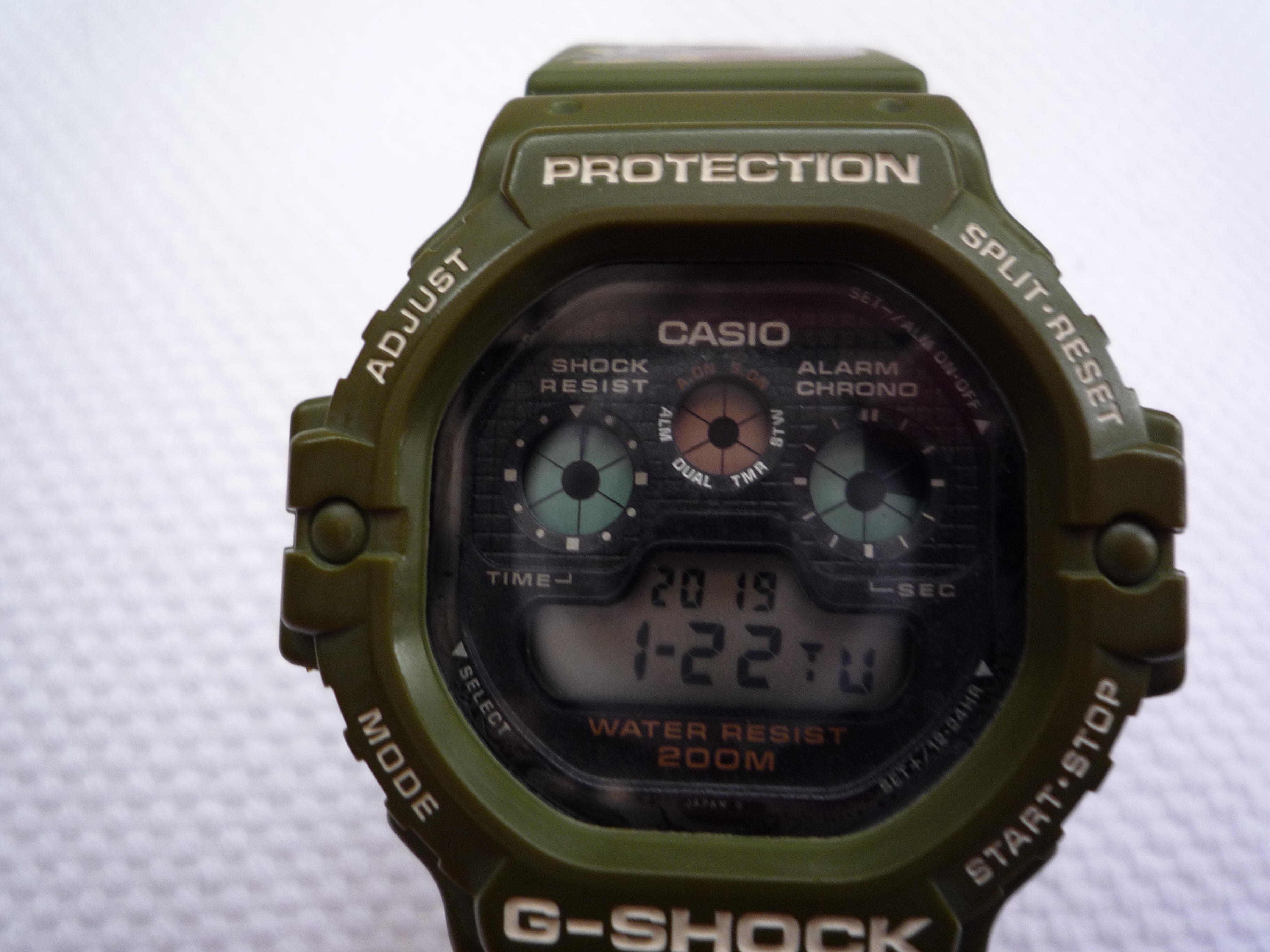
Worst watch for legibility has to be the reverse display on a gshock.
Also I couldnt get on with the hands on a prs10/g10
I also have a Sinn 656, and its great.
I bought this specifically for use during the night :)

Ha, I agree, this must be the worst watch to tell the time during snorkling |:D
Legibility is prob the main thing I think about. I am ok with my speedy.. but need something big and clear. Had a couple of Torgoen T10, black and cream
Just purchased this, thinking it will get some wrist time.
Sent from my iPhone using Tapatalk
Bo**ox to that! I thought AT is bad but that's just atrocious.
Fas est ab hoste doceri

breitling aerospace is the most legible watch ive ever owned in all conditions . the lume is also the best ive had . mine is a 2002 model 75362 .
Ageing eyesight can be a problem but the Dornblüth is superbly legible....my Sinn 856 UTC is excellent too due to the fact the extra hand is shorter and painted yellow at the tip ...
Sent from my iPad using Tapatalk
Surely if legibility is what youre after its hard to go past Mondaine

Legibility and the ease of telling time quickly is the main issue in me banging on about dive watch bezels over the years. Its easier if they are fully indexed and black but fashion/tradition seems more important to some brands.
Sun reflecting of both bezels...one stays readable and the other doesn't

Springdrive Vs Hulk
Sent from my ONEPLUS A3003 using Tapatalk
 Posting Permissions