Reply With Quote
Terrible of course not, but likely as commercially successful, well, it's Eddies final decision obviously.Originally Posted by DannyPN

Still it's nice he lets us chuck around ideas.


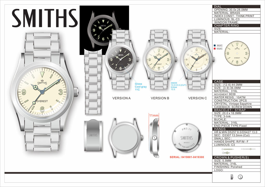
Would that be so terrible? As lughugger pointed out, the PRS-29AM is not a negative of the PRS-29A. They have entirely different hands and dials.


Terrible of course not, but likely as commercially successful, well, it's Eddies final decision obviously.
Still it's nice he lets us chuck around ideas.
Hand issues addressed but for sure it still won't suit everybody.
Eddie
Whole chunks of my life come under the heading "it seemed like a good idea at the time".
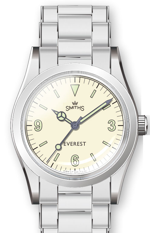
It's perfect imo, will the handset be blued?
Yes.
Eddie
Whole chunks of my life come under the heading "it seemed like a good idea at the time".
I'd say go ahead and make that, then.
Dave E
Skating away on the thin ice of a new day

The hand on the am are outstanding so these lumed should be stunning.
It looks good and I'll probably buy it ... I do think it would look better with a slimmer second hand and smaller lollipop though :-)

Looks pretty good Eddie - I think the Everest in the same colour as the 'Smiths' name and logo works well too. Gives some balance to the dial.
Are my eyes deceiving me or do I see a closed minute track? I like that. I like the logo and the better proportioned hands. And I really like the 36mm Oyster case. But I dunno. Maybe when I see some pictures of the real thing that I will change my mind and rush to buy it after all.
Yes, I'd prefer to see a slimmer second hand too, and one that maintained a constant thickness, rather than being an elongated triangle. I'd also rather the second and minute hands fell fractionally short of the minute markers rather than half overlapping them (which to my mind falls between two stools). Up to Eddie now, though.
I have no issues with that exactly as it stands, I will definitely be ordering one
Dave
EVEREST is far too dominant in Eddie's latest render. I would like the font colour to be a closer match to the dial per the original(s). Other than that, it's a winner!
As above.
F.T.F.A.
Probably wants to be smaller font as well. The Smiths logo is not as imposing as the one on the black version, so it's lost the balance.
I'll still be adding to the collection with the white Everest as is but I'd love something like this in the future future future.
Based on a central seconds version of the A404.
I'm done now, back to some Actual Work (tm)
Eddie, will the hands be thermally blued like the AM?
Its looking very good indeed!

Have been reading the forum for quite some time because the Everest has caught my attention however i just registered to ask something.
Will you also update the black version with the same dial elements and hands?
Cheers.
These look excellent imo, very nice work.
I think he still has 234 of them left to sell first.
There's nothing wrong with the current black version, you get used to any "flaws' you may perceive at first. I've been wearing it with pleasure for nearly two weeks now without looking at my other watches.
Thanks Eddie for the udate.
Please will the same modification to the hands be applied also to the black dial next version, whenever it will be issued ?
Thanks
I think it would bother me. Especially after wearing my 114270 the "flaws" would become apparent again.
This new version is fantastic so if the black doesn't get updated i'll probably get the white one. :)
Same here ... it's been permanently on the wrist since it arrived on 21st December (and I'm a guy who typically changes his watch 4x a day LOL). It has some stiff competition from Omega and Tudor, but is brushing them off with ease thus far ...
Last edited by 459GMB; 31st December 2018 at 16:15.
Love it.
I'll adjust the hands but no plans to change anything else.
Eddie
Whole chunks of my life come under the heading "it seemed like a good idea at the time".
Very nice but which movement are you using with 24 jewels?
Eddie
Whole chunks of my life come under the heading "it seemed like a good idea at the time".
As well as the Miyota 9039 movement, I understood from your previous post. It will be a simply beautiful black Everest, taking into account also the new 20->16mm rivet oyster bracelet.
Compliments Eddie, a real stunning project !
The virtual 9039. In my mind.
Thank you. :)
I would love to see this version, take my money!
Sent from my iPhone using TZ-UK mobile app
That link you posted to the Miyota movements has the 9039 as 24 jewels :
https://miyotamovement.com/pdf/spec_9039.pdf
If this really happens 2019 will be a great year! Black Everest 36 + white Everest 36 + this one in Everest 36 case
See post #155
Thanks, I saw that but was asking if they will be thermally blued like the AM rather than chemically blued.
Hoping they are getting the heat treatment!
Just make it like youve shown, Eddie, and ignore all the other suggestions to change it. Like the black 36, it will be lovely.
What the heck, I'm in
When are these due to land Eddie?
Not a major issue, but I agree with this - it would be better to cut the size of the font on 'EVEREST' just a little I think. Now that this is in the same colour as the Smiths logo, and given the varying letter size on this version of the logo, Everest seems more prominent than Smiths.
Either way, this is going to be another winner and I'll be picking one of these up as soon as they are ready.
Those are fantastic! Much better than merc hands
Sent from my iPad using Tapatalk
Though not everyone would agree with that opinion.
Take my money!!! When will the white version be going on sale?
Nailed it.
It's moot though as they won't be appearing on the PRS-25 anytime soon.
Ah well we can but dream.
And i understand that. I am just voicing an opinion.
Sent from my iPad using Tapatalk
Eddie
Whole chunks of my life come under the heading "it seemed like a good idea at the time".
Really like it Eddie! Especially version C. If it goes ahead will it be available in 36 and 40mm like the black Everest?
Sent from my iPhone using TZ-UK mobile app
Only 36mm.
Eddie
Whole chunks of my life come under the heading "it seemed like a good idea at the time".
Super great Eddie, I'll buy the version A !!!!!
Please Eddie can you confirm that the bracelet is tapering from 20 to 16 mm (while on the drawing is reported to 18mm?) ?
Last edited by Engi; 3rd January 2019 at 12:38.
After having the 40mm Everest I think the 36 will be too small for me ☹️
Sent from my iPhone using TZ-UK mobile app
I thought that after wearing the 39mm PRS29-b, and nearly did not buy the Air Ministry as that is 36 and years ago i gave away my issue watch as i was not happy with it being 36.
Now however i find that the 36 is actually a really nice size to wear and have zero issues with it.
I would say buy one, try it. If it really is not for you then move it on, you will have no trouble doing so.
(I have a seven and half inch wrist).
 Posting Permissions