Reply With Quote
Smiths needs to be smaller and not deluxe, and Everest a little bigger and further away from the centre, and in upper case.
The font for the lower lines is not quite right.


Im not very good with photoshop, im not a fan of this either. I like the idea of 10 atmospheres but I cant find the right text.
Any ideas?
Sent from my iPhone using Tapatalk

Smiths needs to be smaller and not deluxe, and Everest a little bigger and further away from the centre, and in upper case.
The font for the lower lines is not quite right.
'Against stupidity, the gods themselves struggle in vain' - Schiller.
Sent from my iPhone using Tapatalk

Try this in place of the 10 Atm.:
EVEREST
29,029 ft.
Given that you are nearly sold out of the current batch, is release date going to be Sept/Oct for cream dial with new bracelet?
Pennies now saved.
and a hear hear from me - keep it clean, and don't mix fonts.Originally Posted by magirus

On reflection I agree - keep the fonts the same and stick to the original plan
Thumbs up :-)
I would like to her more about that version C - I think it's called the Expedition version. Hoping for some sneak peak pictures :-)
Surely the designs are already submitted if we are going to see product in Sept/Oct?
I was thinking that to myself earlier on - surely they are currently being fabricated or are just about to be?
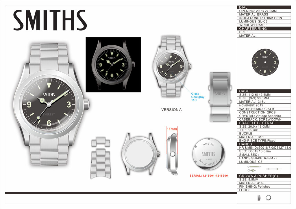
36mm is the diameter of the case, not the dial.
The diameter of the dial on the Everest is 27mm. I wouldn't say that's small - in fact it's the same diameter as the dial on a current model Rolex Submariner.
On balance I suppose I'd prefer to stick with just 'Everest' as text in the lower half, but not because I think the dial wouldn't take it size wise.
Apologies, I should have been clearer. I meant the watch overall at 36mm, not just the dial. Obviously.
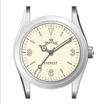
Still nothing better in terms of design for the white dial than what Eddie served first up in post #1 ...
But the presence of the 'milky ring' makes it appear a couple of mm smaller though - had an acrylic crystal been fitted it would have appeared just a little larger, something that is apparent when you see pictures of the Everest side by side with a 1016
Last edited by Velorum; 10th June 2019 at 08:29.
I tend to agree with this
The dial size of a 1016 is 29mm. The dial size of the 1016's predecessors 6610 and 6350 is 28mm.
I don't have the 1016 or any of its predecessors so can't comment on that.
My measurement of my existing black-faced Everest gives a dial opening diameter of 27mm. By 'dial opening' I mean the visible dial which, I would suggest, is the most relevant measurement in terms of what text or logos might look good on the dial. The case opening diameter is a slightly larger figure of course.
That diameter is the same as my measurement of the dial opening diameter on my current model Rolex Submariner (which, for better or more probably worse, has the coronet logo and two lines of text in the top half plus no fewer than four lines of text in the lower half).
This comparison would suggest that it wouldn't be totally mad to have two lines of text in the bottom half of the dial on the white-faced Everest, though on balance I think I prefer it as it is, with just the one.
Anyway no-one should be paying too much attention to measurements taken by a bloke who is both so short-sighted and so long-sighted at the same time that he has to take his specs off while trying to fit a common or garden ruler against the watch.
However, I think I know a man who can measure Timefactors watches with some precision (case opening followed by dial opening, I believe, top right of the diagram) ...

Your original for me Eddie, I don't like elaborate worded dials either.
My vote for the originally proposed dial, balanced, simple, and uncluttered. No need for anything else on the dial in my humble opinion.
I did like the Everest in red, as well as the height in feet.
Would be interested to see what it would look like with the V inverted ie to resemble the peak. Naff perhaps, but it would still be interesting to see if any of our Tech Wizards facing having a play?
Already got two peaks in the top half of the dial :-)
If you want an Alpine like peak, buy a Toblerone.
Eddie, when is this watch being released?
If your measurement is correct it would explain why the Everest looks smaller next to the real deal. It's not the "milky ring" that makes it appear smaller, the dial is actually 2mm smaller. To my eyes the Everest always looked like a 34mm watch i.s.o 36mm watch.
It's strange anyway, because, based on TF23 measurement, the 'dial opening', that is the visible dial, is 27 mm , that is the same value as of the dial opening diameter on current model Rolex Submariner ...
Rolex Submariner dials were/are smaller. Here's a dealer in vintage Rolex and refinished Rolex dials who lists the exact diameter of the different dials he offers: link
Why did this thread now revert to a Rolex thread?
Perhaps because the Smiths Everest is trying to look like a Rolex 1016?

Yes but with the new seconds hand with the counterbalance.

Or perhaps instead of the elevation at the summit, you could put this in place of the 10 atm;
EVEREST
0.33 - 10 atm
i.e. the watch can perform at pressures that range from the top of Everest to 100 m submerged. I think that would be pretty cool.

Haha are you confused by the idea or disgusted by it? Or both perhaps?
Sent from my iPhone using Tapatalk
The problem with this is that you are being dimensionally inconsistent.
The pressure at the top of Everest is about 0.33 Bar(a) - Absolute. or -0.66 Bar(g)
The pressure to which the WR is tested is 10 Bar(g) - Gauge, which is 11 Bar(a).
So it would need to be 0.33 -11 Atm, by which time no-one would have a clue what you mean........
I vote simplicity. Less is more.
To me, the PRS 29 AM is Eddies's most successful recent design, and look how little is on that dial.
Post #1 dial, albeit with the re-proportioned hands.
Dave
Yeah, I think youre correct in the end, it was more of a passing thought than a serious suggestion. Thats a good point about gauge vs absolute pressure as well, I wasnt aware that water resistance ratings were gauge pressures.
This watch doesn't need a "waffle dial", ie a dial filled with waffle. It's a white dialled version of the Everest. I refer you to post #520 .
F.T.F.A.
Smaller Everest, bigger smiths, job done. Keep any extra wording eyc for the type C which is intentionally trying to be a homage to older deaigns.
Is the version with 1 - 12 around the dial still in the pipeline?
Yes, that had occurred to me too, but as I can't make a comparable measurement on a 1016 I held back from commenting on it.
The link you've given (message #575) to a vintage dial seller is the same relevant result I'd come up with on a Google search (other results were useless as regards the dial diameter). The thing is though that the 29mm diameter figure quoted there is the only measurement that's given. Doesn't that imply that 29mm is the edge-to-edge diameter of the dial they are selling and that therefore the dial opening on the watch must be smaller than that? Remember that the case opening diameter on the Everest is, I believe, 29.5mm.
The position seems inconclusive based on this information alone. Perhaps someone will come along who has a 1016 and can give a definitive answer, who knows? It won't make any difference to my enjoyment of the Everest, but it would be mildly interesting (with apologies to those who don't want the subject of Rolex to rear its ugly head on this thread).
I disagree. I think that the milky ring does make the dial look smaller, not only on the Everest but on other pieces too such as Speedmasters fitted with sapphire crystals - plenty of side by side shots on a Google image search.
I thought it was the milky ring as well but now I'm starting to think it's actually the dial. If the dial of the Everest is indeed 27mm it is 2mm smaller than the dial of a 1016. That difference would be very noticeable. But whatever the reason, milky ring or dial diameter or a combination of both, the Everest looks smaller than its 36mm.
Perhaps the case opening of the Everest is slightly off as well compared to the 1016. Fact is that the Everest next to a 1016 (there's a comparison pic in the other thread) looks quite a bit smaller.
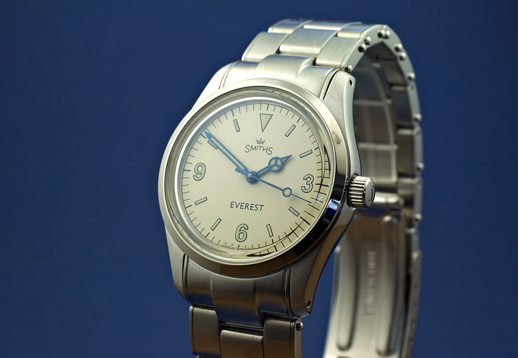
First picture of the prototype.
Changes to be made for the production model (so far) are:
Shorter minute hand.
Bracelet end-pieces changed from male to female.
Better clasp.
Eddie
Whole chunks of my life come under the heading "it seemed like a good idea at the time".
Nice, although I'll buy the new upgraded black dial
I think the lume is looking good on the white, black outline is perfect weight. Looking very exciting!
Are the blue hands exactly the same as the AM?
Sent from my iPhone using TZ-UK mobile app
Very smart indeed.
Nice.
Last edited by Sandpiper; 15th June 2019 at 19:04.
This and the Expedition are looking really great. Tough choices to be made.
Dave
The unique design of the Expedition version is understandably attracting most attention but, once the final improvements to the Everest (minute hand etc) have been made, I think this will be just classic and it's definitely the one for me.
Can't wait to see it on my wrist!
If the Expedition wasn't in the picture I would have been interested in this. It is a beautiful combination.
Eddie - do you take advance orders?
Or is this really not needed- there will be enough.
 Posting Permissions